Project date: 2013-2016
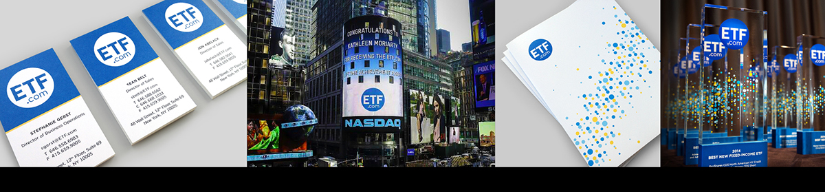
ETF Branding
ETF is the world’s leading independent authority on exchange-traded funds. They offer financial investors access to the best ETF data, ratings, analysis, and news available.
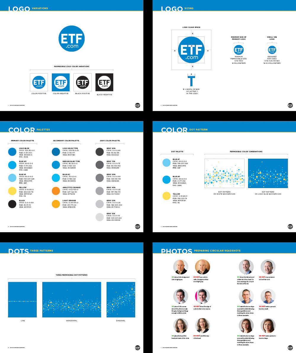
I rebranded the company from the ground up when IndexUniverse decided to change their name to ETF. They pride themselves on having the cleanest data in the industry, and this guided the brand development. The logo communicates the ideas of being clean, pure, and having on target data. In addition, the logo projects an element of approachability which reflects the company's mission to inform and empower investors. The supporting dot pattern graphics were derived from financial regression charts and reflect that the heart of the company is data-driven. The dot patterns express the "uneven-ness" of real data and the energy of market trading. Website traffic, event attendance, and publication subscriptions all saw steady growth post rebrand.
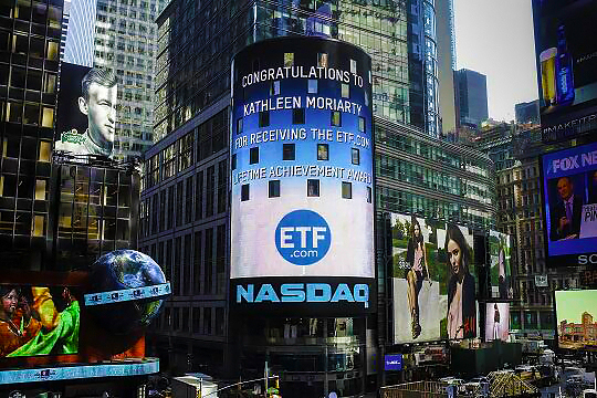
Logo in Times Square
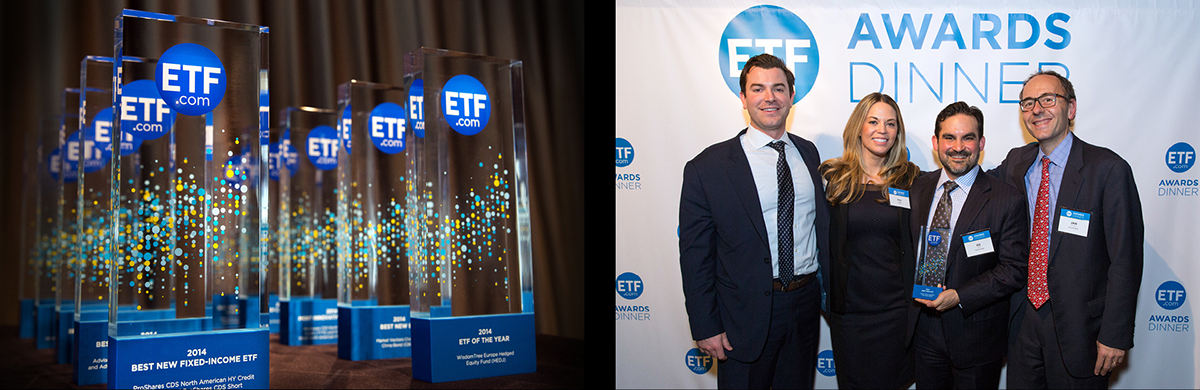
ETF Awards
Stage design

Branded chartered flight

Website redesign

Corporate collateral
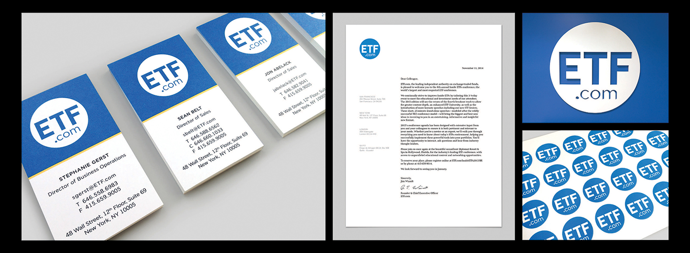

Swag

Print advertising

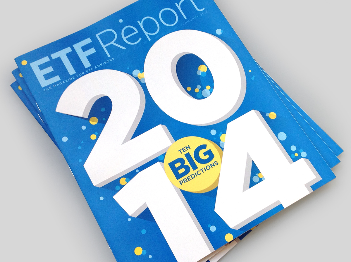
ETF Report magazine released with the announcement of the new name
— S T Y L E G U I D E —

— P R O C E S S —


DESIGN DIRECTOR
ETF
ETF
(Project date: 2013-2016)


