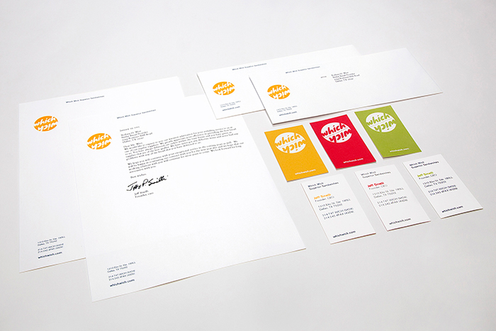
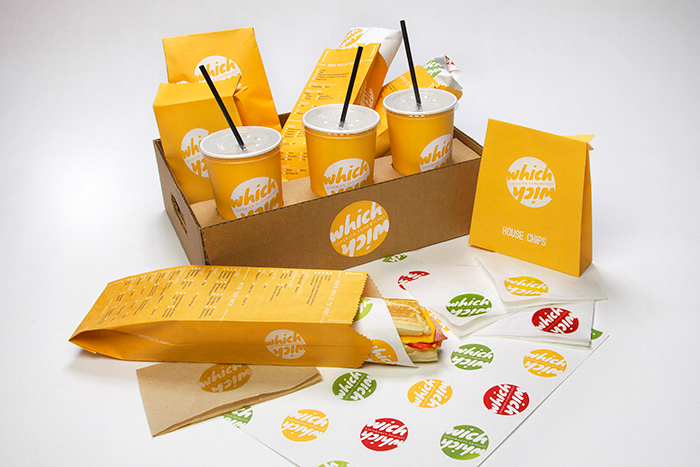
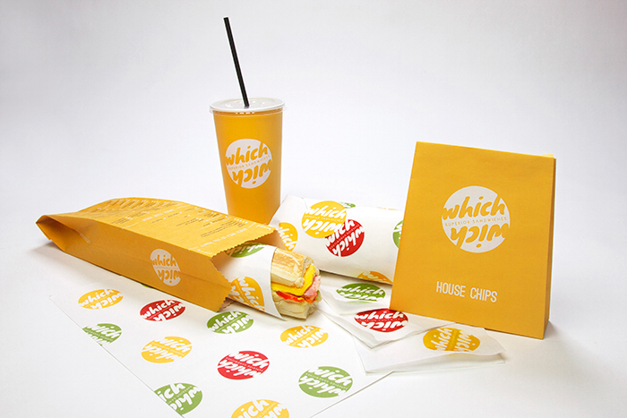
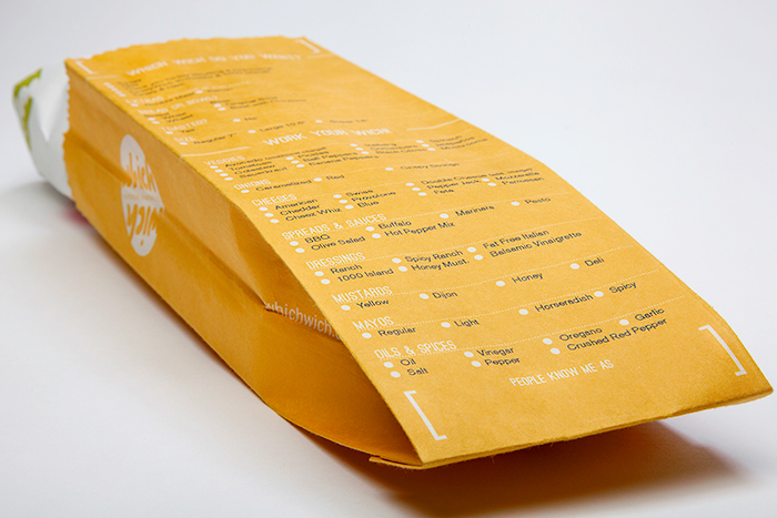
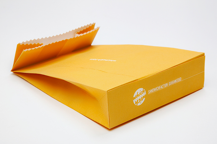
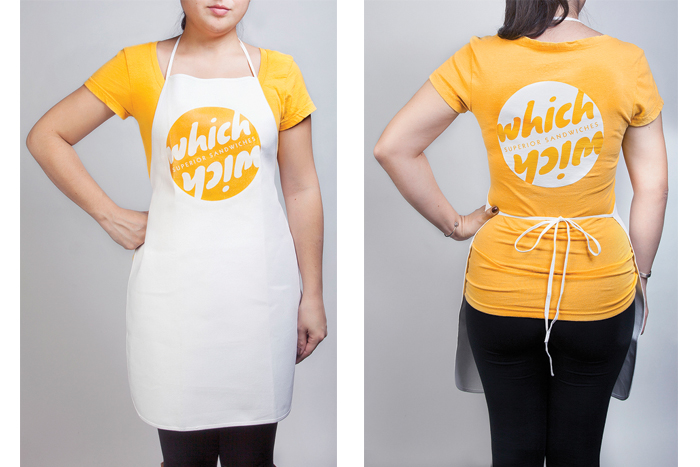
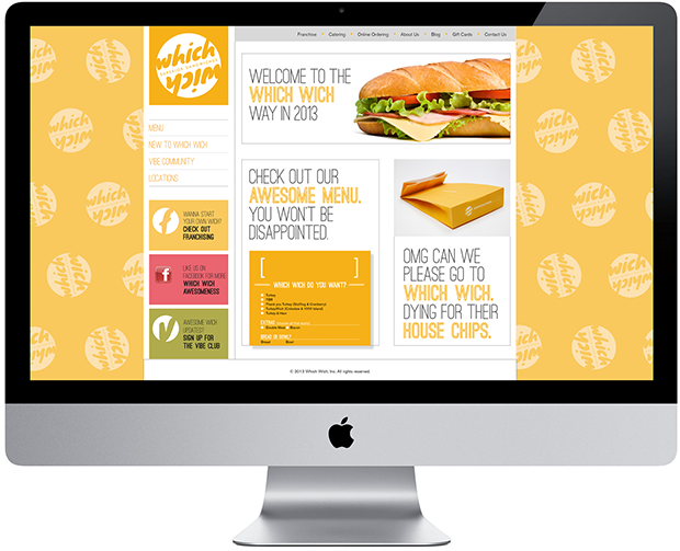
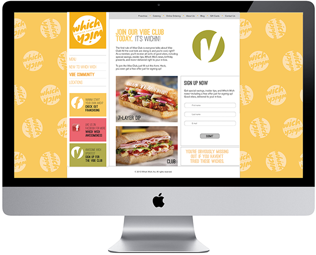
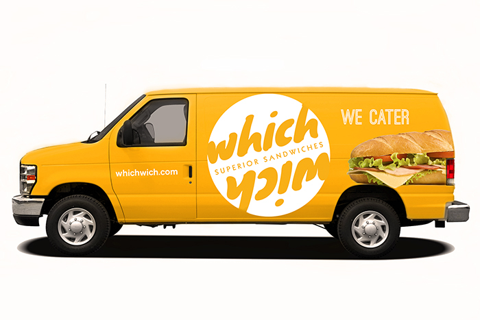
For this project, I was asked to rebrand a company of my choice. I decided to go with Which Wich, one of my favorite sub shops. The rebranding includes identity, stationery, packaging (cup, chips bag, sandwich bag, napkins, sandwich wrapper and stickers), uniform (apron and t-shirt), website, social media, store front and catering van.
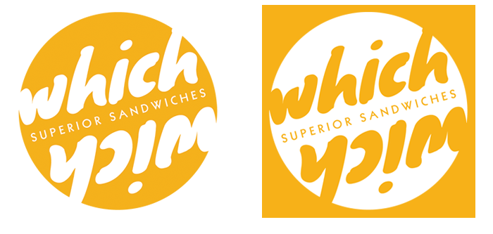
The company logo represents Which Wich’s edgy and fun environment. The words “which” and “wich” frame the words “superior sandwiches” just like a sandwich. “Wich” is also flipped vertically, which allows for the company’s name to be read even when the logo is rotated.
Check out more on mariaarobles.com


