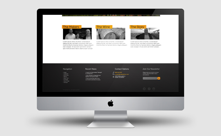
Made By Four Winery
Corporate Identity, and Packaging Design
Corporate Identity, and Packaging Design
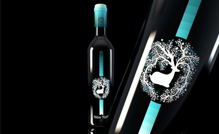
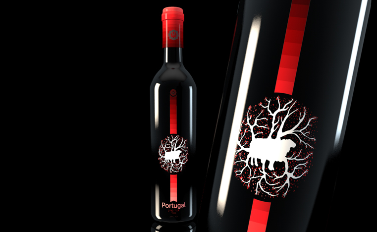
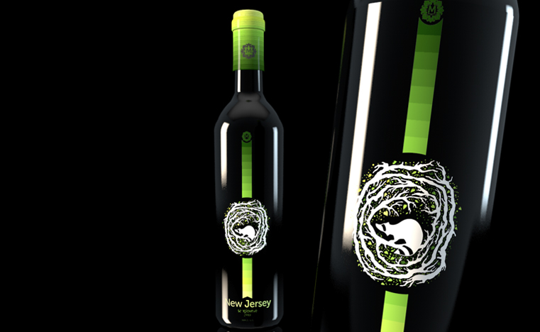
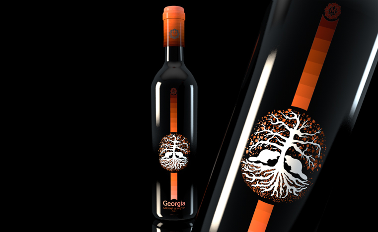
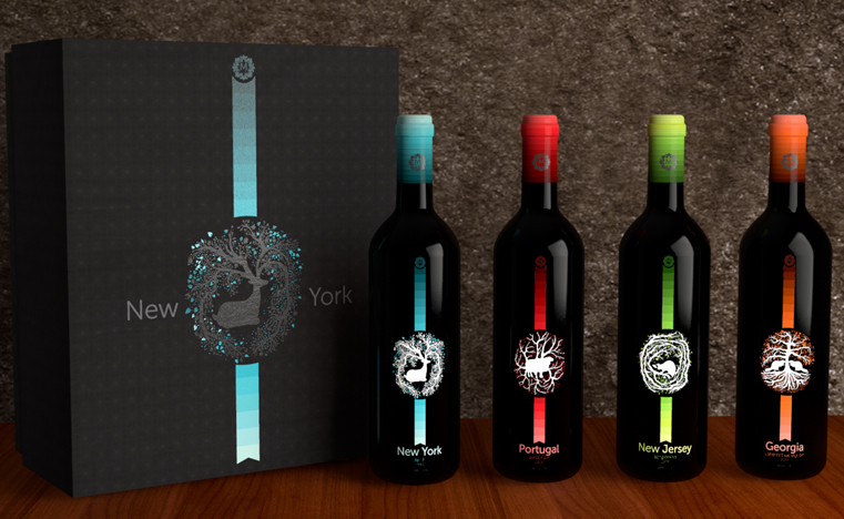
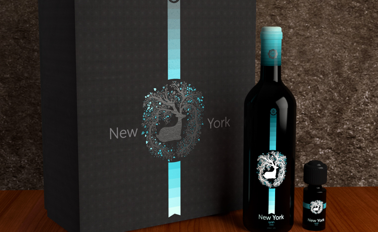
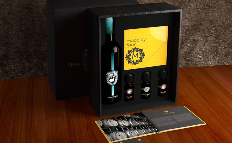
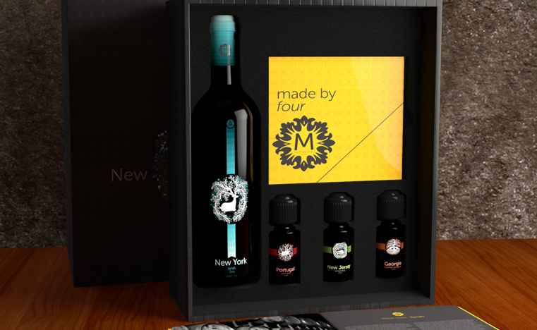
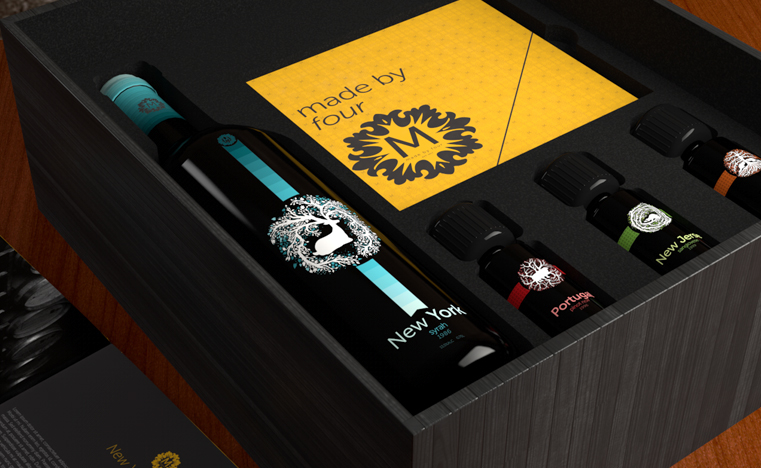
Made By Four (MB4) is a fictitious, dynamic wine company.The concept sprung from my family and the history, and stories we all share.Each bottle has a gradient with a specific color, location, and an animal. Eachcolor on the gradient represents individual memories from a specific location(New York, Portugal, New Jersey, Georgia) where we have lived. The small winesamplers focus on individual events from each bottle; hence, the reason whythey are a solid color off the gradient from each bottle. As the wine decreasesthe gradient gets lighter, and so our memories become "happier". Thisalso plays off nights at the dinner table where my father usually relives ourfamily history, and becomes "happier" while he tells us our great talesas a family. The animals are targeted as pivot points in each location thatplayed a part in our lives, and in some cases had an impact on me as anindividual, and ties in the symbols of the colors with the location.
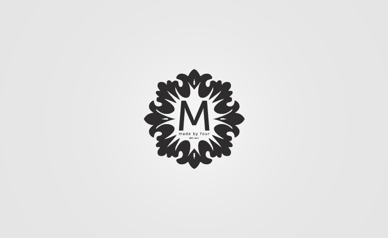
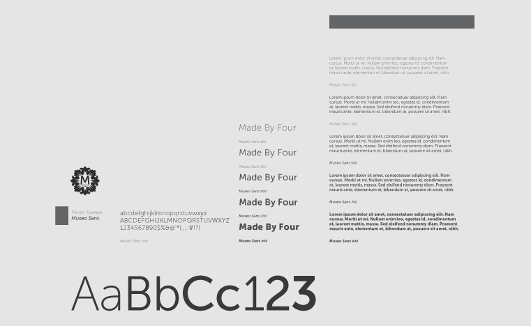
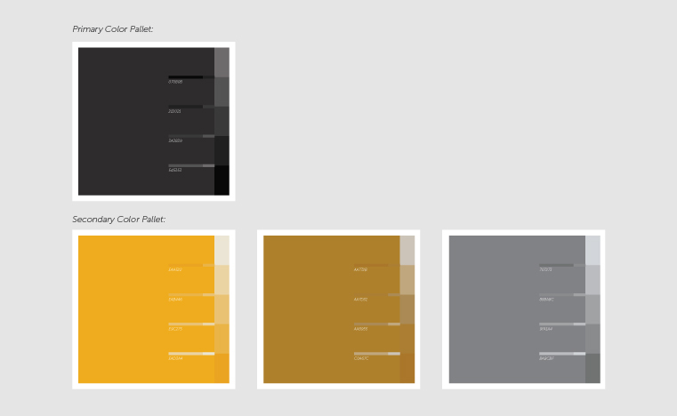
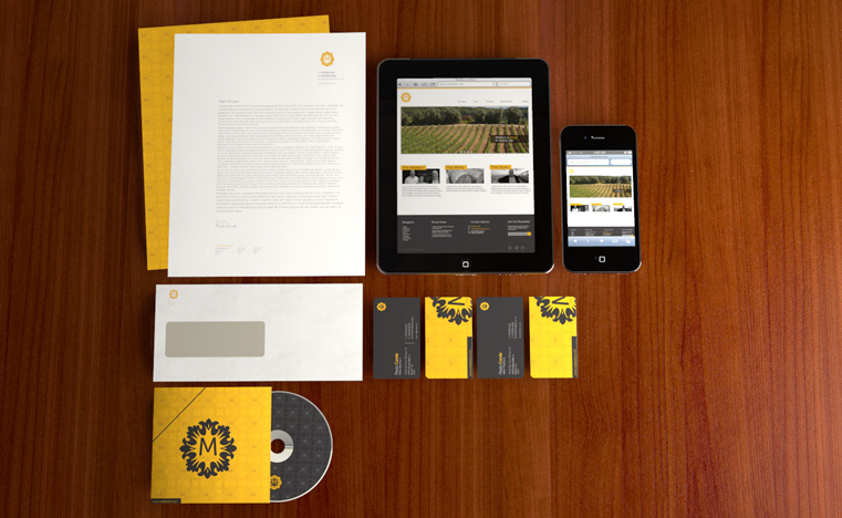
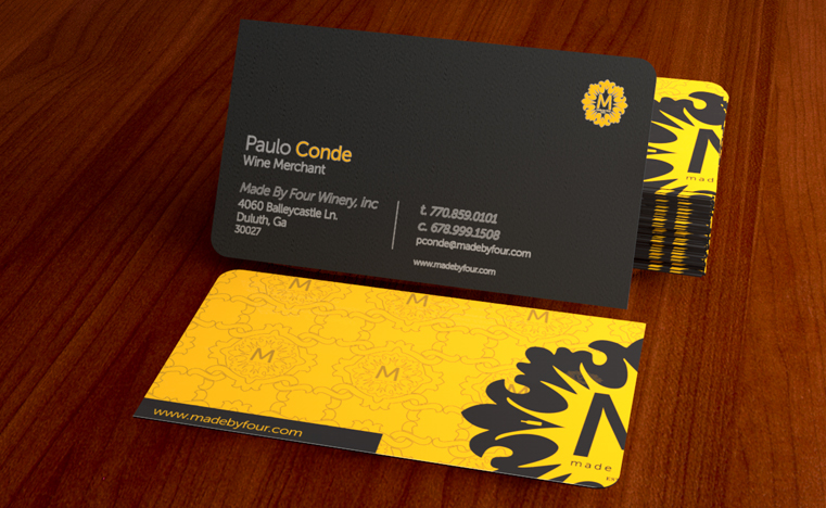
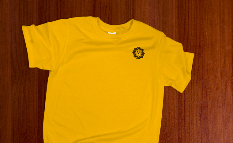
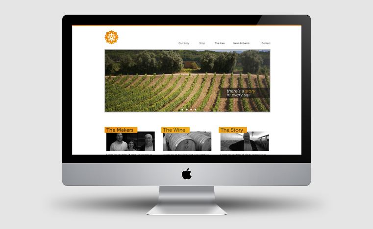
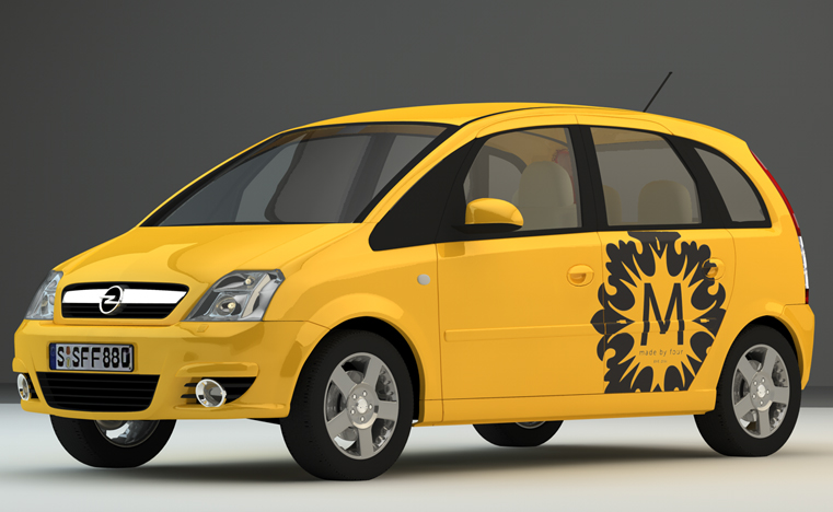
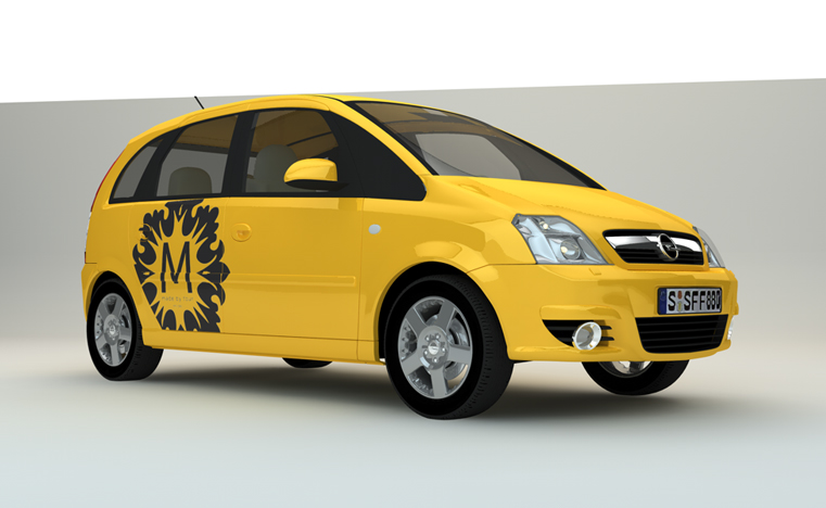
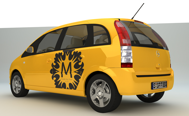
Vintage wine companies inspired the logo, as well as traditional Portugueseceramic art called "Azuleijo". Yellow and black where used as part ofthe logo and visual branding of the company to represent its dynamic, andmodern European culture.
Vintage wine companies inspired the logo, as well as traditional Portugueseceramic art called "Azuleijo". Yellow and black where used as part ofthe logo and visual branding of the company to represent its dynamic, andmodern European culture.