During the summer of 2013 I interned in the teen art department at Bauer Publishing in NYC. It was an incredible experience that showed me the nuances of branding, as I was working on five different magazines aimed at the same demographic: girls, ages 8 to 16.
What I realized while interning was that so many teen magazines use excessive color and design elements in their layout. Maybe it is because designers feel they need the “drama” of the graphics to equal the “drama” of the content.
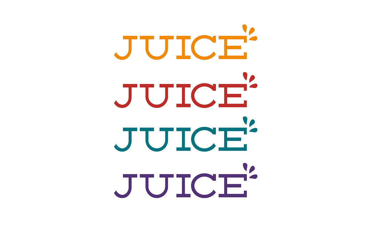
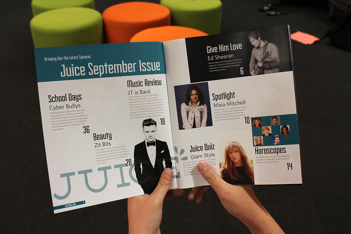
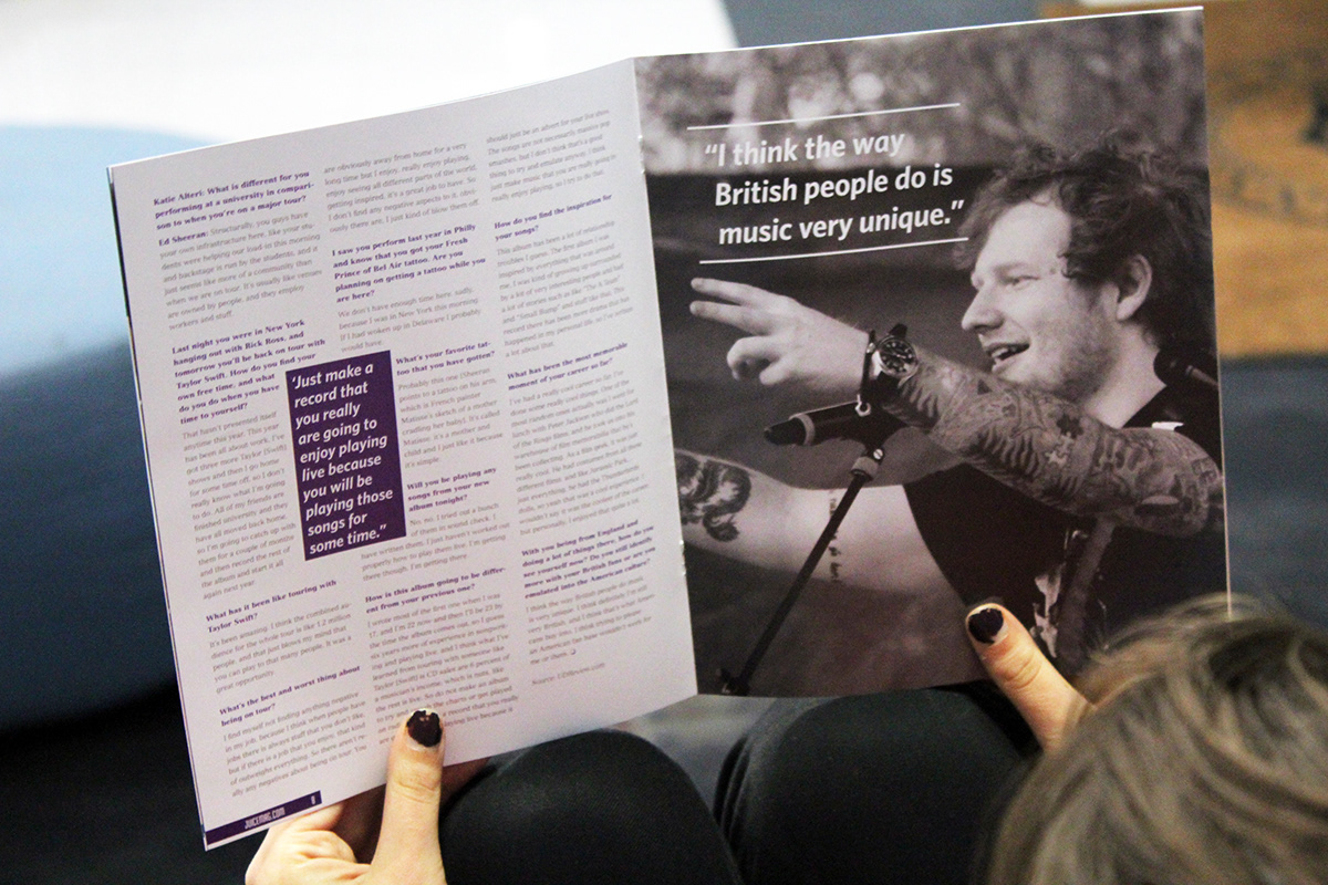
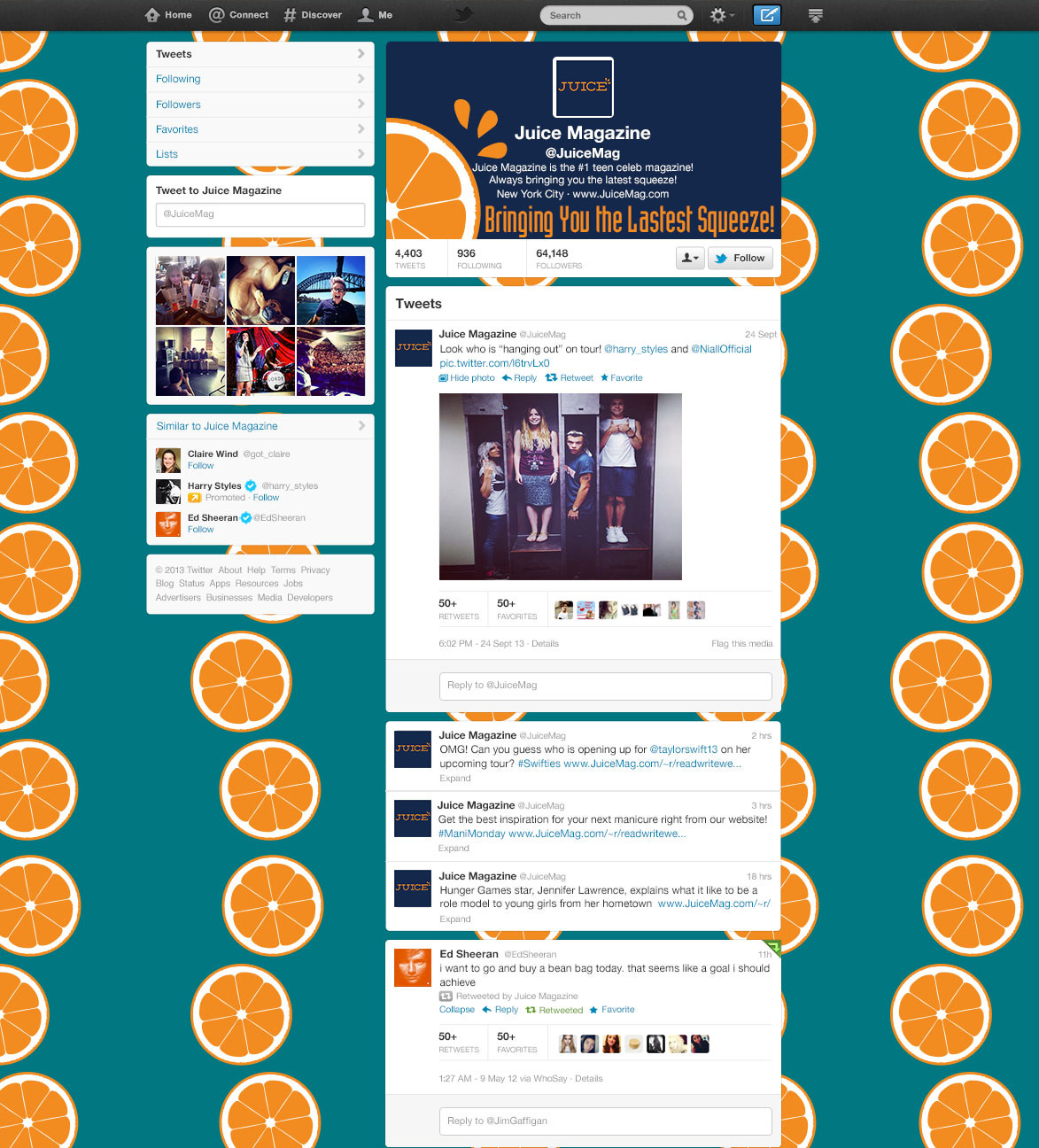
I proposed designing a new teen magazine, Juice, which would feature a cleaner design. The topics could still be “hot” – such as Harry Style’s newest tattoo -- and relevant – such as eating healthy in school cafeterias. But I felt a cooler, cleaner design, one that uses space mindfully, could be artful and compelling. If successful, it would be fun to look at it and also easier, in a sense, for readers to absorb the written words. Juice was also an effort to show that print is not "dead" at all -- but coming back in multiple forms.