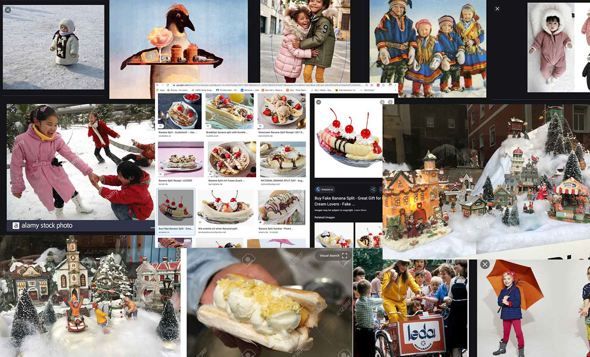
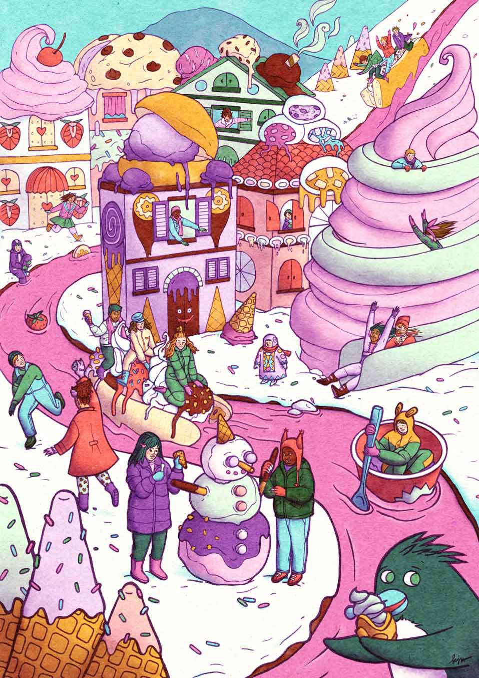
Inspiration
I wanted to create an image that was as diverse as possible, so the first thing I did was look up lots of different kinds of ice cream from around the world and images that I could base the characters off of.
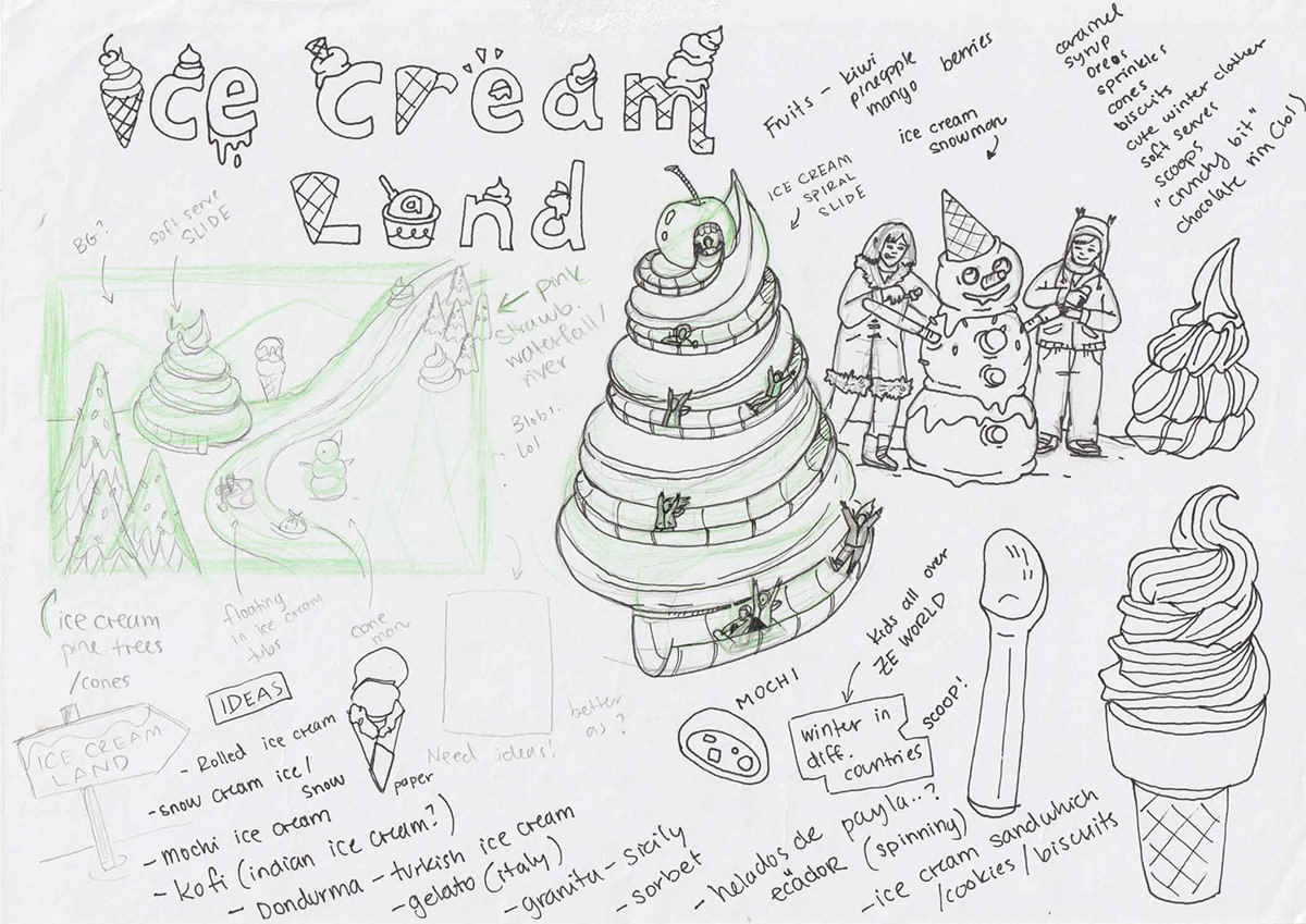
Sketches & Thumbnails
After narrowing down the scope of my inspiration pool, I practiced with some quick doodles, then quickly moved on to developing thumbnails. I went with Option 2, as the portrait layout makes the scenery seem 'busier', and with the strong "S" shape in the composition, more dynamic & exciting.


Final Sketch & Inking
Developing the final sketch took the most amount of time, as it was like working through lots of little individual character designs. I based each person in this piece off of real life people, but overall tried to stay loose and true to my style (without relying too much on the references).
On top of that, I faced the entirely new challenge of creating a believable scenery (not realistic per se, just believable) – with depth and atmosphere. I even had a friend help me figure out the 3-point perspective needed for the image, and eventually I was able to recreate the 3-point perspective grid in Procreate. See the video below for an explainer.
The draft started out as a pencil sketch, finalised in Procreate (with the aforementioned grid as a help), and then inked by hand. The inking took significantly less time, but was still a challenge, as I can be quite a perfectionist when it comes to capturing facial details.


Final Colour + Choosing a Palette
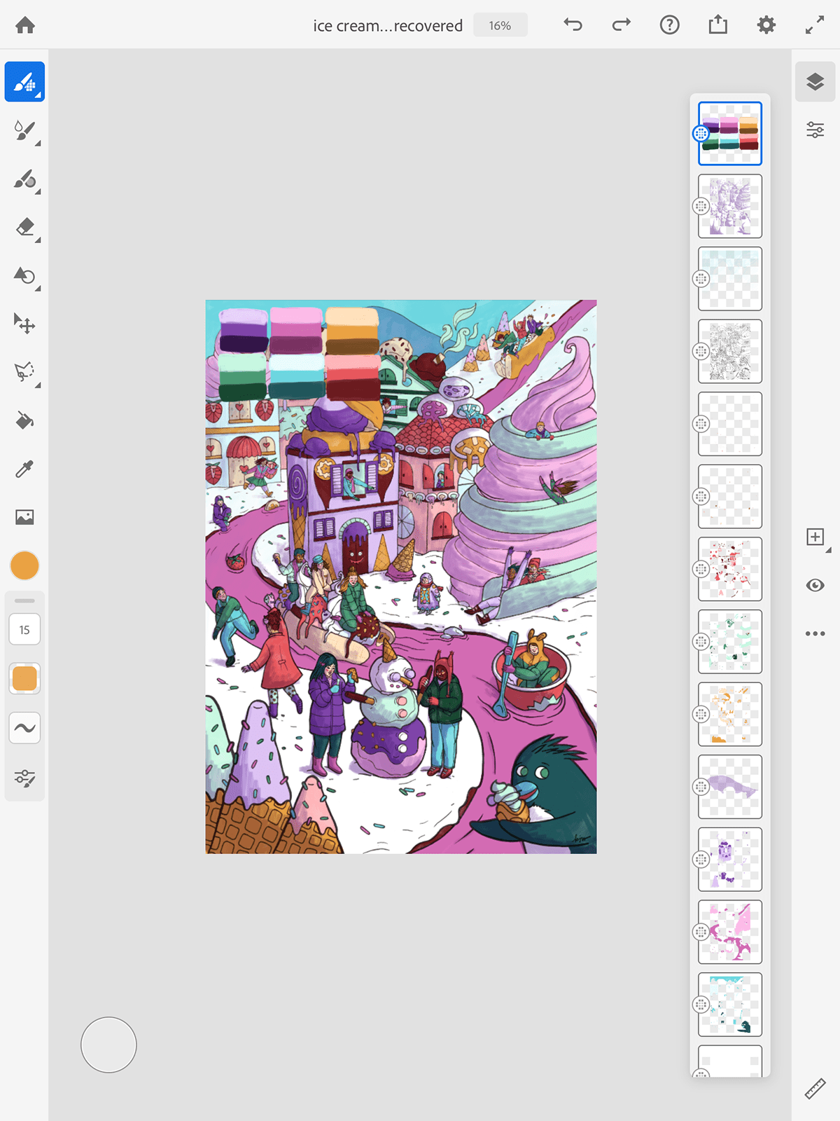
I exported the drawing to Adobe Fresco as I like how how much control it gives me when colouring. Plus, I'm able to use my favourite Kyle T. Webster marker brushes within it.
I exported the drawing to Adobe Fresco as I like how how much control it gives me when colouring. Plus, I'm able to use my favourite Kyle T. Webster marker brushes within it.
For the palette, I used 6 swatches, all of which I split into 3 shades – light, mid-tone and dark. That immediately gave me more colours to work with.
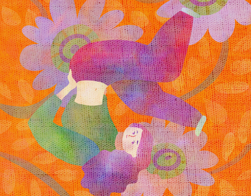
When it comes to deciding on a palette, I'm not overly technical or theoretical. I just go with whatever makes sense – I knew this image was 'asking' for lots of blues, purples, and pinks. To that, I added a washed-out red (strawberries), minty green (ice cream), and a warm yellow (for the cones). Then I just tried to make sure they all had a pastel-coloured ice cream feel to them, but at the same time, didn't seem too washed out.
I suppose if you really wanted to, you could classify this colour scheme as a double–triadic or a double-split-complimentary, but honestly... who knows 🤪
Adding Textures & Finalising
After finishing the colour in Adobe Fresco, I exported the illustration back to Photoshop, where I added some final shading to push the atmosphere, blending, plus an adjustment Curve layer & a texture. I used this Matchbook Texture which added a warm-yellowish hue and further helped tie everything together. Overall I recorded ~33hours for the process, though it could have easily been more!
After finishing the colour in Adobe Fresco, I exported the illustration back to Photoshop, where I added some final shading to push the atmosphere, blending, plus an adjustment Curve layer & a texture. I used this Matchbook Texture which added a warm-yellowish hue and further helped tie everything together. Overall I recorded ~33hours for the process, though it could have easily been more!
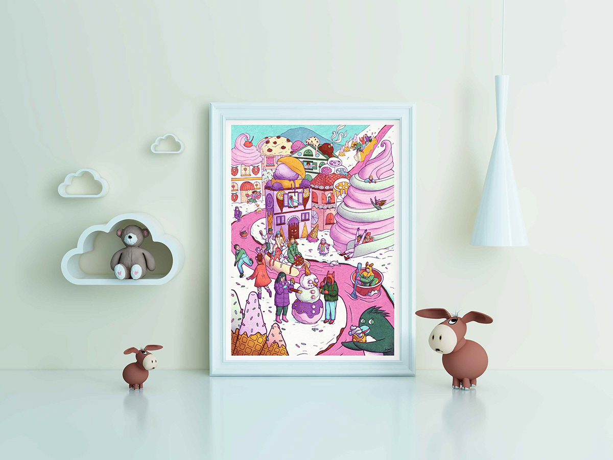
It is available to purchase on demand as a poster here.
Details


Video Process
All images © Kat J. Weiss 2020. Do not reproduce without
the expressed written consent of Kat J. Weiss.
the expressed written consent of Kat J. Weiss.