TASK
The client has requested to stray from the traditional visual aspects of Spanish winemaking, expressing, however, the desire to have a connection with the easiness, expressiveness and creativity associated with the country. That is why the most obvious solution was to employ the elements of modern and postmodern Spanish art, which served as the basis for the final version of the label.
SOLUTION
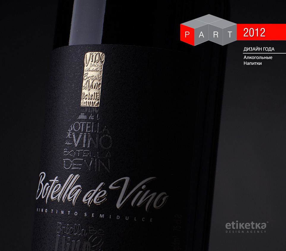
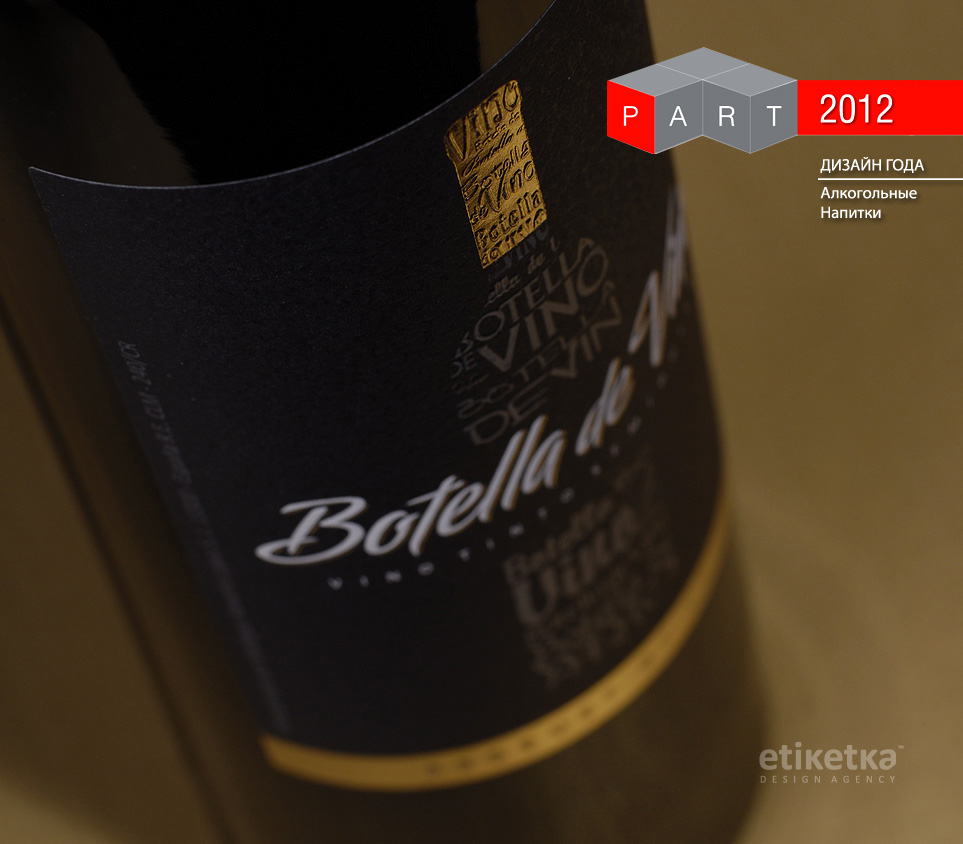
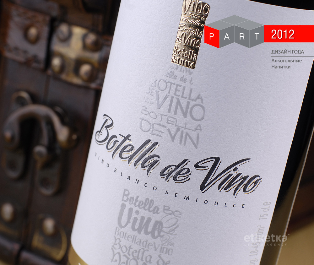
The main graphic element of the label is a bottle of wine comprised of stylized writings. Thus, the name of the product - Botella de Vino - was embodied on four different levels. First, it's the product itself, which is a "bottle of wine" per se. Second, it's the name of the product, which bears the same meaning. Third, it's the stylized image of a wine bottle on the label. Fourth, it's the use of writings spelling "botella de vino" that form the bottle shape. Thanks to this visual recursion, the only thing the buyer is looking at no matter how close or far they are from the product is a "wine bottle".
The stylistic temperance combined with the expressiveness of the fonts employed further amplifies the psychological effect, causing apparent associations with the works of such Spanish artists as Gaudi and Picasso among many others.
* Botella de Vino is PART Awards Winner for "Design of the Yeat" in alcoholic beverages category , 2012