MoMA Newsletter
I had to pick a non-profit organization and I knew I wanted to do something educational and my decision to pick MoMa in New York City was inspired by a recent field study I did in October 2012. I had to recreate the design while staying within the existing style. I repeated the idea of the 'square' that is used within the logo throughout to pull the newsletter together. I was only allowed to pick two colors to represent the organization and I picked red and black because it was bold and stood out, which is what modern is about.
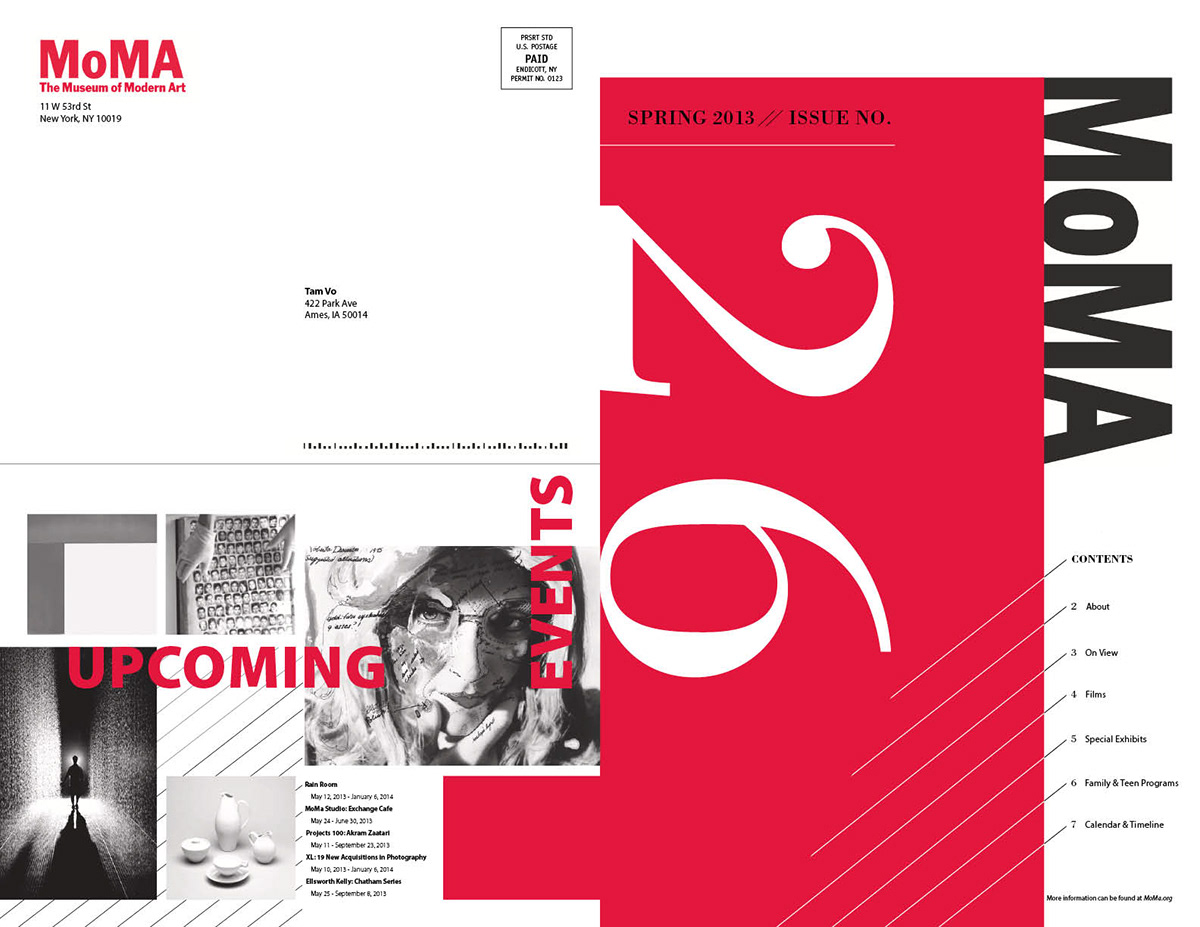
Back & Front Cover
About Page & Exhibit Info

FIlm & Special Exhibit

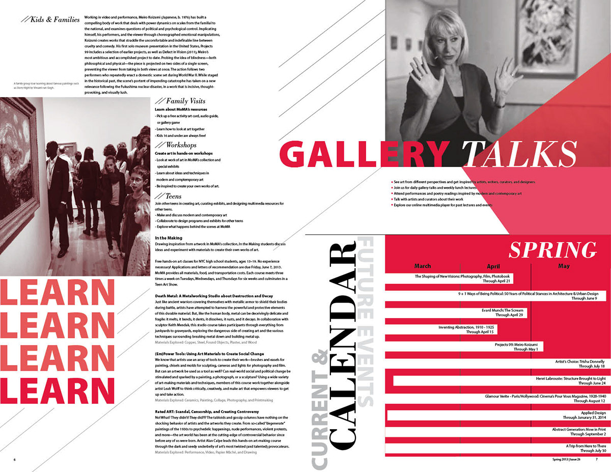
Learn & Family Section