
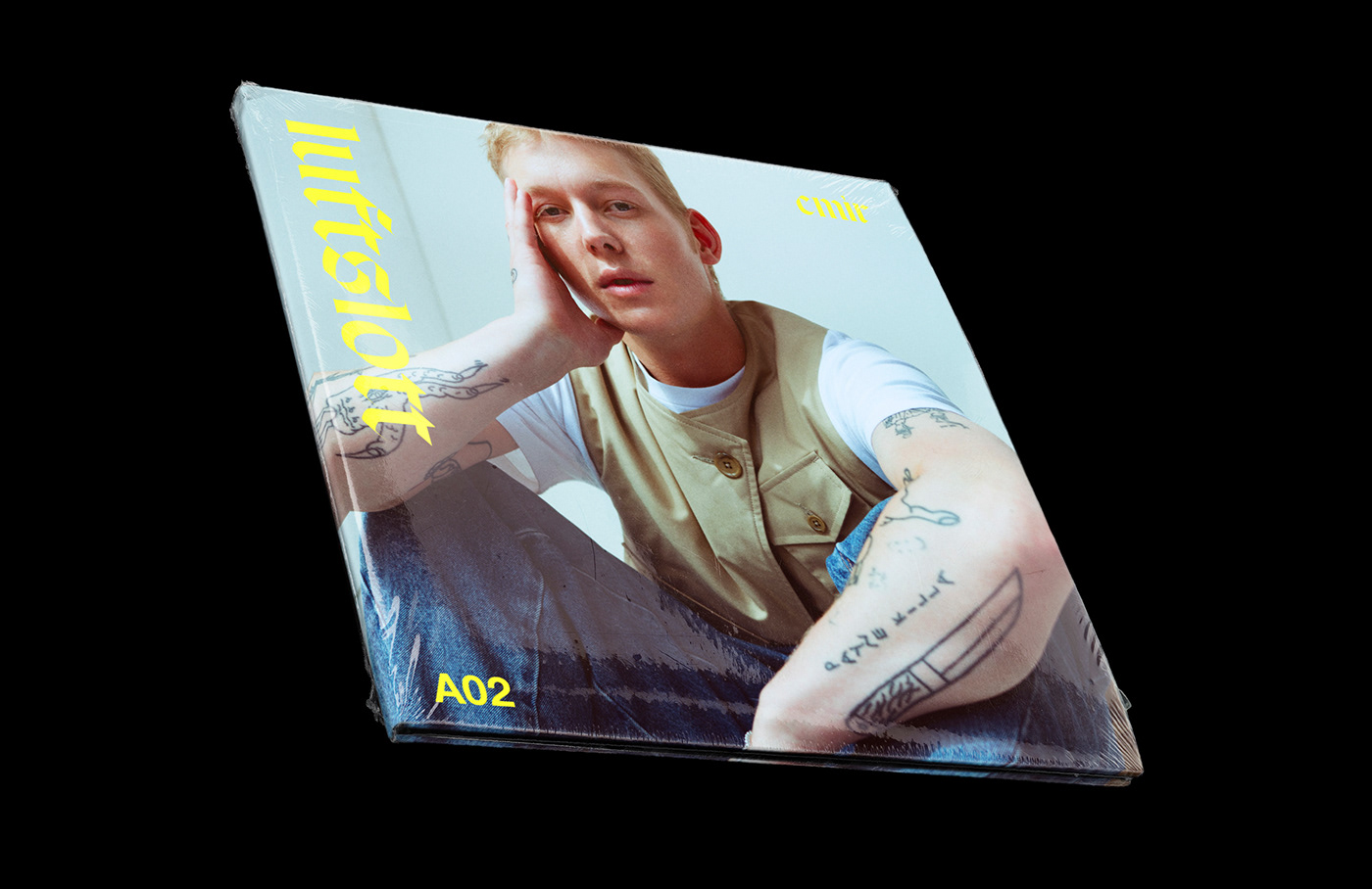
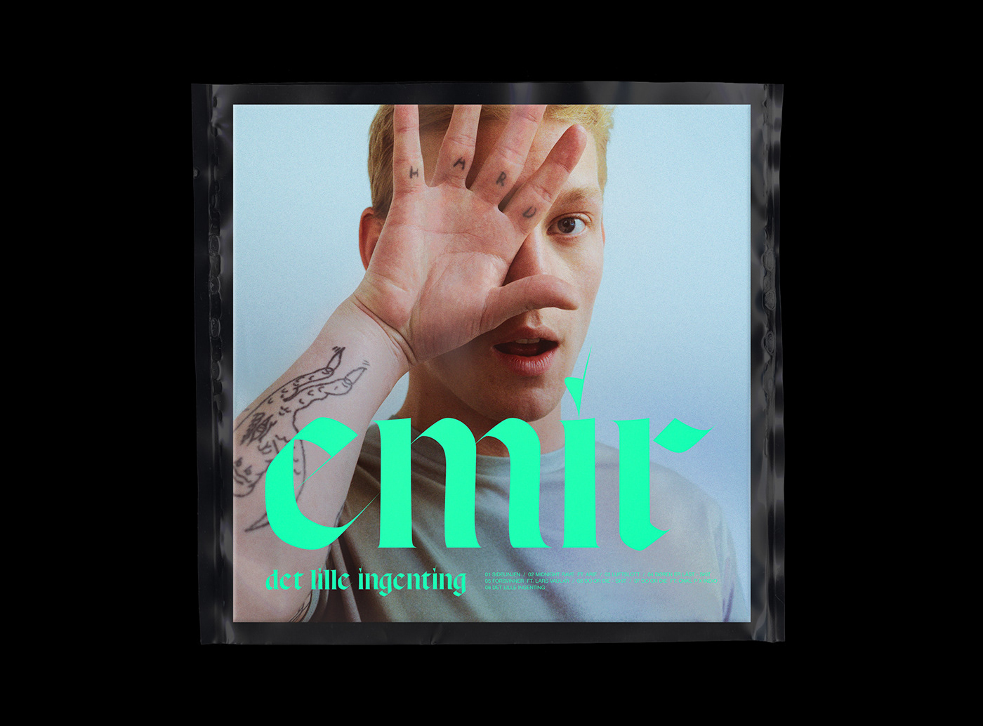
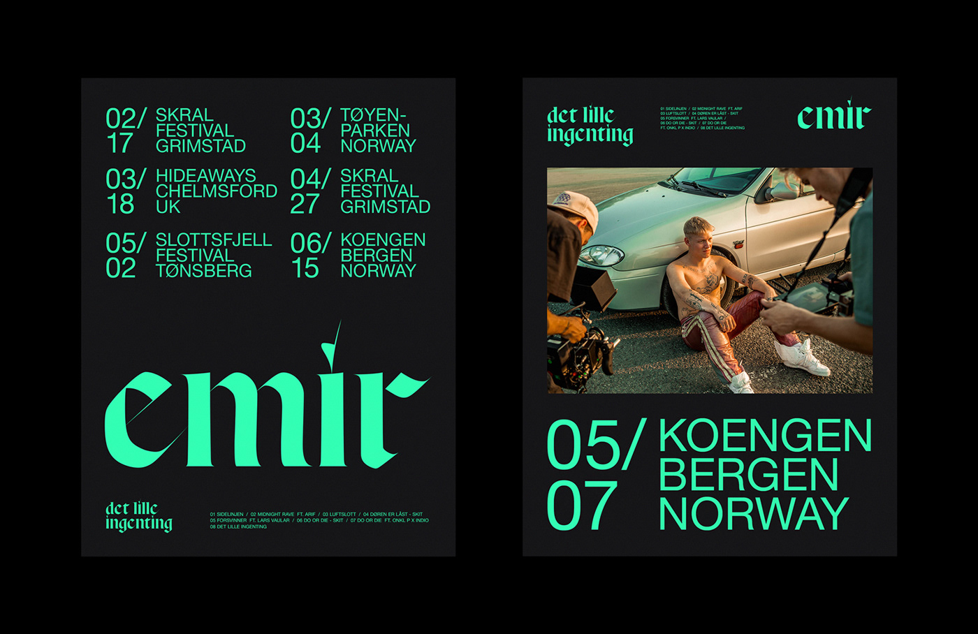
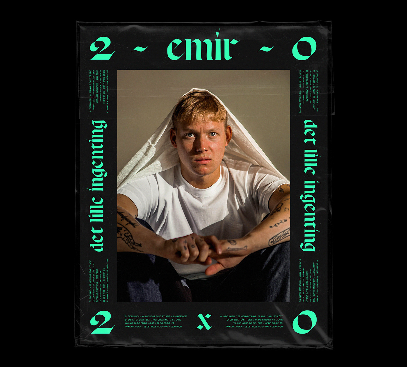
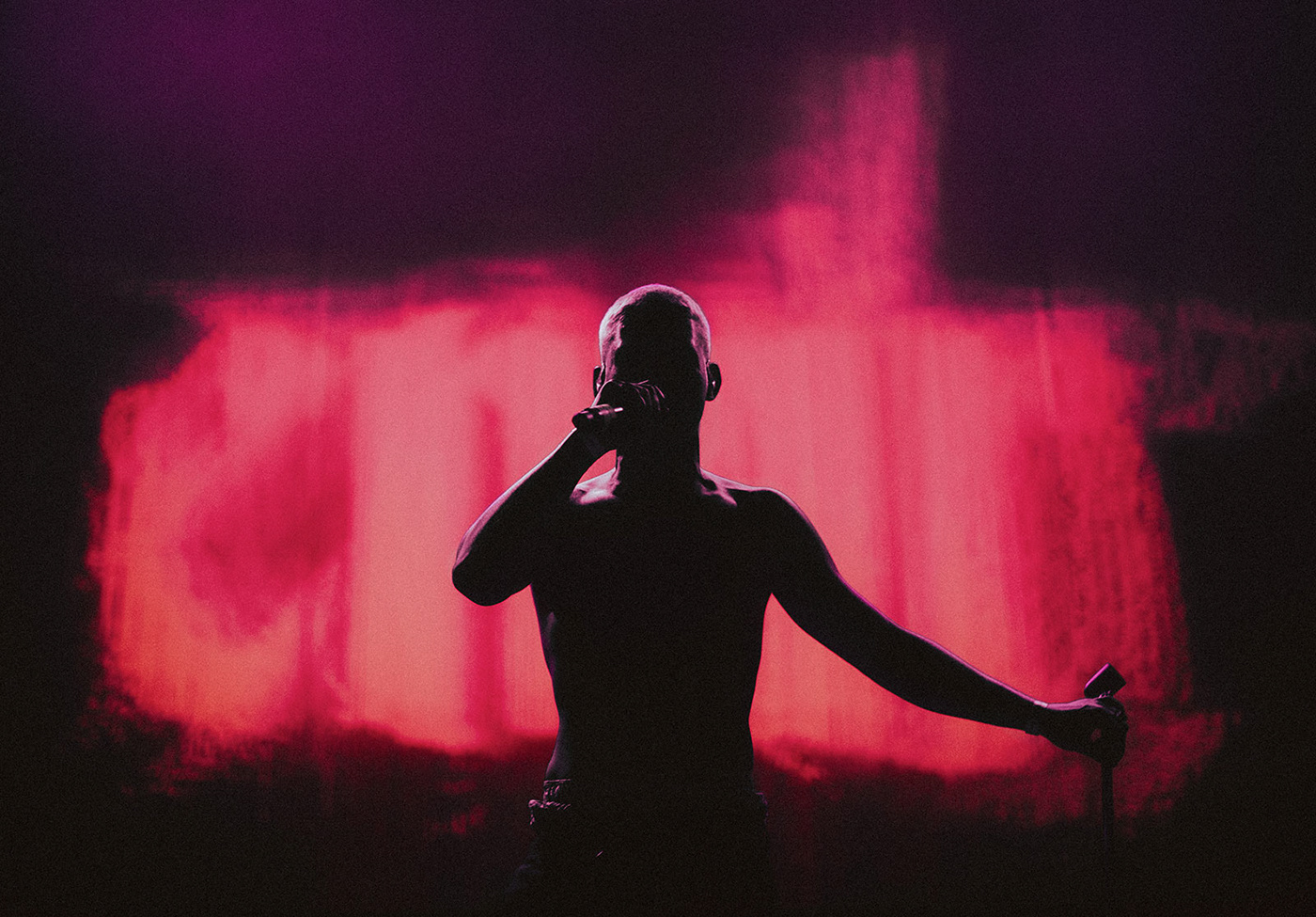
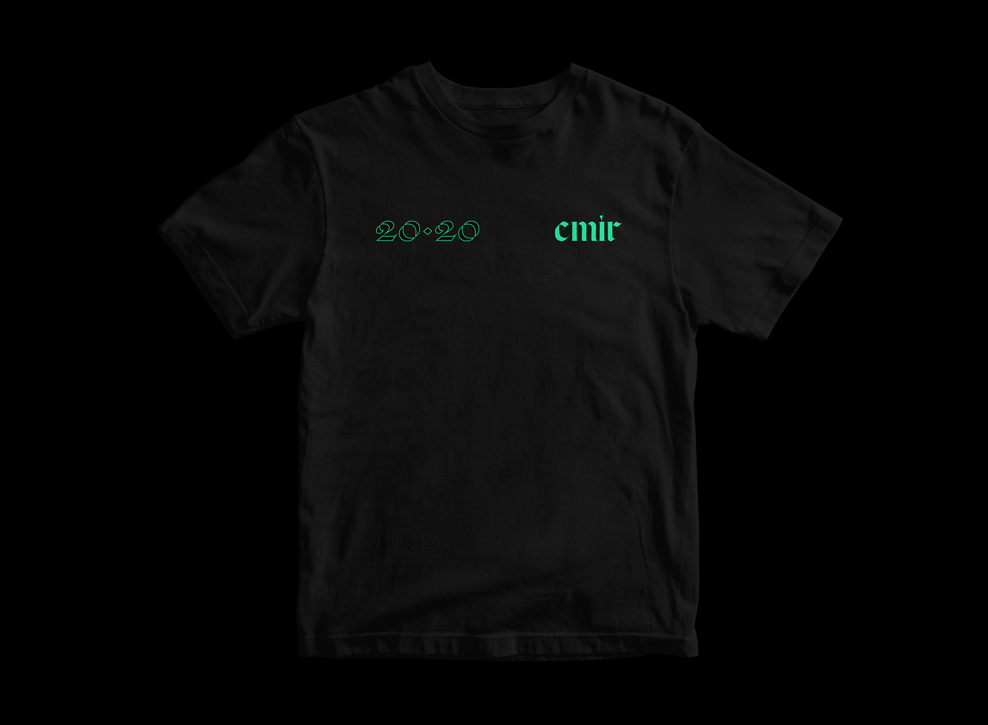
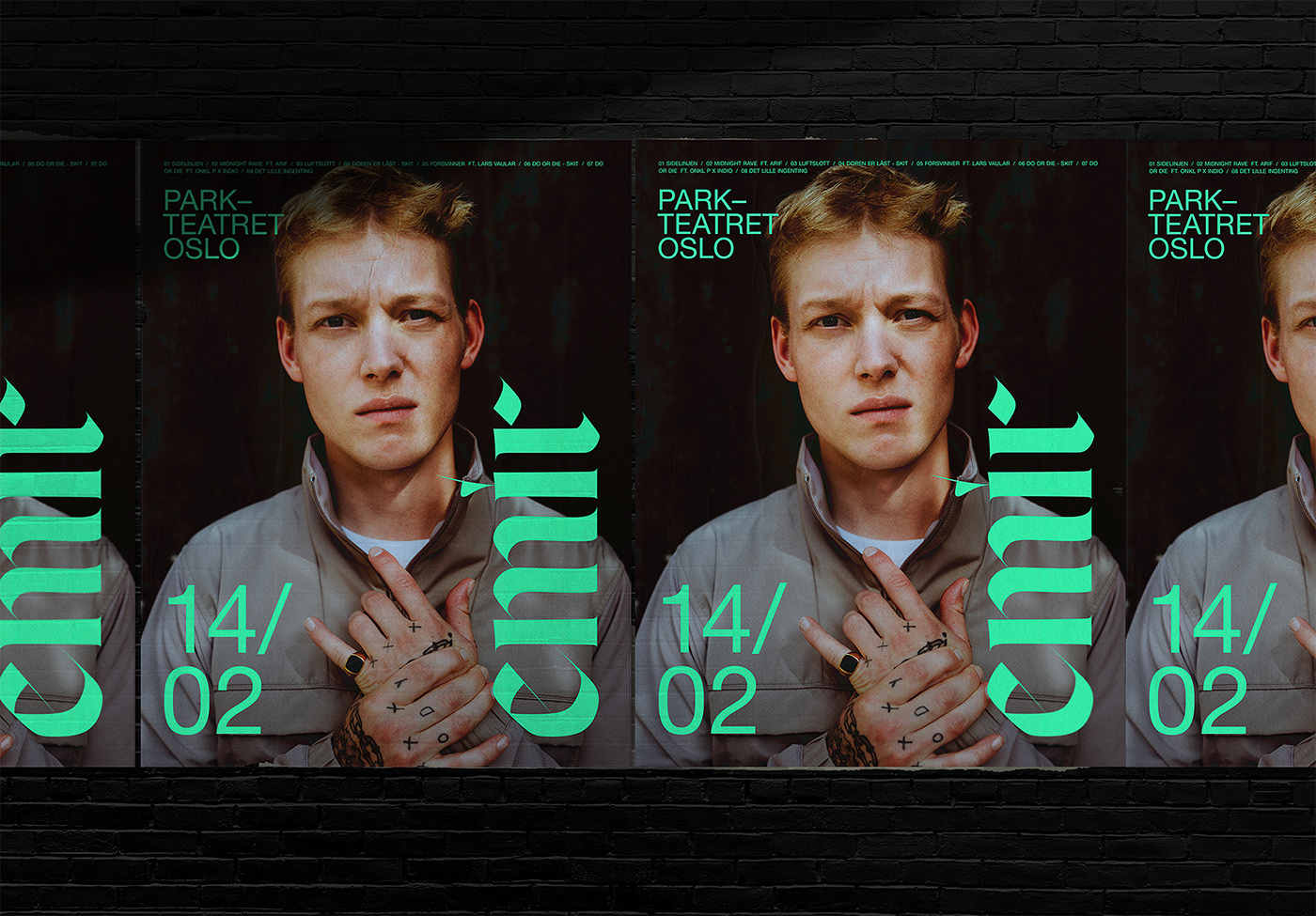
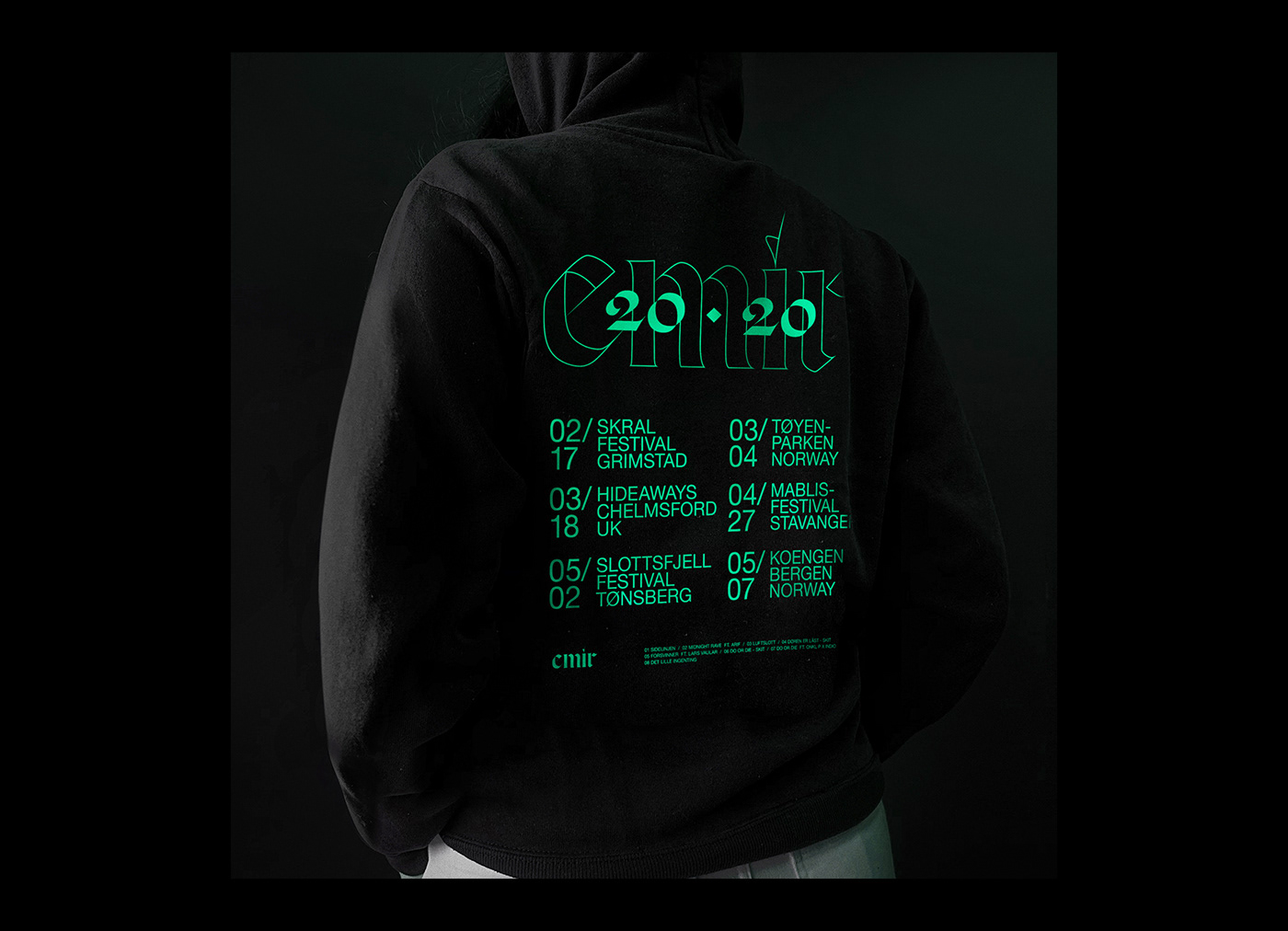
Identity for Norwegian Grammy Award-winning artist EMIR. The rebrand consists of the album artwork for ‘Det Lille Ingenting’, three singles and tour merch that accompanied each release.
The identity is based around Sharp Type’s contemporary blackletter typeface Respira Black, used in combination with Helvetica Neue in order to strike a comfortable contrast. The gothic typography is unusually set entirely in lowercase, adding a slightly more human feel to a typeface from a category that typically has a more aggressive tone.
Read more about the work at The Brand Identity.


Sony Music Norway
Creative Direction: Christin Malén Andreassen
Creative Direction: Christin Malén Andreassen
Photography: Morgan Norman, Also Known As, Ridwaan Gossarad, Armand Nasiri
Type foundry: Sharp Type Co
Disclaimer: All tour dates in this work is for branding purposes only.


