
L.E.A.P. Smart
L.E.A.P Smart is an app for kids grade K-5th to ‘earn while they learn’. The app is a safe and fun platform which gives incentives with a well-crafted user specific interface. My role was to research ‘e-learning’ tools and create UIs for a one-of-a-kind digital world. I collaborated with graphic designers and a storyboard artist for this project.
Competitive Research
Knowing the e-learning space has several big fish cornering the market, I took the initiative to research several by signing up for trial versions. Additionally, I created a questionnaire and took to several local schools who were already using e-learning tools; there I surveyed students to discover what tools they enjoyed most and why. With this valuable information the designers could be more diligent and focus on fine tuning a purposeful and engaging experience.
Most engaging subjects
(data from 200 students)

Competitors

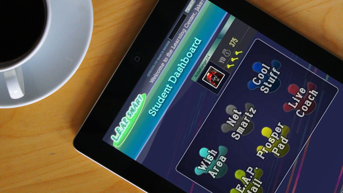
Wireframes & Prototyping
Using Illustrator and Balsamiq, I drafted the bare bones for the landing pages. Going off of the sitemap I crafted a base model wireframe which would help flesh out the layout for the app interface. Working with the Storyboard artist, we fleshed out the key components page by page, for seamless usability. Using Illustrator and Balsamiq, I iterated several versions for vested partners and stakeholders to use. Once they got their hands on it, we quickly narrowed it down to one, with the livelier button animations. We then delivered the product over to a development team for the final production.
User Testing
Once I finalized the working prototypes using Illustrator and Balsamiq, I reached out to parents at my church and friends with children for testing. This allowed us to observe their behaviors by recording areas of frustration and noting moments of fluid progression through each area. With this valuable data, we were able to rework the look and functionality for a more polished working product.

Project Summary
All in all, I think the most difficult part of this was crafting the wireframes with a simplified layout. This was in part due to R&D showing multiple ‘good’ elements across multiple e-learning platforms with few conclusive ‘best’ aspects. Considering it was only myself and one designer tackling this behemoth responsibility, we did what we could with what we had. I personally got a great deal from testing out some of the leading e-learning apps and in turn, have a new respect for the field and its unique challenges. It was interesting and fun to interact with folks form different disciplines and backgrounds with this project. I would gladly welcome this kind of collaborative effort in the future! An honorable mention to the G.O.A.T., Julius Woodard for his keen sense of color swatches for the UIs. This expertise made this aspect of the design extremely fluid and would save the group much needed time for other critical components.


