C O N T E X T
On the Paraguayan roads there is a whereabouts that all local travelers know, the Frutería Paraguarí (Paraguarí Fruit Shop).
The place began in the middle of informality and, because of this reason, its image was never solid; it was never structured, and over time it had hundreds of different versions.
Nowadays, because of the Frutería Paraguarí becoming such a big traditional spot, it needed a complete makeover to match the power of its initial spark.

I D E A
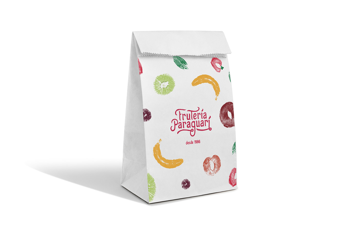
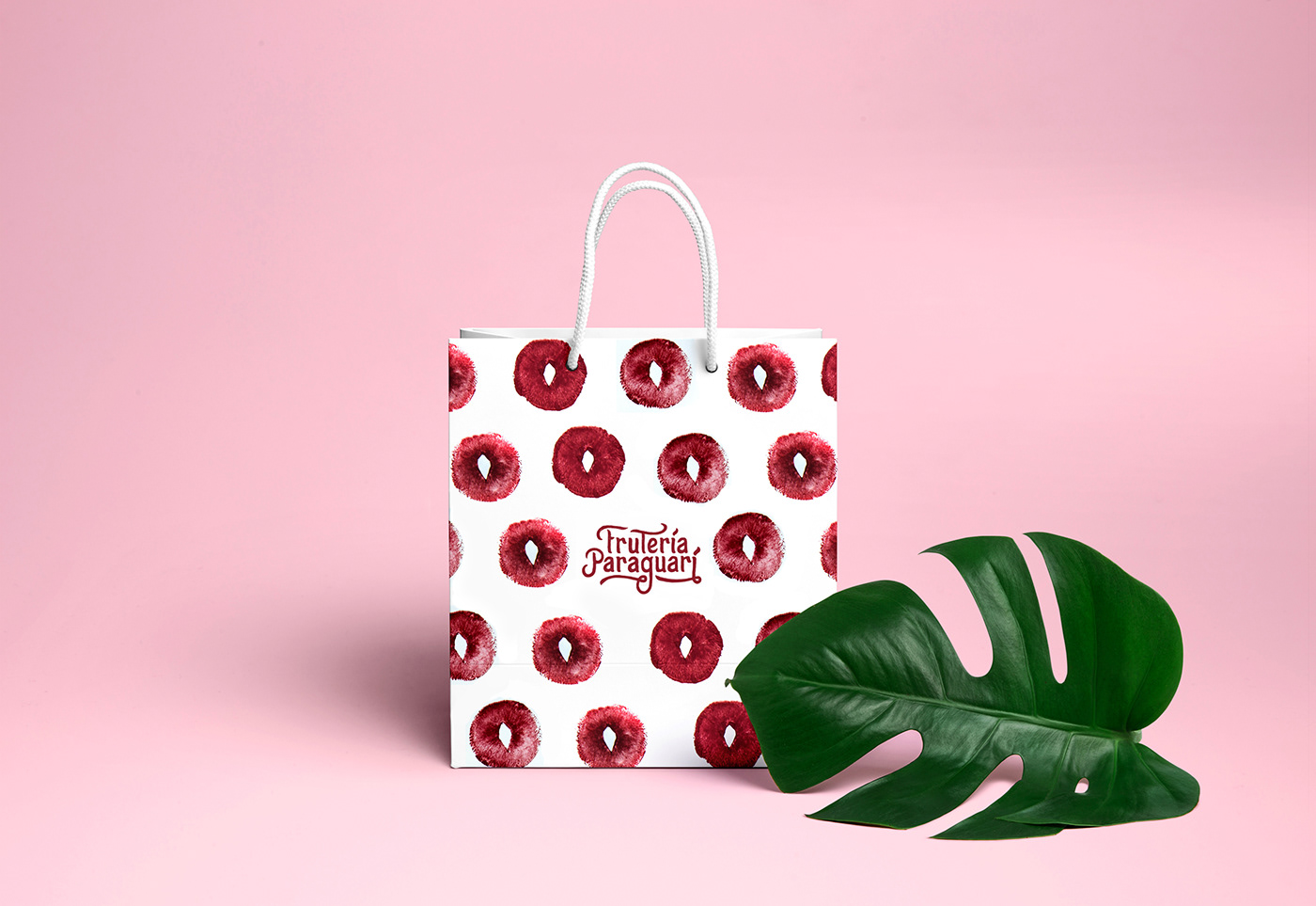
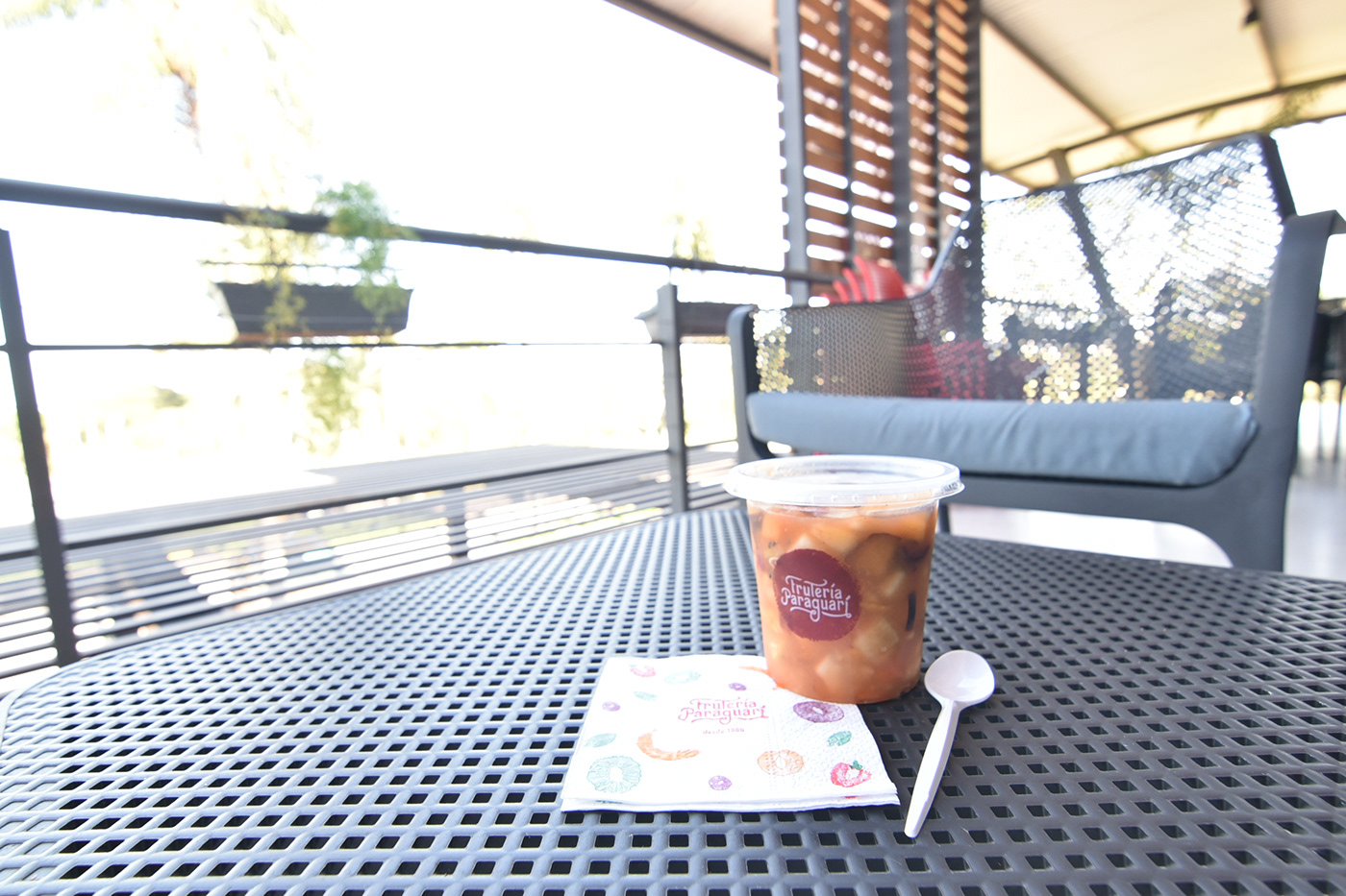
Through a manual work that turned fruits into brushes, and their extracts into pigments (with which this universe was created), we designed a graphic universe that keeps the natural essence alive in each of the elements that compose it.

Compositions from fruit textures created


And since everything was made by hand, we also produced an exclusive display typography, born from the brand's own concept.


CRÉDITOS
DCG:
Santiago Morello
Directores creativos
Julio C. Gallego, Verónica Velázquez
Dirección de arte:
Diego Centurión
Fotografía:
José Torres
Agencia:
Garabato Mullenlowe
________________________________________
Reconocimientos:
Oro • Tatakua 2019 (Festival Paraguayo de Publicidad) • Diseño de identidad corporativa


