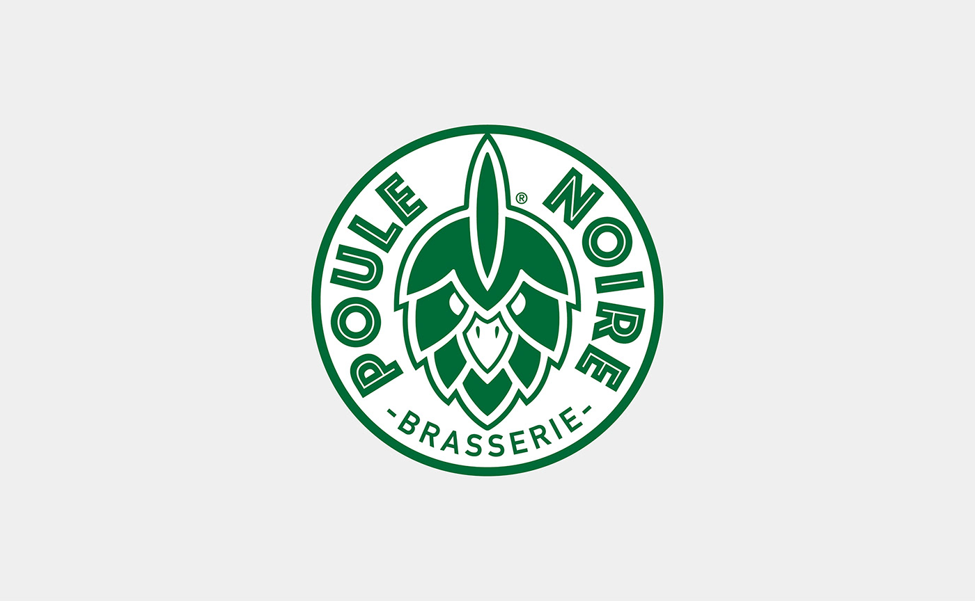
Brand New logo for La Poule Noire, craft beers from Nantes, France
La Poule Noire is an artisanal brewery from Nantes which creates beers without concession, and with a lot of character.
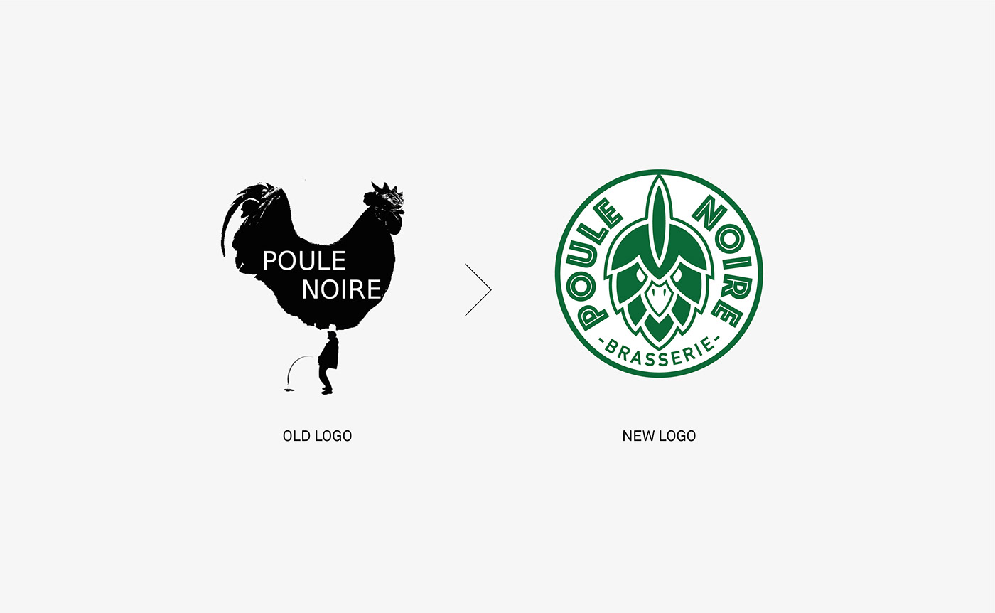
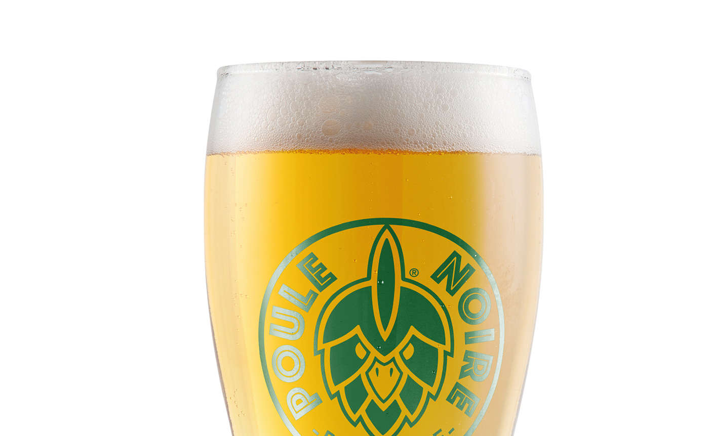
It needed a new logotype to make its bottle packaging more unique and striking.
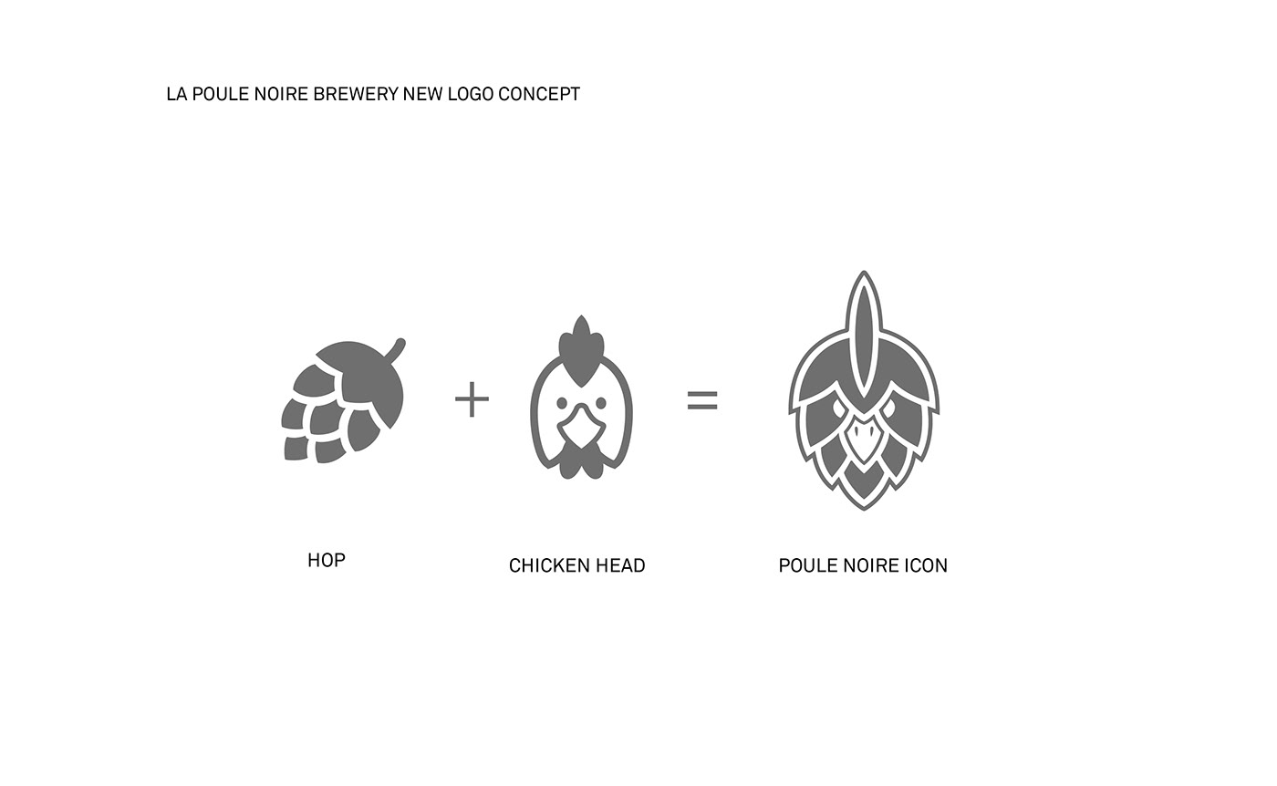
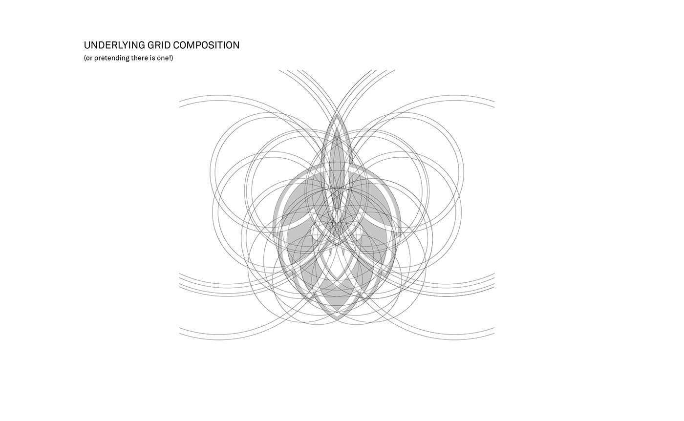
The new logomark was created by mixing the shape of a hop and a chicken head.
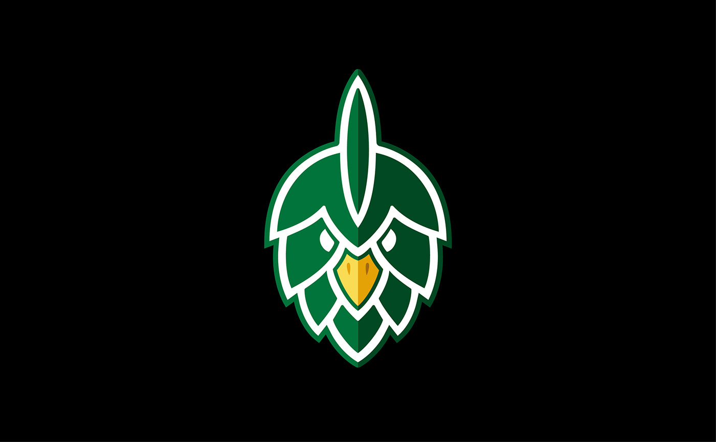
Its result is a distinctive design that is both original and appropriate for the production of strong character beers!
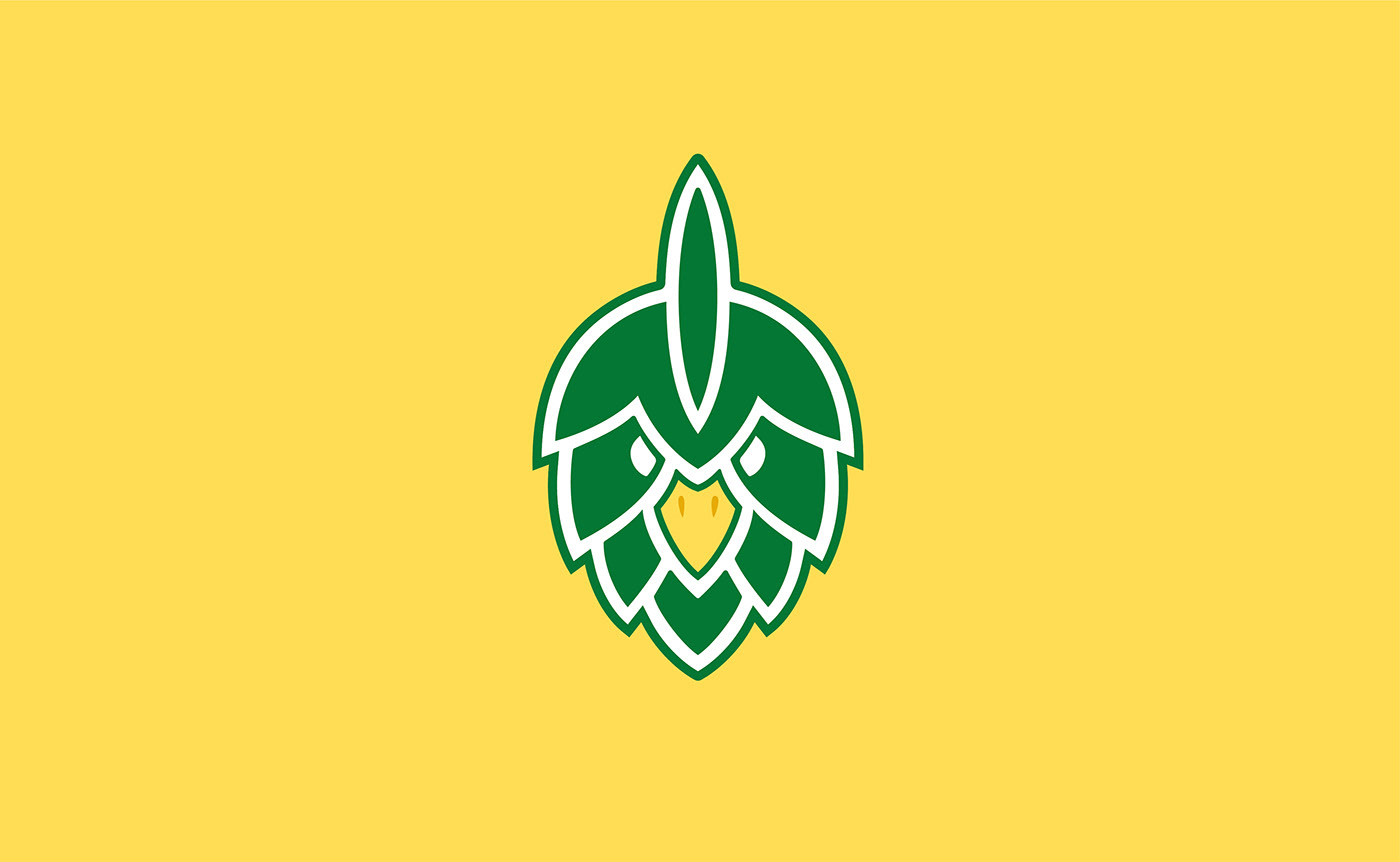
The visual identity gets versatile by letting the possibility of multiple compositions between the icon and the typeface, in order to offert the best adaptations for packaging, website and merchs.
Already thirsty? Go check 👉 lapoulenoire.beer
🐔🍺
It needed a new logotype to make its bottle packaging more unique and striking.
The new logomark was created by mixing the shape of a hop and a chicken head.
Its result is a distinctive design that is both original and appropriate for the production of strong character beers!
The visual identity gets versatile by letting the possibility of multiple compositions between the icon and the typeface, in order to offert the best adaptations for packaging, website and merchs.
Already thirsty? Go check 👉 lapoulenoire.beer
🐔🍺