Background
Bayer has been recognized around the globe as a trusted partner in health care for 150 years. To ensure the continuation of that distinction into present day and beyond, Bayer Medical Care team developed a new technology to improve on the current glucose monitoring systems. With new technology, it was clear that there was a need for a relaunch of the brand’s visual identity. The challenge was to deliver a system based on the historic packaging that would allow continuity for current consumer at shelf. However, in recent years the packaging, advertising and multimedia outlets were frequently changed without preserving basic brand assets such as the logo, nomenclature, color palette, etc.
The Process
Phase 1 | Audit immersion, strategic development and design brief, alignment in opportunity areas – Deep dive into competition. Analysis identified brand equity elements to preserve and evolve. It was identified at this stage that the color blue was the only consistent asset owned and executed by Bayer Contour Next, therefore I recommended blue be elevated in a more meaningful way.

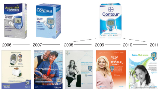
Historic Packaging and Marketing Campaigns
Phase 2 | Design Expression board, look/ tone/ feel for global brand guidelines – The package design strategy incorporated concepts from clinical to human warmth. The design intent included: Improve unification of the Bayer Contour Next portfolio; create an identity system that leverages Bayer as a master brand and to clearly communicate benefits and new technology.

Visual Branding Strategic Choices
Phase 3 | Brand identity, packaging, architecture development, and qualification –The new brand expression was tested globally and resulted in positive preference to the human warmth strategies for design options. Consumers found the new designs “eye¬-catching” and “modern.” All shape language, including the updated logo, is optimized from the original and streamlined to maintain continuity. The design language systemized visual cues inspired by the product to build stronger consumer recognition and recall. Additionally, the equity typography has rounded corners to mimic the strip and monitor shape to connote "friendly" and "approachable" maintaining the concept of human warmth. We also introduced a hexagon crystal pattern to validate the science behind the new technology. Lastly we added the product swoosh, light effects and bling to communicate the power behind the product, accentuate product cutting edge technology, as well as elevate the franchise presence at shelf.
Phase 4 | Global deployment and final production – Guidelines were created and the organization trained on the visual assets to ensure consistency across media.
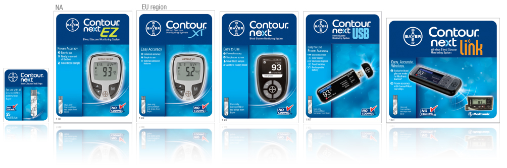
Packaging lineup

Advertasing

Social Media & Web Site

Events & Congresses


