

We are The Inputs.
101/102 was our take for data recollection within a student space and exposure of findings and insights. Starting as a different approach to Information Architecture, we set ourselves to find big amounts of data and convert them to graphs that where simple, easy to understand and that communicated our findings at a glance.
We selected the computer labs in our school as the data collection space and decided to track Motion, Temperature and Humidity. The class organized a small event to show our findings to the students in the building.
The final event consisted of Printed Graphs as well as tangible representations of the data.
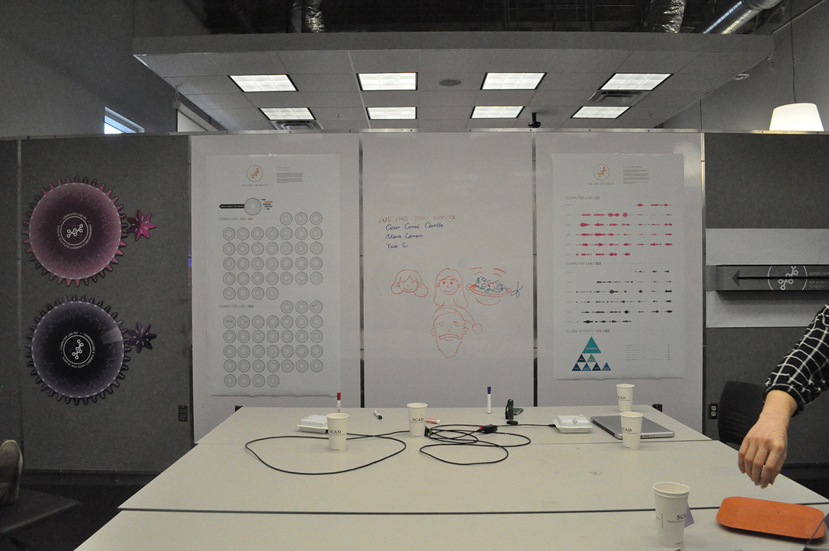
Our space within the event (and some scribbles on it.)
The Final Event
When thinking about the tangible final deliverables, we decied we wanted everyone to interact with the data found in some sort of way. In the end, we came up with Gears to represent the Temperature data found by days and a box in which we laser cut the Motion graphs. Inside the box we installed a light that, when activated, would shine through the laser cut graphs.
In the class event, we all exposed our findings and received feedback from our graphs. It was a nice time in which we all shared the experiences we had throughout the quarter.

The gears showing Temperature and Humidity data.
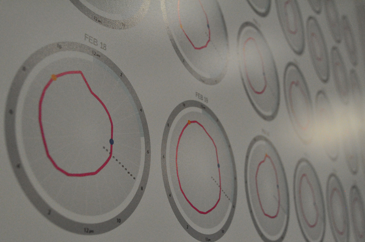
Temperature and Humidity
Some of the findings we had while looking through the data consist of the labs always remaining within 71ºF and 82ºF, with sudden spikes happening at night. We also recorded a stable humidity throughout the 5 weeks of our data collection time.
Data was exposed in the form of radial graphs per day and also gears that allowed people to see temperature recordings and spikes per day.


Some of the data was not tracked and lost since the Arduino got disconnected at some point. Our teacher encouraged us to leave that in the final delievarables, so people could understand the risks that might come up while collecting data.


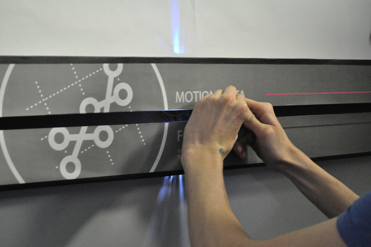
Motion
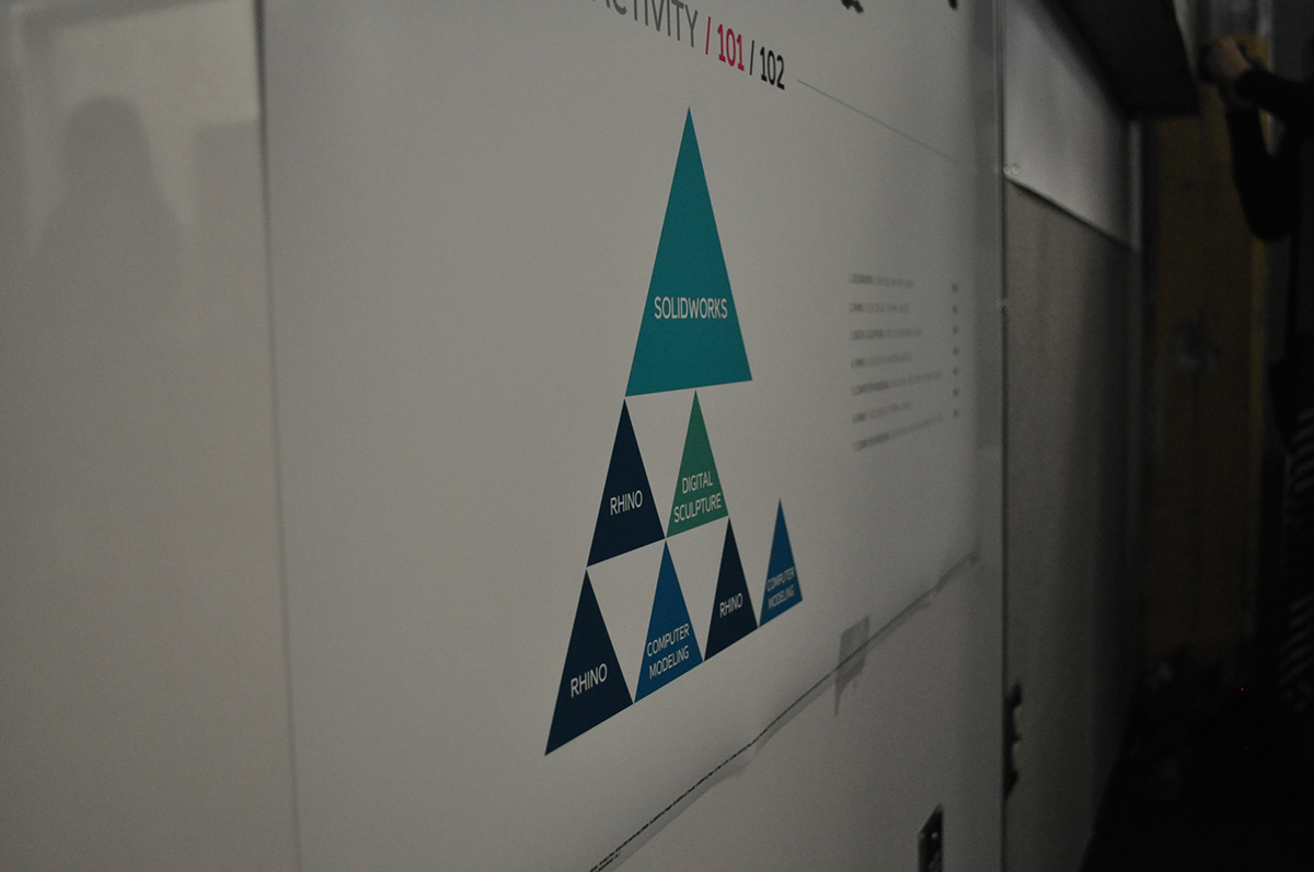
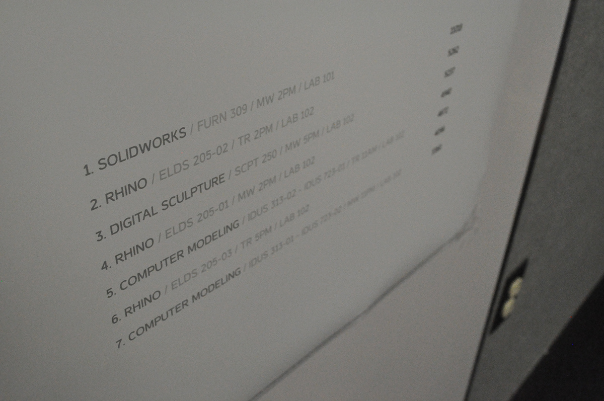
For Motion, data was recorded with motion sensors that recorded a 1 if it sensed activity and a 0 if it didn't. To better expose this data, we added those numbers into clusters of data and translated those results into graphics. The first graph is a timeline that shows the levels of activity per hour. The second one is a triangular graph that represents the level of activity within all the classes held in the computer labs.
The results were interesting and clearly visible. Computer Lab 101 consist of mostly homework activity rather than class activity, since there is only two classes happening in that room during the week. We can see a clear drop in activity during the weekend of Week 5 for both computer labs, right after midterm presentations end.
The second graph was created to find the hierarchy of classes per activity within each class. The 1's given back by the Arduino within all the class periods that happened during the 5 weeks were added up and compared, resulting in a graph that shows which class has more activity and which others followed suit.


That's me explaining the graph to faculty within the School of Design.


Finally, we have our Motion Box. We designed the box so that it could show the motion data in a beautiful, abstract way. The feedback we got from people was great.


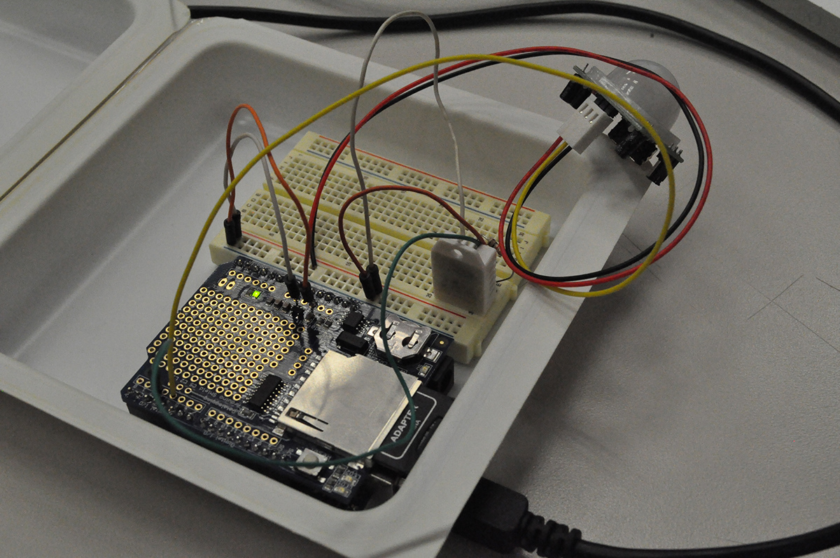
The Arduinos
For data collection, we added tracking sensors to two Arduinos that were placed in the middle of the computer labs. The information tracked was collected as different .csv files that were saved to an SD card mounted on the Arduino and then put into Processing for the creation of graphs.
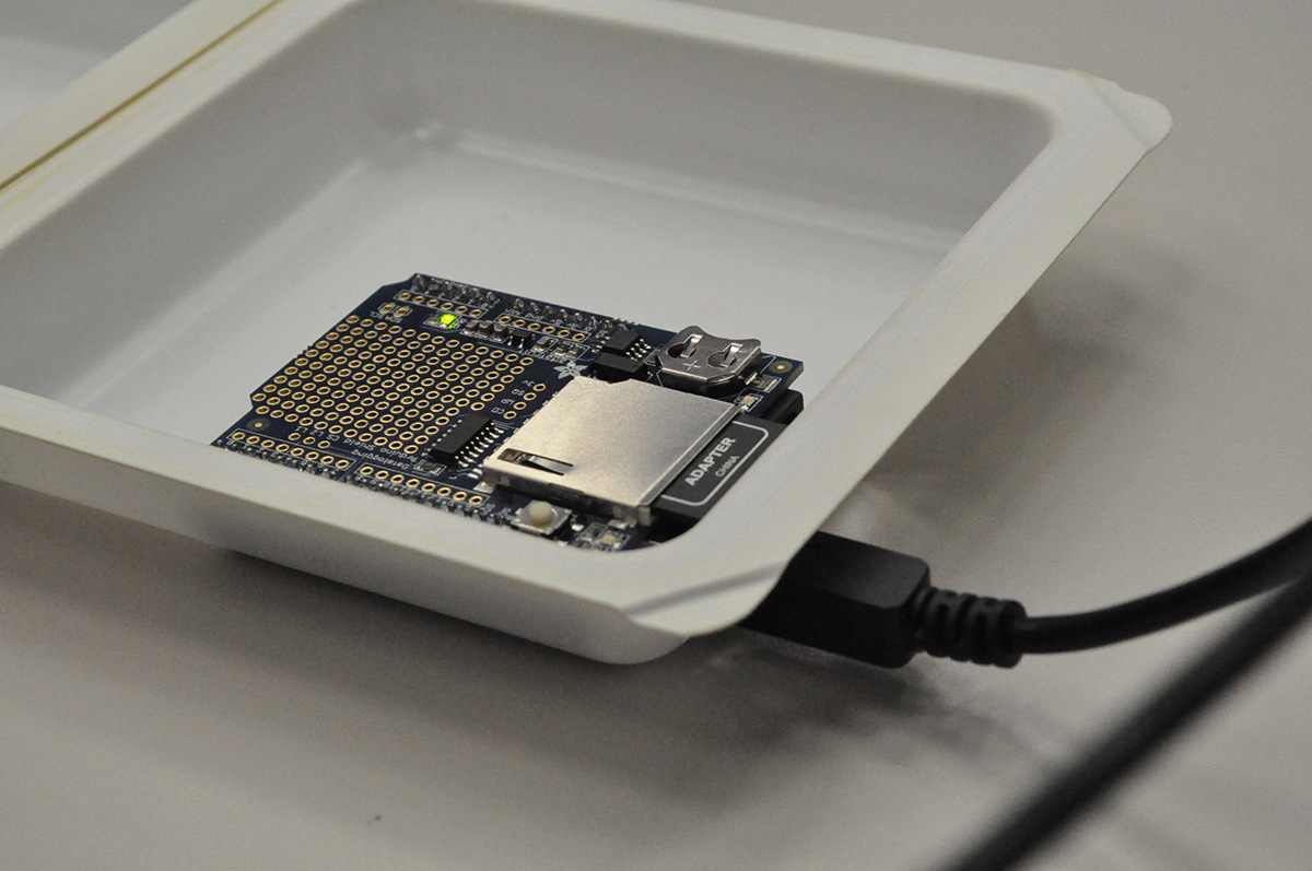
The Arduino used in one of the labs, ready for set up.


The Arduino starts tracking!
Ready to go.

My teammates setting up the other Arduino.

Me and my teammates with Prof. Michael Felix.


