The Origin Story
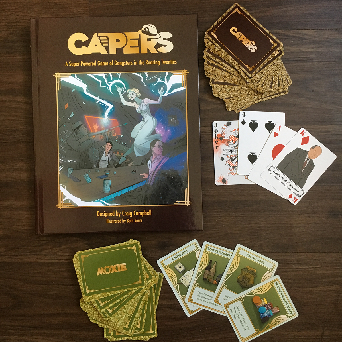
CAPERS is a unique tabletop roleplaying game, designed by Craig Campbell of Nerdburger Games, about super powered gangsters in the roaring 20s. What makes this game truly interesting is the use of playing cards instead of dice for its underlying mechanic.

Making a Mark
The title of the game was the perfect place to start setting the visual tone for how the book would look and feel. The challenge was to create a style that was reminiscent of the time period without being too historical or relying too heavily on art deco kitsch.
The result was a logo as much inspired by typefaces of the period as by comic book, and sci-fi novel covers. The small embellishments illustrate every aspect of the game.


The underlying mechanic of the game can be licensed to other creators under the name CAPERS Core, so a logo system was needed for this as well.


The Spread
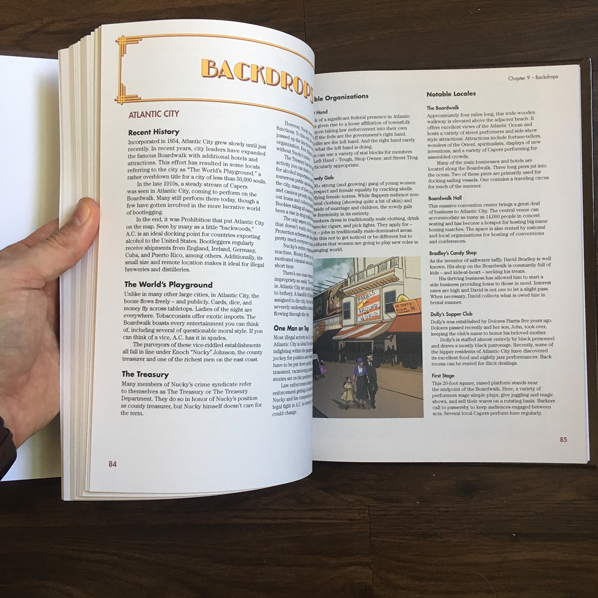
The tone had to be translated to the rest of the book. A sample section of the manuscript, containing all of the different types of content, was used to iterate on the typography.
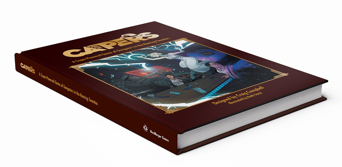
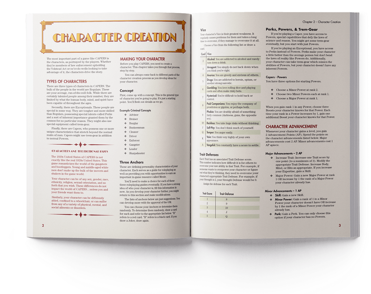
In the end, we settled on the historically appropriate Century for the body, and Futura for the headlines, with faux Deco faces embellishing titles and sidebars. These type choices and the addition of subtle, understated colors paired beautifully with Beth Varni’s Illustrations.

In the Cards
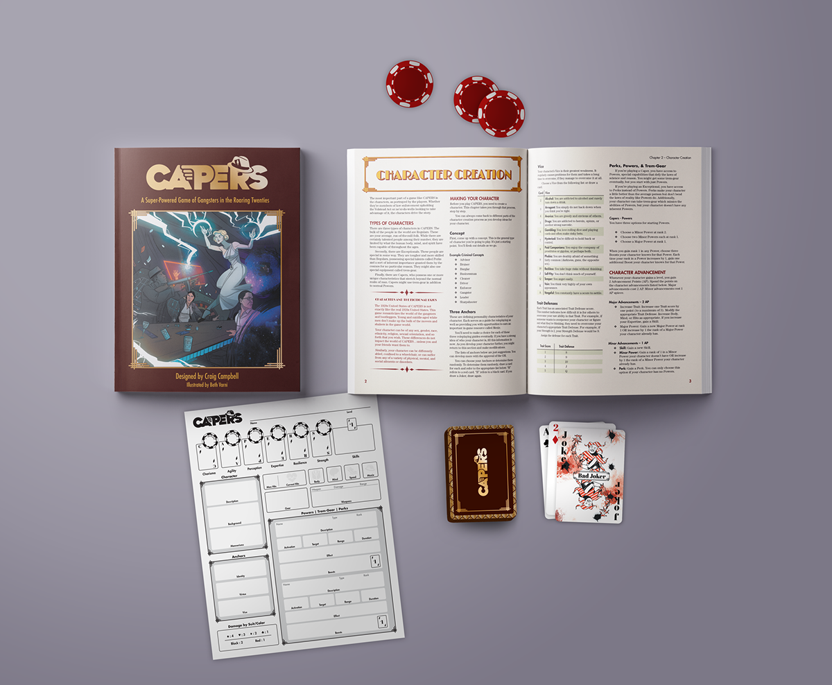
Character sheets, and kickstarter incentives such as custom card decks, were some of the final touches that made this game shine.


The Results
CAPERS funded in under six hours and went on to make nearly five times its initial goal. The game has recently fulfilled its pledges, and the final product has met with overwhelmingly positive feedback. Its available for purchase at DriveThruRPG.
