


Nouvelle identité visuelle de Klara Energy, spécialiste de l’installation
de centrales photovoltaïques et des solutions pour les exploiter
de centrales photovoltaïques et des solutions pour les exploiter
Le rebranding de Klara Energy a pour objectif de développer un territoire de marque qui respecte et valorise à la fois le savoir-faire technique d’ingénierie énergétique lié à l’installation de panneaux photovoltaïques, ainsi que l’agilité et la simplicité d'utilisation des solutions digitales créées pour les exploiter. L’agence Graphéine a conseillé Klara Energy dans son positionnement stratégique à la fois éditorial et graphique.
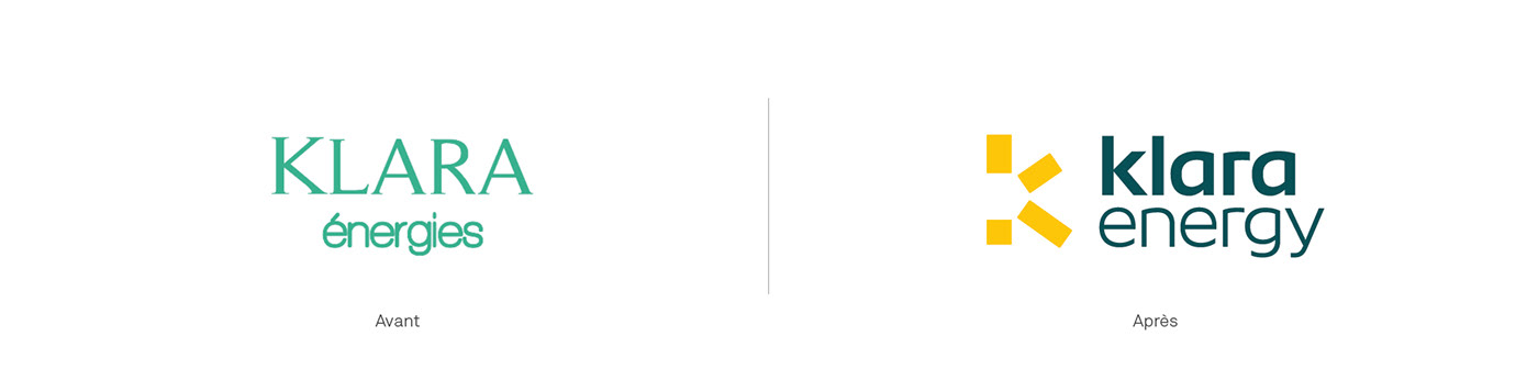
Cette réflexion a tout d’abord abouti à l'évolution du nom de marque. Le passage en anglais du mot "énergie" amorce la volonté d'une image de marque plus ambitieuse. L’étape suivante a été la création du slogan "Fiers d’être responsables" qui communique désormais efficacement l’engagement écologique de la société par la création d'énergies propres.
New brand identity for Klara Energy, specialist in installation
of photovoltaic power plants and solutions to exploit them
of photovoltaic power plants and solutions to exploit them
The goal of Klara Energy rebranding is to create a new brand territory that respects and enhances both the technical know-how of energy engineering related to the installation of photovoltaic panels, as well as the agility and simplicity in the use of digital solutions created to operate them. Graphéine agency advised Klara Energy in its strategic positioning both editorial and graphic.
This reflection first of all led to the evolution of the brand name by anglicizing it. This transformation gives a more ambitious image to the brand. The next step was the creation of the new tagline "Proud to be responsible" that now effectively communicates the company's ecological commitment.

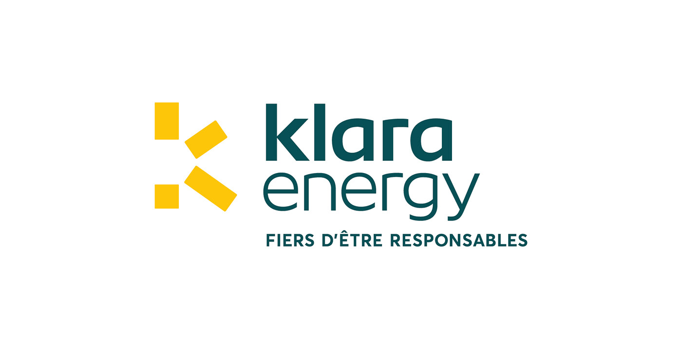
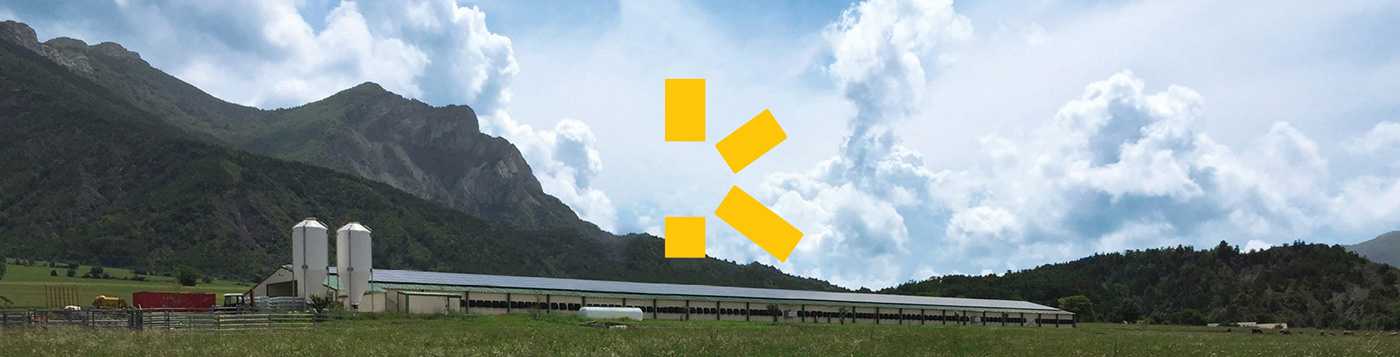
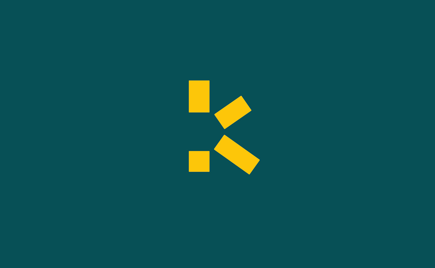
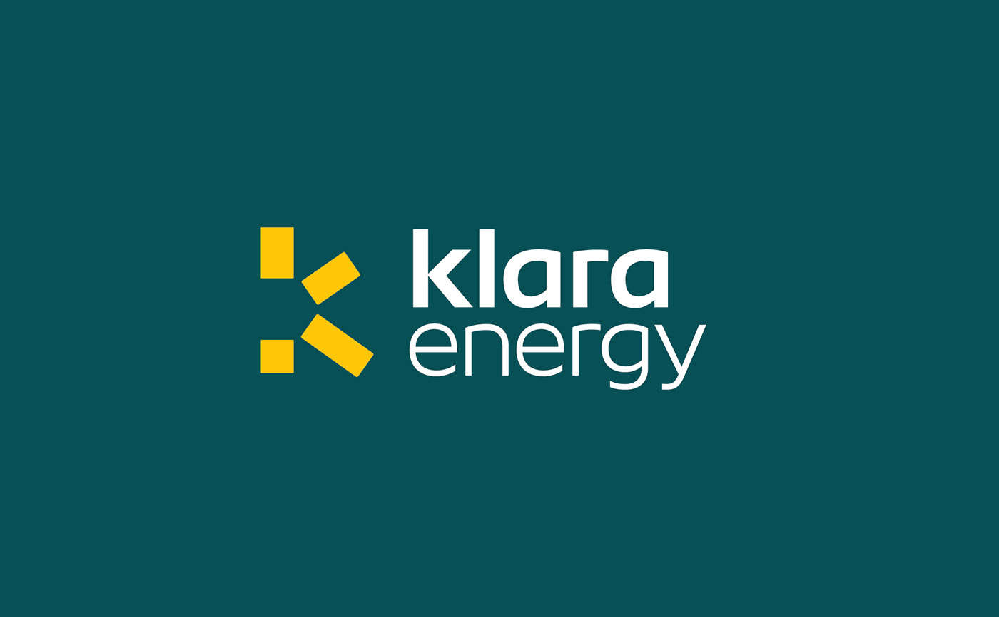
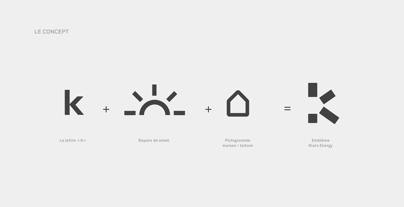
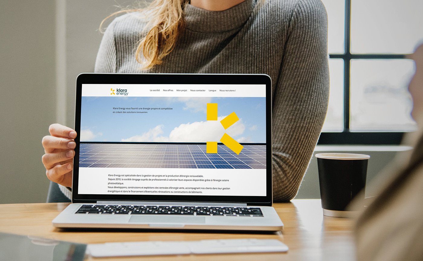
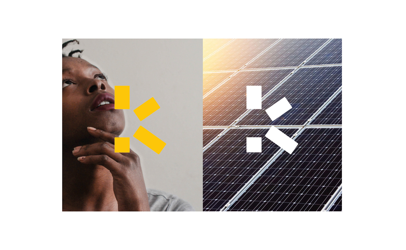
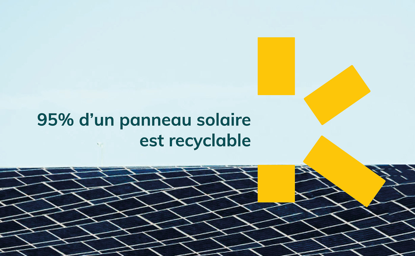
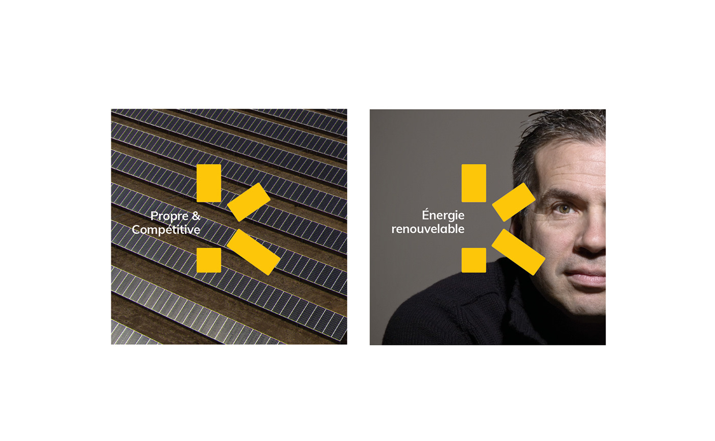
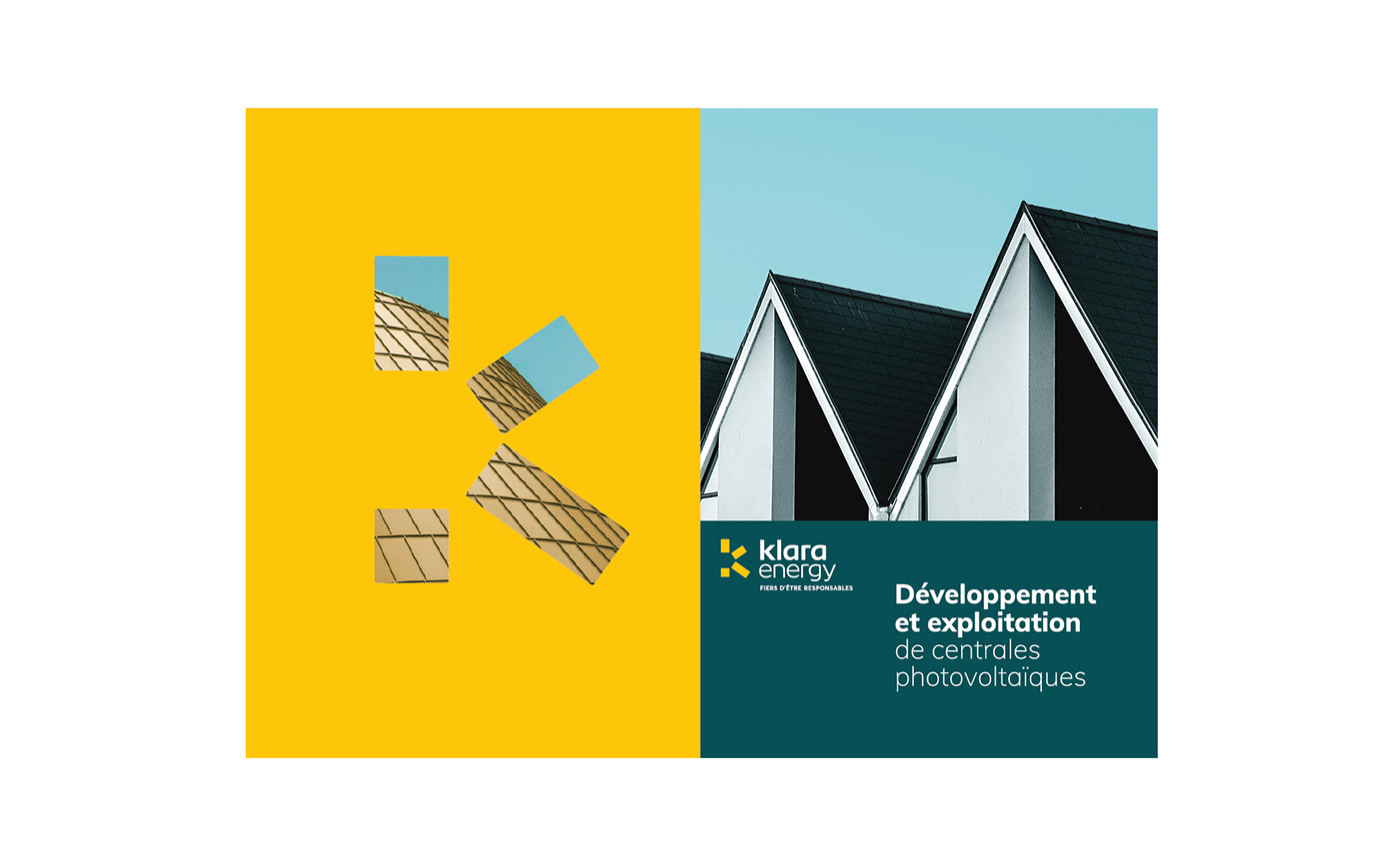
[FR] La dernière phase de cet accompagnement a été la création de la nouvelle charte graphique de la marque. La nouvelle identité visuelle de Klara Energy est construite autour d’un nouveau logotype qui symbolise l’idée d’énergie solaire en stylisant la lettre K en quatre rectangles jaunes agencés en rayons.
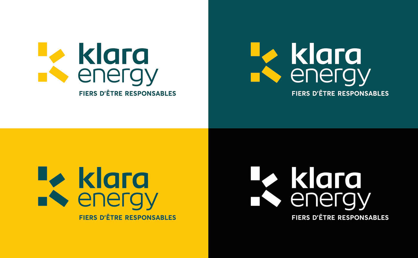
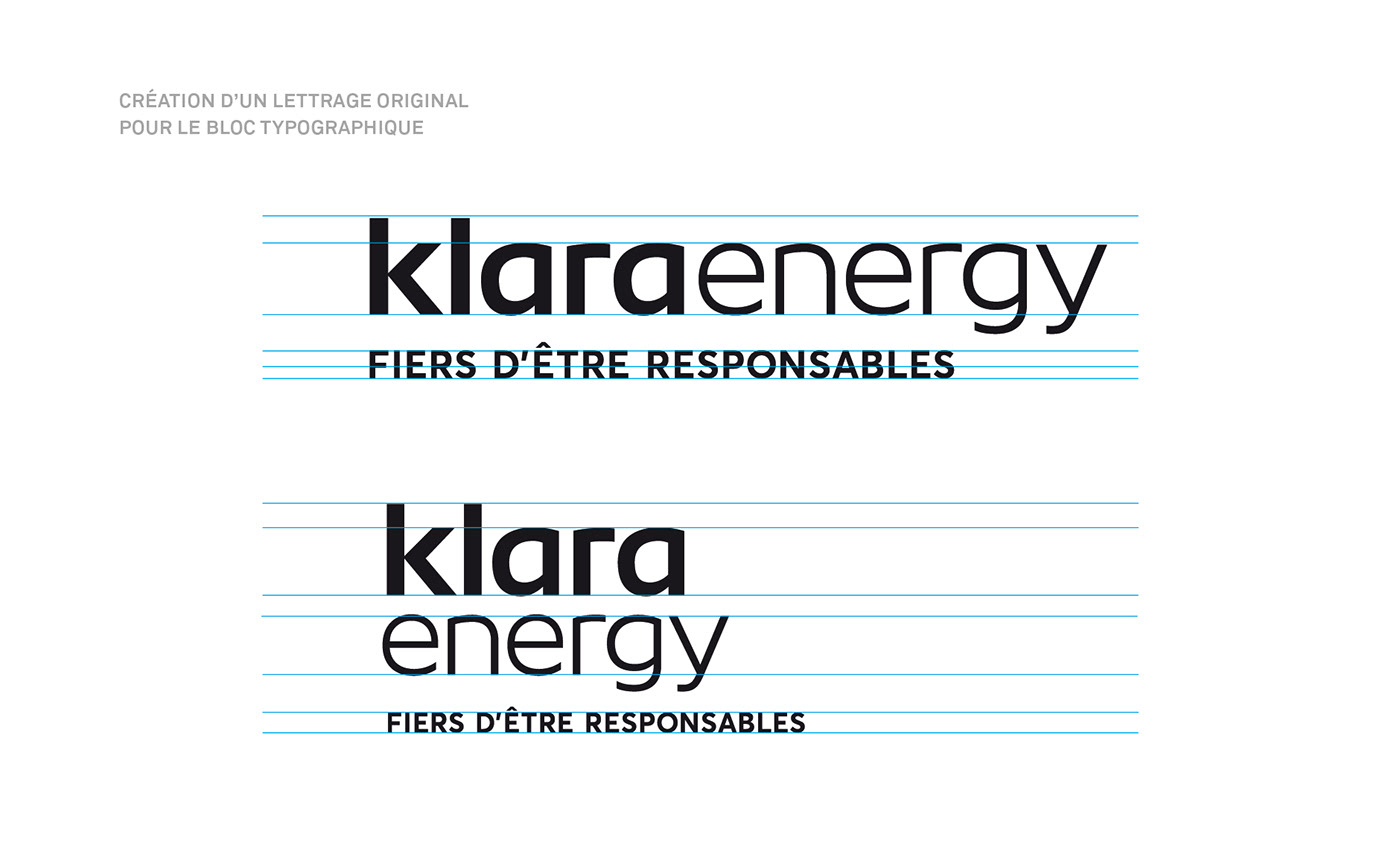
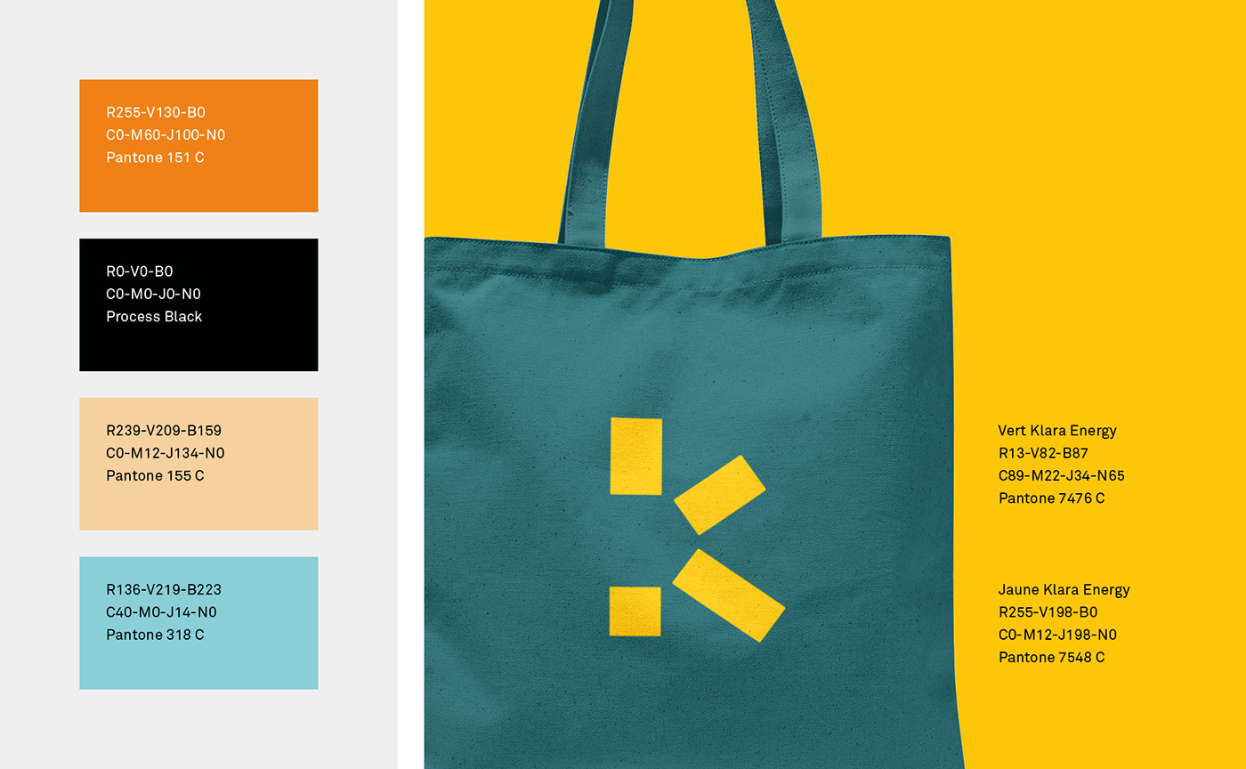
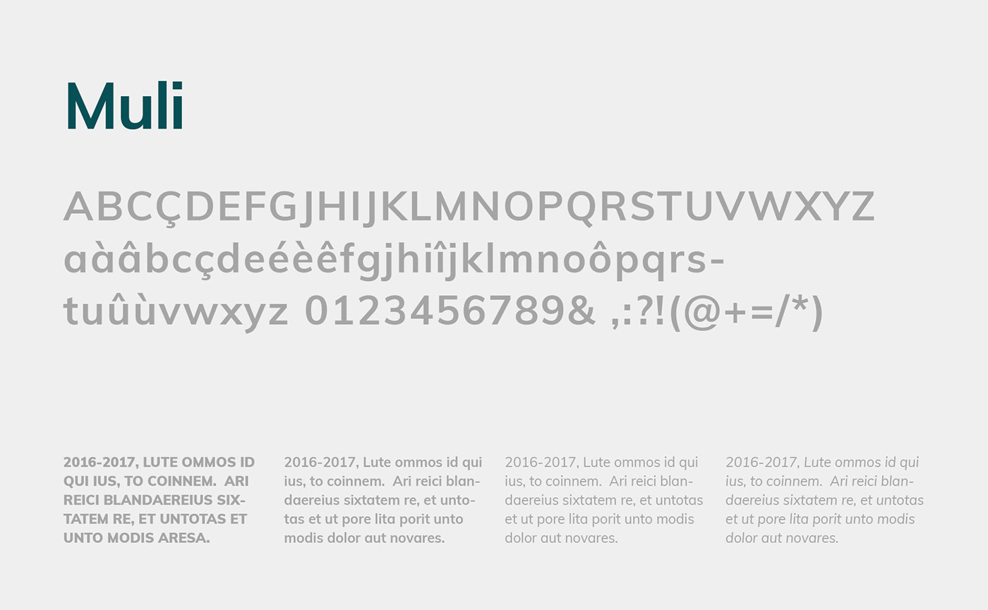
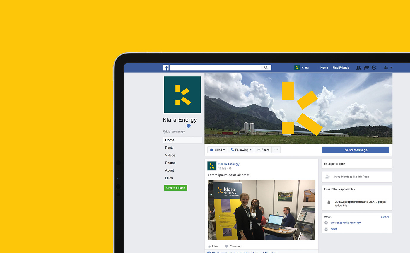
Cette idée simple et astucieuse installe les codes d’une identité "impactante" et mémorisable. Ce symbole intemporel et solide véhicule l’image rassurante et chaleureuse de Klara Energy. Le bloc typographique est composé à l'aide d'un lettrage bas de casse dessiné sur-mesure par Graphéine. Les couleurs principales de la marque sont le vert émeraude et un jaune chaud. Cette palette permet de créer un univers chromatique qui distingue Klara Energy de ses concurrents. Associée à l’utilisation de la typographie Muli, elle installe une forte cohérence graphique à travers les différents supports de communication de la marque.
[EN] The last step of this support was to create the brand's new graphic guidelines. Klara Energy's new visual identity is built around a new logo that symbolises the idea of solar energy by stylizing the letter K into four yellow rectangles arranged in rays.
This simple and smart idea installs the codes of an impacting and memorable identity. This minimalist and solid symbol communicates the reassuring and warm image of Klara Energy. The wordmark is set thanks to a lowercase custom lettering designed by Graphéine. The main colors of the brand are emerald green and warm yellow. This color scheme creates a chromatic universe that distinguishes Klara Energy from its competitors. Combined with the use of Muli typeface, it creates a strong graphic consistency across the brand's various communication media.


Credits:
Creative & Art direction: Jérémie Fesson
Graphic design: Philip de Canaga
Project manager: Leslie Darné
Project manager: Leslie Darné


