Robert Burns
Branding / Identity
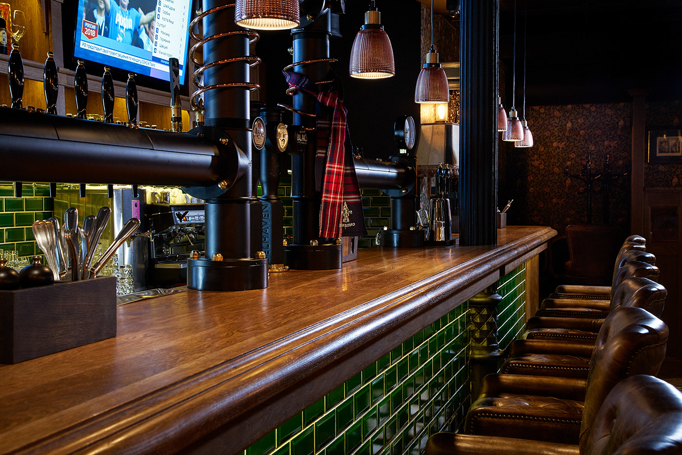
There’s plenty of pubs in Moscow, but somehow a great & authentic one is still a rare find. Robert Burns Pub & Roast does not try to emulate the features of a traditional British (or Scottish for that matter), but rather brings it’s own perspective. It features a meticulously designed interior, a jaw-dropping beer list and food that’s a bit too good for a pub, really.
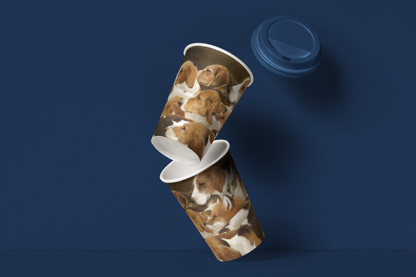
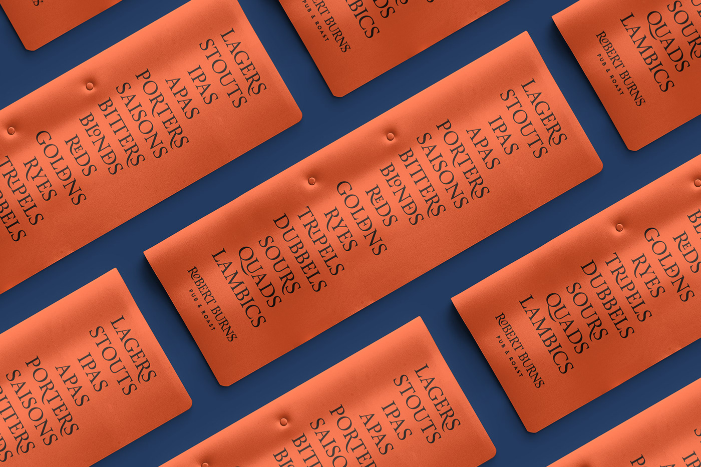
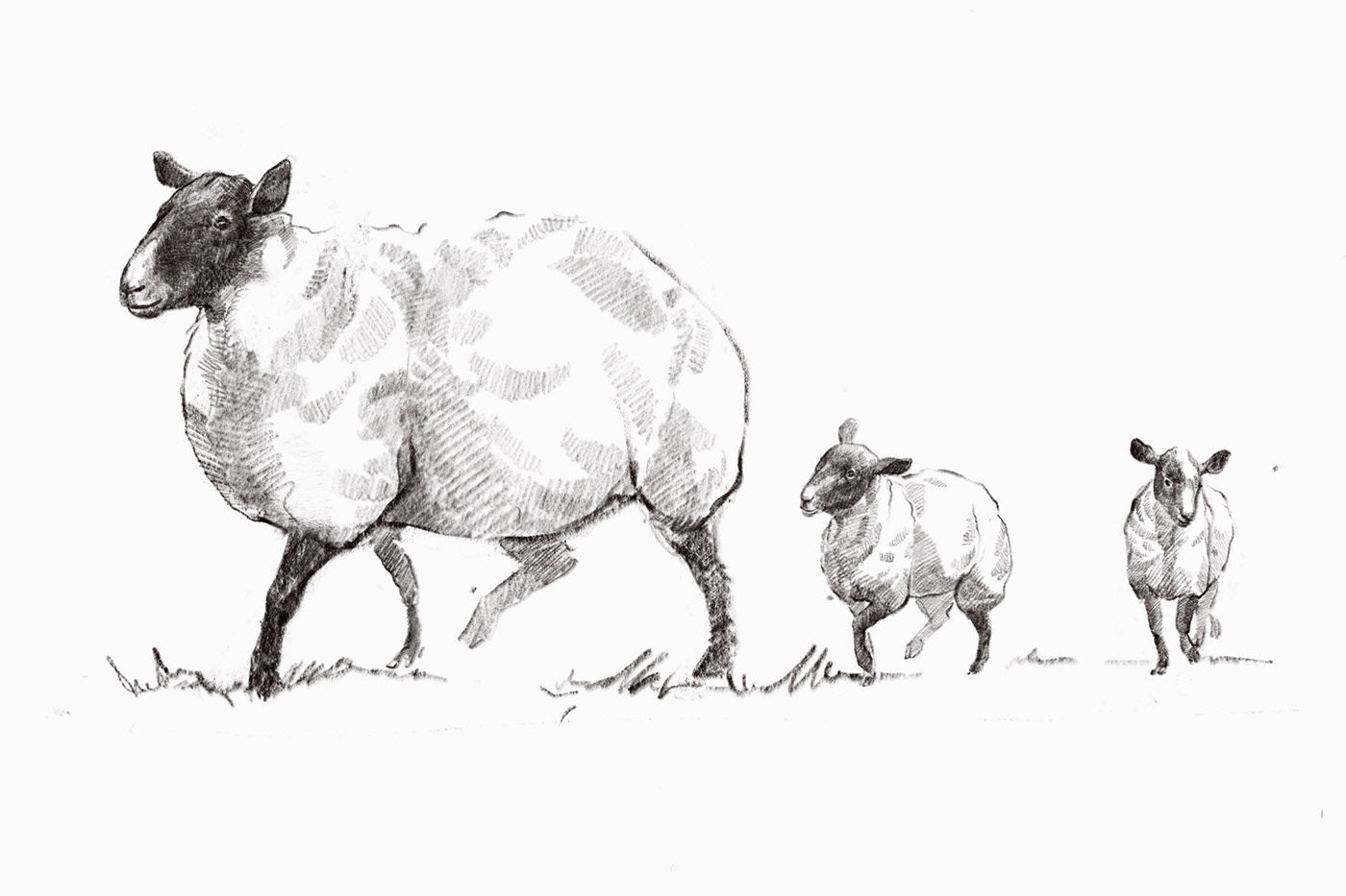
We created the visual identity for Robert Burns which emphasises the key features of the establishment: character, tradition & a fair bit of cheekiness. Instead of building the visual language around the image of Robert Burns himself, we took inspiration from the extensive world of 18th century rural Scotland sung by the poet, traditional Scottish art and fables too.