Alight — Lightning and technical management
Challenge
Alight is the largest company in Ukraine providing lighting equipment rentals and technical services for TV shows and entertainment events. In 12 years, they have organized more than 10 thousand events, concerts, and live broadcasts of the largest television shows in Ukrainian and post-Soviet markets. Alight needed branding that would clearly communicate their commitment to one-on-one relationships with clients and fundamental involvement in projects, as well as define their own distinctive brand voice.
Strategy
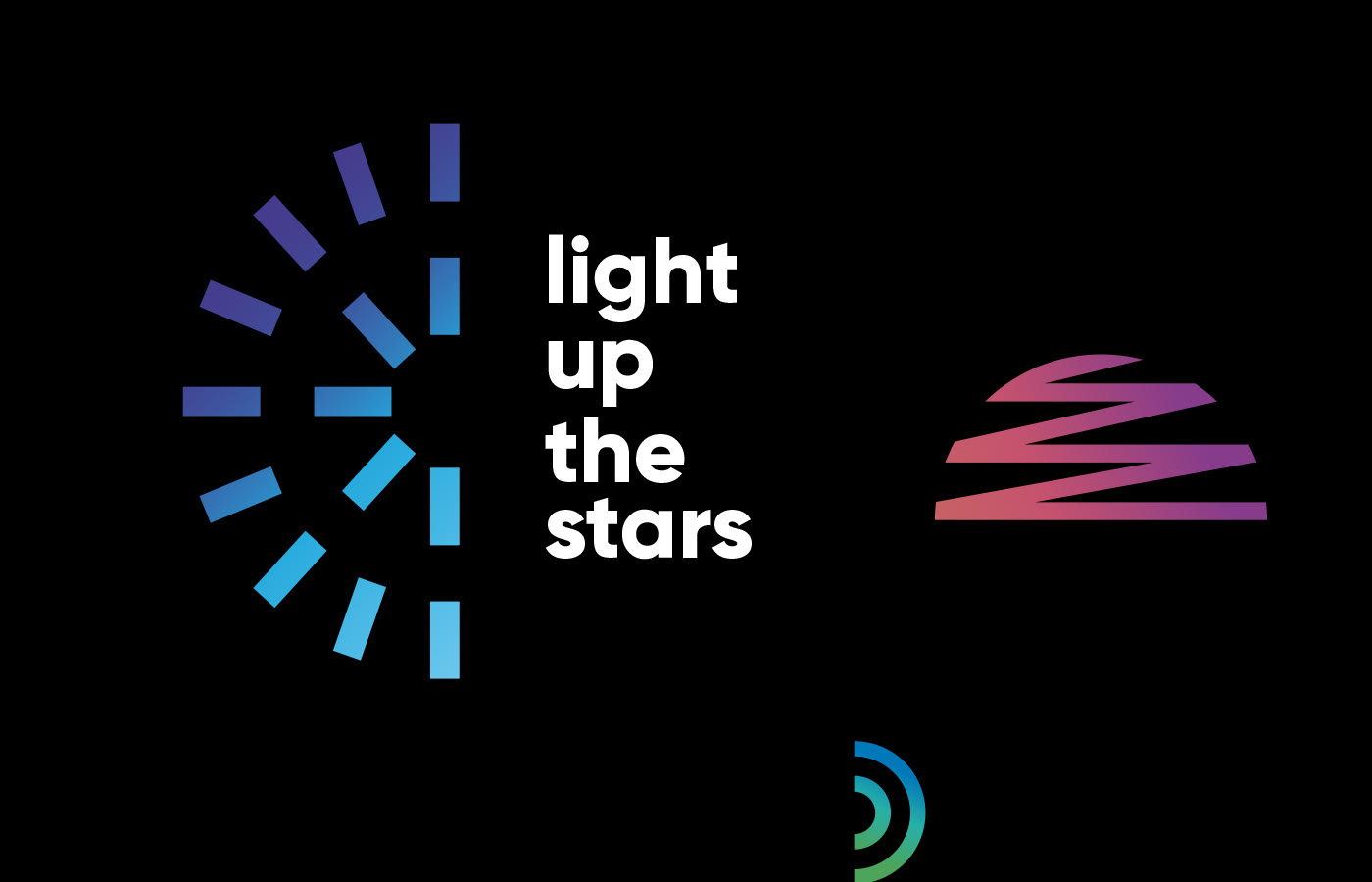
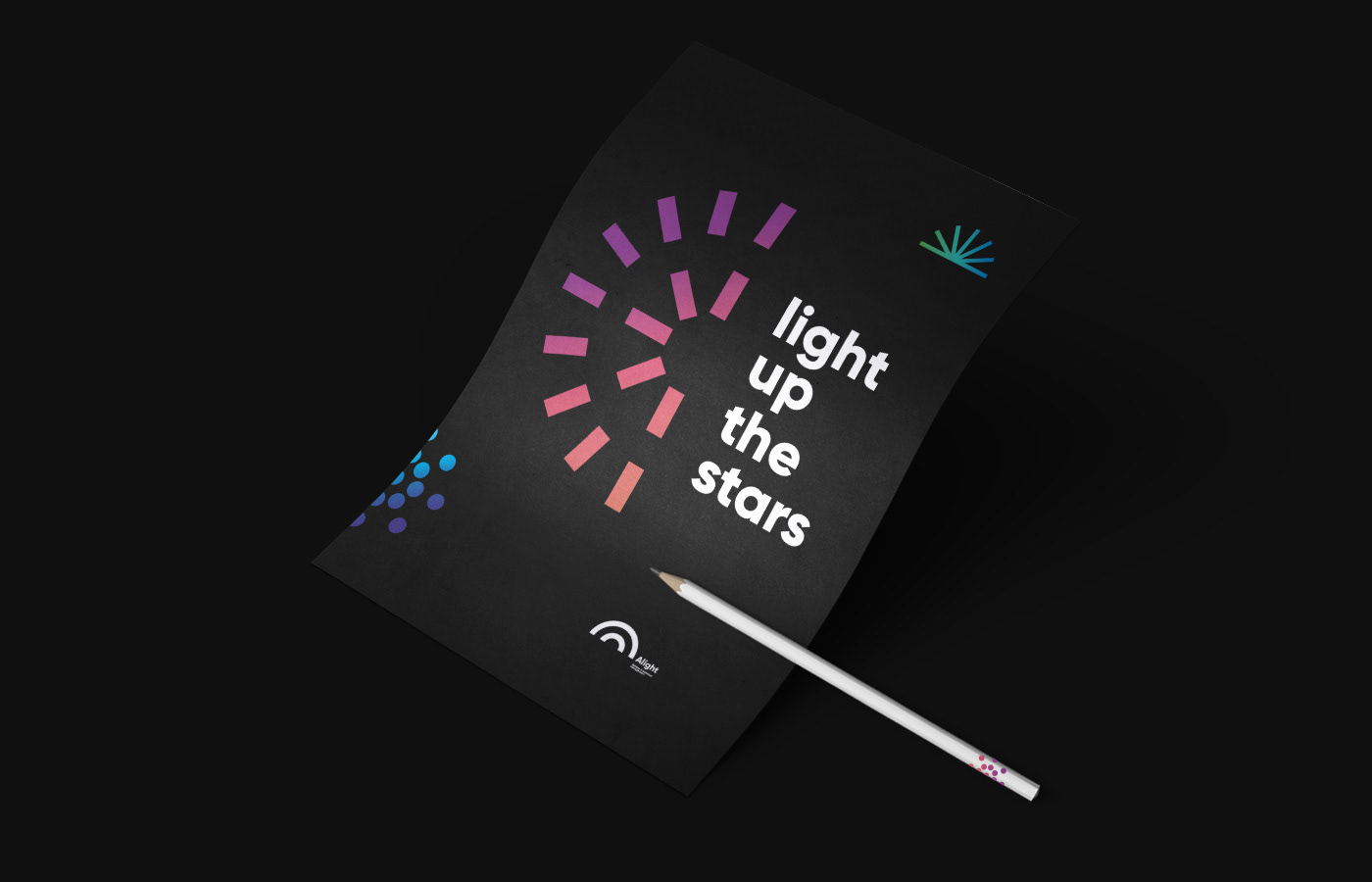
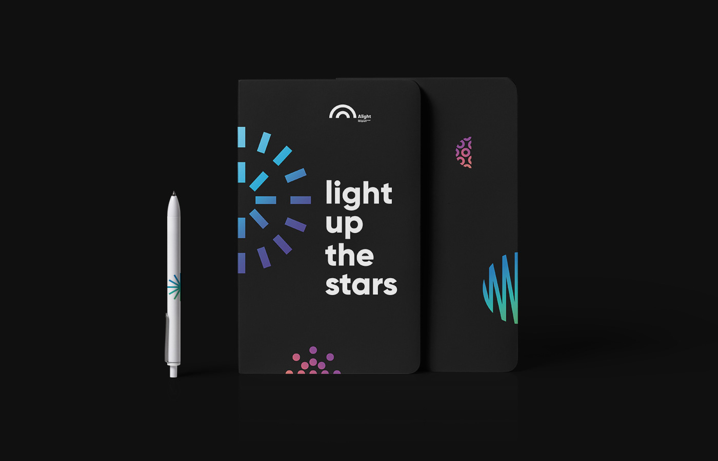
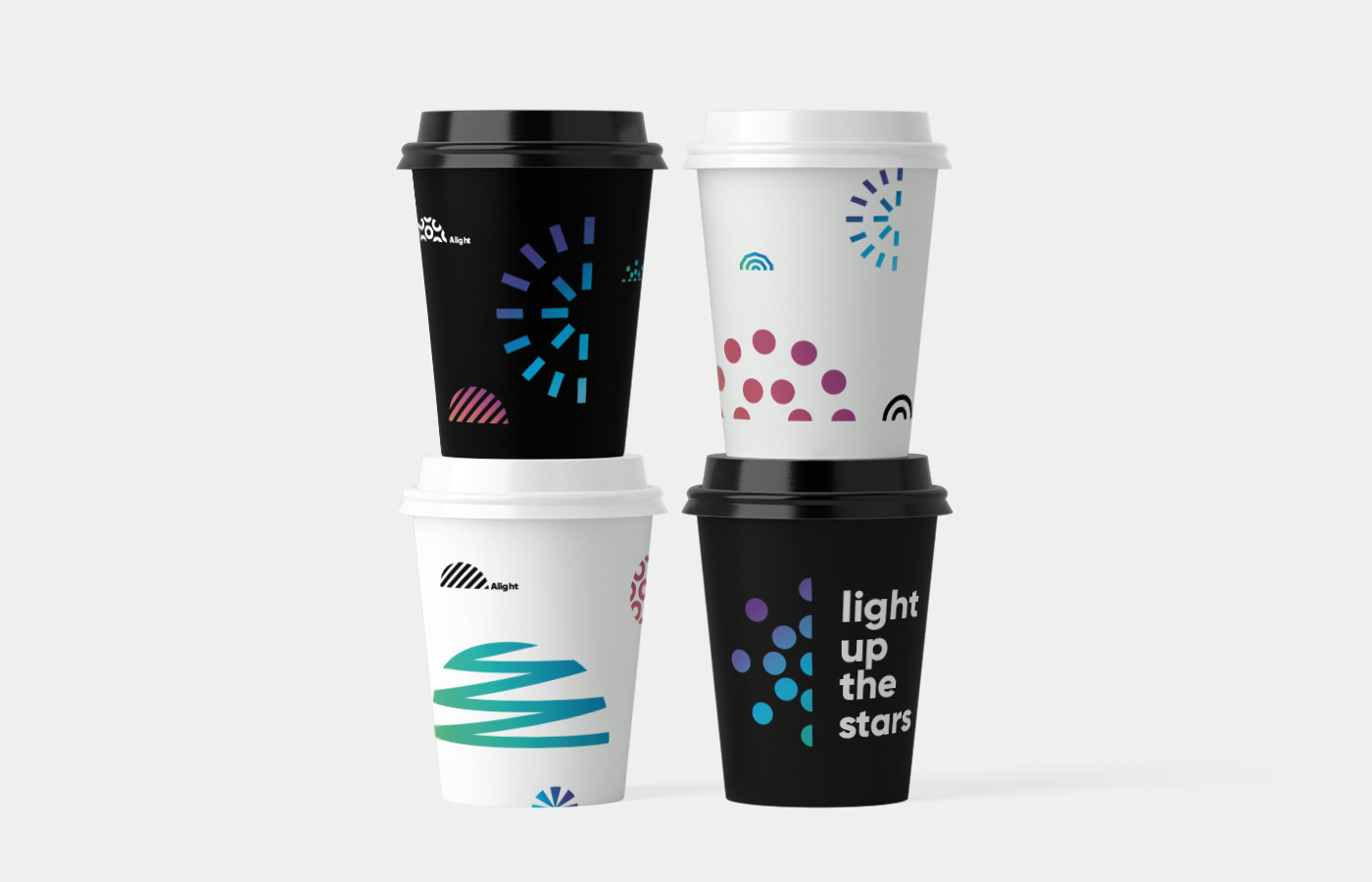
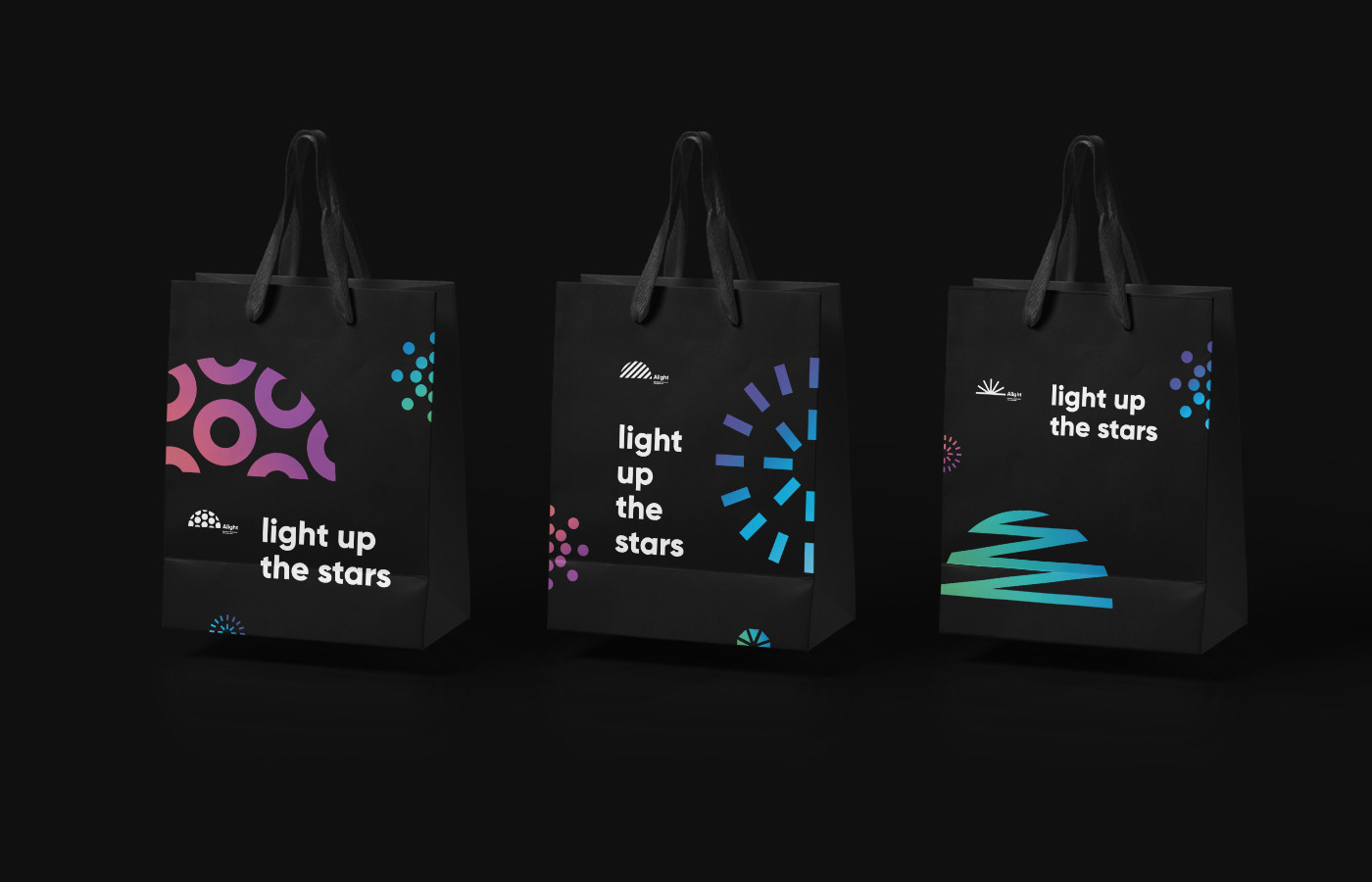
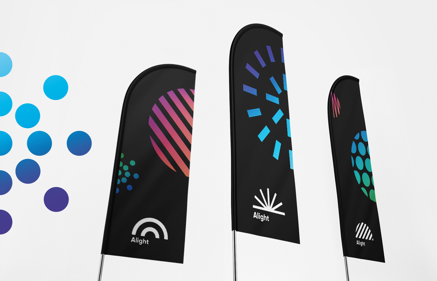
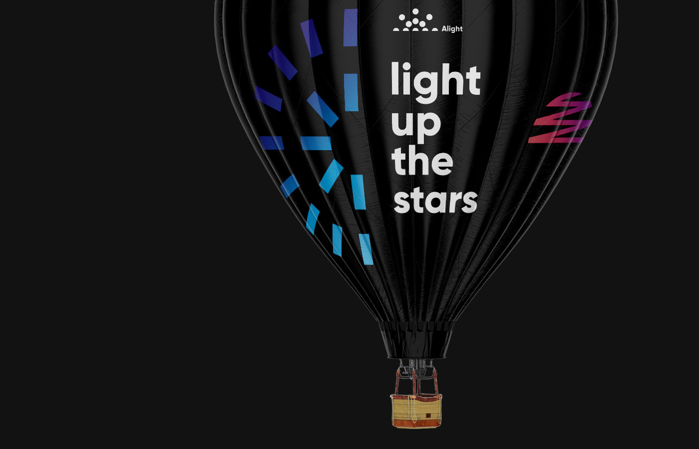
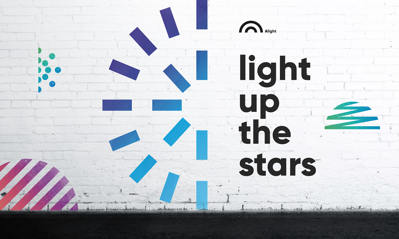
With Alight, stars from all over the world get the attention of viewers. The new visual strategy was to create a bold, colorful, and dynamic identity to make Alight stand out in the B2B entertainment space and showcase their new big idea of the brand — Light up the stars!
Design
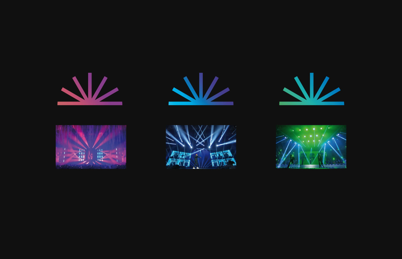
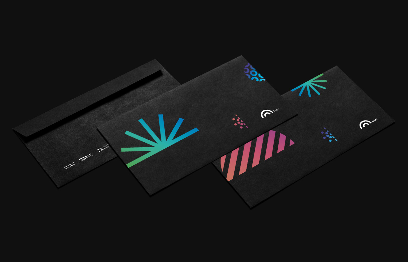
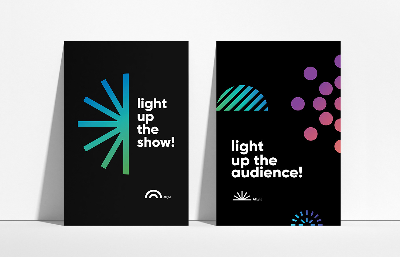
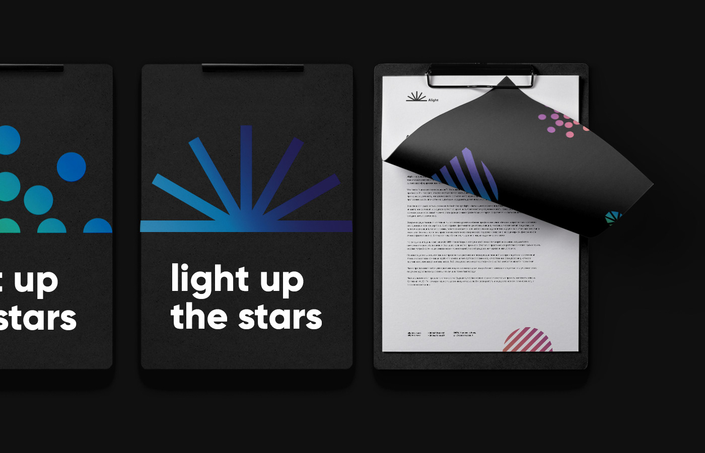
The dynamic design concept is inspired by the light patterns and color gradients that the team displays during their jaw-dropping shows. The logo forms a dome of light and defines the stage space and where the stars are lit and the rays of light fill the space with geometric shapes.


Visual system
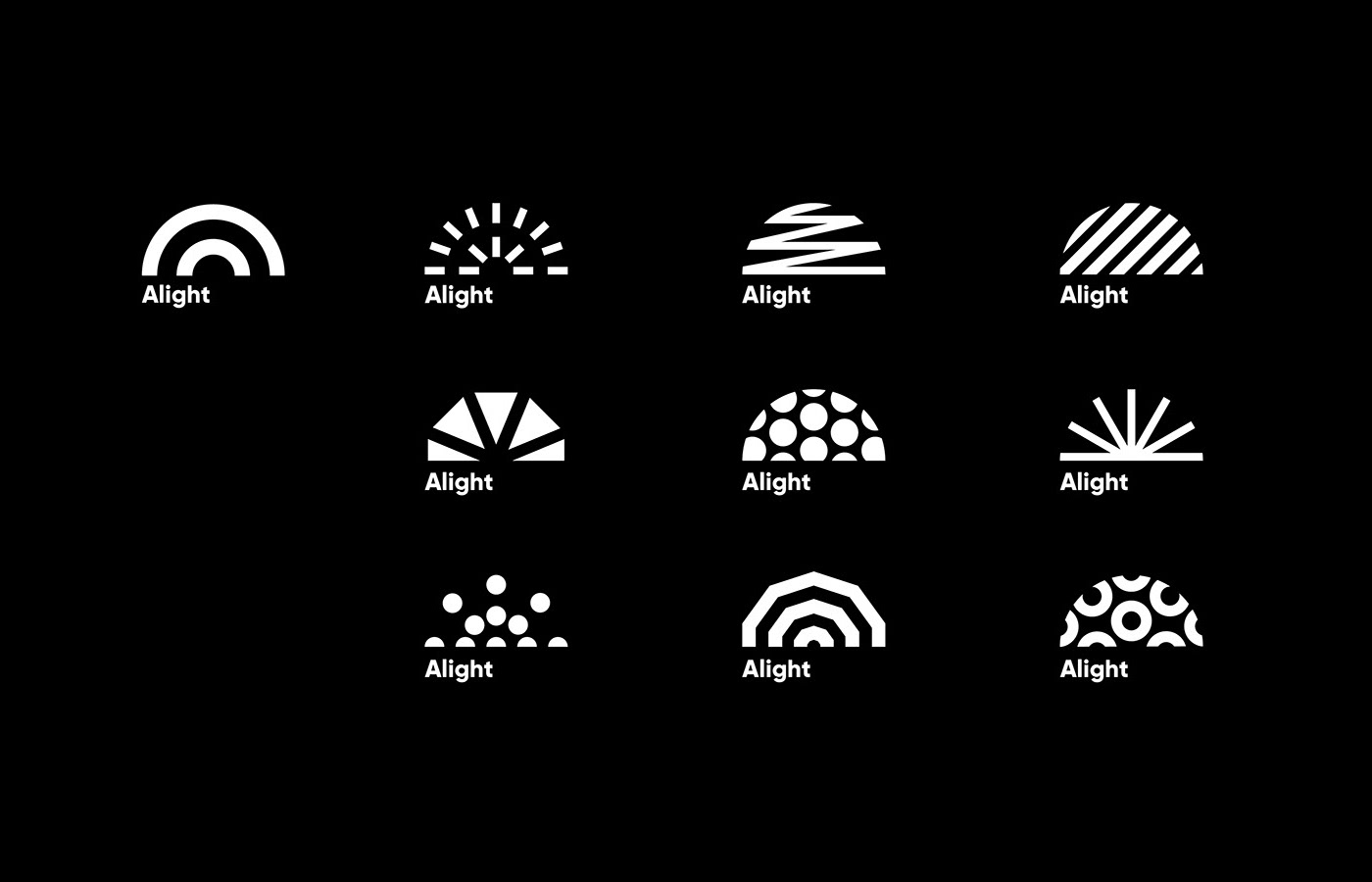
The universe of the Alight brand is constantly changing, but made of a family of components, such as a dynamic logo that represents diversity, a limitless range of possibility, and a color spectrum that easily conveys Alight’s energetic spirit.


Solution
The new brand identity clearly reflects the Alight’s passion for creativity, innovation and high performance of the company’s modern lighting designs. The new visual language demonstrates an aspirational, positive, and passionate voice and the variety of elements are flexible enough to work on a wide range of brand expressions and garner great recognition from the client.


Brand identity design, branding, top best brand designer, clean, modern, minimal, simple, pattern, stationery design, logo, logotype, typography, business card, visual identity corporate
Thanks, for watching!

