


O projeto Escola em Ação é um programa que visa uma intervenção de base escolar para promover hábitos de vida saudáveis, através de ações educativas e de pesquisa junto ao público infantil.
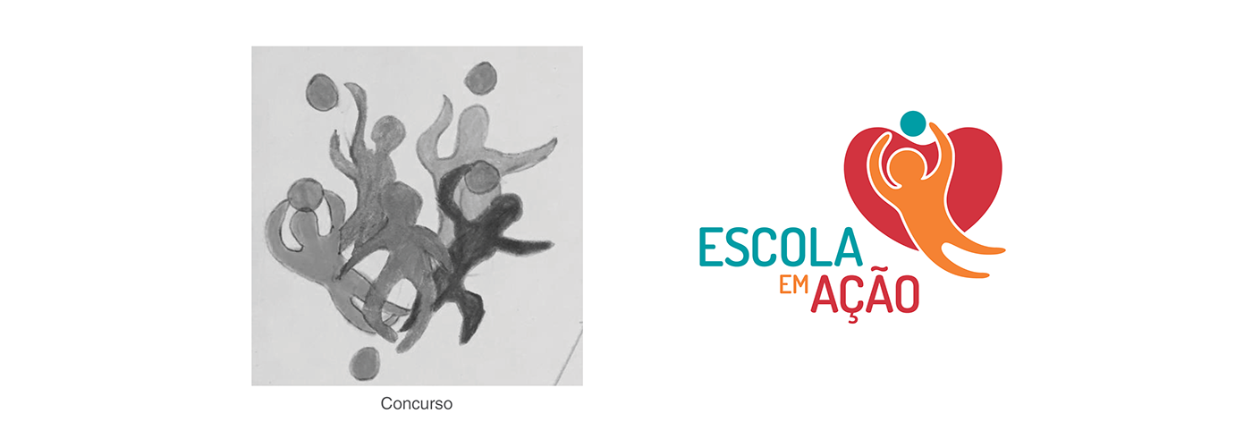
A marca foi desenvolvida através de uma metodologia colaborativa e foi inspirada no resultado de um concurso promovido com crianças atendidas pelo projeto.
Ocorreu ao longo de dois anos envolvendo vários designers diferentes do laboratório Inky Design.
Agradecimento especial à Rafaella Sant'Anna Bortolan (25/01/1995 - 15/12/2017).
The project Escola em Ação is a program that aims at a school-based intervention to promote healthy living habits through educational actions and research with children.
The brand was developed through a collaborative methodology and was inspired by the result of a contest promoted with children attended by
the project.
It took place over two years involving several different designers from the Inky Design laboratory.
Special thanks to Rafaella Sant'Anna Bortolan (01/25/1995 - 12/15/2017).
Special thanks to Rafaella Sant'Anna Bortolan (01/25/1995 - 12/15/2017).
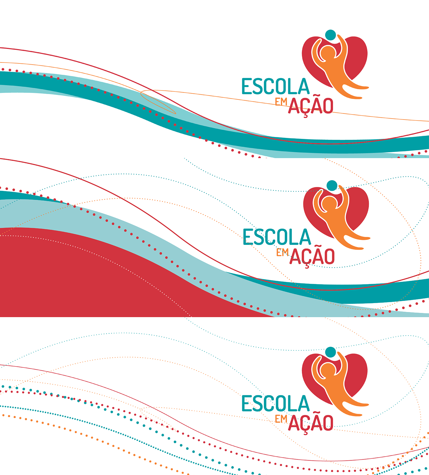
Conceito - concept
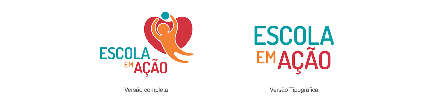
A partir da ideia apresentada, alguns elementos se destacaram: o corpo em movimento, o equipamento esportivo (bola) e o coração, sintetizando a importância da prática esportiva para a manutenção da saúde.
A partir da ideia apresentada, alguns elementos se destacaram: o corpo em movimento, o equipamento esportivo (bola) e o coração, sintetizando a importância da prática esportiva para a manutenção da saúde.
From the idea presented, some elements stood out: the body in movement, the sports equipment (ball) and the heart, synthesizing the importance of sports practice for health maintenance.
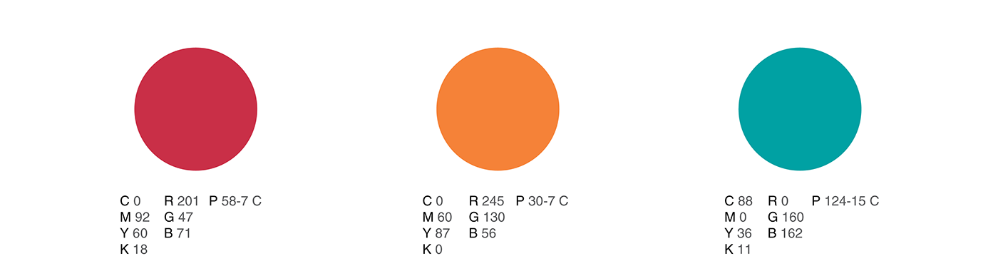
Cores - Colors
As cores vermelho e laranja valorizam a ação por serem quentes e a cor verde azulada tem forte relação com a área da saúde. A composição dos elementos é dinâmica e também reforçam a ideia de movimento.
The colors red and orange value the action for being warm and the color blue-green has strong relation with the health area. The composition of the elements is dynamic and also reinforces the idea of movement.
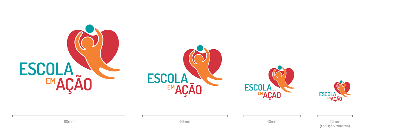
Reduções - Reductions
Importante para saber até onde pode reduzir a marca para sua legibilidade.
Important to know how far you can reduce the mark for readability.
Área de Proteção - Protection Area
O logotipo apresenta tanto elementos horizontais quanto verticais de grande peso. Para garantir uma leitura confortável, é necessário respeitar a área de proteção ao redor da imagem, referente ao tamanho da letra “E”.
The logo features both horizontal and vertical elements of great weight. To ensure a comfortable reading, it is necessary to respect the protection area around the image, referring to the size of the letter "E".

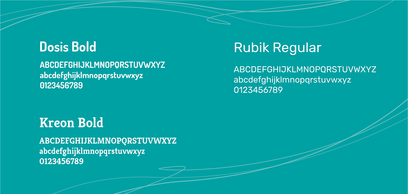
Tipografia - Typography
A fonte escolhida para o logotipo foi a Dosis Bold, pela suavidade das curvas aliada ao peso das formas.
Já nas aplicações de texto interna dos materiais, a escolha mais indicada para títulos, subtítulos e informações de grande destaque é a versão Bold da tipografia Kreon, utilizando a Rubik Regular para grandes massas de texto corrido.
The font chosen for the logo was the Dosis Bold, for the smoothness of the curves allied to the weight of the shapes.
In the internal text applications of materials, the most suitable choice for titles, subtitles and information of great prominence is the Bold version of the Kreon typography, using Rubik Regular for large masses of running text.
In the internal text applications of materials, the most suitable choice for titles, subtitles and information of great prominence is the Bold version of the Kreon typography, using Rubik Regular for large masses of running text.
Aplicações - Applications
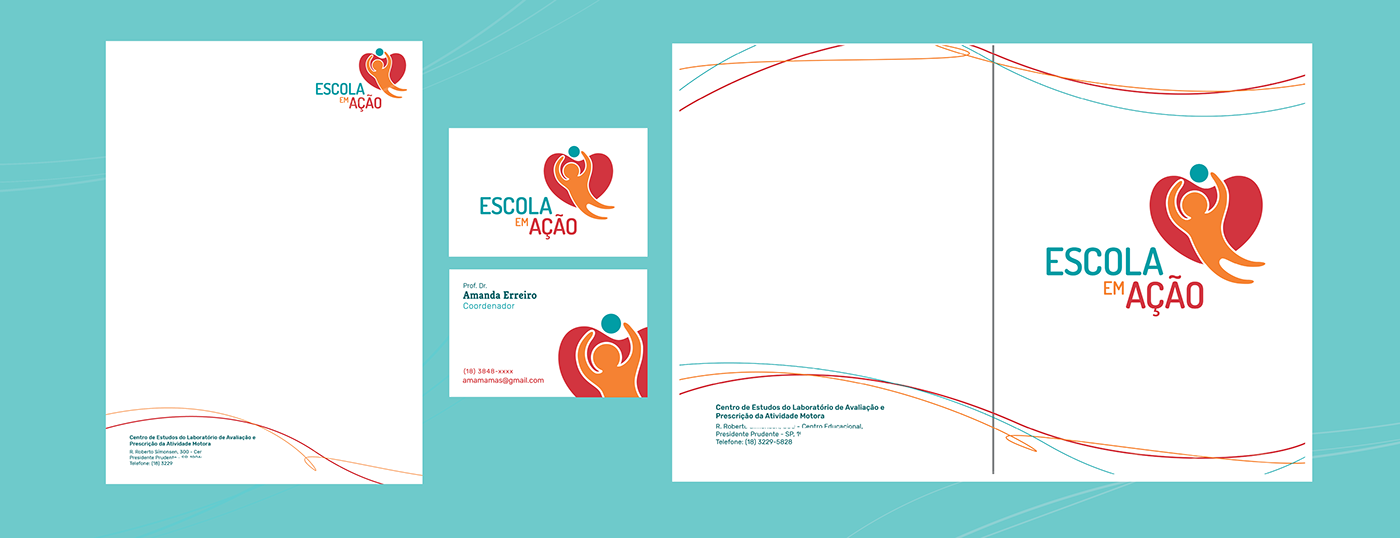
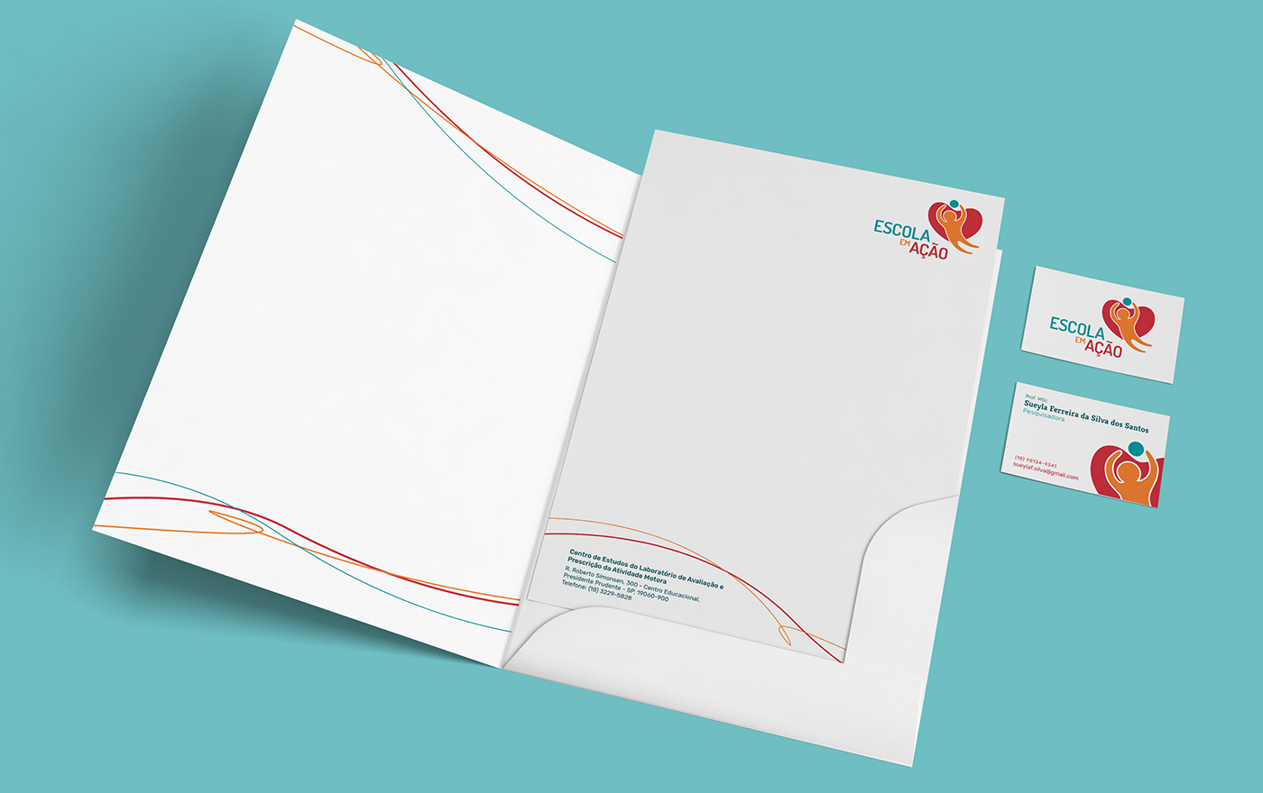

Materiais - Materials
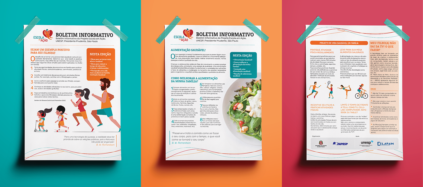
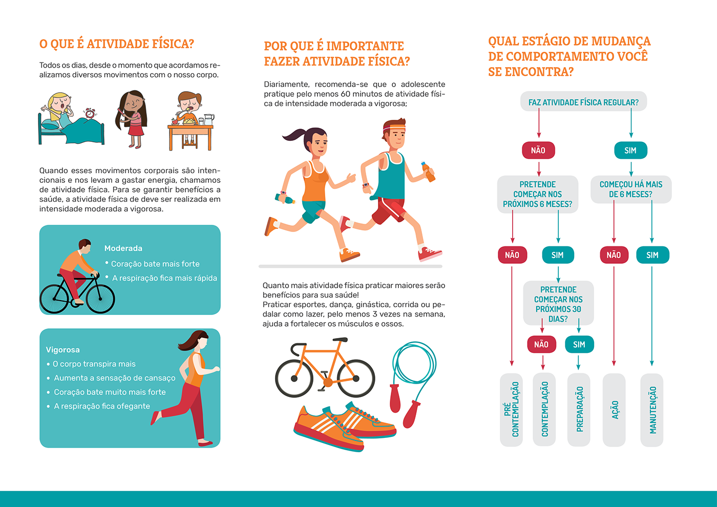
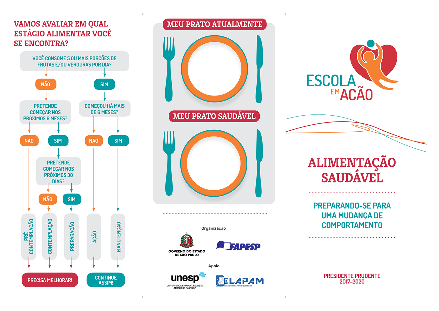
Foram criados materiais como Boletim informativo, folders, banners e álbuns seriados.
Materials such as newsletter, folders, banners and serial albums were created.
Equipe - Team
Amanda Erreiro, Cássia Carrara, Fernanda Henriques, Gleison Cipriano, Guilherme Contini, Lucas Ikeda,
Luis Felipe Andrade, Rafaella Bortolan, Ruan Augustinho.
Luis Felipe Andrade, Rafaella Bortolan, Ruan Augustinho.
Algumas ilustrações foram retiradas e adaptadas do site freepik.
Some illustrations have been adapted from the freepik site.


