
My role
Help reframing the problem
Desk research
Information Architecture
Wireframing
Visual Design
Prototyping
Client
GNT tv channel
Platforms
iOS, Android
Year
2017
The ‘GNT Recipes’ was a cooking app available for iOS and Android. Although “GNT” is a payed brazilian TV Channel, the app was free for everyone interested in recipes in general. The return came from video ads and special programs with branded content.
Problem
The app was an MVP released years ago to which the team didn’t have the chance to go back to and iterate.
At this time, the client was keen to making a few improvements and had already a list of features in mind. Deadlines were aggressive and changes were expected to be seen soon.
Approach
Taking a look at the store ratings and reviews helped focusing in the main user's pain points to inform design decisions and slightly reframe the briefing.
Benchmarking also helped aligning the client's expectations about the final result and buying some time.

From the user feedbacks we understood that the primary problem was architecture related:
1. People found the navigation slow and demanding
2. The general thought was that there were only a few recipes on the app (not true)
3. There were doubts on where to find some of the content
Our main hypothesis for those impressions were:
• The ‘Home’ of the app was a place for highlights, which by its own concept didn’t sum up to a lot of recipes
• The search results were limited to a maximum of 20 itens, regardless of the term searched
• The recipes were scattered through the app in a bunch of different categories, some of them being a little confusing
• The burger menu didn’t help, hiding many of the navigation options
Sketches
Sketching was key to sharing ideas as soon as possible. Everyone had the chance to sketch over ir and no one was committed to a solution yet.
That way it was possible to seek insights from teammates and client, as well as balance everyone's expectations.
Main recommendations
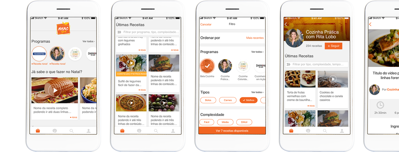
1. Swap the burger menu for a bottom navigation with fewer navigation options;
2. Consolidating ALL recipes on the ‘Home’ area, with 3 different approaches for 3 different user drives;
3. Communicating which recipes were new and the total amount on the Program page, as well as in the search results (not limited to 20 anymore);
4. Other functionalities like combined filter, suggestions and segmented push notification.

UI and Prototyping
With everyone’s feedback in mind it was time to translate the ideas into visual design. I tried to use as many native components as possible to minimize the maintenance costs and facilitate possible future highlights in the app stores.
Why it never came to be
Before having the chance to present the final design to the client or test the solution, the project was dropped due to a budget cut and a change in leadership.
Nevertheless, it was a project I enjoyed doing. I learned a lot about balancing expectations, the importance of keeping the client close each step of the process and communicating with the team.


