Visual Identity / Naming / Signage / Copy / Research
Design strategy and signage design proposal for Sears clearance department.
Working within limitations and budget.
While collaborating at Sears I was assigned to develop a new visual identity for the clearance store department.
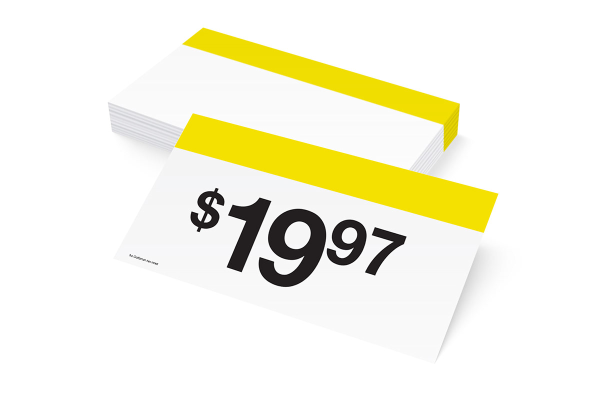
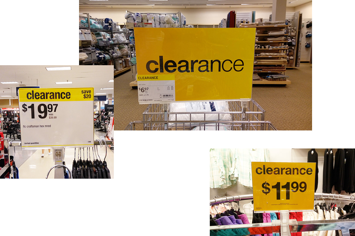
Because the 'Sears visual department' already had thousands of preprinted sign-price cards with a yellow strip on the top, the design proposals had to work with these materials to avoid reprinting costs. Moreover, the production of materials required to be within a budget, therefore premium finishes or high cost materials were limited.
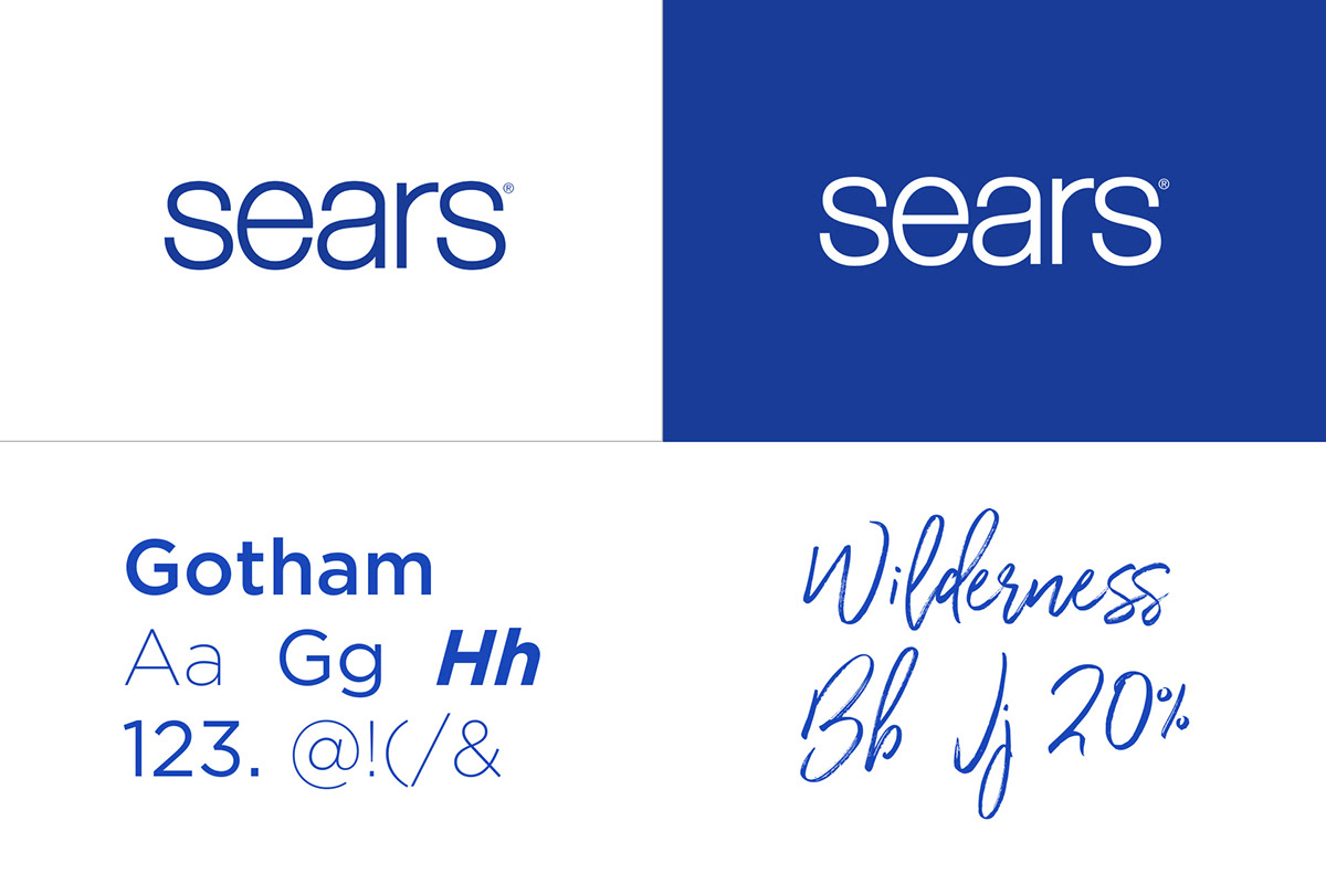
Furthermore, the design required to be aligned with the current Sears brand guidelines, color palette, and typographies (Gotham and Wilderness).
Peer & Competitor Analysis
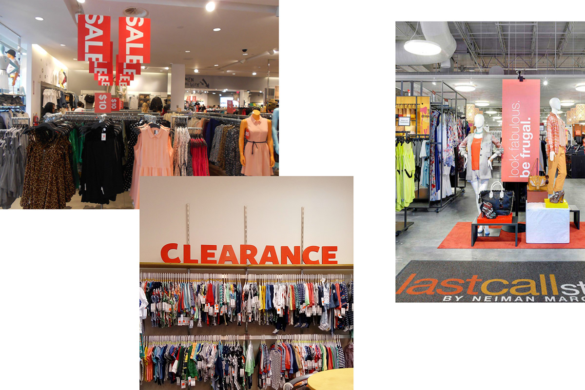
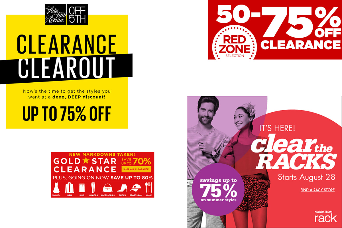
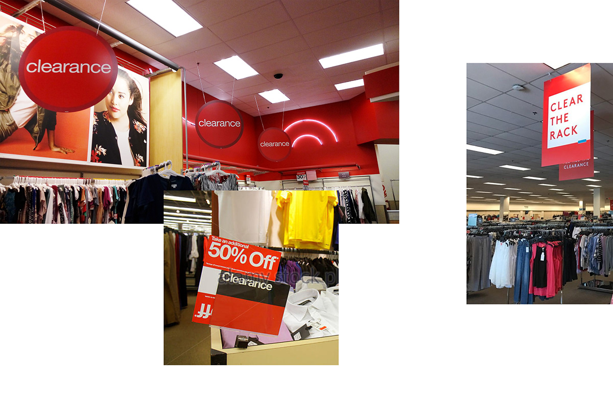
Secondary research, field visits, and observations were conducted to understand the visual language and materials other department stores and shops were using for the clearance section.
The analysis included brand names such as Macy's, JCP, and Kohl's whose target audience is similar to Sears's; H&M and Express which are current big and popular names; and peers like TJ Maxx, Nordstrom Rack, and Target.
Findings include:
- Multi-purpose add-on signs.
- Special name for clearance events.
- Big price signs.
- Red color schemes.
- Special name for clearance events.
- Big price signs.
- Red color schemes.
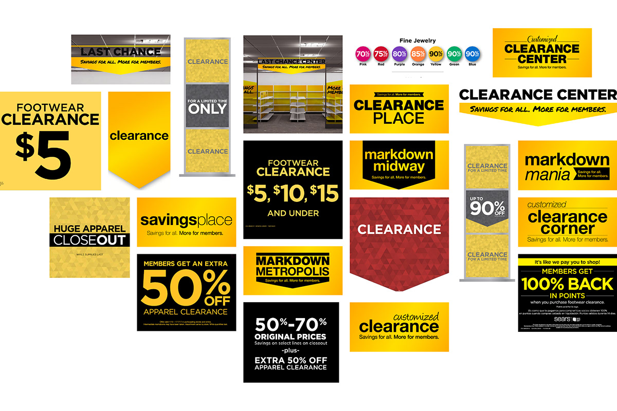
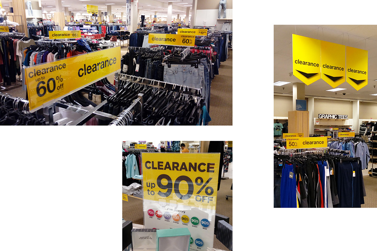
Sears current and past signs analysis
An analysis of past, current, and discarded clearance designs was done, as well as interviews with the legal department, visual team and store managers to fully comprehend the constraints, pain points, and needs of the stakeholders.
Multiple field visits were also done in different Sears stores around the Chicago area, including the prototype store in which all new signs and floor layouts are tested.
Findings include:
- Uneven clearance signs
- No storytelling
- Overuse of signs
- Yellow color scheme
- Elements do not play together
Insights and Challenge Question
After analyzing the data from the interviews and the secondary research on buying behaviors, 3 main insights were found:
— New Offers, New Members.
Customers are open to trying new things when they are low-priced.
— Value Over Price.
Customers might think of low-quality products when prices are low, thus product value plays a greater role.
— I don't spend, I save.
Customers focus on what they save, not on what they spend.
How might we reinvent the Sears clearance signage strategy and design to highlight the value of clearance products and encourage customers to shop?

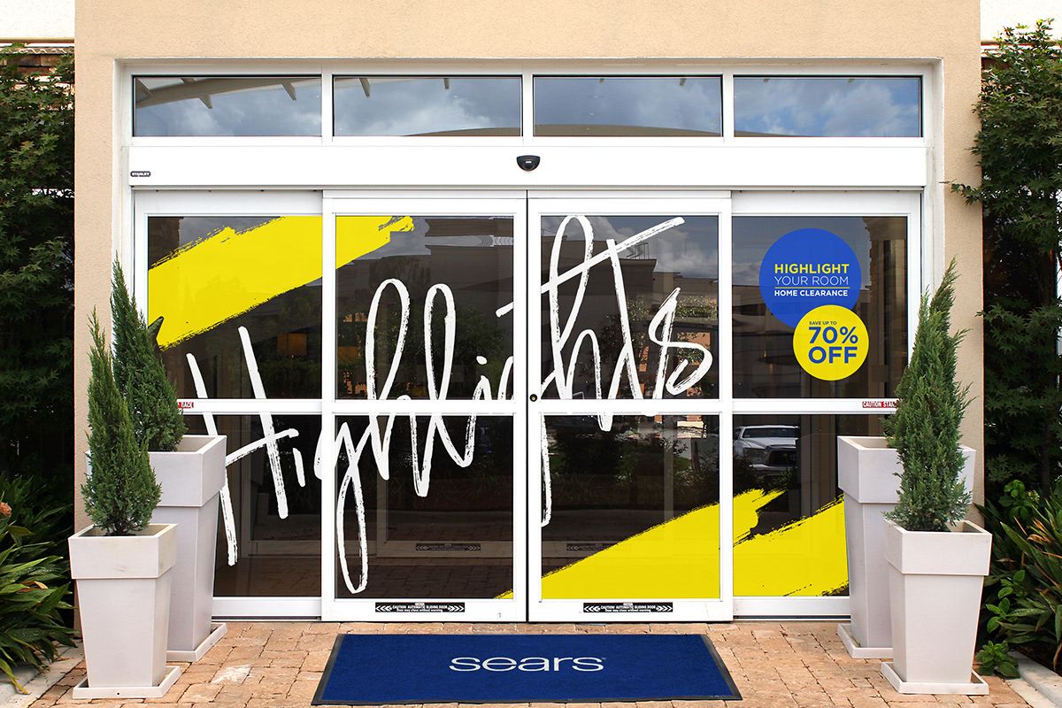
Concept 1: Highlights Sale
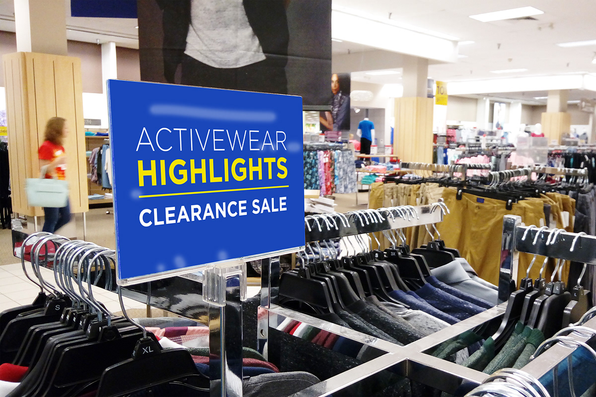
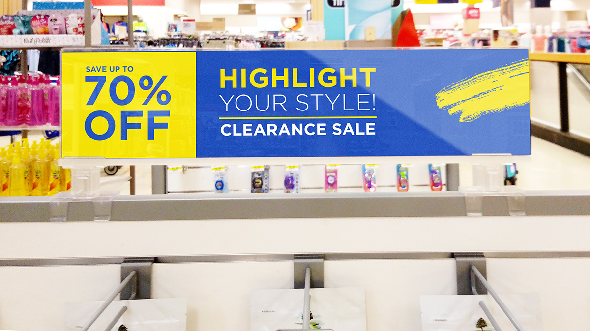
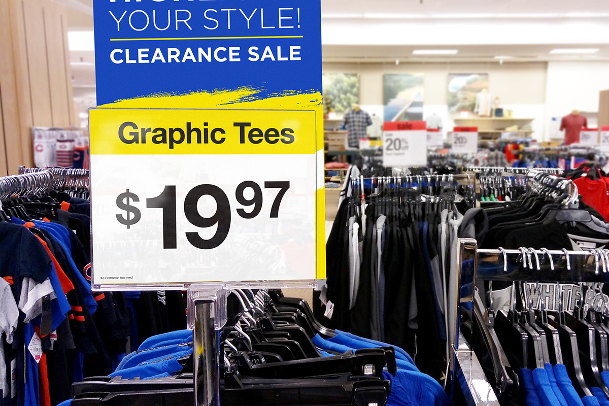
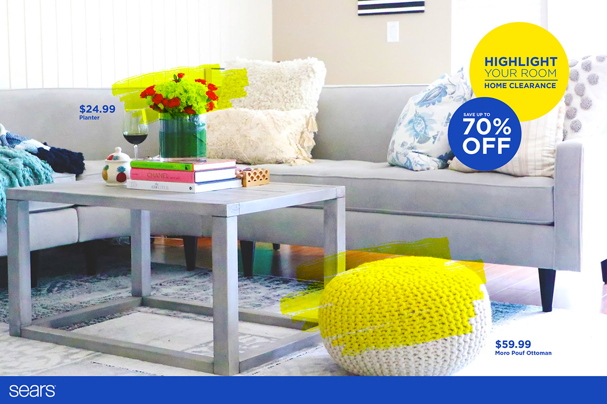
Based on the insight that products with low prices can be perceived as low-quality products, this concept aims to change that mindset by showing the clearance merchandise as the outstanding products of the season. Thus, the name "Highlights" was assigned to the clearance sale".
The language and visuals of the concept are inspired by highlighters used to draw attention to sections in a text. This visual inspiration also allows the concept to adapt itself to the preprinted price-signs.
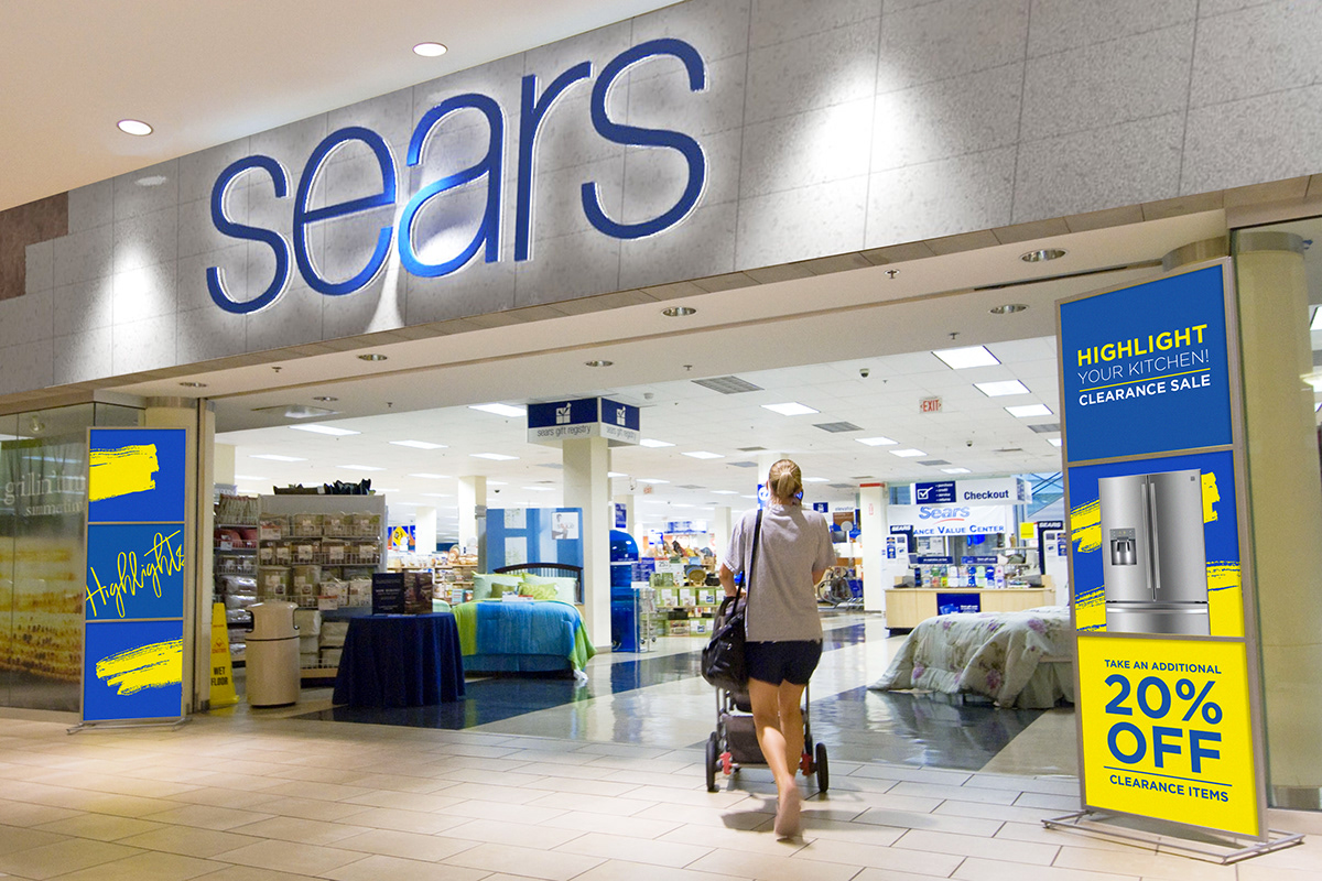
Speaking to the customer: copy
During the research it was found that encouraging messages make people buy more, thus, a flexible language was designed. The copy maintains the name of the 'clearance sale' using it as a verb to encourage customers, and as a noun to describe the merchandise that is on sale.
Elements working as a team.
The design needed to work in conjunction with the preprinted price signs, which are printed in stores and can only use basic typefaces. That is why the design of the signs has a highlighter mark in the center of the sign that is combined with the yellow strip of the preprinted cards.
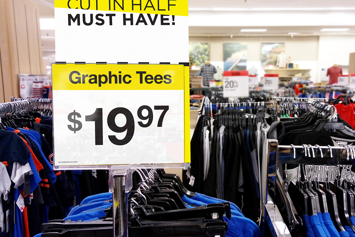
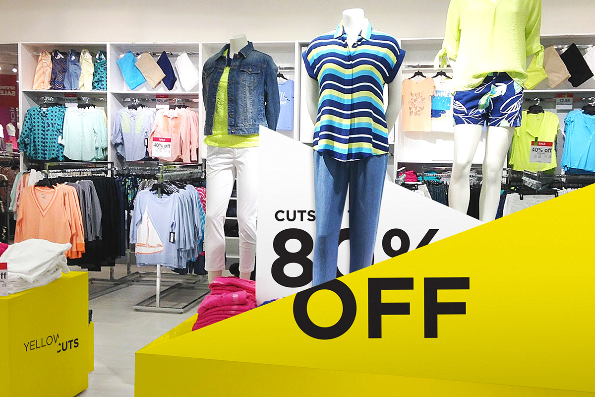
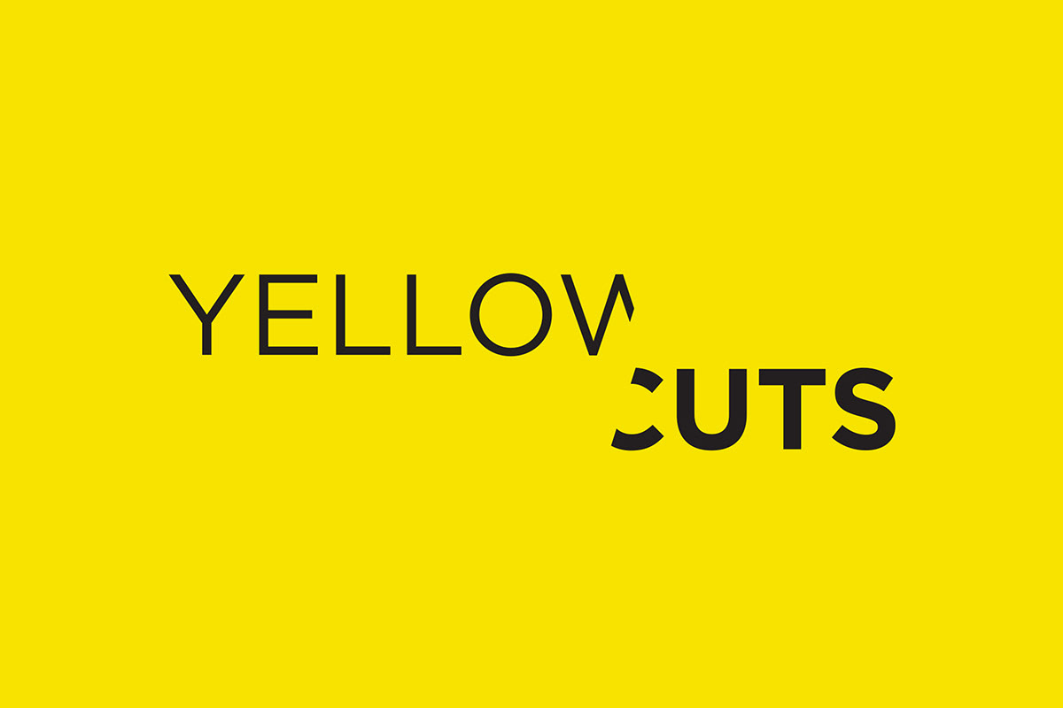
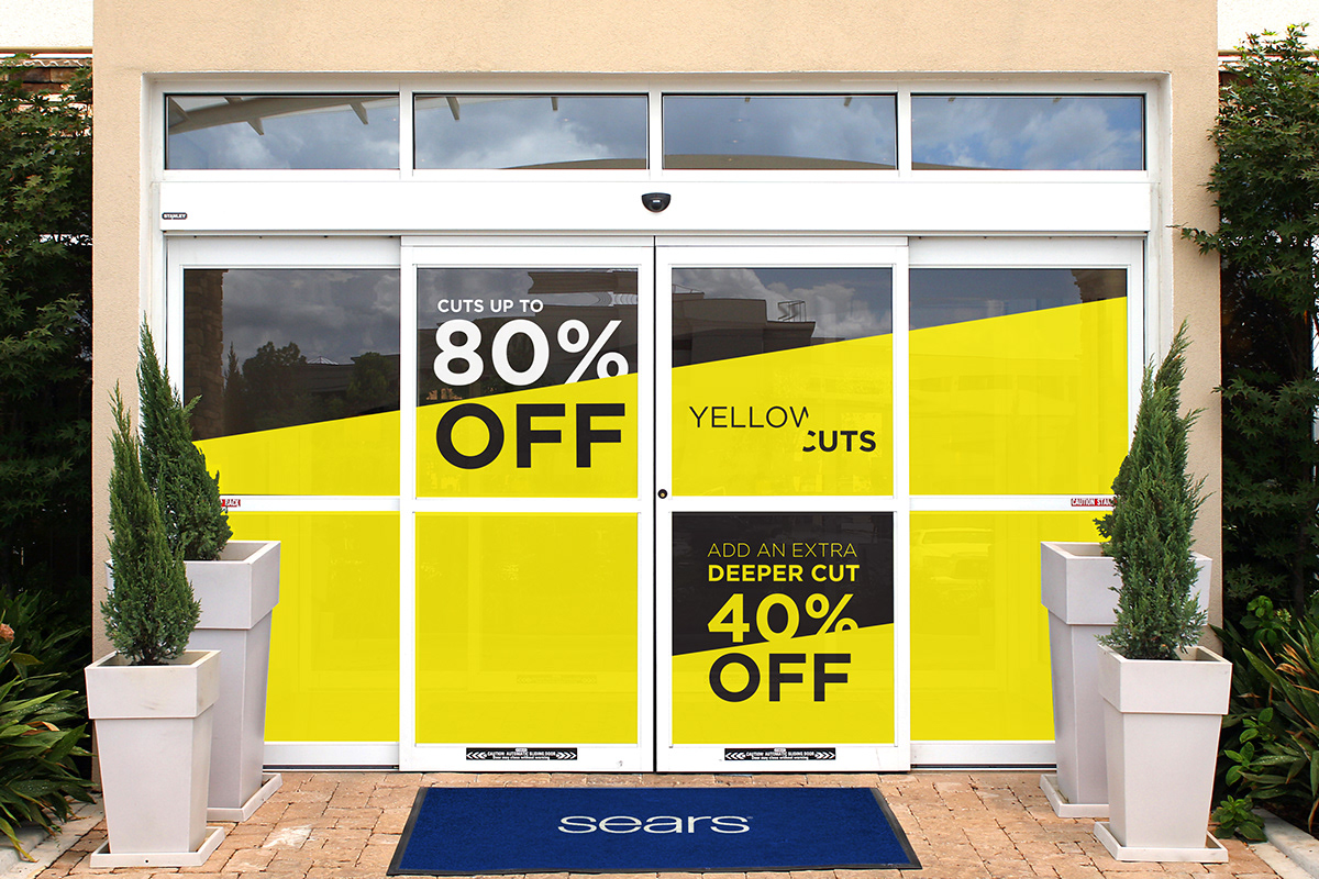
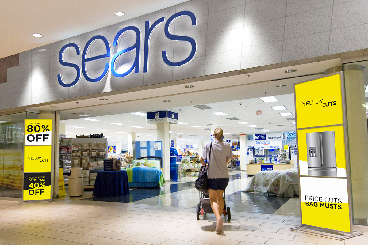
Concept 2: Yellow Cuts
Based on the insight that buyers focus on the money they are saving, this concept is based on the analogy of cutting prices.
Furthermore, taking advantage of the preprinted yellow price signs, this concept aims to establish and own the color yellow so people can relate the color scheme to the store and great deals.
Speaking to the customer
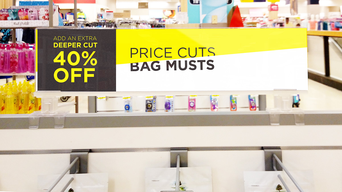
Similar to the 'Highlights' concept, this exploration also presents a unique language that plays with the idea of cutting. Phrases like "Price Cuts, Bag Musts" and "Cut in Half, Must Have" encourage customers to buy, while "Deeper Cut" indicates an extra discount on the merchandise.
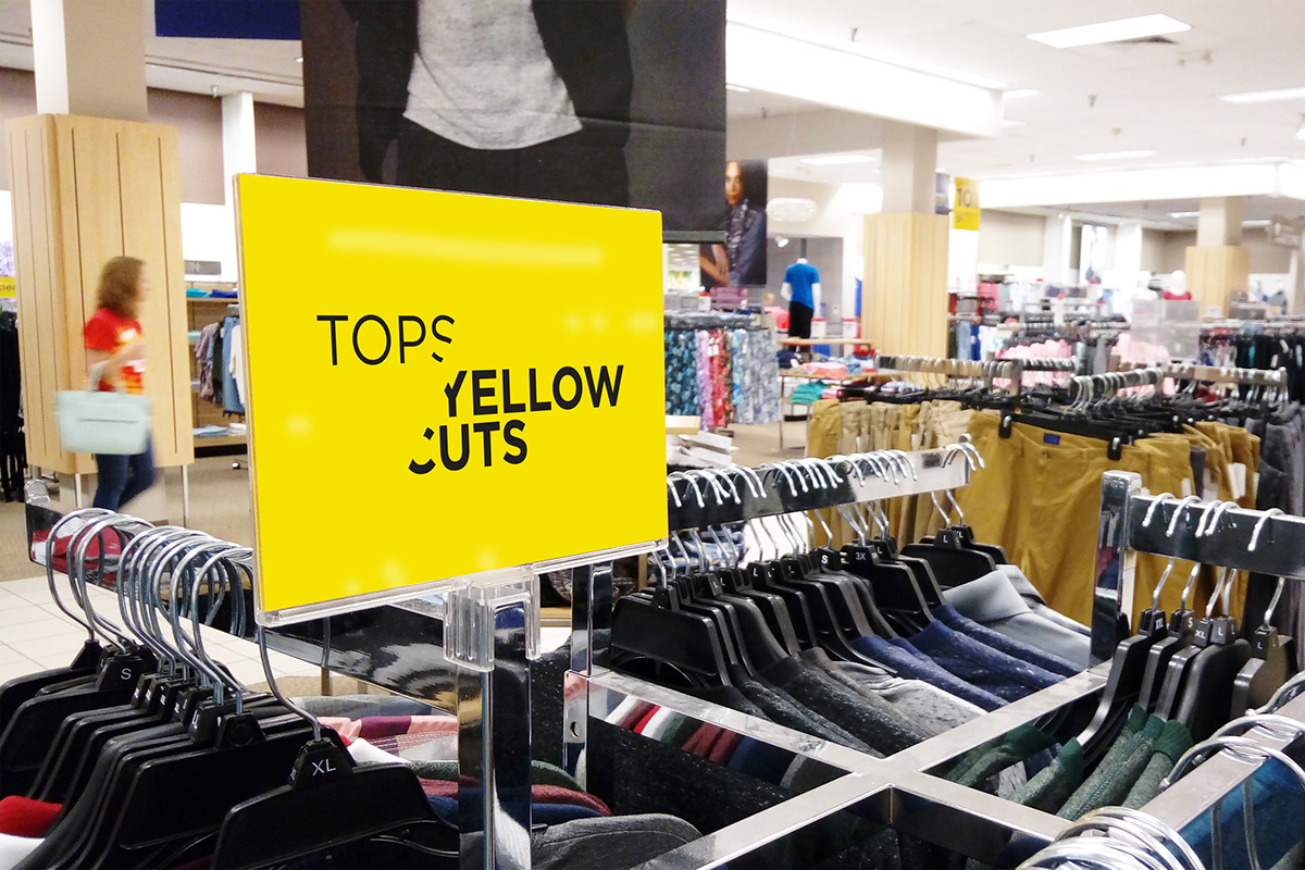
Elements working as a team.
As mentioned above, the preprinted price signs are printed in-store, therefore there cannot be a full design control over them. However, the new proposed signs are designed to interact with this cards by featuring a dashed line in the center that simulates a cutting line for the price