So I've been thinking about branding myself for a while. It was not an easy process and the result is not perfect, but I'm glad I get it done. “The world does not reward perfectionists. It rewards people who get things done” right?
Basically, the objectives are:
1. To create a sophisticated, reliable, confident yet friendly logo.
1. To create a sophisticated, reliable, confident yet friendly logo.
2. To make more people aware of my business in general and my website in particular.
The logo must be as simple and minimal as possible. Because I want to get my name out there, I choose to go with a logotype rather than a symbol/icon. And the logo must have my full name (aka my business name), because initial-based logotype is not for a startup. It's not friendly enough.
I tried many, many, many different fonts and finally found a good one.
The first one is the raw Delicious. The default letter spacing doesn't look good for me. For instance: look at that big gap between the "B" and "u", and the dots on the "i". I need something more compact, so I change the kerning and tracking to suit my own needs. I also made some changes to the "k", "r", "a" and u" as well. The second is my tweaked version.

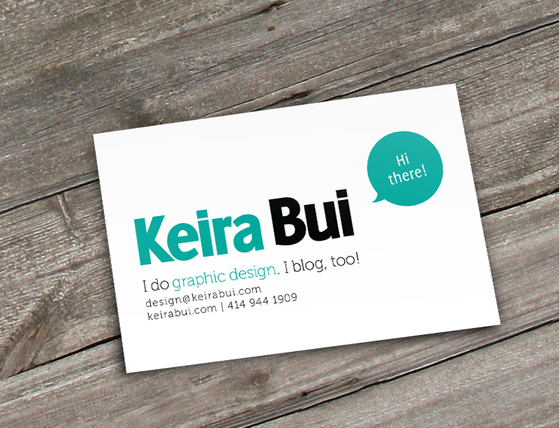
A welcoming, friendly business card.


Thanks for viewing :) I'll post a detailed process on my design blog later, stay tuned!
________________
________________


