


In 2017, we streamlined the Blackbaud brand at every customer touchpoint using font, color, illustration, and icon treatments. Blackbaud Sans, created in partnership with Monotype, embodies Blackbaud’s “geek-chic” brand personality and functions nicely in print, digital, and mobile applications. We simplified our corporate color palette and designed a new brand icon, the little b, for social media and space-inhibited uses. In addition, Blackbaud’s first-ever icon illustration style and icon library offer a unique branded look. These elements have been applied to corporate logos, product logotypes, app icons, and digital marketing efforts, resulting in a modern, cohesive, and recognizable brand.

Bespoke typeface, Blackbaud Sans

Custom channel lettering, Blackbaud World HQ

Secondary brand mark, Blackbaud World HQ
Print ad, digital ad, and email header design utilizing new color palette and typeface

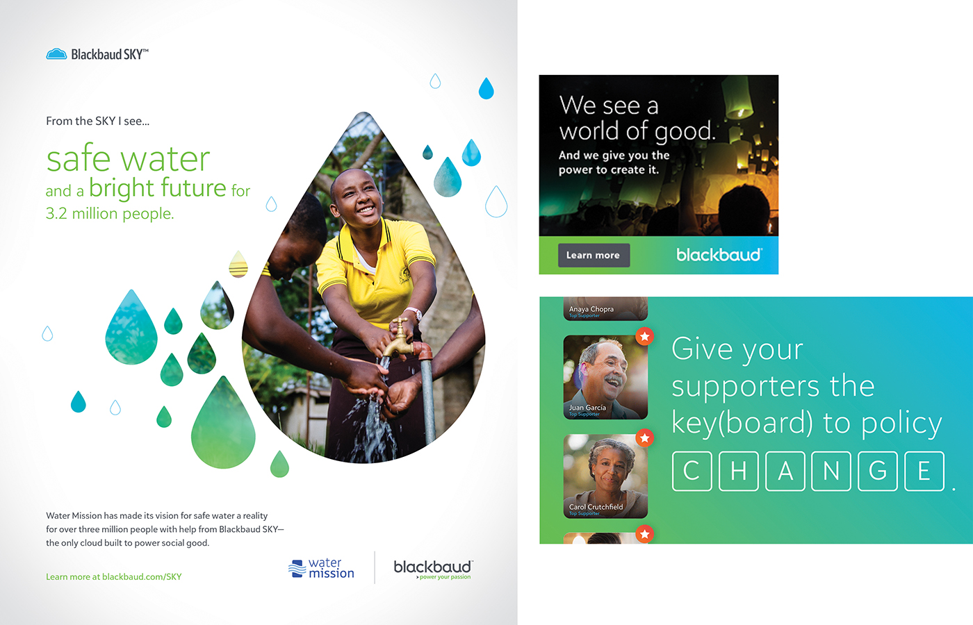
Corporate ad campaign utilizing new color palette and typeface

In-product UX using Blackbaud Sans

New secondary brand icon (pictured on T shirt)
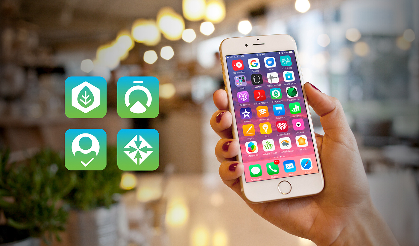

App Icons

Illustration style

Collateral template set

Collateral template: datasheet internal page details
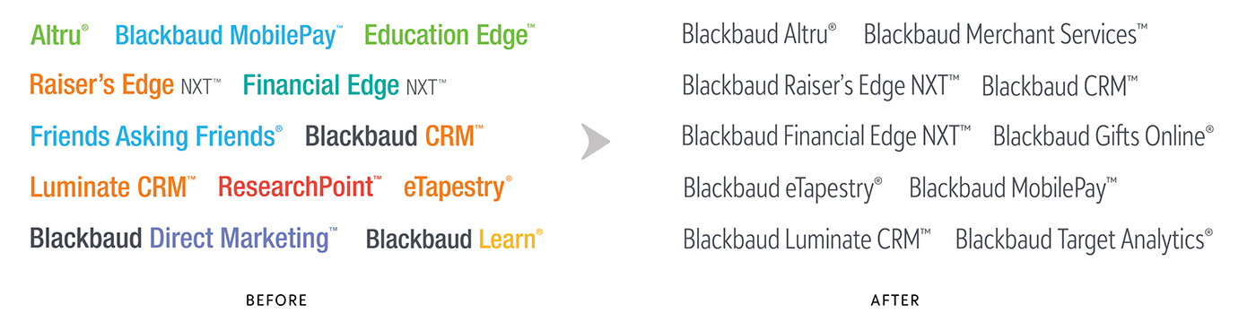
Product logos


