RADIKAL
typeface and product design
Radikal is a multi-tone, geometric, display typeface that was designed around a single question: "What would it look like if Emigre's Priori Acute and House Industries' United had a love child?" Radikal derives its name for the "radical" shifty feeling viewers usually get from staring at the face for too long.
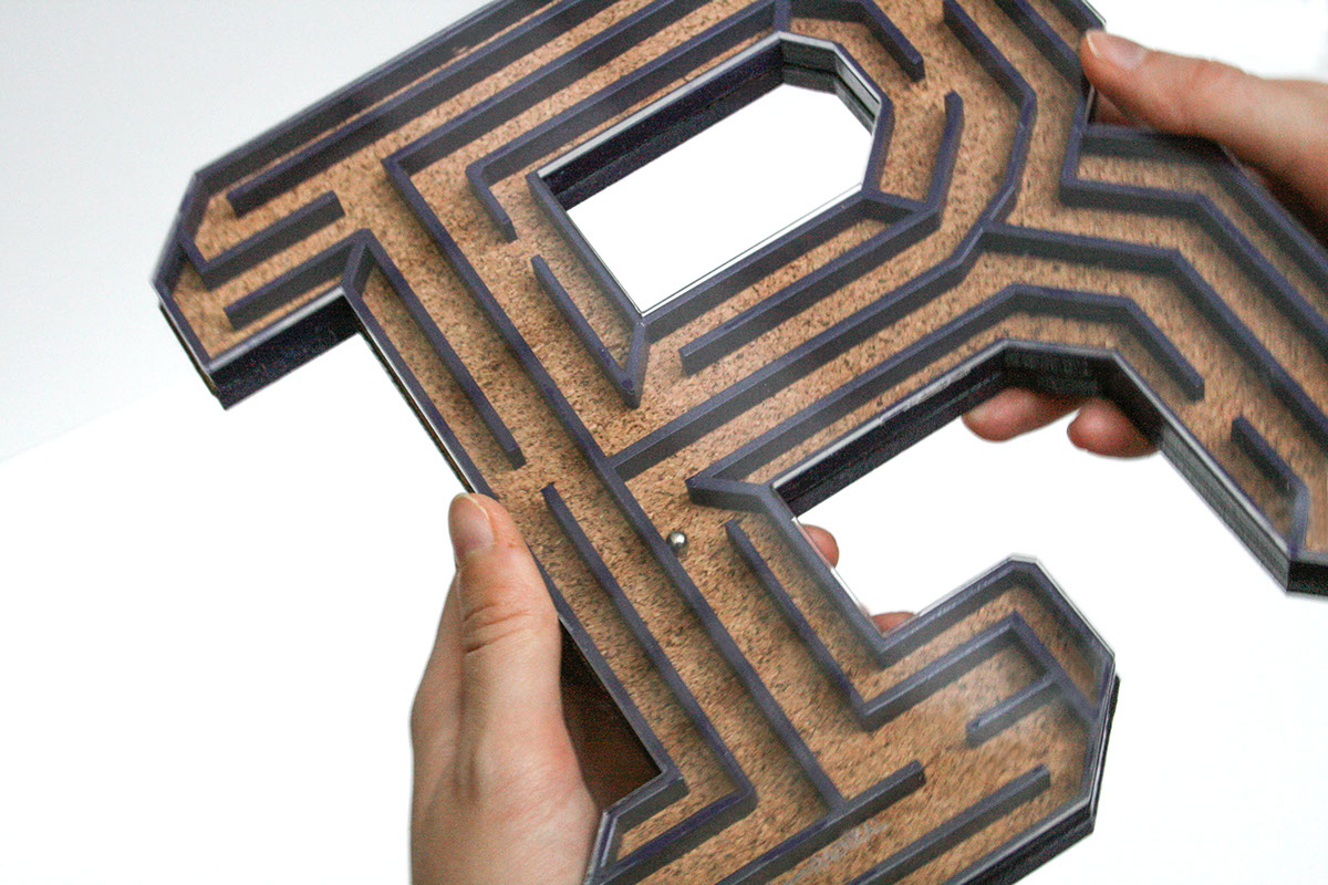
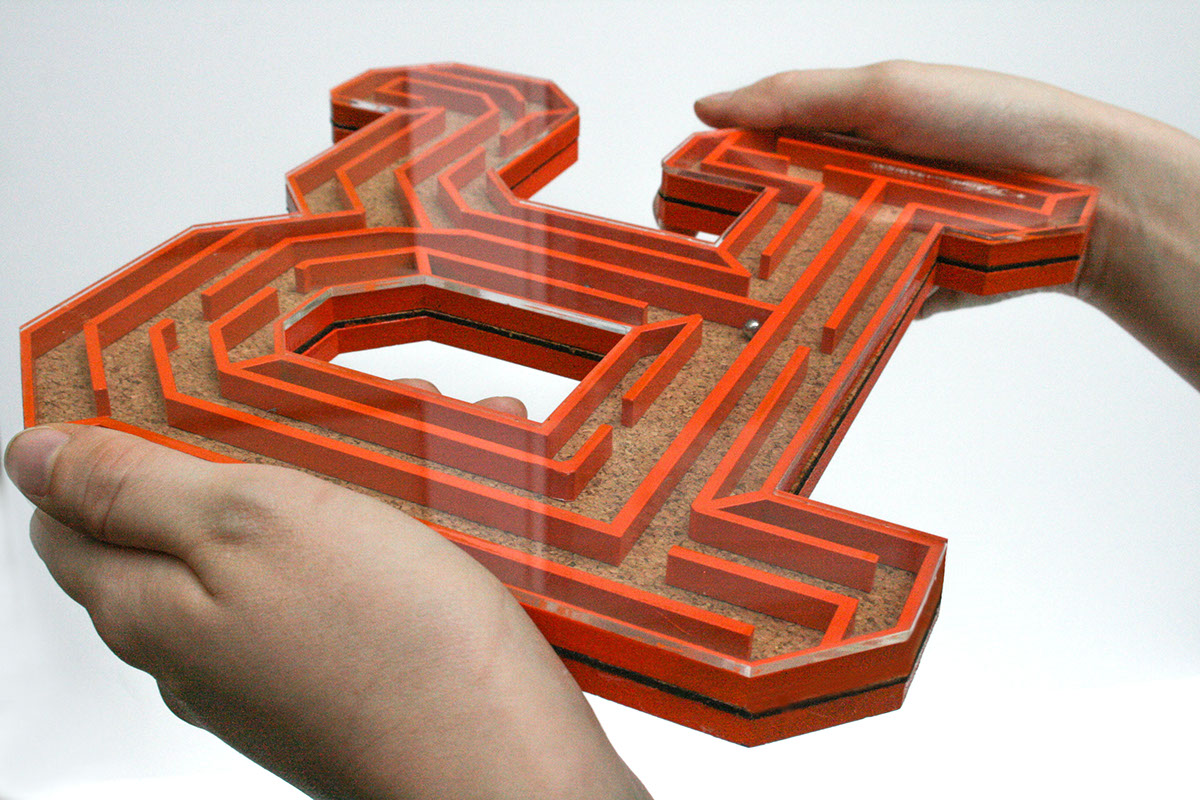
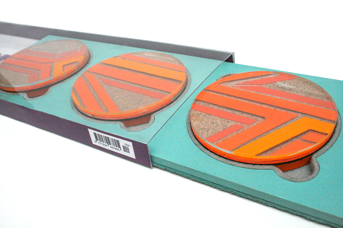
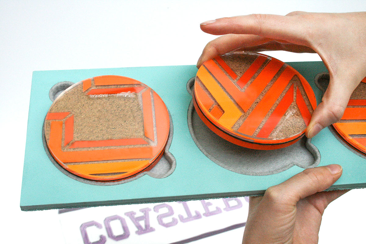
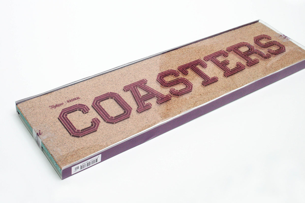
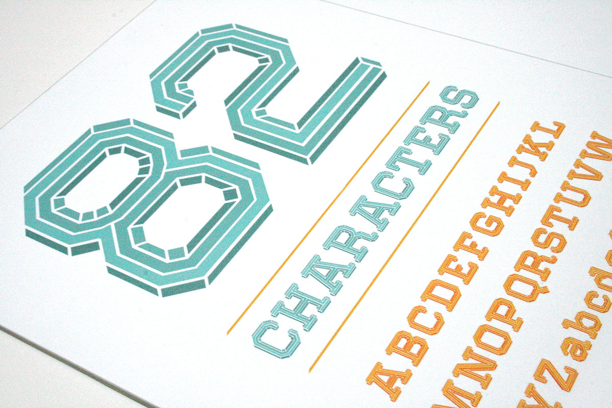
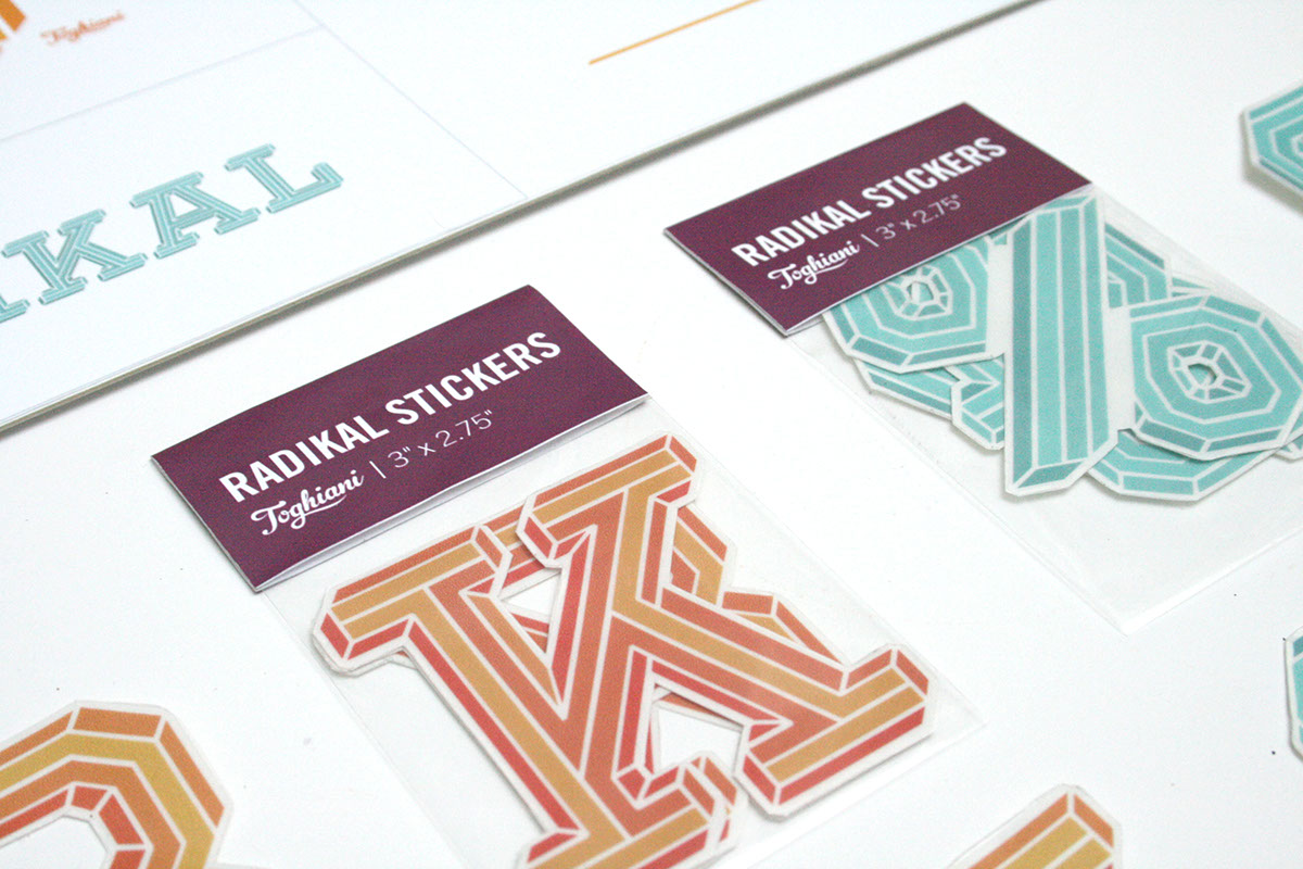
The typeface comes with 4 separate styles: Highlights, Mid-tones, Shadows, and Regular (a combination of all three), which gives the user the ability to make typographic color changes on the fly. In addition, I designed and assembled a series of products, packaging, and print pieces to help promote the typeface. These included a ball maze, coasters, stickers, and posters.
typeface and product design
Radikal is a multi-tone, geometric, display typeface that was designed around a single question: "What would it look like if Emigre's Priori Acute and House Industries' United had a love child?" Radikal derives its name for the "radical" shifty feeling viewers usually get from staring at the face for too long.
The typeface comes with 4 separate styles: Highlights, Mid-tones, Shadows, and Regular (a combination of all three), which gives the user the ability to make typographic color changes on the fly. In addition, I designed and assembled a series of products, packaging, and print pieces to help promote the typeface. These included a ball maze, coasters, stickers, and posters.