
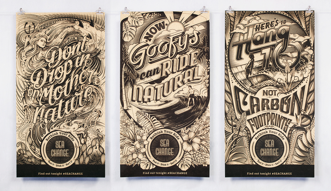
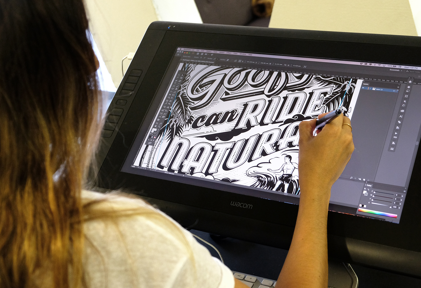
The brief was to illustrate posters to promote john McCarthy's eco-minded surf documentary "Sea Change" for the Wavescape Film Festivals held in Cape Town and Durban.
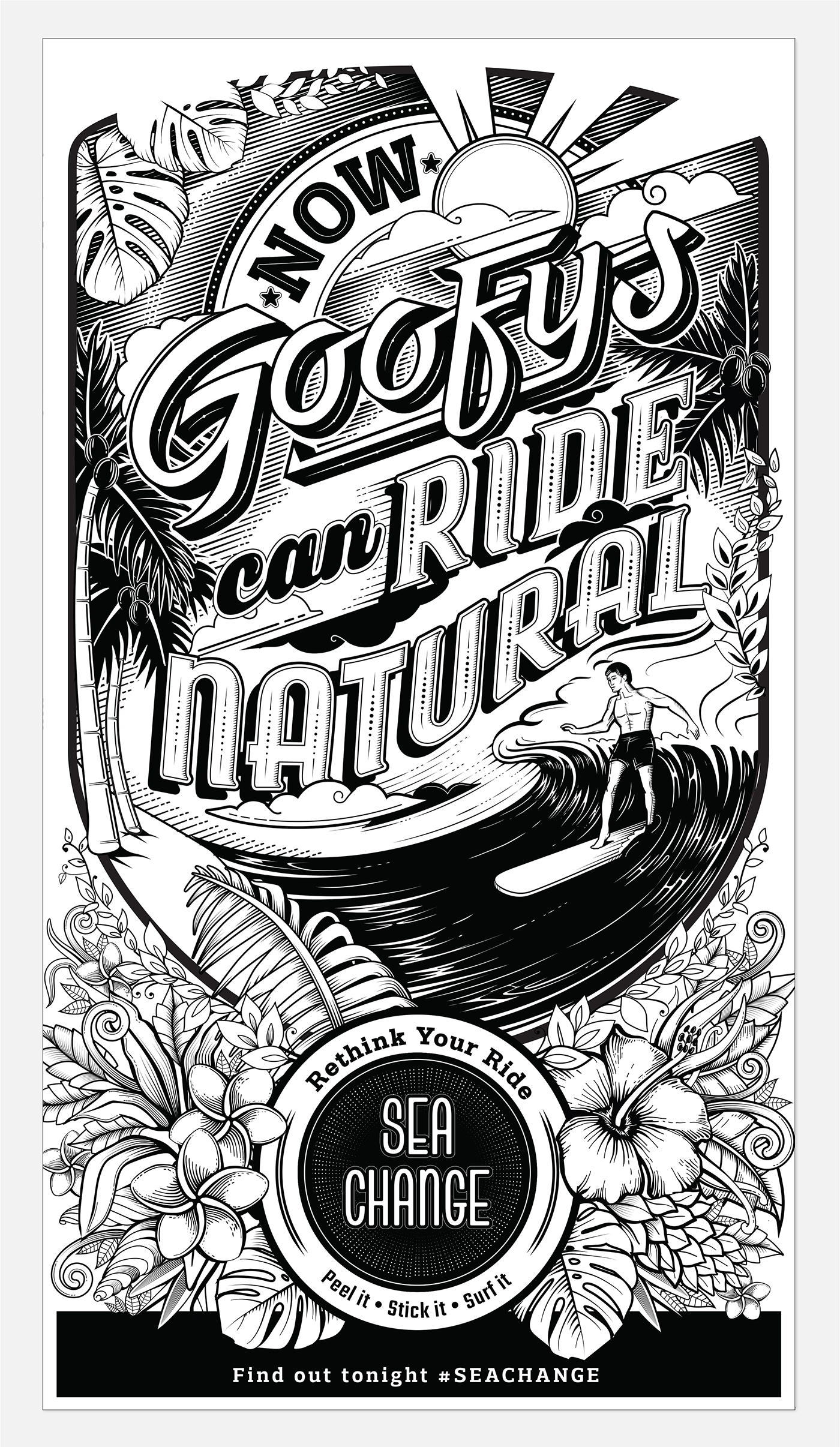
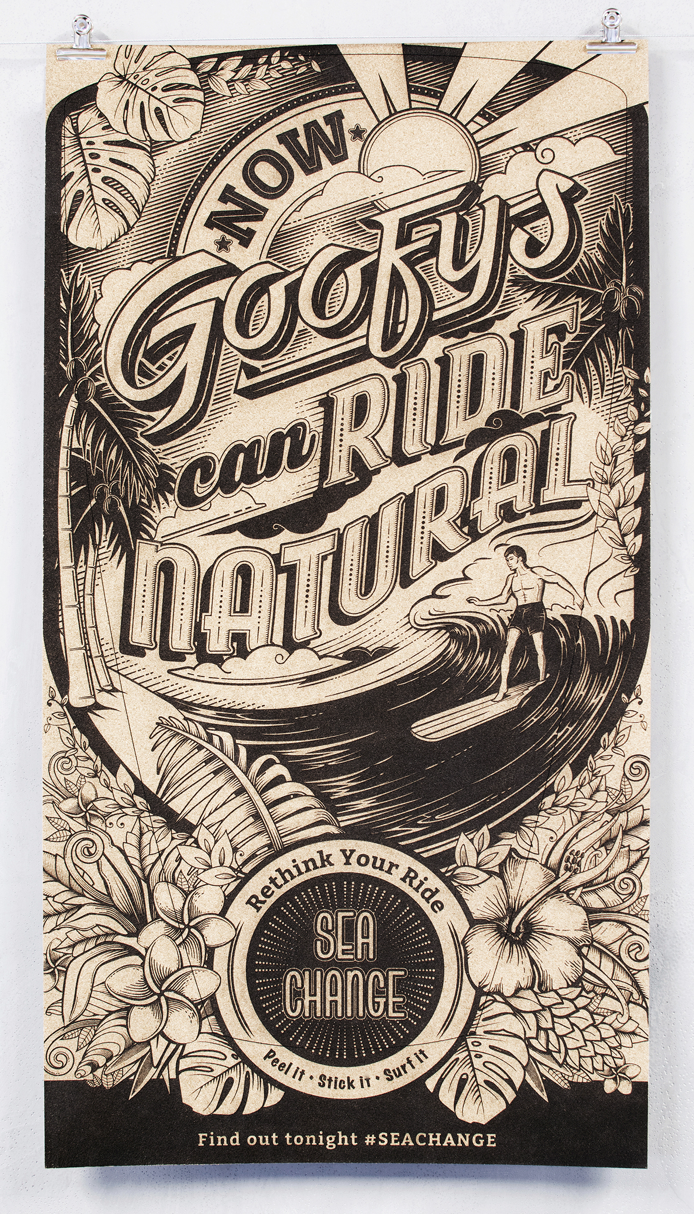
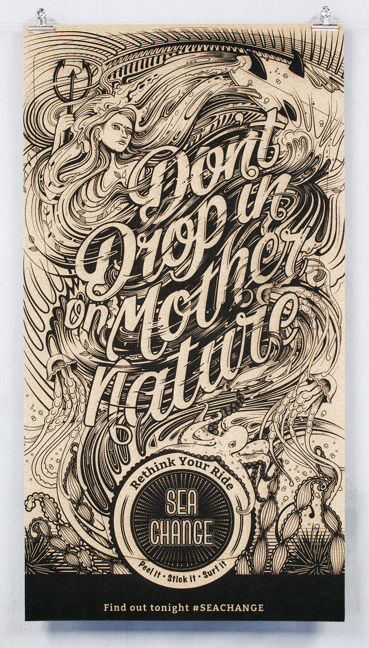
Paramount to the Sea Change brand is the commitment to empowering surfers with a greener, cleaner way of enjoying the natural sport of surfing. To spread this message we created a series of illustrated posters uniquely crafted to both inspire our message of sustainability, as well as enable festival goers with something they could physically use. The posters were lazer engraved into cork and doubled up as deck pads that could be peeled out and stuck onto a surfboard as an eco-friendly traction alternative. No wasted paper and no inks, meant no toxins.
3 x Bronze Loeries winner


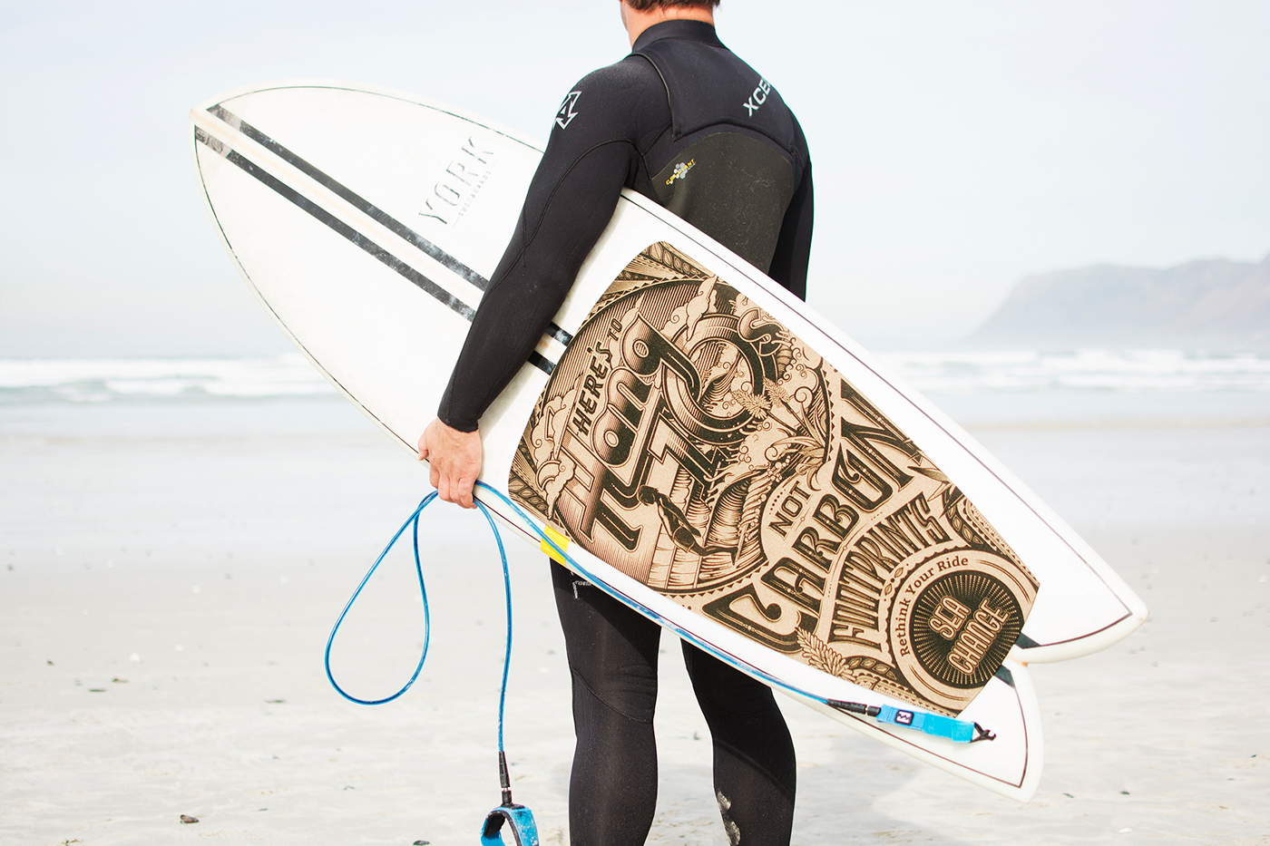
Deck-pad application

POSTER 1- Hawaiian Heritage
We used wordplay and surf vernacular to communicate the movement’s ideology. A surfer is either goofy or natural, depending on which foot leads when surfing. Our headline implies that even goofy riders can change their ‘stance’ to natural, by choosing equipment made from sustainable materials. The illustration style pays tribute to the birthplace of surfing – Hawaii. The earliest surfboard, the traditional Hawaiian Alaia, inspired Sea Change to revisit the use of natural materials. The duality of the posters meant that every time a surfer took to the water, our message of sustainability was reinforced - giving them the opportunity to ride with a clear conscience


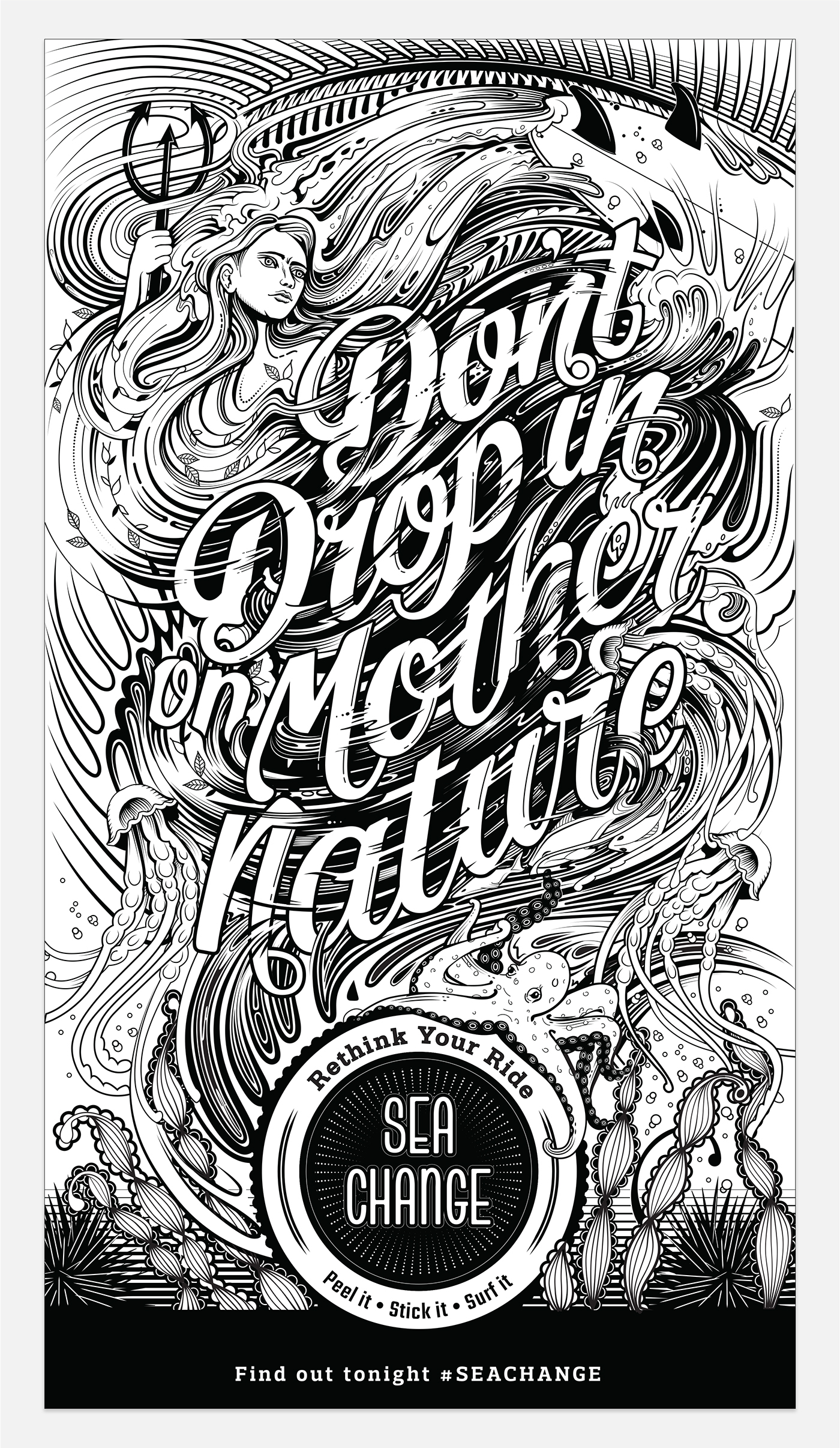
POSTER 2- Balance
To ‘drop in’ is to disrespect a fellow surfer by taking off on a wave which they are already riding. ‘Dropping in’ on Mother Nature is treating the earth with a lack of consideration by not riding sustainably.
The illustration work is inspired by the balance and fluidity of nature. The lettering has a flowing quality, while the depiction of Mother Nature is bold and powerful, portraying her as a protective force. The elements come together to create balance.


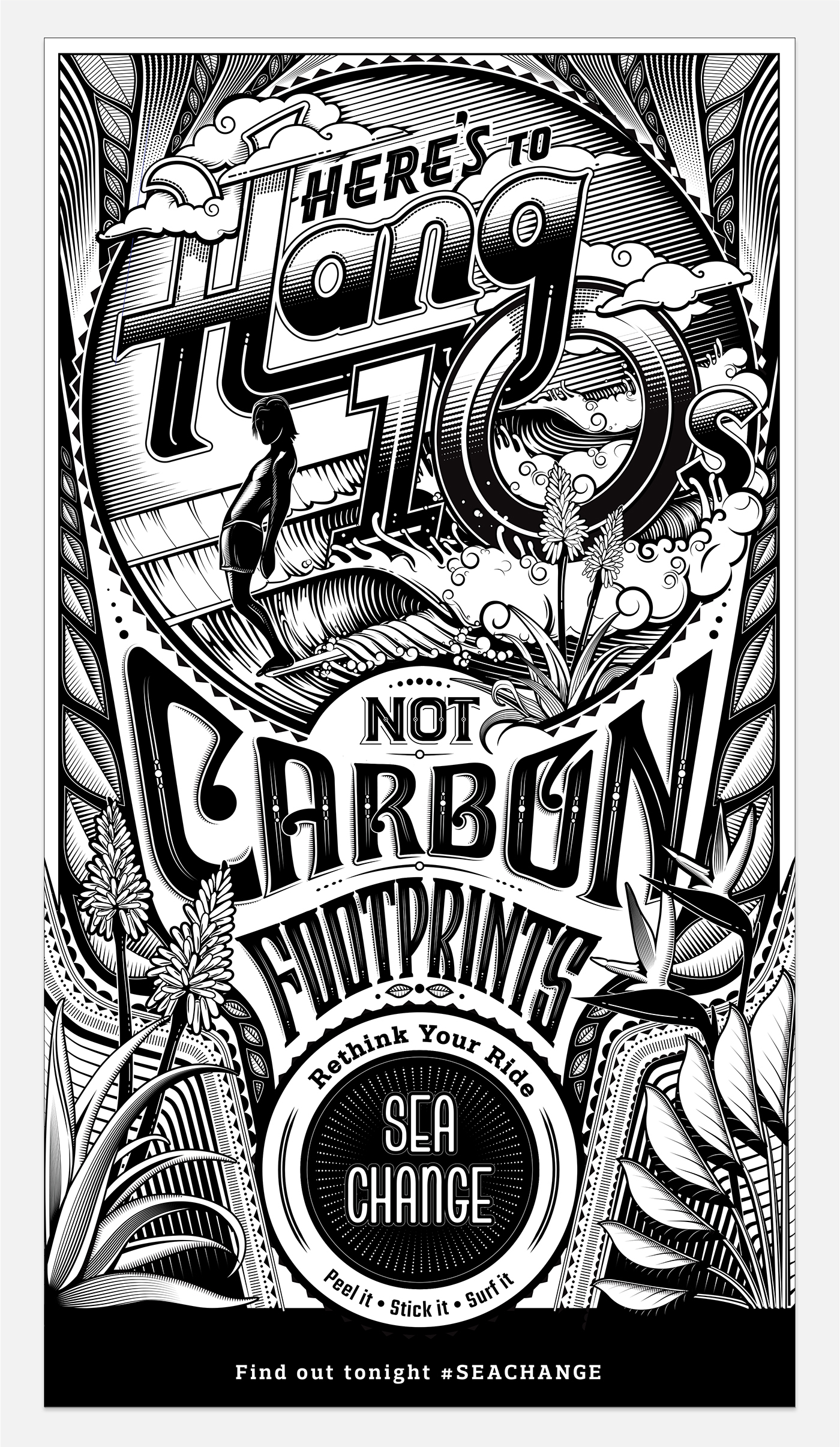
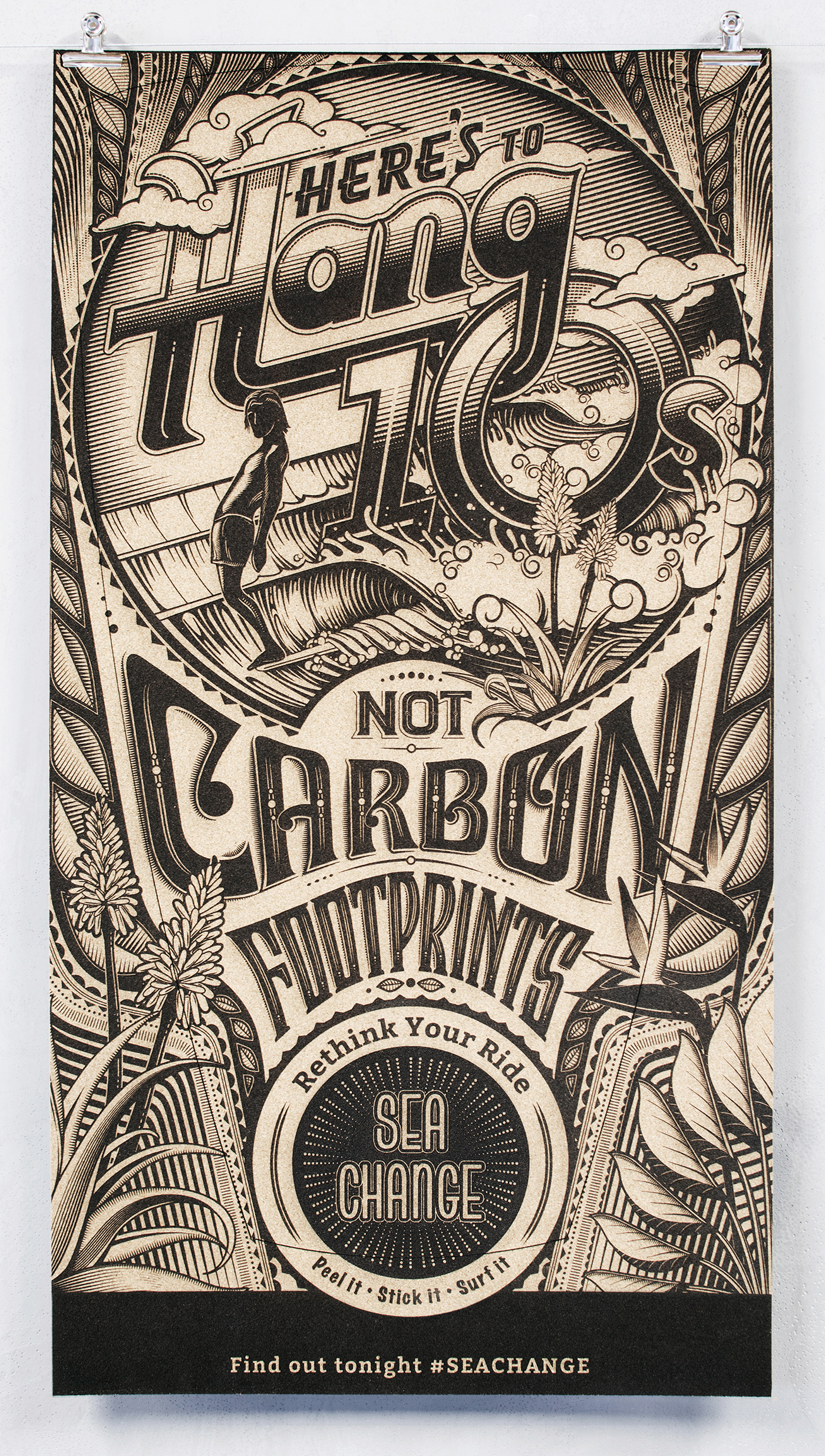
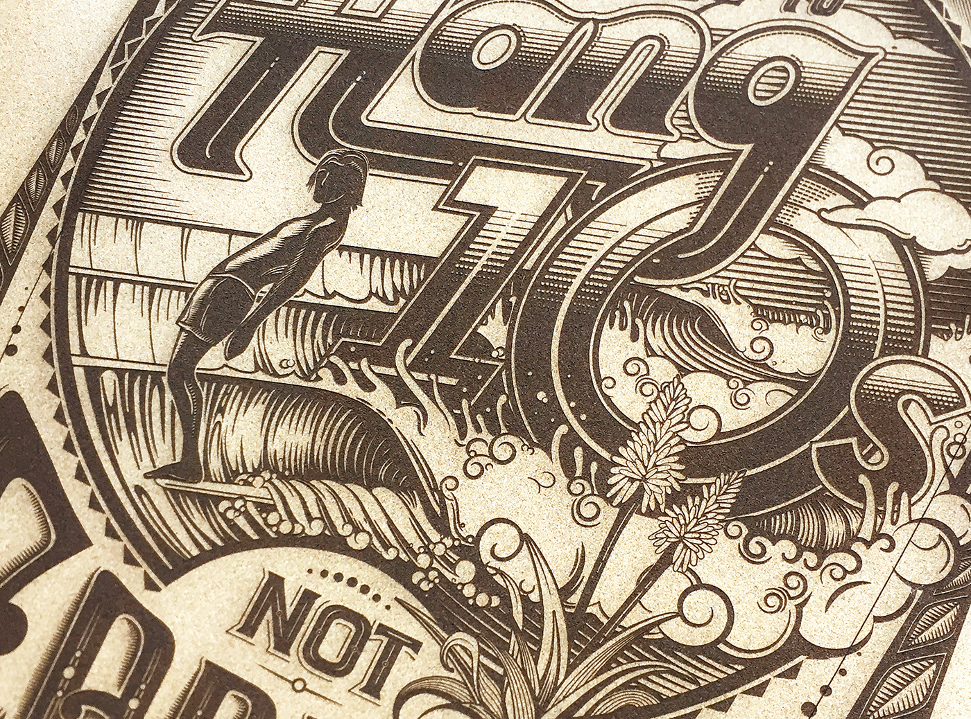
POSTER 3- The Golden Age
A ‘hang ten’ is a retro surf move that involves walking to the front of a longboard and hanging all ten toes over the nose of the board. We juxtaposed the lingo with the common environmental term, ‘carbon footprint’ to get surfer’s to rethink where they place their feet.
The illustration is inspired by the retro surf style of the 60s. This era is often referred to as the golden age of surfing. The lettering is reminiscent of the typography used on surf posters of the time; featuring curved, bowing letters. Circular holding shapes and psychedelic patterning are framed by the iconic aloes of Jefferys Bay, giving the design South African context.


THANK YOU
CREDITS:
Client - John McCarthy
Brand - Sea Change
Short Film Production - Like Giants
Agency: Bittersuite Communications
Executive Creative Director - Andrew Hofmeyr
Creative Director - Dani Loureiro
Illustrator - Dani Loureiro
Art Director - Conn Bertish
Art Director - Derick Botha
Copywriter - Conn Bertish
Producer - Jason de Wet
Account Manager - Lori Cape


