
"Marianie" Self Branding

Overall branding materials: Folder, Cover Letter, Envelope, Business Card


We were asked to make our own personal branding in PORTFOLIO class which includes a folder, envelope, cover letter, business card and resume. Our branding identity had to be unique and true to ourselves. What best represents me? The color pink of course!
Other than my obsession for pink, I doodled text balloons. It represents my love for comics and how I always want to speak out with my ideas or designs. I merged the two in a quirky way but maintained a simple and clean look.
1.) ARTIST NAME & LOGO


"Marianie" is my screen name as an artist since 2015. I used it for my facebook page where my art grew and was recognized. It' actually a nickname my dad calls me (although technically longer than my real name?) so it grew on me.
I used my own handwriting for a creative and authentic feel. The base is a simple text balloon with a curved tail for additional quirk. The logo is designed to be versatile in order to be printed or put easily on any collateral.
2.) FONTS & PALETTE
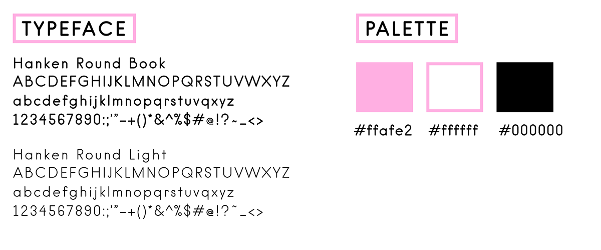
I used the font Hanken Round by Alfredo Marco Pradil for a clean and simple look. I also chose it because of its round ends. For the color palette, well, pink.
3.) BUSINESS CARD


The front of the business card is simply my logo over pink and text balloons occupying all the space. I wanted to keep it straightforward as my name stands out in black. The back of the card is a mini comic that illustrates how to contact me. I want to instantly show my passion for comics and illustration in my card. It also serves as a short demo of my skills.
4.) FOLDER, ENVELOPE & COVER LETTER


For the folder and envelope, I made it purely pink to enforce my branding as the logo pops out. I prefer zero dead space so filled it with hand drawn text balloons of different shapes.

"You have mail" text on the back for a fun and quirky appeal.

The back and front edges are filled with balloons to further instill branding.
That's it for now! You can check out more of my personal works in my facebook art page here. My website and portfolio is under construction but will keep you posted!
Thank you! :D


