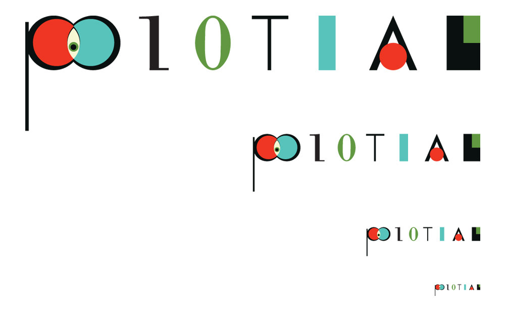
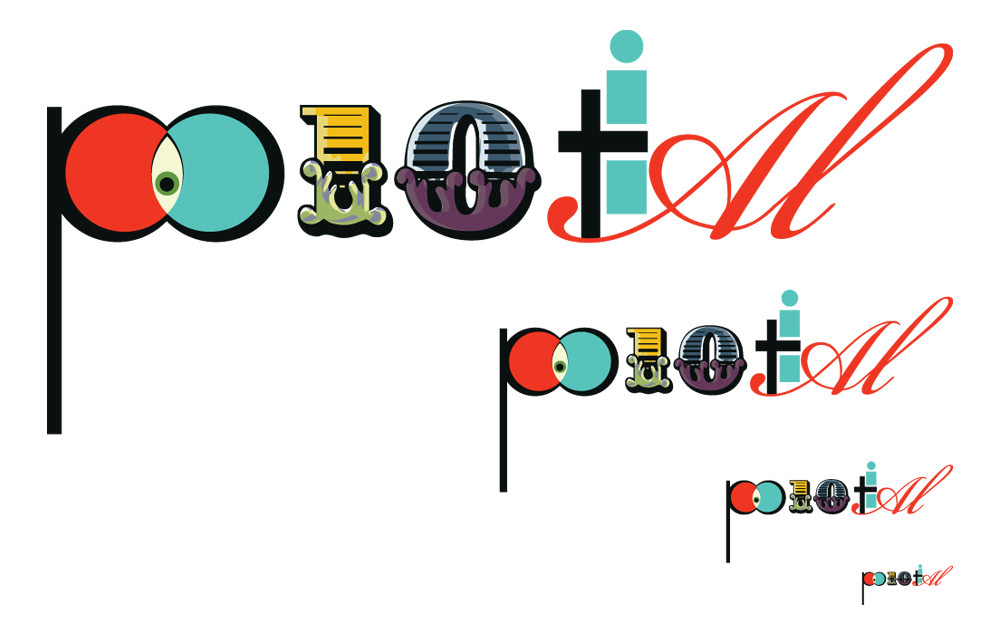
Po10tial Branding
it all starts with the po
it all starts with the po
Beginning with the sacred geometry of a Vesica Pisces, I wanted the mark to be a ligature, a representation of the coming together of multiple ideas. I also wanted it to be representative of a visually-centered take on the local arts community. The marque also needed to be something completely unique in the community. Abstraction would make the mark memorable, but also adaptable as seen in the illustrative posters. I also developed an historically-inspired mark for promotional purposes. The mast for the magazine would be more geometric. Color would emphasize both the diversity of the city of Pensacola as well as the fact that we were working digitally.