Ill Pictures
for the marque
for the marque
Though the illustrations shown are studies, the picture-making process started with the question, what makes a city? And if the city were to have an arts magazine, how would it look? There's texture, richness in color, pattern, and characters to give the magazine 'a face' if you will. Making the brand playful and approachable, but also visually dynamic and unique in the visual landscape of Pensacola were all of concern. Eventually, these studies would be further developed into a more refined color palette as well as actual covers.
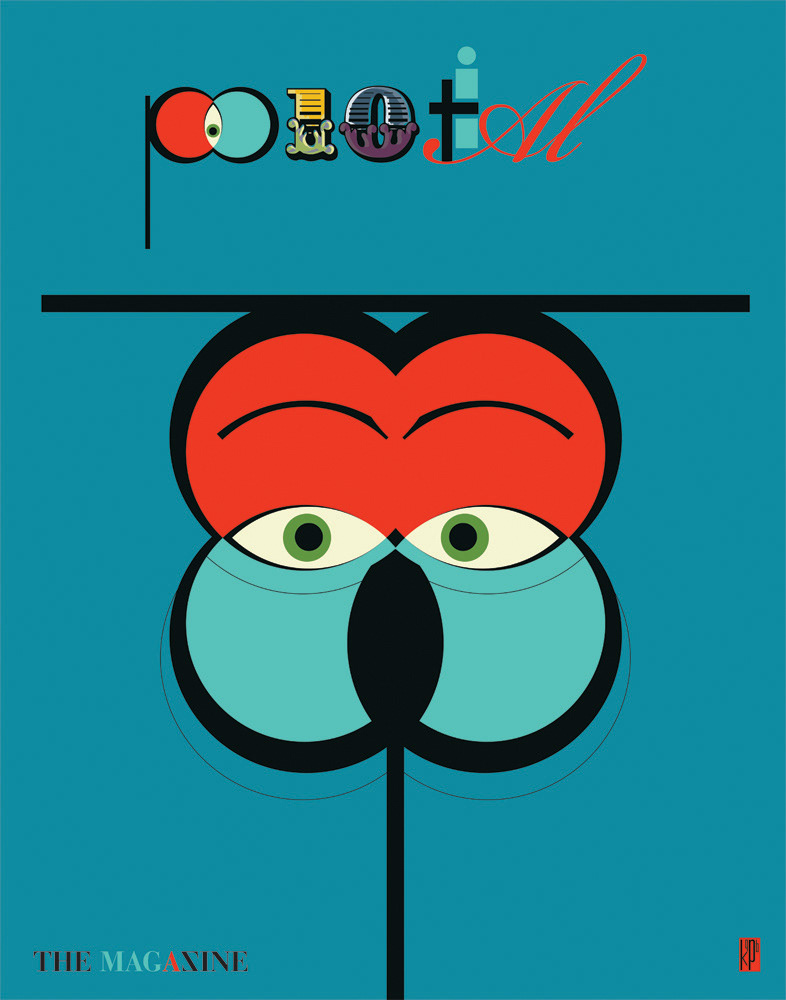
No fear of using the brand as an illustrative form.
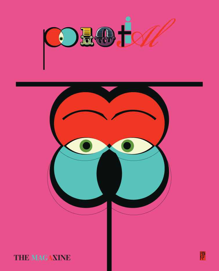

The elements of the brand may also be picked apart for the sake of creating texture, etc.
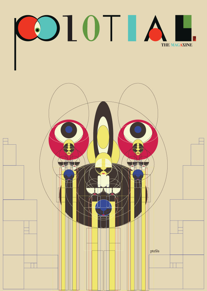
Gulf Breeze, Florida is known as one of the world's UFO hotspots, just outside of Pensacola, FL.
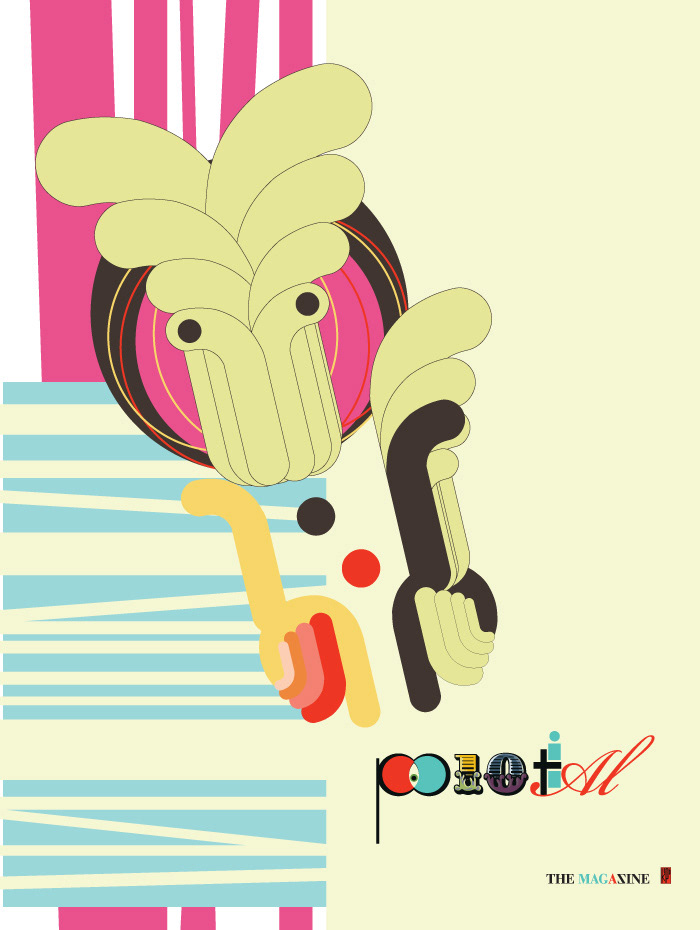
Idea for an abstract form that would point to the brand, a type of character that might be seen around the city in different forms, colors, venues, times of day.

It's all about communication.

Much of Pensacola is a Christian town, but they also have an affinity for Rastafari culture.

Collage sketch. Note the use of the triangles throughout these works...

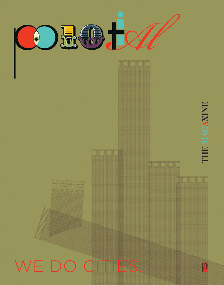
Though there are no skyscrapers in Pensacola, there is much Patriotism. We are still a people united by the same shared space and our own unique architecture.

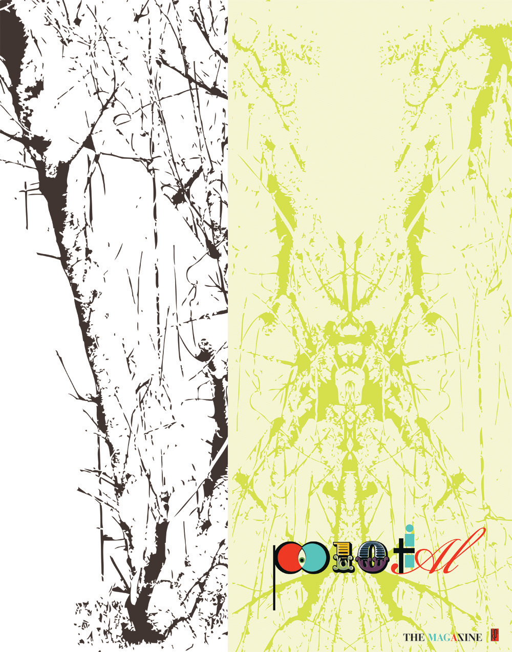
Nature references should abound.
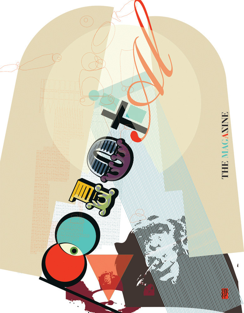
At the end of the campaign, we wanted to have a series printed that collected all of the different strategies and tactics into one frame.

