

The Story behind Cinema Roxy
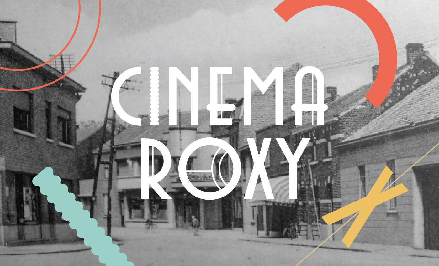
The little village of Wijgmaal (Leuven) used to have three cinemas to accommodate the workers of the local Remy factory. Cinema Roxy was one of those beautiful cinemas and was built in between the 1930's and the 1960's. Nowadays, it is a home to four families who cherish the history of the building and re-use the name Cinema Roxy to host living-room music concerts every once in a while. As one of the Cinema Roxy residents, I got involved by designing a logo and poster template and drew inspiration from the old building's features and color palette.


Using the features of the Cinema Roxy building
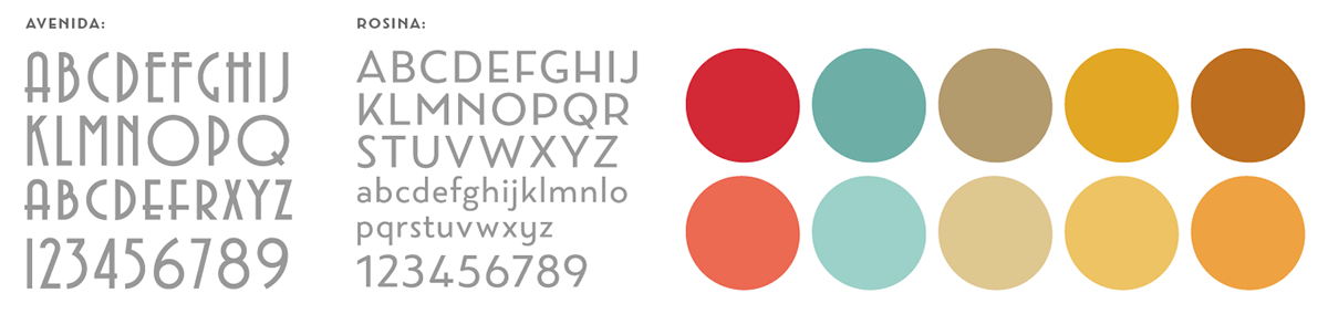
As a starting point, I took detailed pictures of all the features of the building. (see below) Its curvy lines, ribbed tiling, glass window motifs and color palette became the main inspiration for the logo. The Art Deco inspired typeface Avenida, created by architect and designer John Chippindale, holds the same curves, circles and straight lines as the cinema's glass window motif and very much resembles the style of the building.


Building the logo
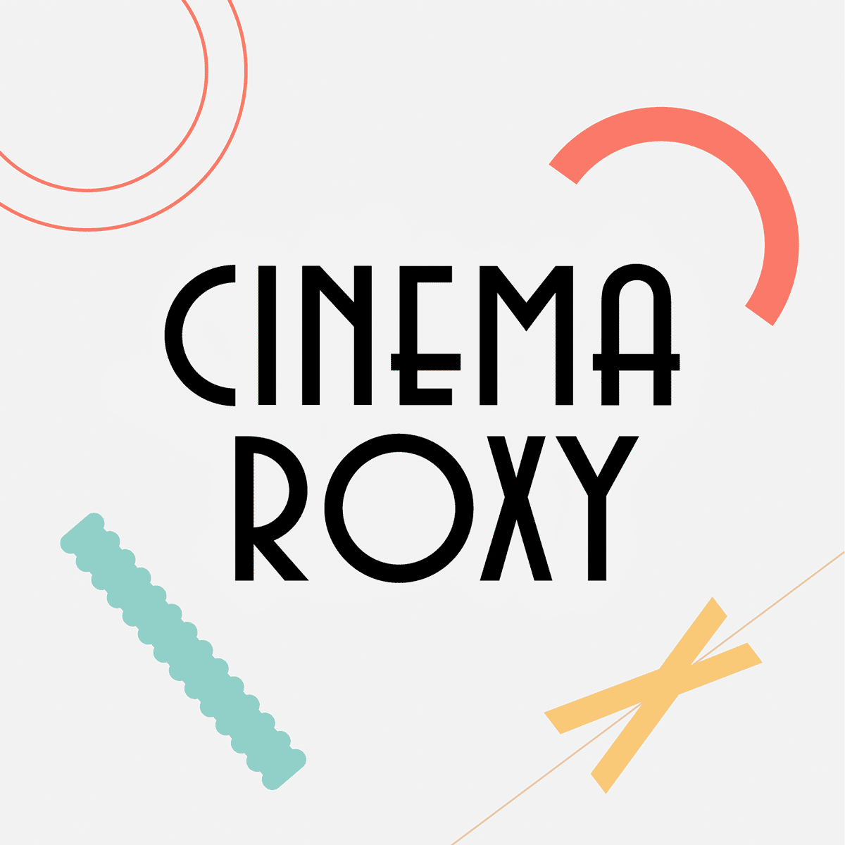
The starting point for the logotype is Avenida, an Art Deco inspired typeface that holds the same curves, circles and straight lines as the cinema's glass window motif and very much resembles the style of the building. By adding features of the building to the logotype, the final logo was formed: the bubbly column near the cinema's main entrance serves as the letter 'i', the vertical lines of the glass windows are incorporated into the letters E, A and R, the horizontal strokes of the E and A are rounded to closely resemble the building's curves and the O contains part of the glass window motif.
Posters
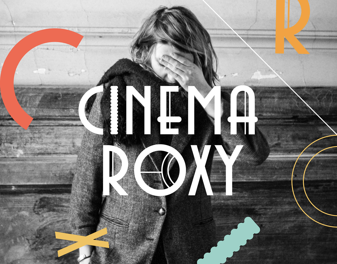
For the Cinema Roxy announcement posters, I designed a flexible template. The logo is positioned at the lower right-hand corner, the exit point of the viewer's eye. Parts of the logo are used as graphical elements that are placed on top and interact with the portrait image of the musician(s). The typeface used for the headlines is called Rosina which resembles some of Avenida's features and forms a great pair. Below are the poster designs for the gigs by Julia Kent and Roosbeef. The beautiful portrait of Julia Kent is made by PEPE fotografia, the portrait of Roosbeef was taken by Elisabeth Van Lierop.


Adobe Live
Part of the Cinema Roxy brand identity was created during my appearance on adobelive.com, recorded live from Paris on May 9th, 2017. Click on the replay video below to see exactly how I designed the logo and posters, what my thought process was and what elements inspired my design.


Click the play button to see a replay of Adobe Live, recorded live from Paris on May 9th 2017


