

The type book is designed as a response to my typographic studies based in the US, compared to my earlier studies in mainland China, western typography shows its distinction from Chinese characters in many ways, thus thrusting me to compose a book on my understanding of Western typography, as the name indicates—rethinking typography.
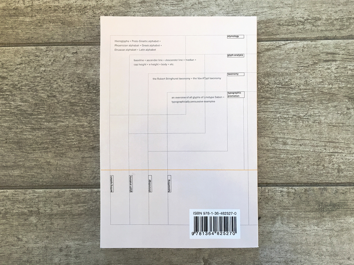
The cover of the book is designed via the matrix of the four major phases of the typographical evolution throughout histories—from the etymology of writing system till the epoch of handwriting, to the time when typesetting was invented, and ultimately reaches the heyday of digital type. On another note, each of the four phases can be explained further by specific typographic nomenclature that constitutes different chapters in the book.
The cover of the book is designed via the matrix of the four major phases of the typographical evolution throughout histories—from the etymology of writing system till the epoch of handwriting, to the time when typesetting was invented, and ultimately reaches the heyday of digital type. On another note, each of the four phases can be explained further by specific typographic nomenclature that constitutes different chapters in the book.


The source of the text: Professor Zoran Belić, Editor: Sihan Wu, Book designer: Sihan Wu, Primary typefaces: Sabon, designed by Jan Tschichold; Scala, designed by Martin Majoor; Scala Sans, designed by Martin Majoor. Photo credits: © 2014 Nicole Franzen, from www.flickr.com, used with permission, Public domain image, available at www.peta.org, © 2011 Glenn Banks, from www.flickr.com, used with permission.


