Real Simple is a bimonthly women’s interest magazine that is dedicated to showcasing DIY projects and helps to provide smart, realistic solutions to everyday problems in a layout that is clean and uncluttered. In order to capture the magazine’s clean layout, it was redesigned through an exploration of identity, type, and layout.
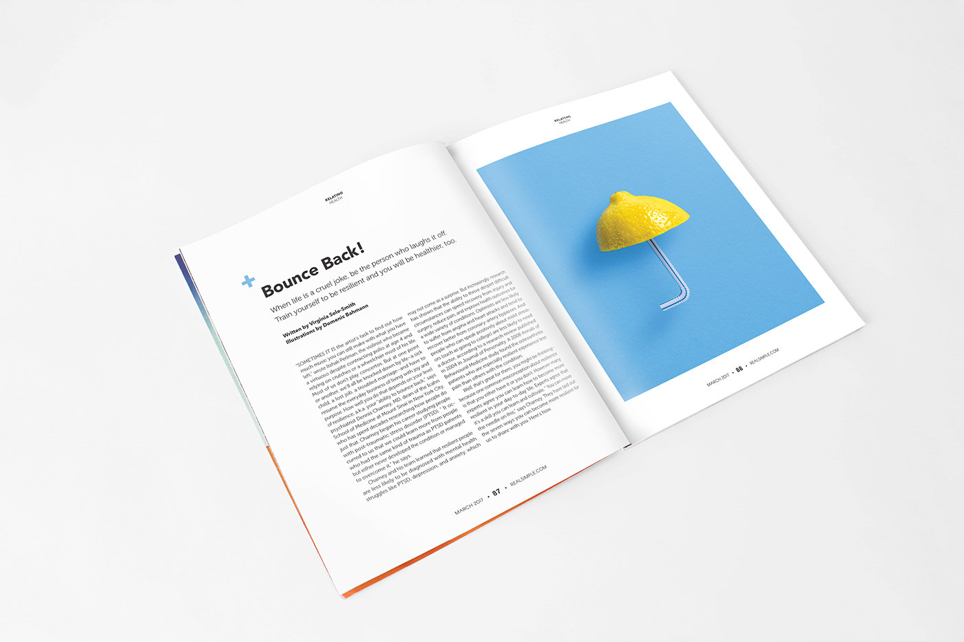
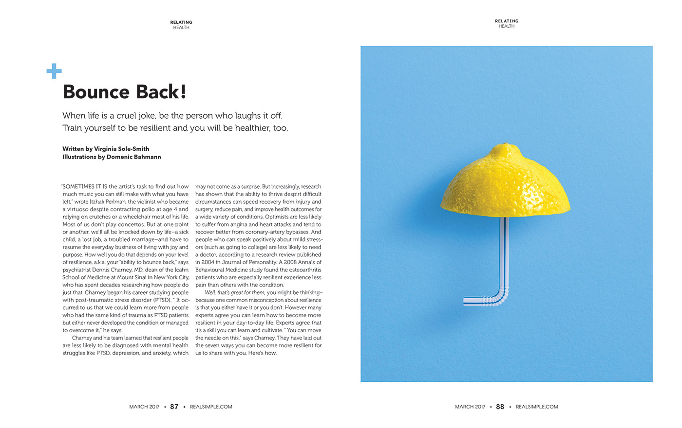
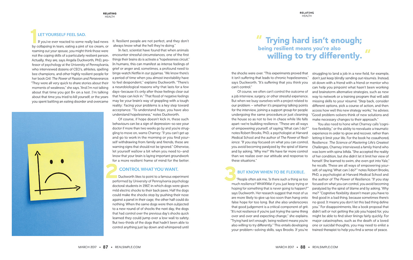
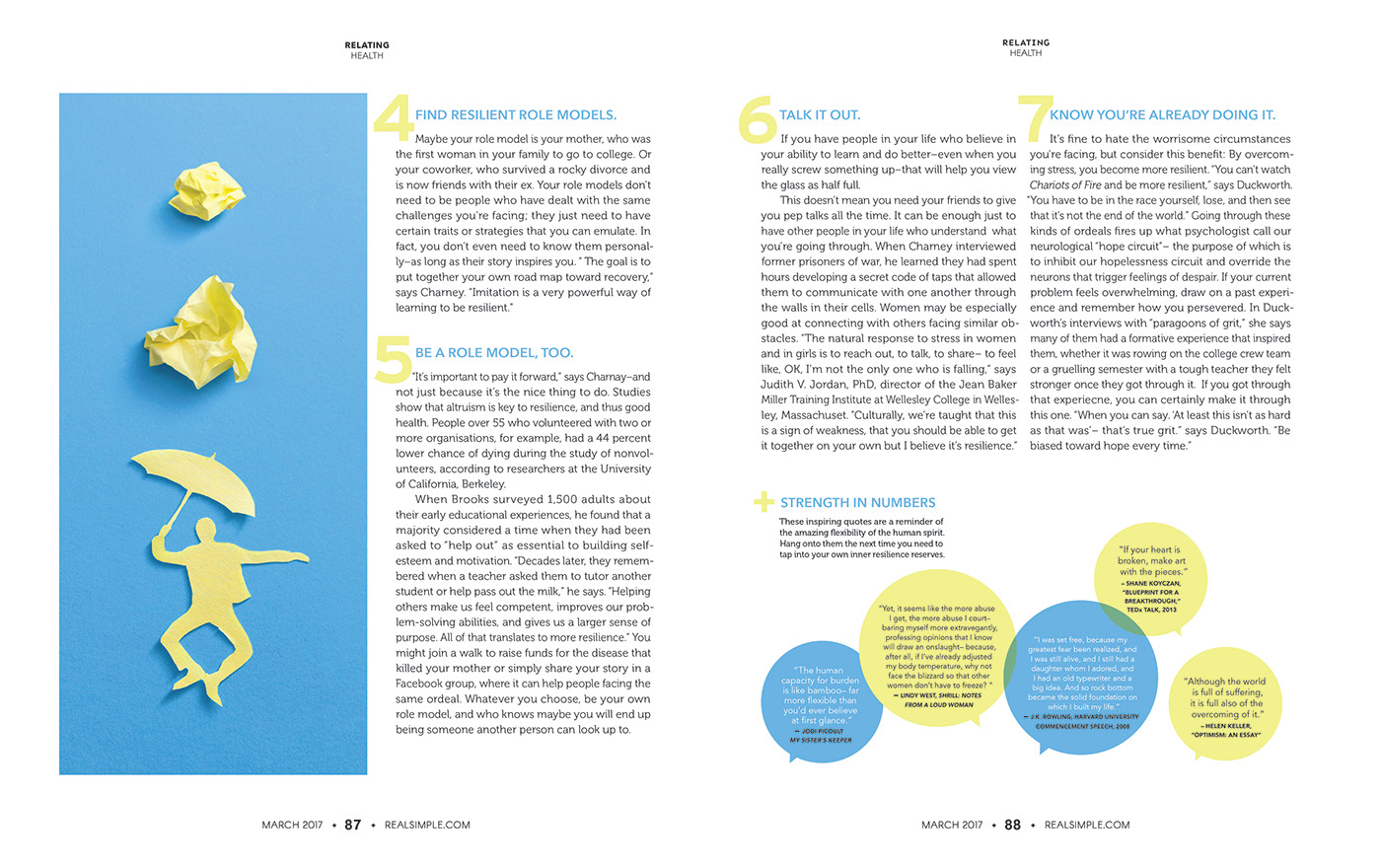
The article subject focused on building one’s resistance, featuring illustrations by Domenic Bahmann. The whole article is focused on the idea of remaining positive in order to build up resilience to defeat whatever problem comes your way. Like the illustrations, the layout is surrounded by a thick border of negative space with a pop of yellow, highlighting the steps to become more resilient. The type spans more columns, unlike there current design that takes up just a few. This allows for more space between the lines, making it easier to read. The identity rebrand took on the attempt of trying to convey the idea of DIY and the step process that follows it. It attempts to relay the idea of “As simple as 1, 2, and 3 ” by changing the “m” to three straight lines in a different color.