
Project Date: May 2016
Strengths Finder Data Visualization
Jeannine!!! You did an extraordinary job of bringing our data to life. I am so impressed! Thanks for all of your terrific work. Without you, the training would not have been nearly as fun or effective. — Senior Vice President, Strategic Solutions
Employees were asked to take a Strengths Finder assessment to help them discover their Top 5 Strengths. They then gathered for a two-day Strengths Finder Training & Development Summit. I was asked to develop materials for the event to present the organization's collective results. The turnaround time for the project was just under a week. I received the project brief late Friday afternoon, was given the data the following Tuesday afternoon, and sent the files to print 2.5 days later on Thursday evening.
— B R A I N S T O R M S K E T C H E S —
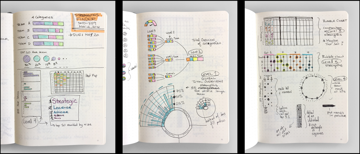
My goal was to create visualizations that would surface useful connections in the data and insights about the employees, teams, and departments that could be used to kick off discussions during the event.
I had about 2 days to wait before I was going to receive the data but began brainstorming ideas for how I might present visualizations of the data in my sketchbook based on what I knew.
• 92 employees participated in the assessment.
• Each employee would have 5 strengths out of 34 possibilities.
• Each strength belonged to 1 of 4 categories.
• There were 14 individual teams, laddering up to 3 larger teams and 1 department
— C O L O R P A L E T T E —
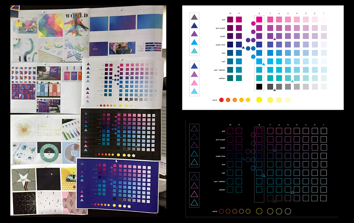
The Pandora brand palette was very limited and I needed a much broader palette for the project. So during this time I also developed a color palette to use for the data visualizations.
— D A T A S A M P L E —
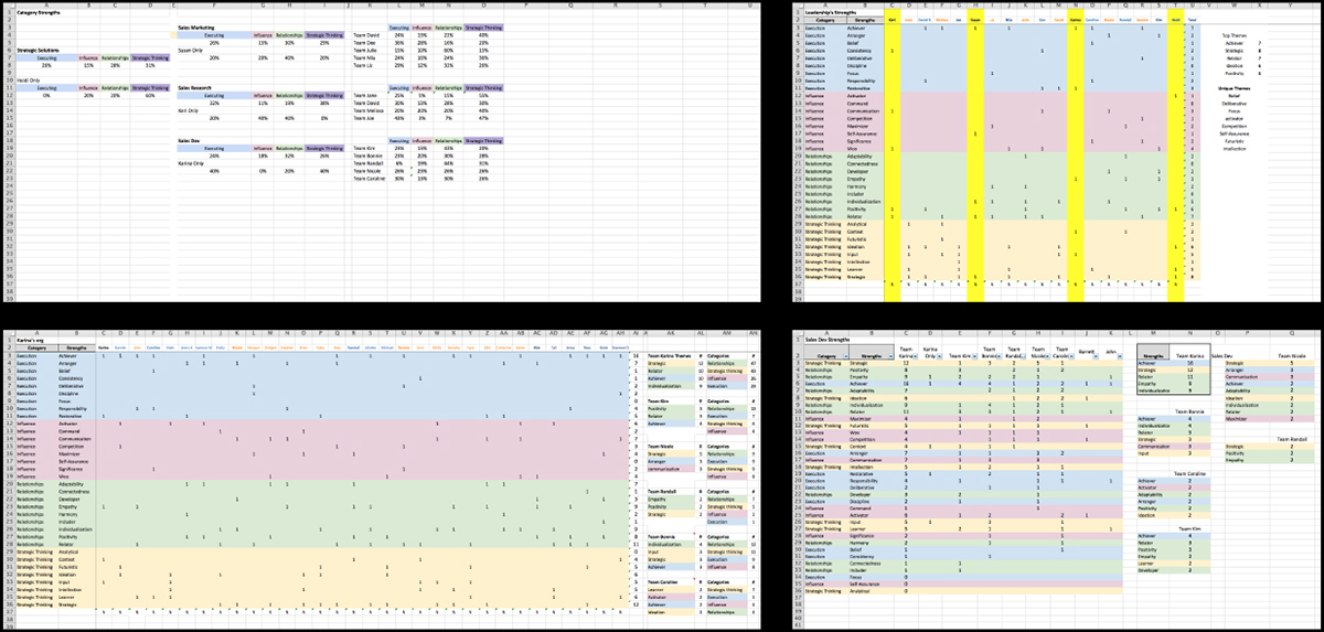
The data finally arrived Tuesday afternoon and I had 2.5 days to finalize the designs and get them off to the printer. I started creating digital versions of my brainstormed sketches with the real data to test out my initial ideas and refine the concepts.
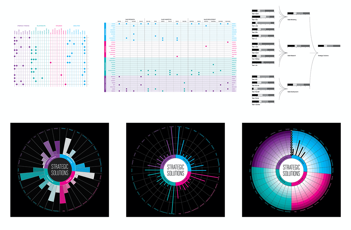
Final Design
I created 3 data visualizations that were printed as a booklet for each attendee. Large posters of the visualizations were also created for the event.
— C O V E R —
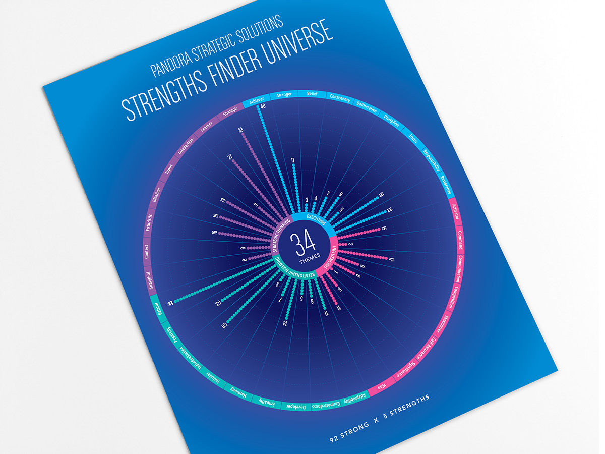
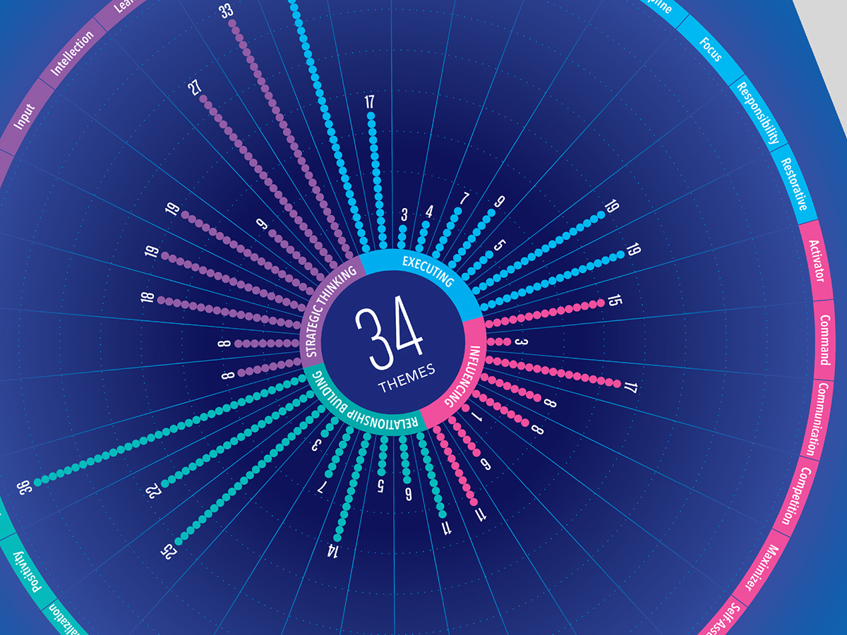
The cover visualization shows an overview of the organization’s collective strengths and unveils some interesting imbalances. Each dot represents one team member's individual strength. There are a total of 460 strengths graphed—92 employees x 5 strengths and these are grouped together in the 34 themes and color-coded across the 4 categories.
— I N T E R I O R —

The interior visualizes the strengths of the 14 individual teams. Each column shows a team’s strengths. The larger circles indicate that multiple individuals within the same team share the same strength. Each of these 14 teams feeds up into 3 larger teams. The strengths of the 3 larger teams are plotted out with triangles pointing to their subteams.


— B A C K C O V E R —
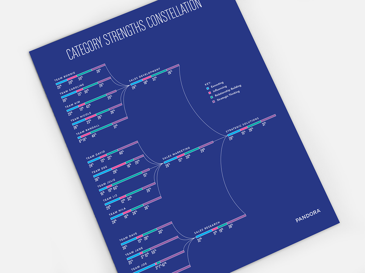
The back cover shows the breakdown of the 4 category strengths at each team level.

— P O S T E R S —

I was told that the visualizations became the centerpiece of the event and were referred to throughout the day. People found insights & connections in the data useful and to be great conversation starters.
SR. DATA VISUALIZATION DESIGNER
Pandora
Pandora
(Project date: May 2016)

