THE CHALLENGE
Visual Chefs and EEcoder provide development and content management solutions for clients looking for an enriched web experience. In combining the two existing brands, it was imperative that the new brand spoke to both offerings simultaneously. The challenge was to infuse a bit of developer knowledge and expertise into the brand, but keep it lighthearted, simple, and fun.
The new site can seamlessly grow child products and services, and is a visual frontrunner for the development industry.
OUR APPROACH
The Foster Made project was a soup-to-nuts overhaul that allowed us to flex a great deal of strategic and creative muscle. After a Discovery process that yielded game-changing recommendations, we helped the Visual Chefs team unify parent and child brands for a cleaner, stronger overall brand and web experience. After a renaming process, we defined a brand around the *new* Visual Chefs—Foster Made—and enhanced existing assets, as well as enhanced storytelling around existing messaging. The end result is a unified brand experience and web presence—one that is smart, approachable, enjoyable, and attractive to both potential design partners and the general audience. The new site can seamlessly grow child products and services, and is a visual frontrunner for the development industry.


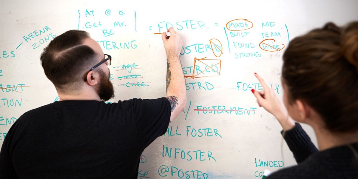
NAMING
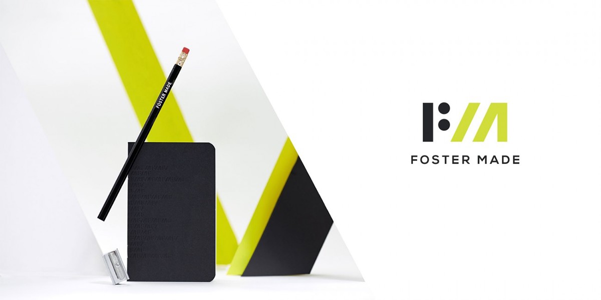
The name Visual Chefs was confusing since the company wasn’t design focused. In order to mitigate that, we launched a four-round naming exploration. The name we landed on, Foster Made, harkened back to the history of their building, which was purchased and renovated during our work with them. The building had long been Foster Studios, a photography studio. Moreover, the term “foster” means “to encourage and promote the development of,” perfect for their offerings and company purpose. “Foster made” alluded to the craftsmanship and personalism of their work.
BRAND ARCHITECTURE
During Discovery, we realized the disconnect between Visual Chefs and EEcoder. Visual Chefs was eroding their own brand with an unrelated sub-brand that had stronger recognition. Our solution was to bring them both back under one roof and to create a new name, face, and experience for a solidified brand: Foster Made.

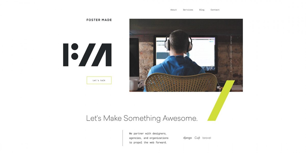
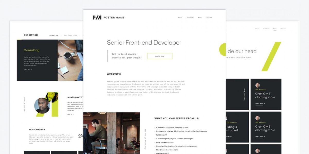
UX AND UI DESIGN
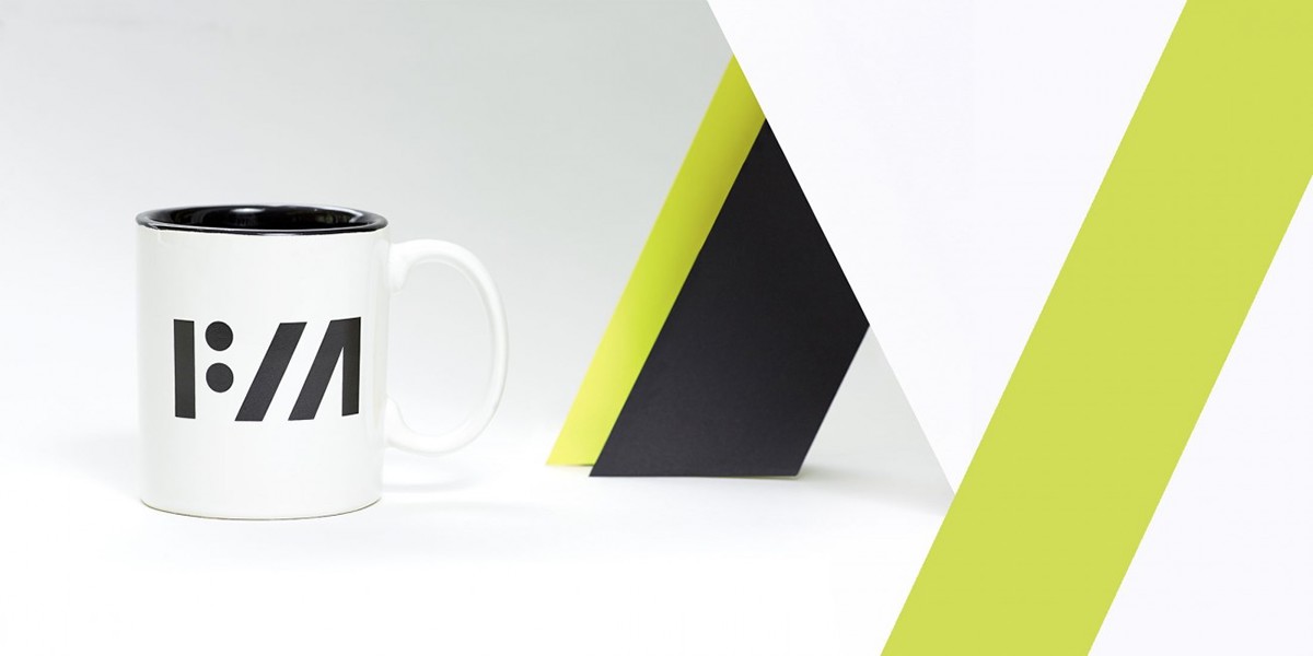
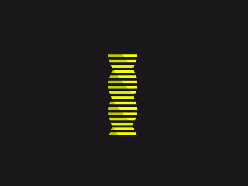
Weighed down by dense copy and repetitious content, the Visual Chefs and EEcoder sites needed both rearchitecting and rewriting. We conducted full content audits, eliminated loads of extraneous copy, and produced a wholly revised information architecture. Initial designs used a dark-on-light theme, which added a technical feel, but we eventually scrapped those nearly complete designs in favor of light-on-dark, choosing to opt out of the dev-heavy darkness. We used lightness, and their signature “slash,” to lend approachability and allow Foster Made’s culture and relationship-focused approach to shine through.


This project was a total @focuslabllc team effort. Huge high fives to all the team members that made this project a success. Another high five to the wonderful Foster Made team as well. They were such a great group to work with.


