THE SECRET GARDEN
Typography & Environmental Design
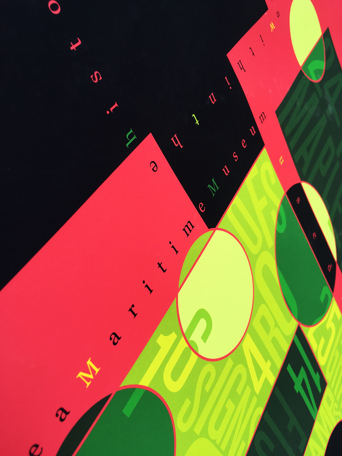
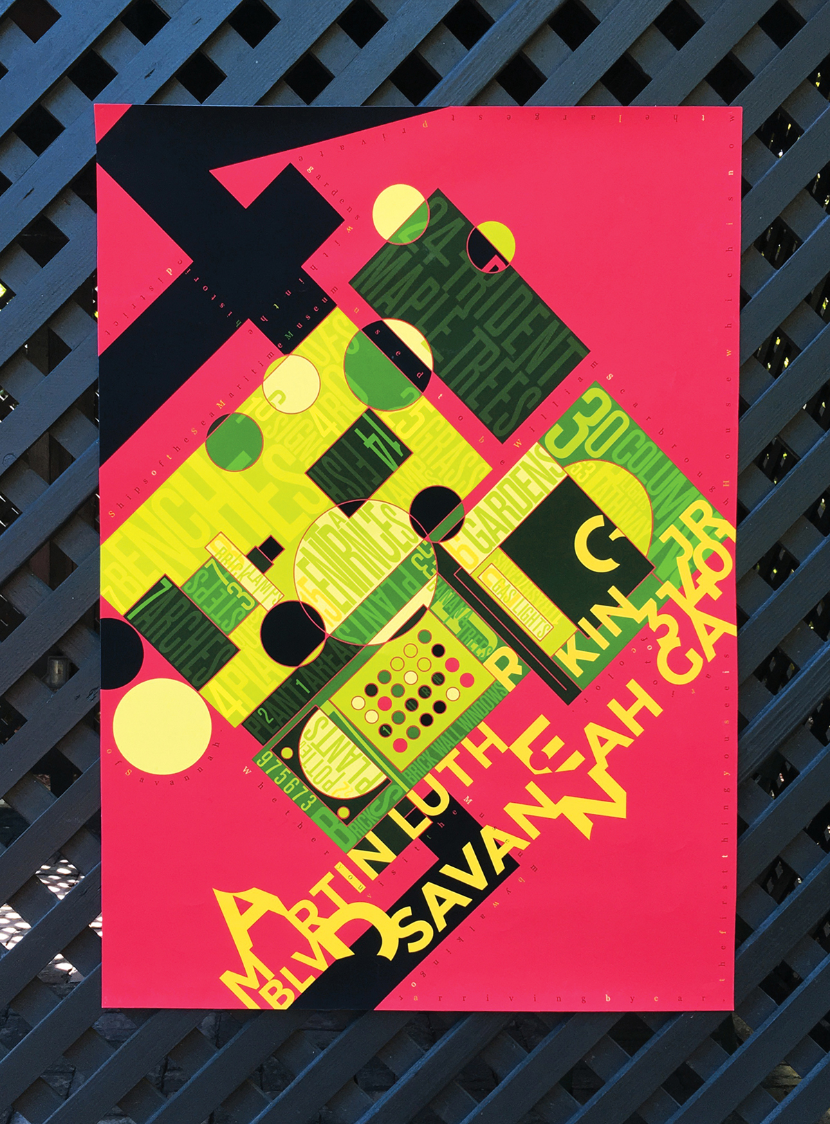
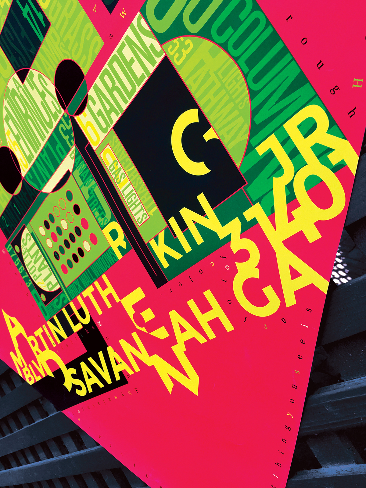
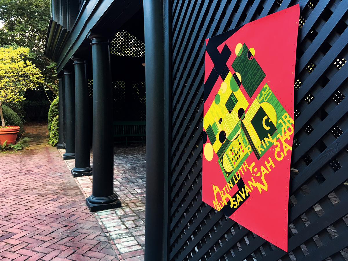
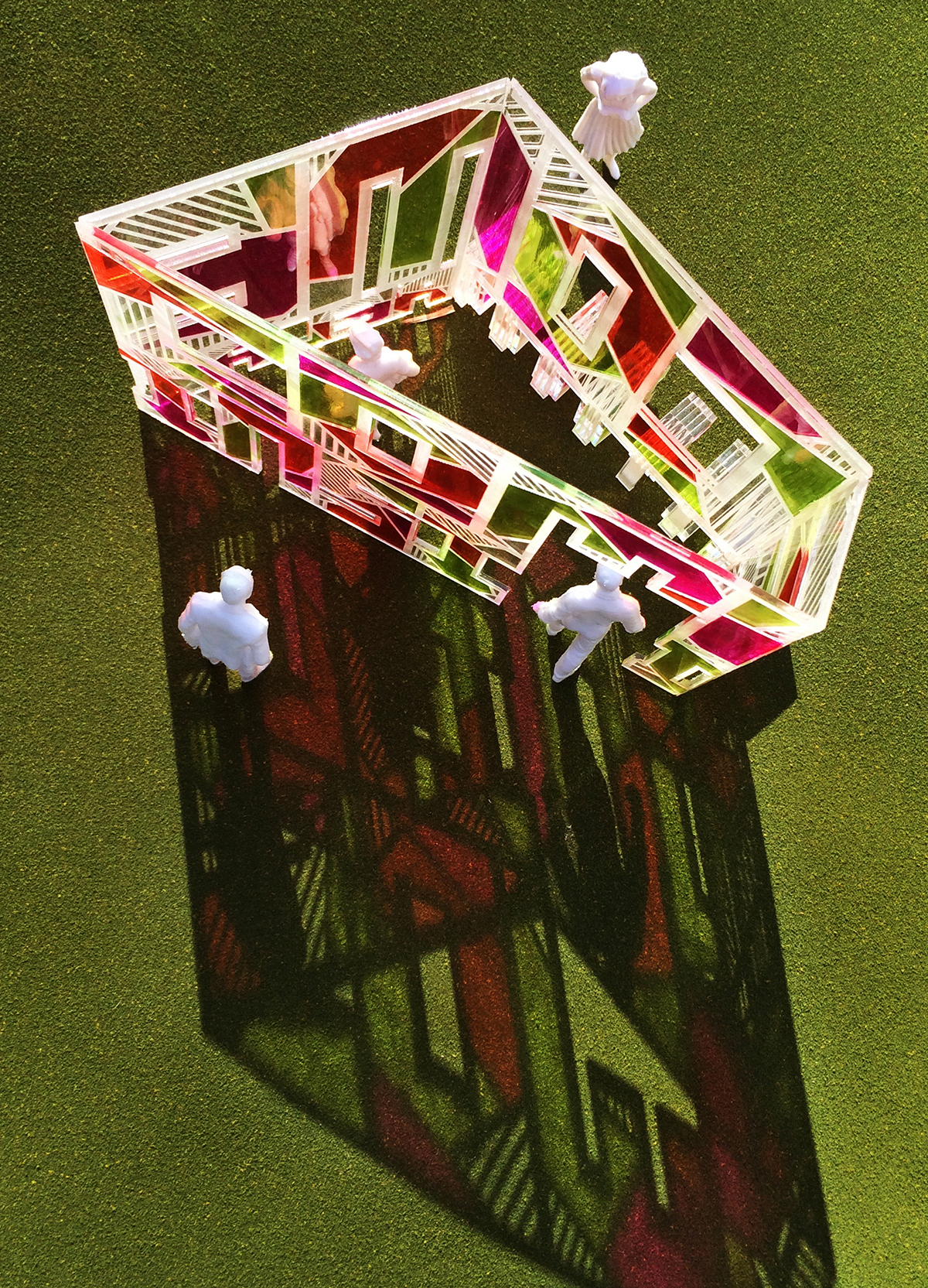
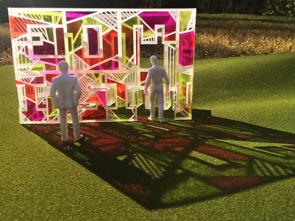
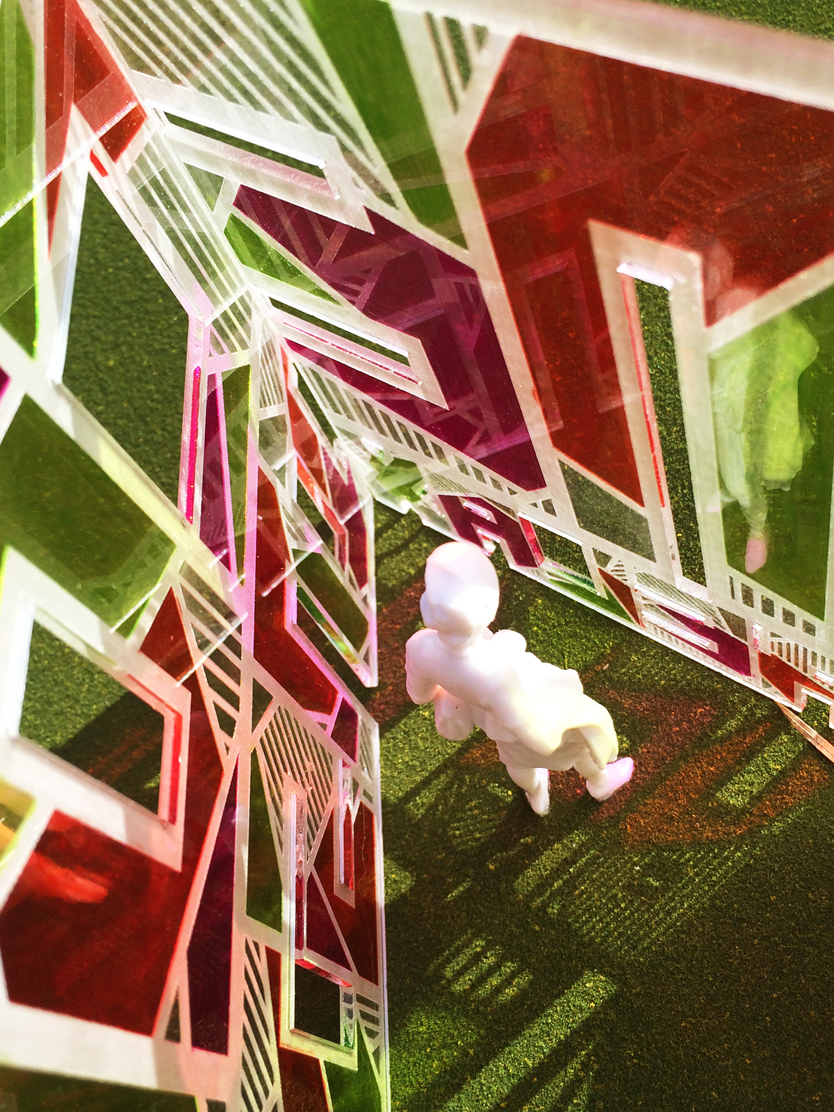
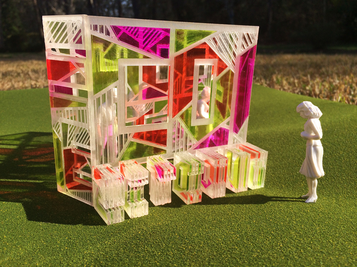
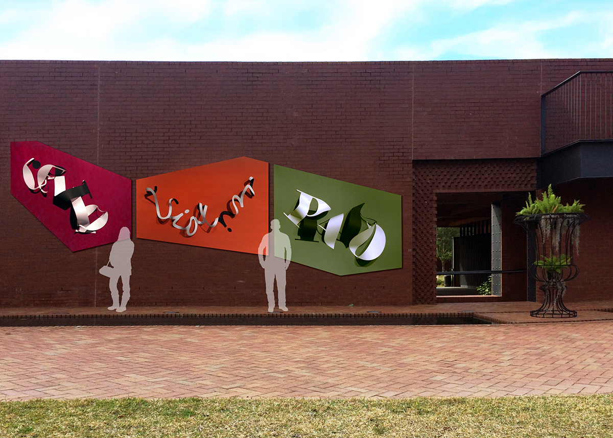
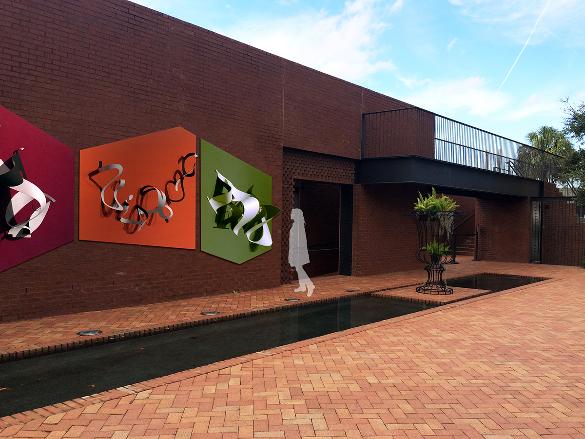
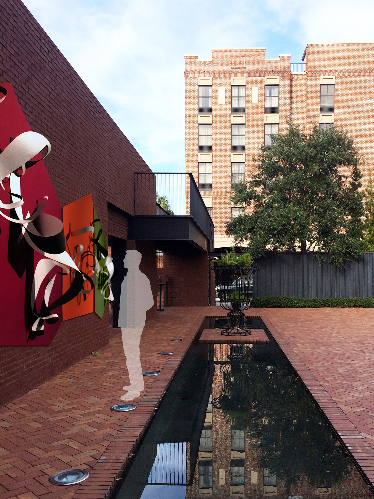
The Secret Garden is based on the Ships of the Sea Maritime Museum located in Savannah. I named it the Secret Garden because the museum is tucked away on a very busy street, which causes many individuals to easily miss it. The Garden has a very urban grid based design and it is used for diverse types of events such as weddings, concerts, and art exhibits. A uniquely designed poster with its vibrant colors was made to attract people and bring more traffic to the museum. Additionally, once the individual is at the museum there are two structures displayed within the garden that playfully show what the garden is meant to be used for.
I wanted to bring awareness to the garden since its easily missed by the public. So I decided to first design a poster that directs people to the garden and then I constructed two abstract typographic forms that is based on what kind of things happen in the garden itself. The poster was based on the gardens grid from an aerial view and within each individual form from the gird has a fact about the garden, if one reads closely enough. Then there are the three wall pieces with the fluid type designs. The manipulated letters are actually three instruments which were used at one point in the garden; cello, violin, and the piano. The fluid design is supposed to reflect the instruments themselves and the flow of the organic form depicted from sound. The last part, the stained glass structure is purely designed with words telling the individual what you can do in the garden. When the sun shines through the glass, the colors playfully scatter on the ground or on the person. Several typefaces were used due to its experimental typographic forms symbolizing the intertwining of the plants and trees. The colors chosen where to represent the radiant flowers the garden has during the spring and the diverse green colors from different kinds of plants.