EVADARE
Branding & Packaging
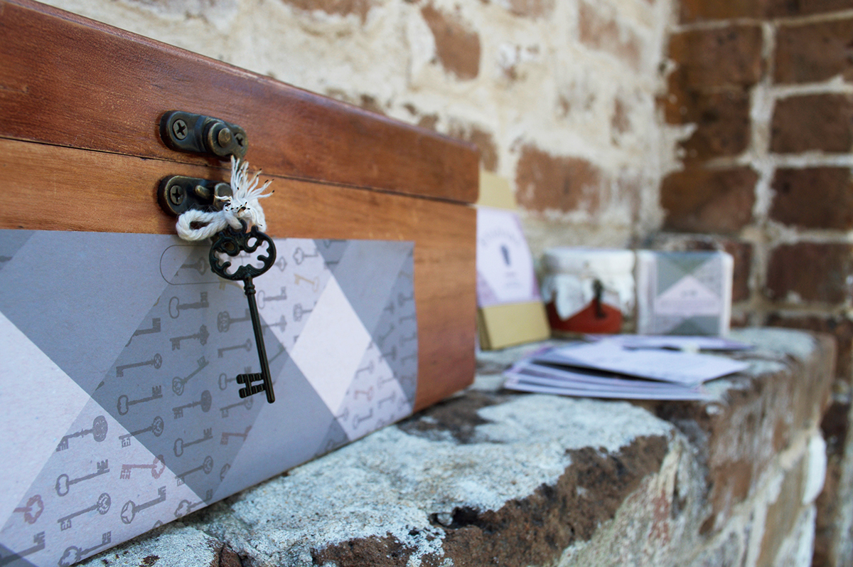
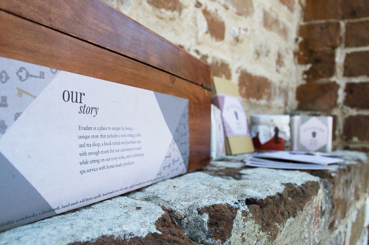
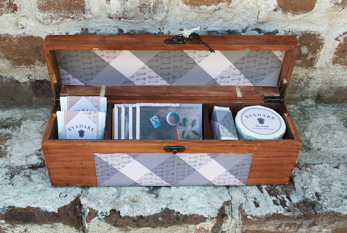
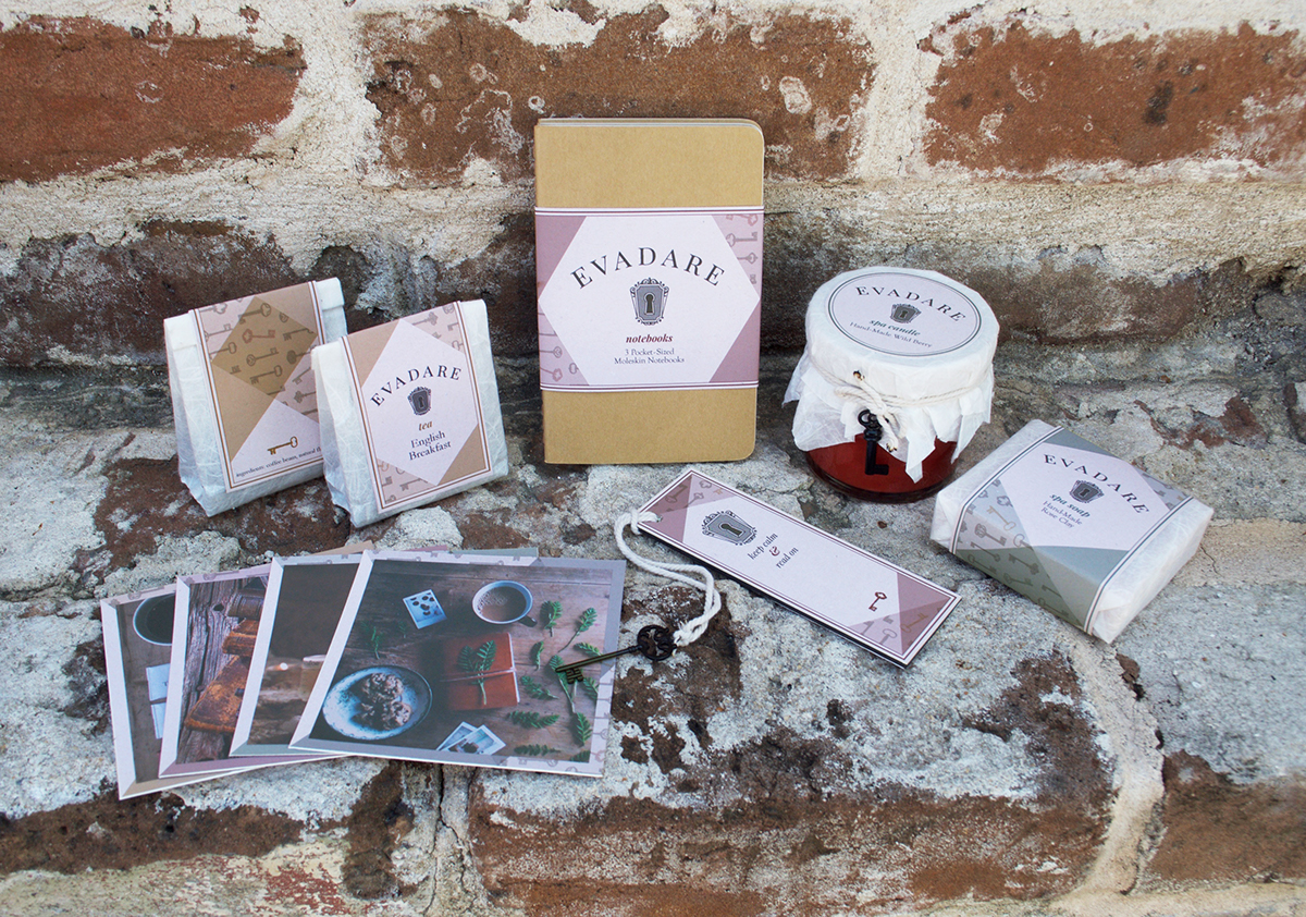
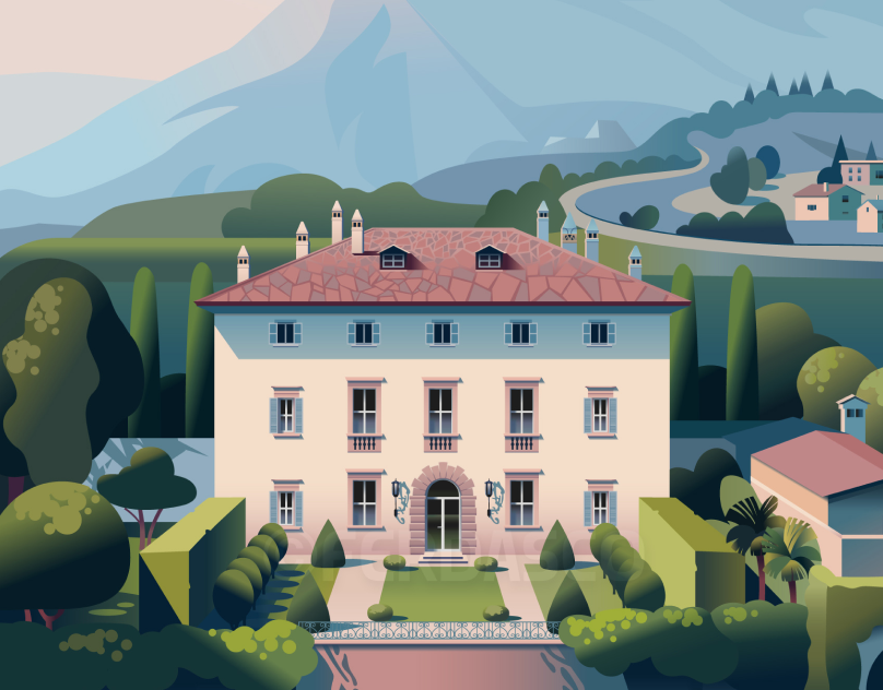
Evadare is a fictitious store that is based on the Nora Roberts Trilogy series which was about three sisters who combined their passions into one store, a book store, spa, and a coffee shop. I wanted to brand the store and create the visual language that supports the idea of a three piece store combined into one. The store is based on comfort, tradition, and escape where customers feel appreciated, and remembered by the owners, and their employers. Not only does the store fulfill everyday wants for the customers with warm fresh coffee or tea, they will also be able to spend quality time for business or pleasure and receive natural skin/body care through the spa to feel completely restored in mind, body, and soul.
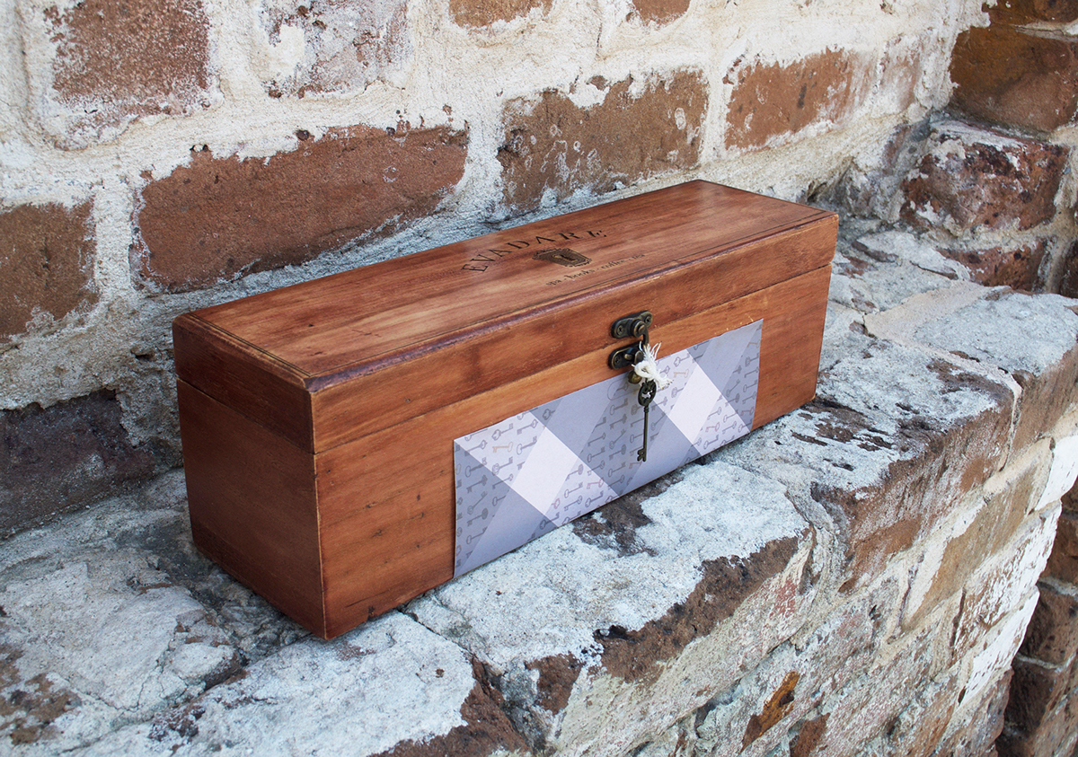
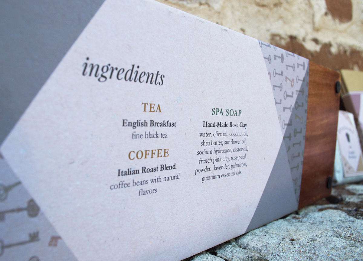
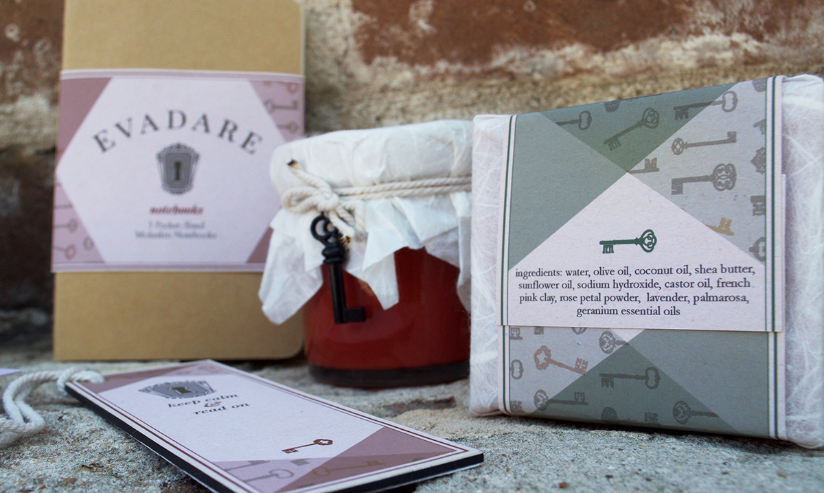
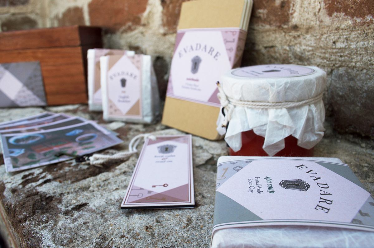
I wanted to create a New England style brand that emphasized tradition, comfort, and escape. The word Evadare means escape in Romanian, which is a place known for their sublime landscapes. I chose three serif fonts to represent tradition. I used Playfair Display for the name as it has contrasting strokes and is very elegant. Also, I used Goudy in the logo as it pairs well with Playfair and Garamond for body copy to mimic old scriptures. My color scheme was based on creating a warm and comforting, yet rejuvenating feeling so I chose a combination of brown, rustic red, and mustard, with sage green and eggshell white. The graphic elements tie it all together as I chose a natural wood, a birch background, and various decorative keys with a plaid integration to go with the keyhole in the logotype.
