Identification and way-finding of the main Warsaw library
The client's request was to create a new identification of the Library based on tradition (using a symbol of the capital city – Warsaw Mermaid) and modernity of the institution (library expanded gaining a modern head office).
The logo is created from an icon of the typographic mermaid (a reference to the written word). Typographic games are present in many elements of the identification: promotional materials, prints, business cards and even way-finding in the Library. The basic colour of the logo – green – refers to the characteristic historical architecture of the building.
The logo is created from an icon of the typographic mermaid (a reference to the written word). Typographic games are present in many elements of the identification: promotional materials, prints, business cards and even way-finding in the Library. The basic colour of the logo – green – refers to the characteristic historical architecture of the building.


Way-finding
The impulse for the change of the identification was new architectural design of an old building and gaining a modern reading rooms.
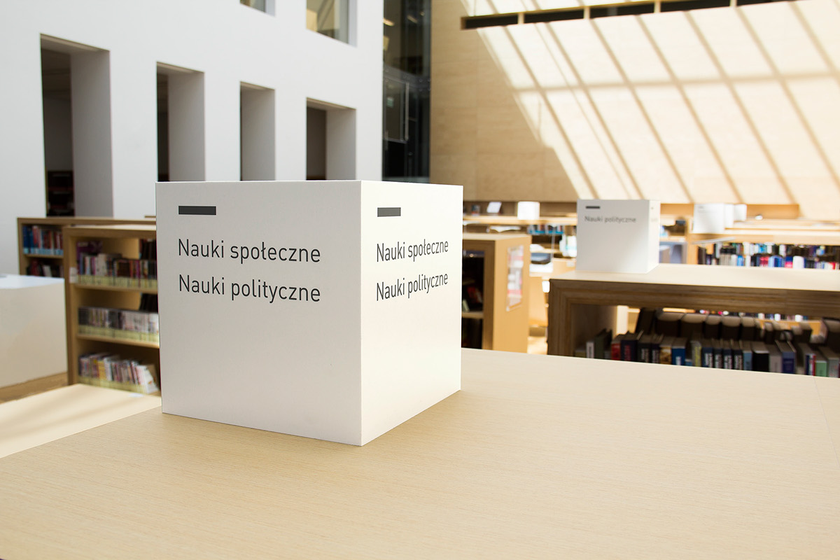
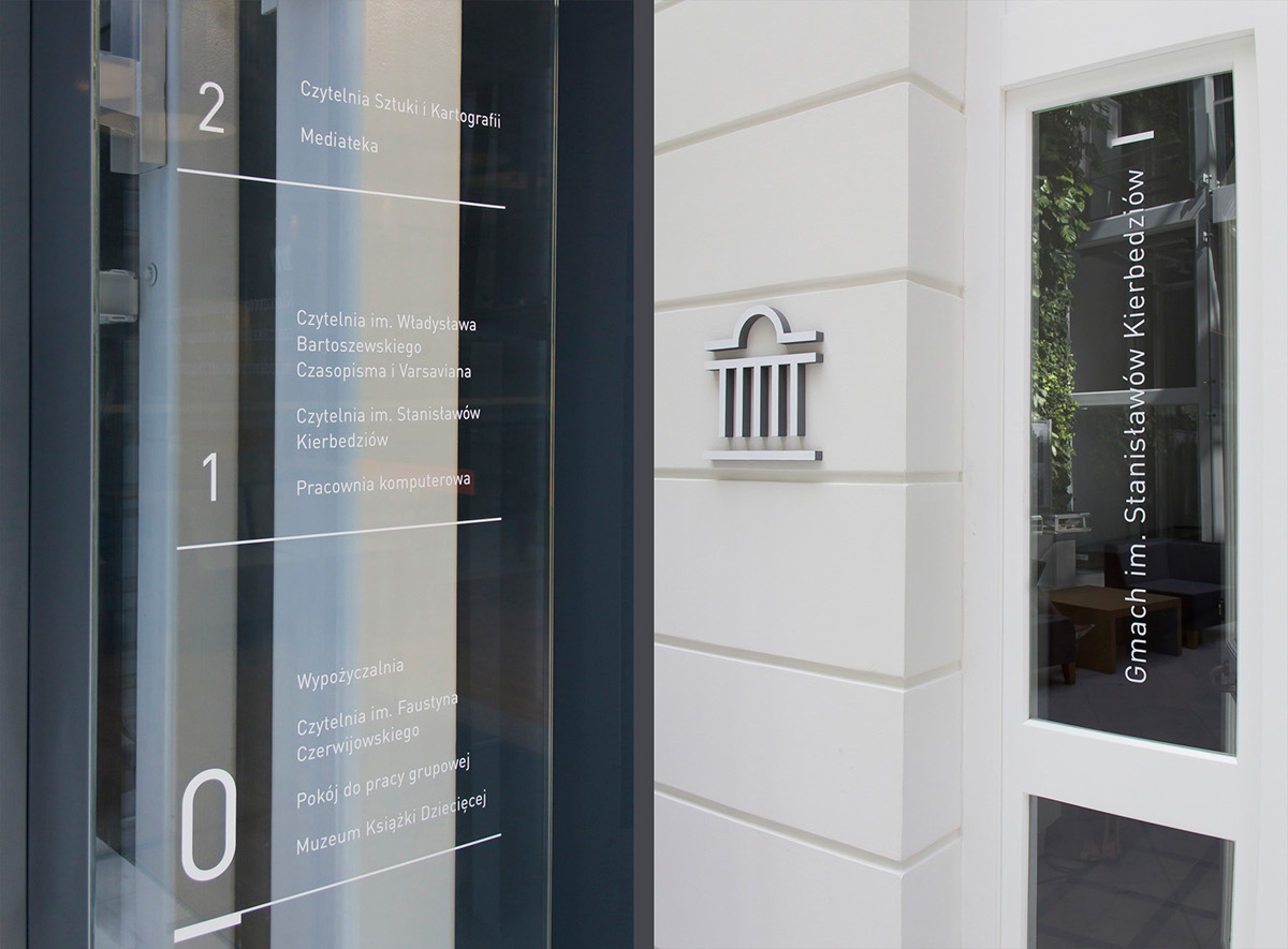
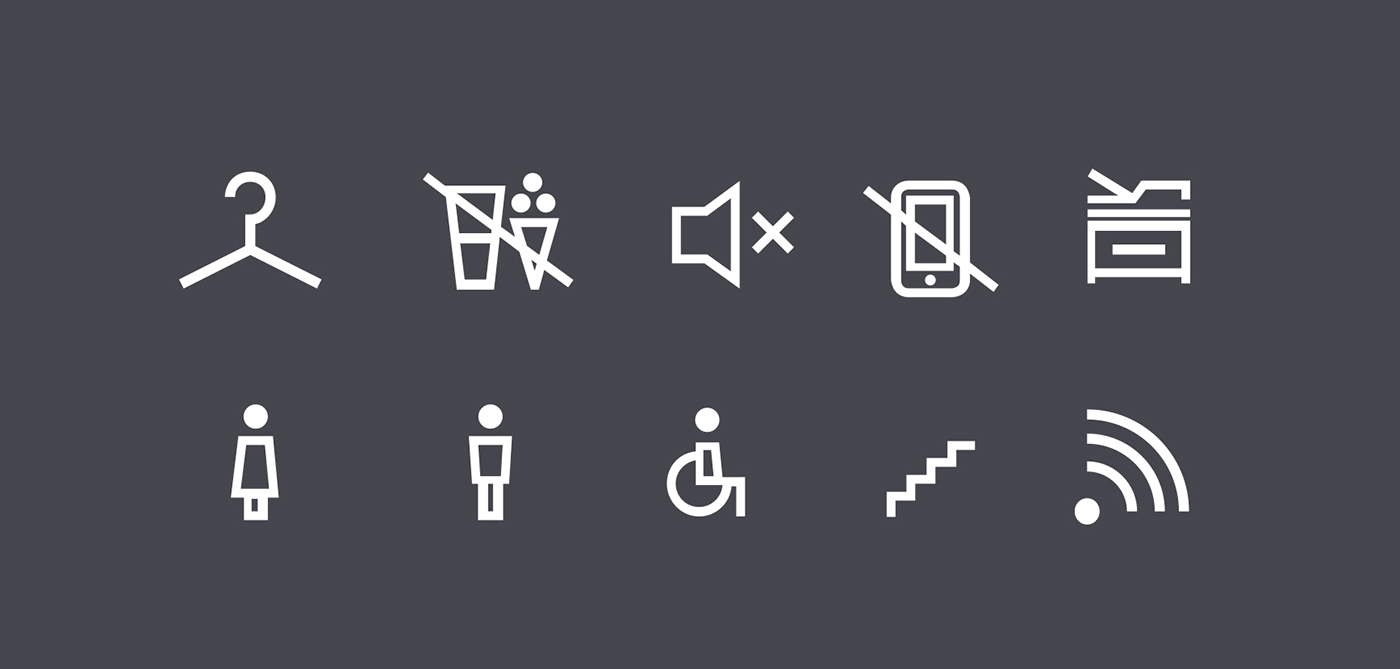
Along with the identification library received new interior way-finding system – directions, maps, room signage, numbering of the shelves and catalogs, library documents and loan system.
Because the new architecture of the library is bright, luminous and wide, the way-finding had to be on the one hand readable and on the other hand minimalist (to avoid corrupting the beautiful and harmonious space). For this purpose we choose light and modern typography.
We have created a system of 3D icons and signs that easily direct visitors around the Library.