

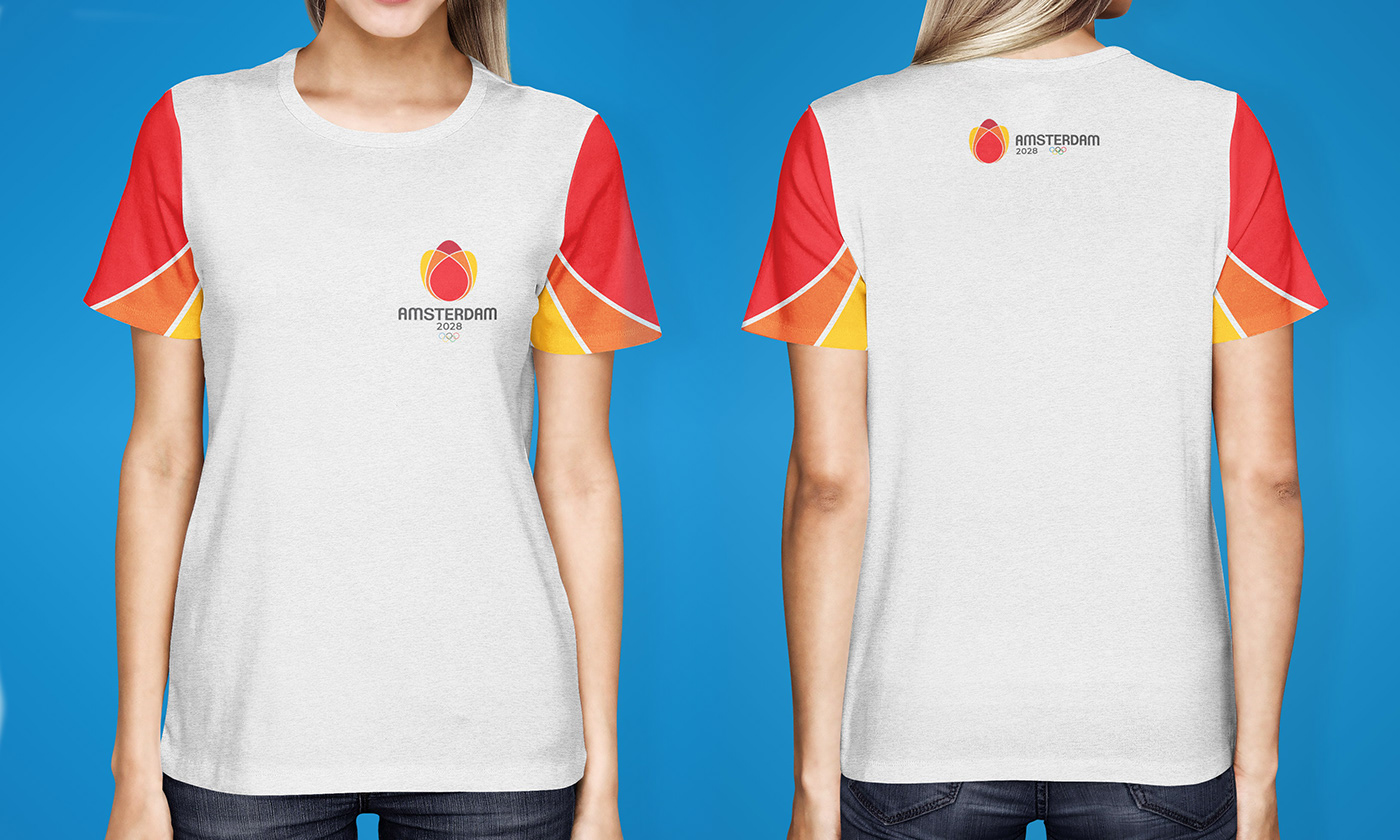
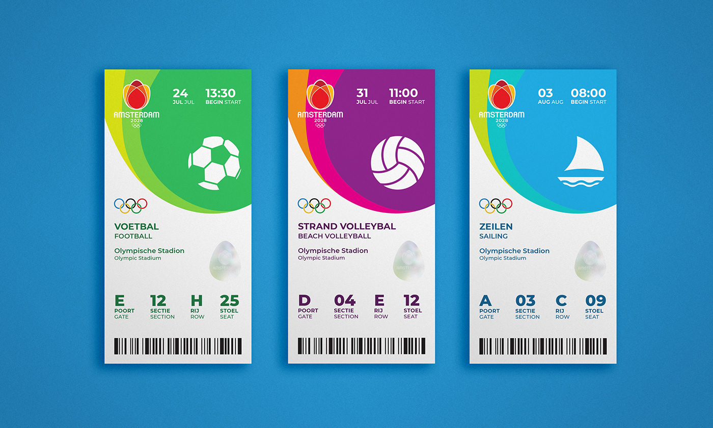
This combination mark features a stylized tulip whose petals come together to create a flame. The tulip is meant to represent the Netherlands, as tulips are the national flower, while the flame is a classic symbol of the Olympics. It also pays homage to an Olympic tradition started in Amsterdam in 1928: the lighting of the Olympic flame.
The color red represents the city of Amsterdam, and orange represents the Netherlands as a whole. The red, orange, and yellow together reflect the colors of a flame. These three colors also resemble varieties of tulips that have red petals with yellow edges.
The typeface, Clemente, is a modern, friendly sans serif. It is tall and narrow like the buildings found throughout Amsterdam, and it reflects the simplicity of the De Stijl art movement that began in the city in the 1920s.
The overall tone of this logo is friendly and welcoming. It is a simple, clean design that appeals to people of all ages, genders, and nationalities.


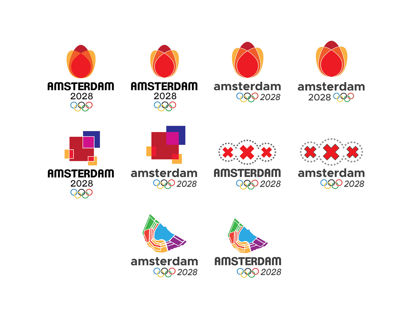
Concept roughs
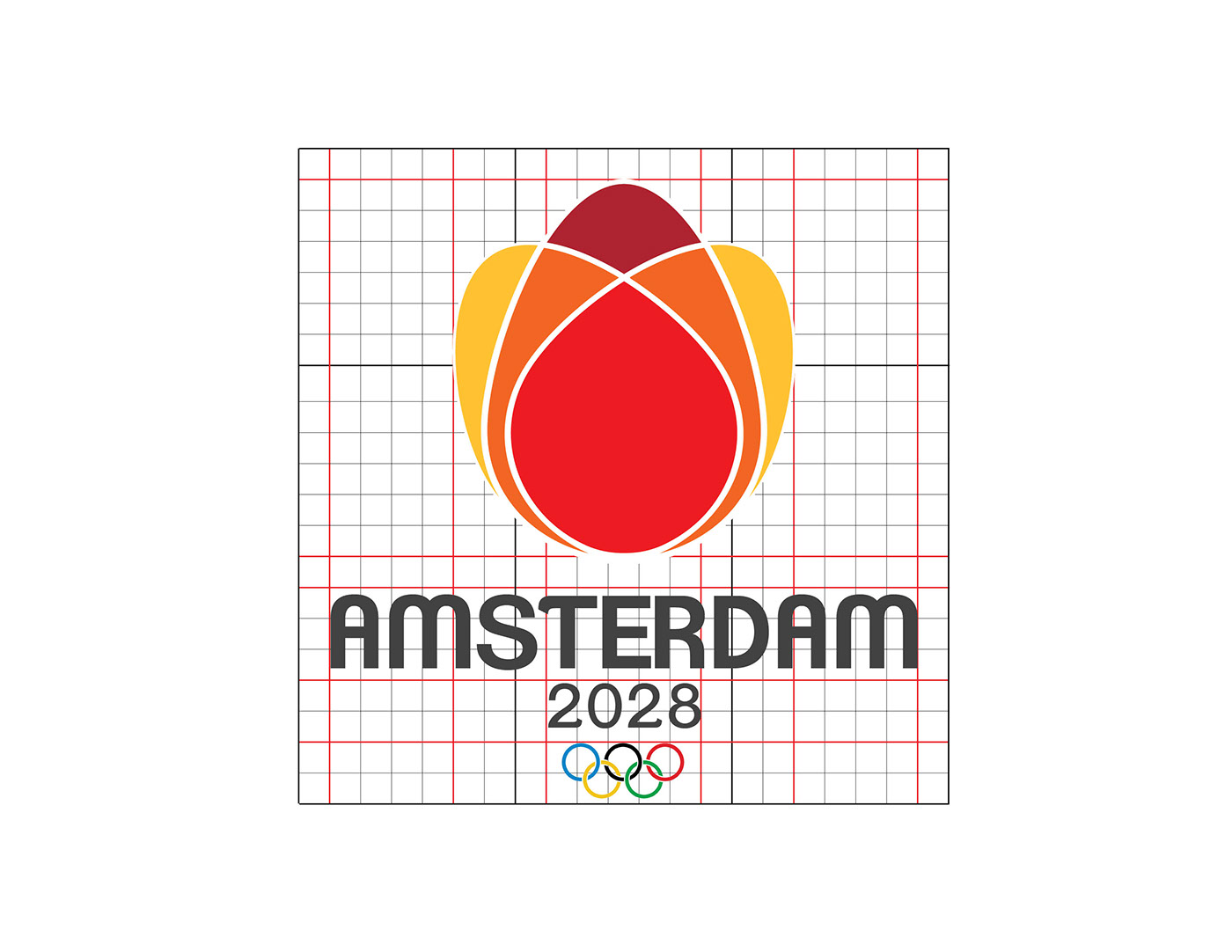
Primary combination mark grid

Combination mark reduction
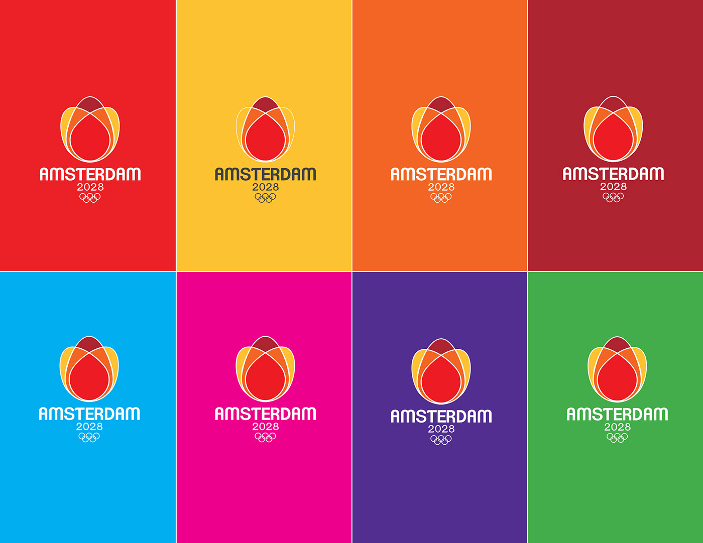
Primary combination mark on color
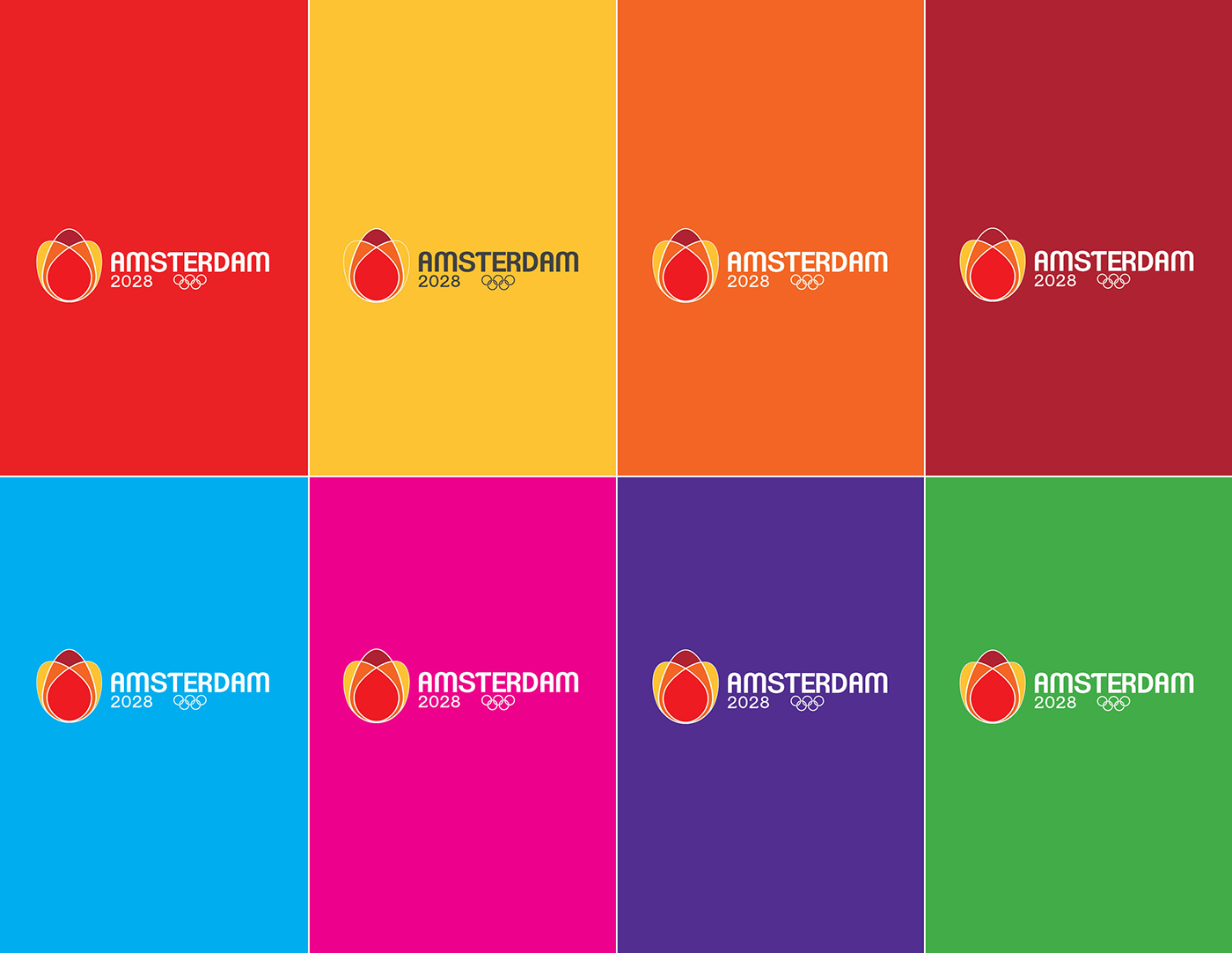
Secondary combination mark on color
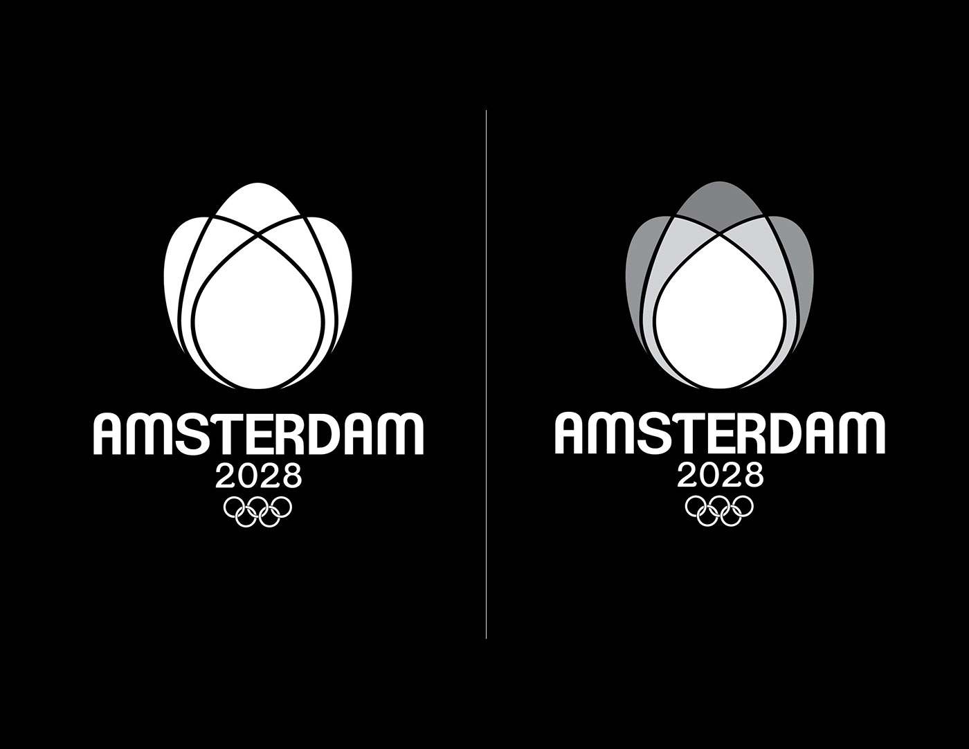
Primary combination mark on black

Secondary combination mark on color


