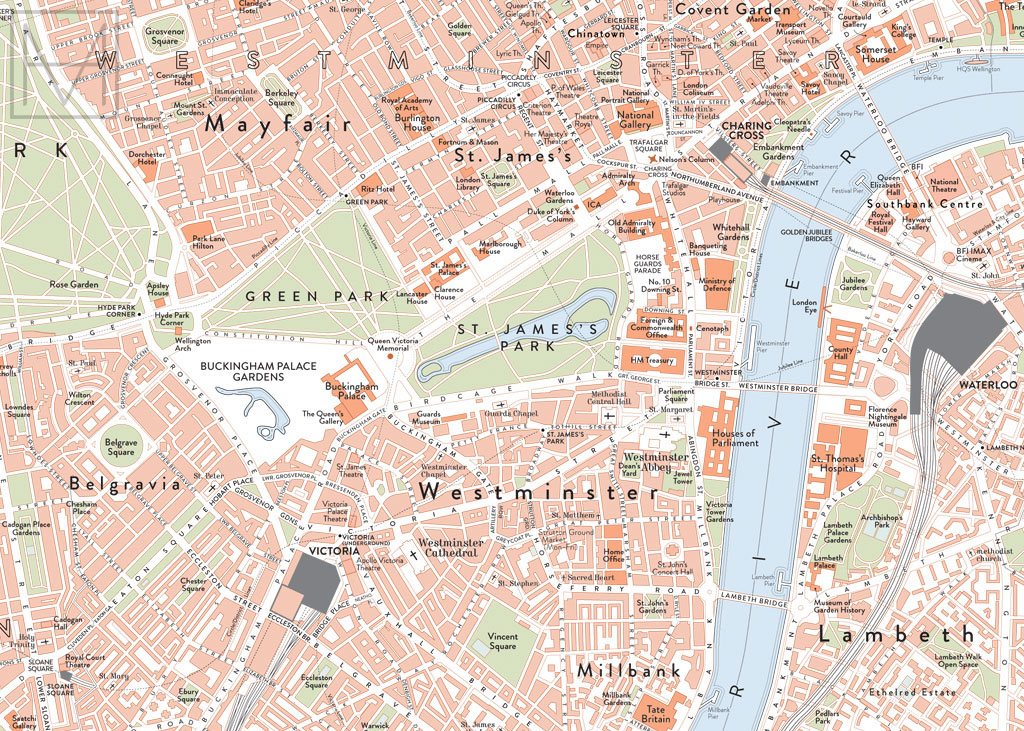
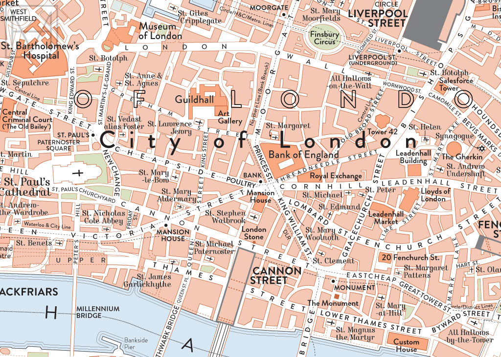
This design for a map of London, UK is an update of an earlier design (see that project here). In the process of designing both, I have been developing a "retro" visual language inspired by designs from the early 20th century, that make use of limited colour palettes and clear, refined typography. My intention is to produce a series of printed maps in this style of different cities around the world.
The typeface used throughout is Brandon Grotesque, with the exception of labels for religious buildings (Kursivschrift) and the title at top centre (Gill Sans).
It is available to purchase as a 70 x 50 cm print via Etsy: http://etsy.me/1JGEODp
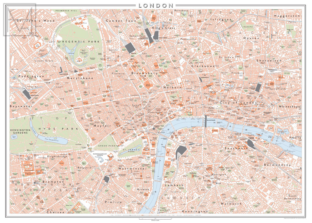
Overview of the whole map, in what I call a 'classic retro' colour scheme: orange, green, blue and black.
It is designed to be printed at 70 x 50 cm or larger.


Mock-up of the print framed.

The same design, in an alternative monochromatic colour scheme.

Different colour scheme possibilities.


