I was given 24 hours to review a webpage, and provide what I thought was an improved interactive experience.
Below is a screenshot of the site I was sent, along with some comments.

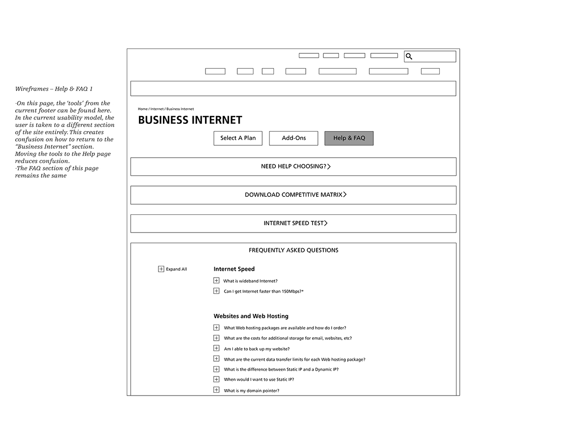
1. There are certain links that take the user to another section entirely, Home / Tools, which is located in the footer. It is difficult to navigate back to the Business Interest page after clicking on these links.
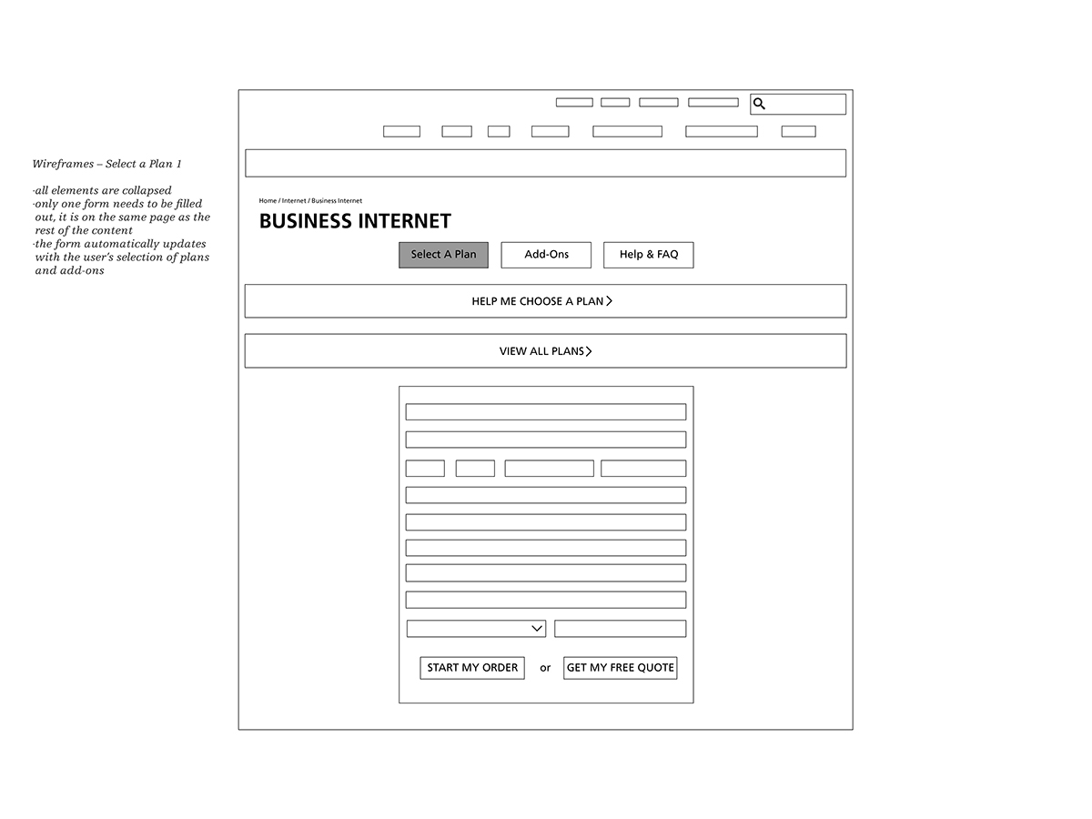
2. Each of these links appear many times throughout the page. They lead to a form in another part of the site, and each form requires the same information. It would be beneficial to include the forms within this page of the site.
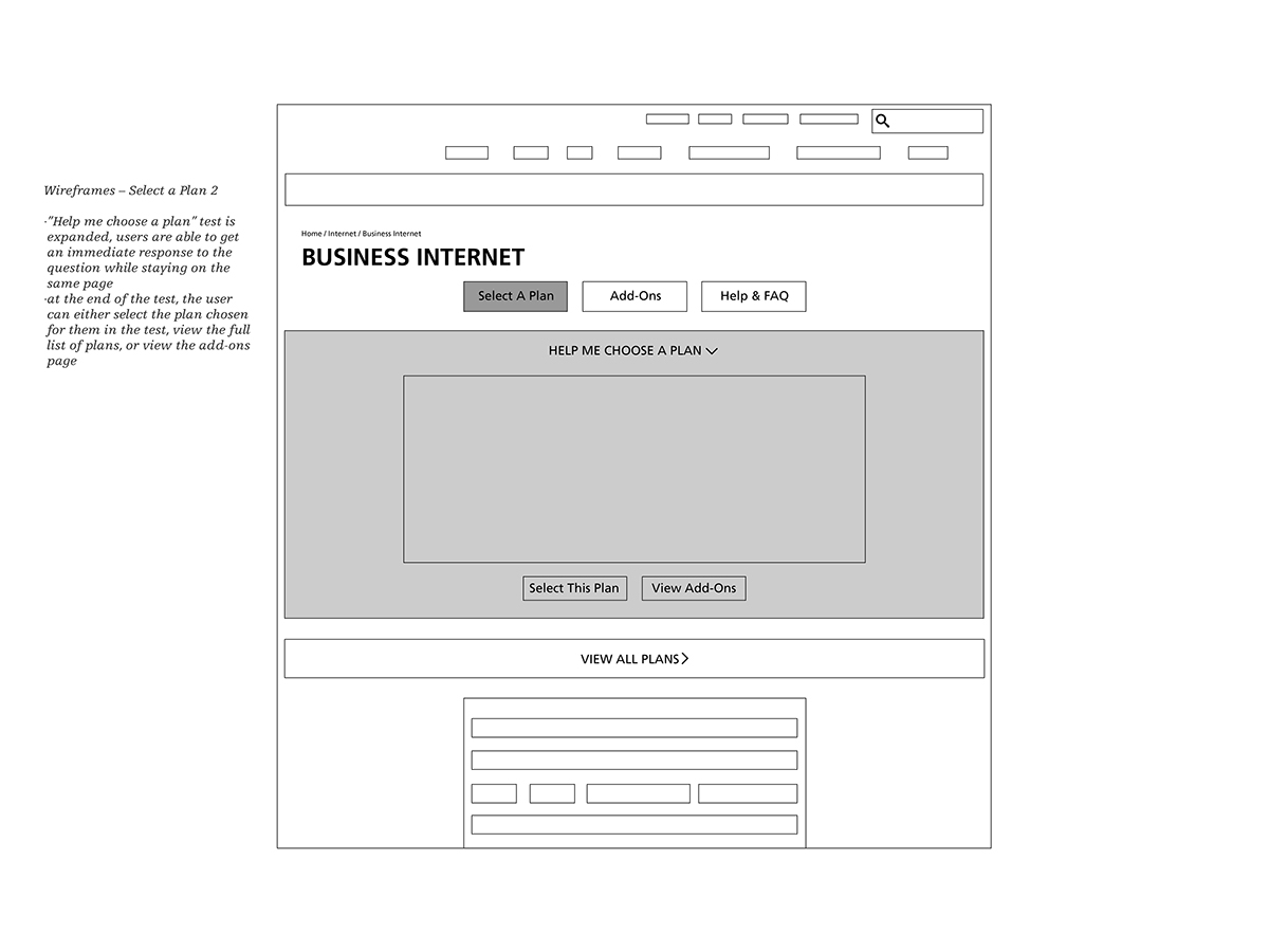
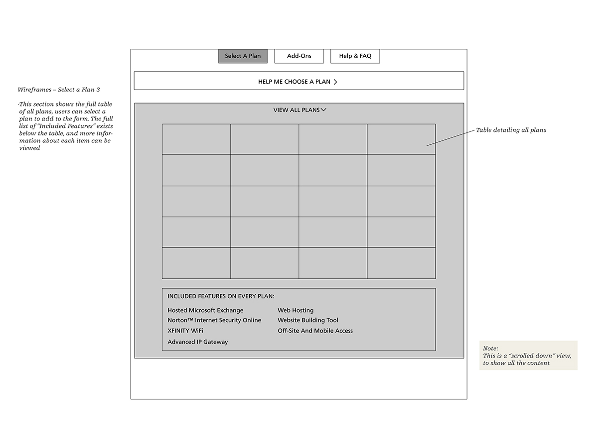
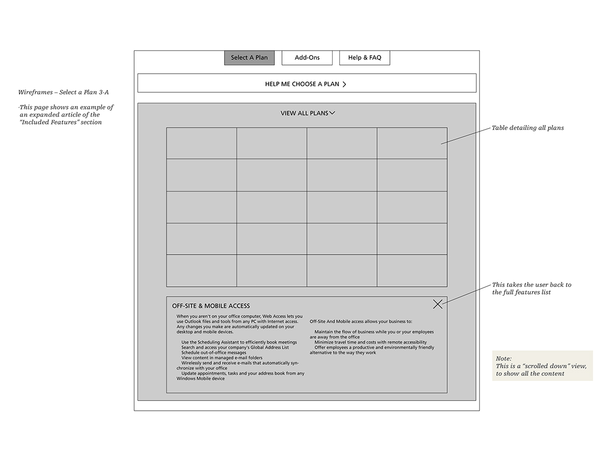
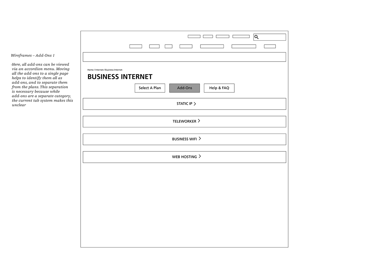
3. Each of these tabs seems to have the same amount of importance; however, included features and plans should be grouped together, and the four tabs after that (Web Hosting, Static IP, Teleworker, Business Wifi) should be grouped together as “Add-ons.” One way to group these links is to create accordion menus on the page.
Next, I mapped out the current Information Architecture of the site.
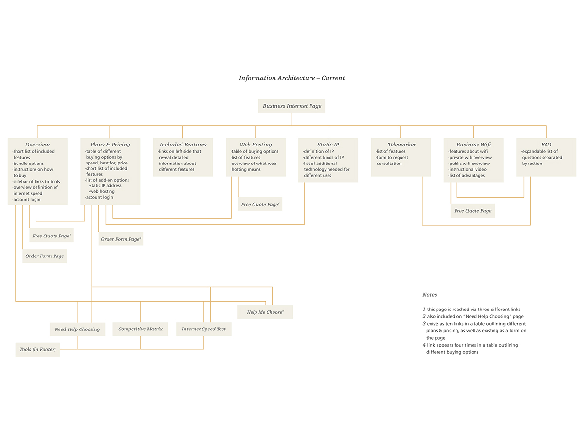
I found quite a few redundancies, as well as links that take the user to different parts of the website, without a clear way to navigate back to the Business Internet Page.
Based on this analysis, I created a revised Information Architecture.
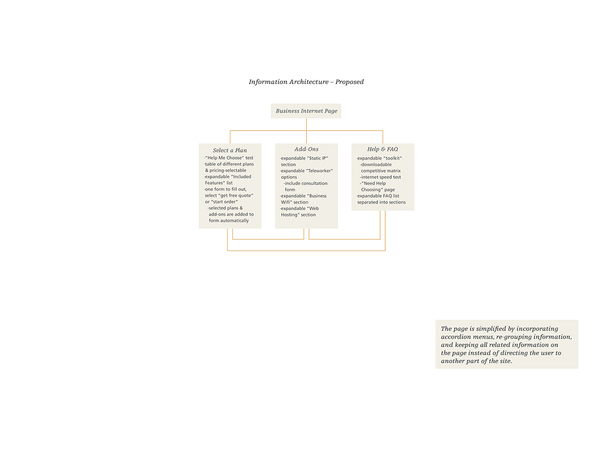
The new Information Architecture is much simpler, grouping information and utilizing accordion menus, so that more information can be stored on a single page in an organized, easy to navigate layout.
From here, I developed some wireframes.