1960s BEIRUT
MAISON LIBANAISE
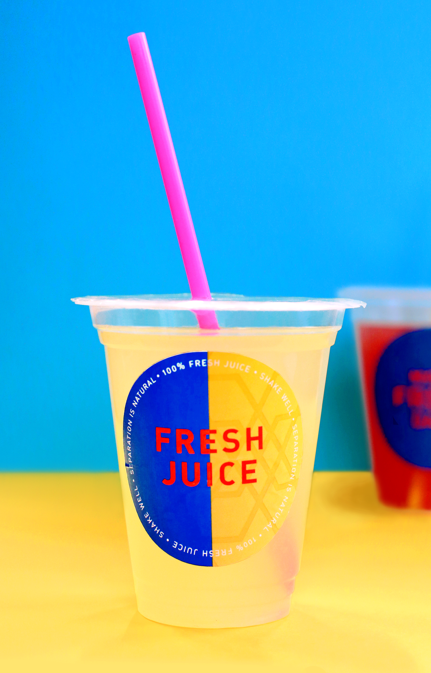
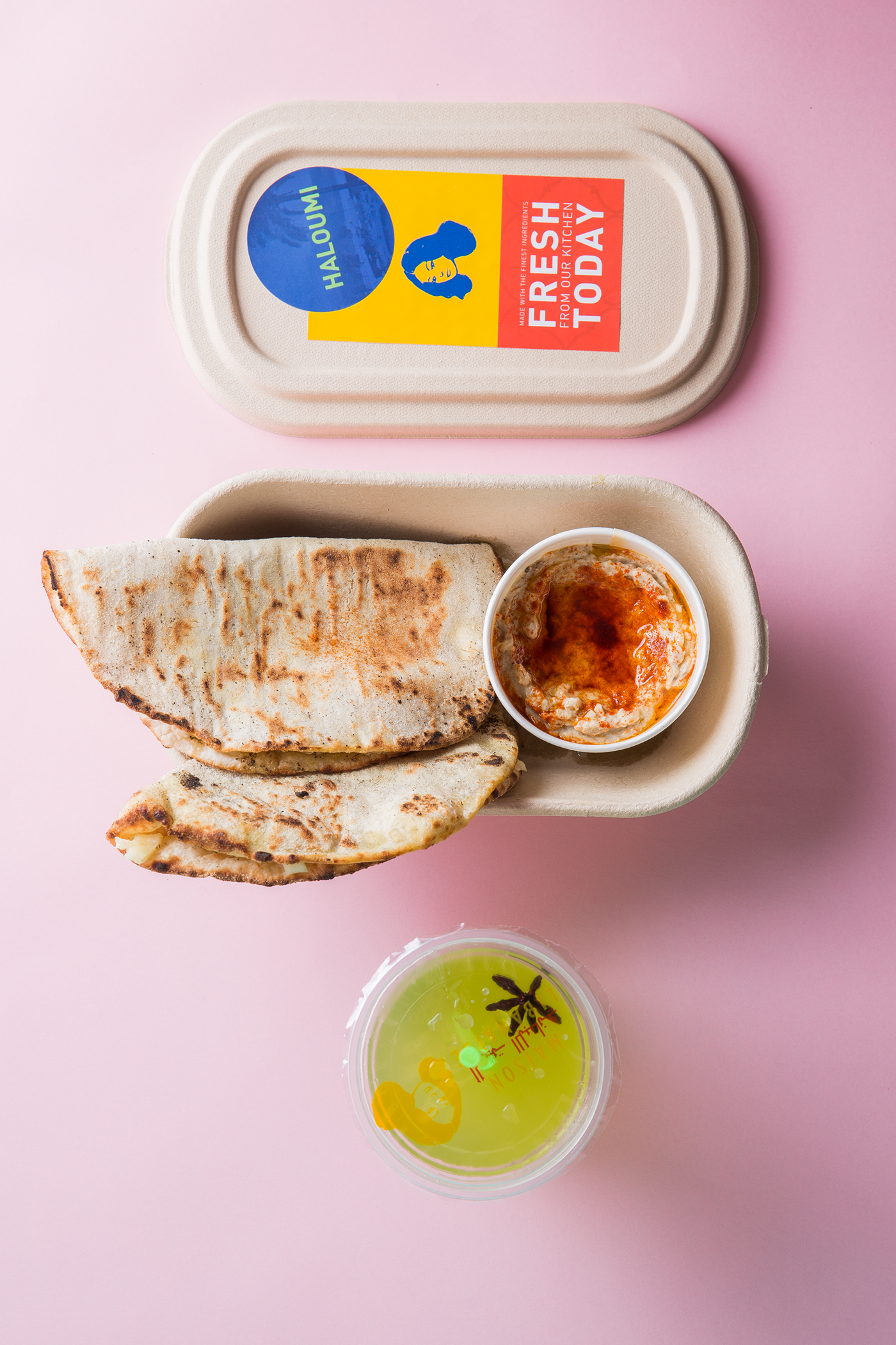
Vibrant takeaway packaging labels to reflect the punchy flavors served up at a Lebanese canteen


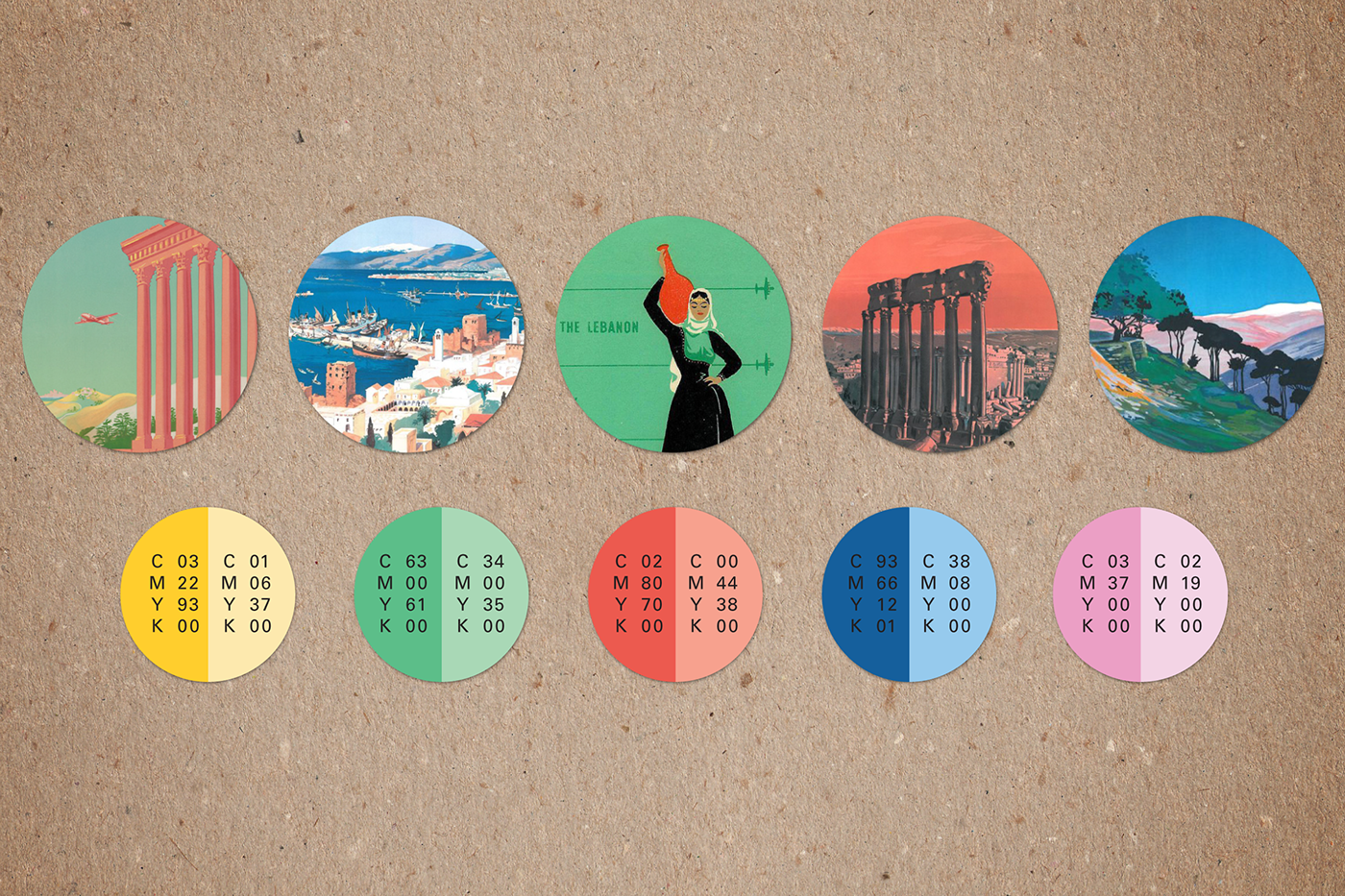

Maison Libanaise is a casual Lebanese restaurant inspired by the “golden era” of 1960s Beirut. With its floor to ceiling murals of vintage travel posters, large glass chandeliers and patterned tile floors, it is a space not lacking in allure. Not wanting this impression to be lost on patrons who chose to get their fare to go, Black Sheep Restaurants came to Downey Creative to liven up their takeaway packaging.
We proposed the use of stickers in various sizes to not only identify the food itself, but also to call out its fresh, made-today nature. With some brand guidelines and design elements such as logo and typography already in place, we expanded on the color palette, and introduced a range of subtle, classic arabic patterns as well as vintage photography that showcased the restaurant’s theme of Lebanon as the “Paris of the Middle East.” These elements were layered in different combinations to bring a bold pop of color and personality to the bamboo food containers and juice cups.
The addition of these labels takes an otherwise bland feature and turns it into an opportunity for consistent brand storytelling, while also reflecting the lively flavors of the cuisine.

