GOLDSMITH
Brand identity
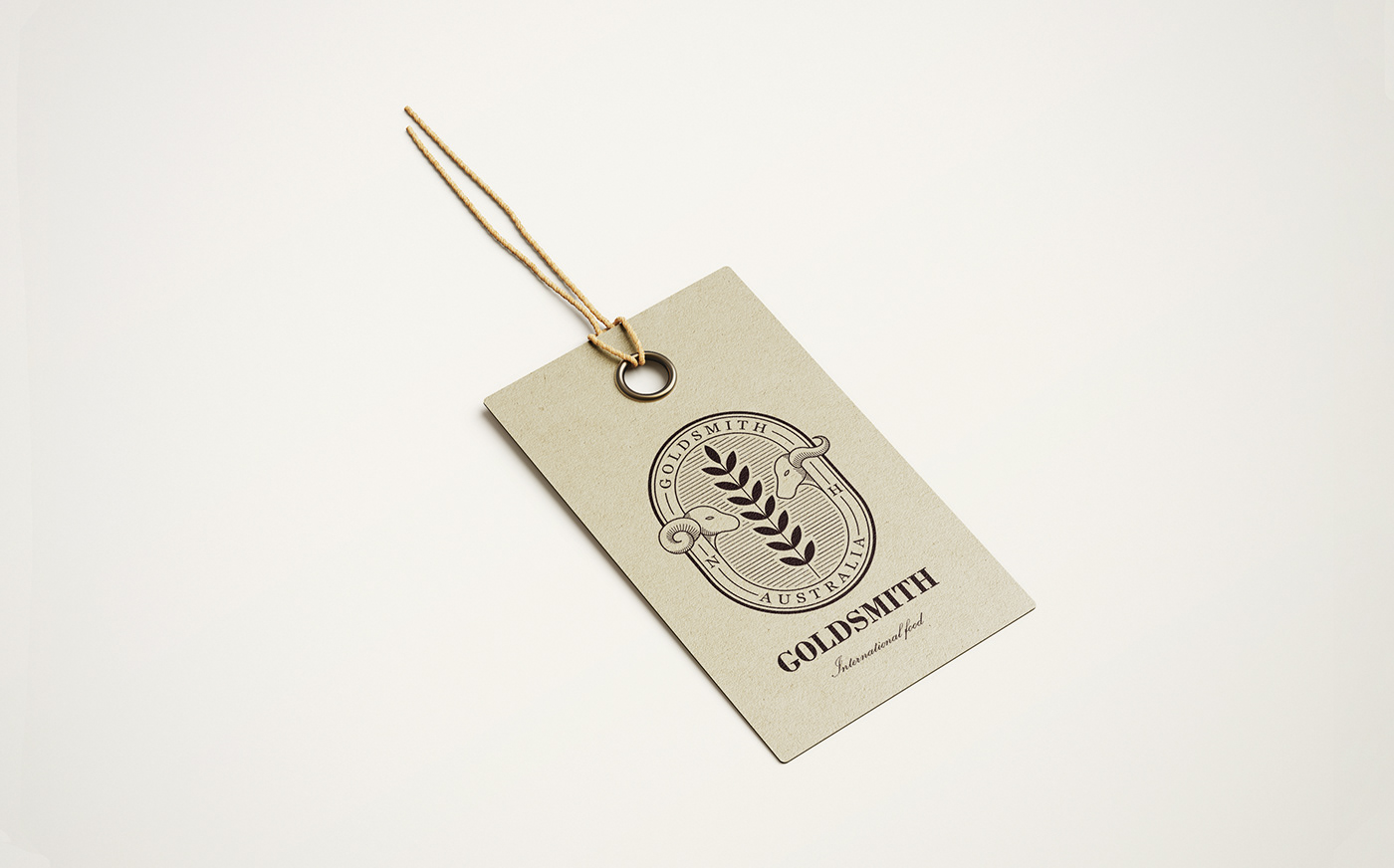
Goldsmith 是來自 Australia 的肉品進口商,販售產品主要以牛肉與羊肉為主。標誌設計上以徽章的型式表現,透過慎密的計算建構而成。品牌名稱是由"鐵匠 (Blacksmith)"延伸,於是以"盾牌"作為標誌的基礎外型,並賦予 "守護" 之涵義,傳達 Goldsmith 維護自然生態的核心訴求,並於標誌左右兩側加入自然 (Natural) 與健康 (Healthy) 的英文字首,而中心主視覺則以牛、羊與農作物三種元素相互搭襯,讓觀者能夠直接從品牌標誌上感受到 Goldsmith 自然健康的品牌核心價值。
Goldsmith is an importer that mainly supplies the highest quality lamb and beef from Australia. We designed the logo in the form of a badge, with the presence of luxury texture. Thus, this logo can be easily applied on a variety of merchandise (for example, stickers on their products). As the brand takes "Blacksmith" as a reference, we adopt the concept of "shield" as the basic framework of the logo. Goldsmith presents the brand as a "guardian" that provides an organic environment to live stock. We further add the initials of ‘Natural’ and ‘Healthy’ on both sides of the logo as the quality assurance of the products. At the center of the logo, we play with the images of cattle, sheep and crops that enable the audience to visually comprehend Goldsmith’s brand.
Art director / Midnight Design
Design / Su I Chan、Gu Yi
Design / Su I Chan、Gu Yi
Client / Goldsmith