


PACKAGING DESIGN - GYUKAKU
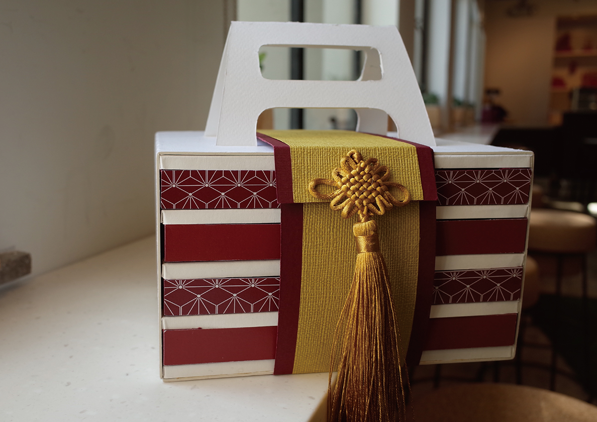
Gyukaku Japanese restaurant is in need of a new package design to refresh their current image, so I designed a take-away box using the red and yellow as the main colors. There are two tiers of customers so I used different colors for each: the red version is for the vip and the blue version is for the regular customers. Inside the packaging there are four layers, on each layer there is a different level of the beef. The yellow label is A5 beef, the red label is A4 beef, the blue label is A3 beef.


