
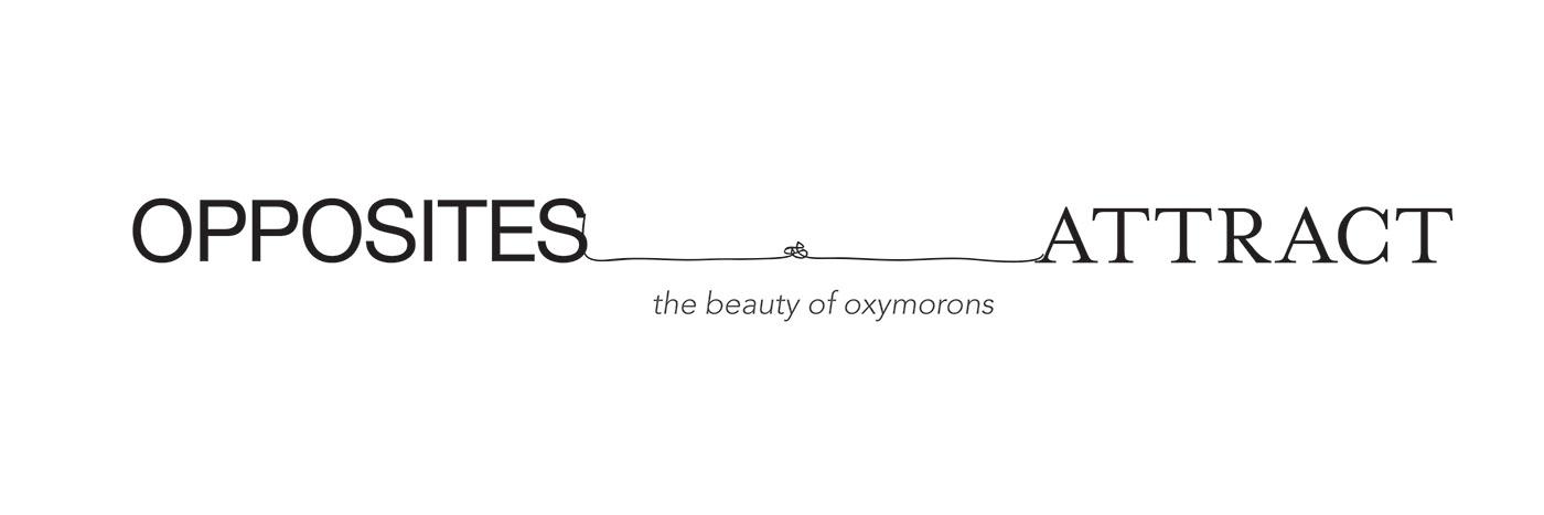
Oxymoron is a significant literary device as it allows the author to use contradictory, contrasting concepts placed together in a manner that actually ends up making sense in a strange, and slightly complex manner. At the beginning of the logotype development, I wanted the design to consist of opposite, contrasting elements. At the same time, showing the chemistry in between words and how they complement each other. After all the trial and error process, I believe mixing serif and sans serif typeface is one of the best solutions. I chose a sans serifed typeface, Helvetica, a neutral typeface with great clarity, no intrinsic meaning in its form, and could be used on a wide variety of signage. In contrast, I also chose a serifed typeface, Mrs Eaves, a variant of Baskerville, has a poetic look and feel, and is widely used on book and album covers. I chose to keep the logo in black and white since they provide the greatest degree of contrast. I used a knotted string tie up the words Opposites Attract together. String symbolises the connection between two contrasting ideas while the knot represents the obstacles when two opposites join together.


For the introduction wall, it aims to echo the theme of oxymorons. Two paragraphs combine together, filling spaces between lines of each other. For the secondary wall, the idea was to create a great visual impact to the audience. Separated oxymorons are used as graphic elements as well, tied up together by knotted strings. The separated oxymorons can always find each other no matter how many words out there. Two contradictory words combine, function, create chemistry and complement each other. The strings link them together, in a red-blue gradient. As red and blue represents magnet, which share same concept with opposites attract.
"The beauty of oxymoron is we use everyday in our conversation without a spot of notice."


This is a book of quotes and philosophy based on oxymoron. How a deliberate mistake is needed for us to make progress. When we survive times of pain, the best of us will still look at the invisible glass as half full but not half empty. Action is the best remedy for comfortable misery. Bitter is what makes us strong, sweet is nice enough, but bittersweet is beautiful, nuanced, full of depth and complexity. The purpose of this book, beyond the love of wisdom and philosophy, is the art of living a good life. The structure I chose for the book is a french fold. Two sheets of paper combine together, a new space is created after the hybrid formation, and that is the inner sides between pages in a French fold. Like oxymoron, they are always here, just we don’t pay a lot of attention to them. I want to create a great visual impact throughout the book. Thus, I make use of two contrasting layouts and typography, place them side by side next to each other. Layouts and use of typography like Black VS White, Positive space VS negative space, Inside a box VS Out of a box…etc, create an interesting effect. Two polar opposite elements on different pages can form into a new visual as a whole.


For packaging design, my inspiration is one of the oxymoron – bittersweet. Bittersweet is the idea that in all things there is both something broken and something beautiful. Bitter is what makes us strong, what forces us to push through. Sweet is nice enough, but bittersweet is beautiful, full of depth and complexity. We really need both the bitter and the sweet in our life. I want to do a packaging for coffee beans because the flavor of coffee is very similar to our lives. The flavor is complex and full of depth. We might think the first sip of coffee is bitter, but the aftertaste might be sweet. The chemistry of the coffee in mouth is strong, it is like a symphony of both bitter and sweet. Different coffee has different flavors; different people have different experience on a same cup of coffee. I chose to do two packaging that can form into one design. One box of coffee beans, one box of sugar. Two contrasting ideas, bitter and sweet form together. In terms of functionality, it is designed for one cup serving. Audience can simply tear off the designated area on the package and pour into the brewing machine. At the same time, two packaging are designed in triangular prisms and then formed into square based cuboid. The name Bitter and Sweet on the front would also join together.

Thanks for visiting!
Want to see more? Keep in touch by clicking the "Follow" link at bottom.
Want to see more? Keep in touch by clicking the "Follow" link at bottom.