OBJECTIVE
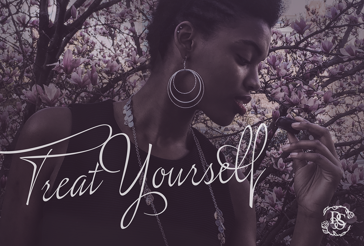
This is an original image art directed, photographed, and edited by Samuel Landis, modeled by Jasmine Martin. It was used as the main banner on the homepage of the wesite to evoke an elegant couture feeling. The copy "Treat Yourself" was inspired by the initiative to brand Russell Stover as a luxury chocolate for everyday indulgence.
Objective
Russell Stover is a classic brand who is quickly losing their place in the competitive chocolatier market. In order to retake their place, the objective was to reexamine how Russell Stover could embrace their history and still find a way to make themselves relevant to a new generation.
Russell Stover is an classic American brand, founded in 1923, however, in recent years they have lost sight of the core principles they were founded on: quality, service, and value. My goal was to recapture these characteristics in way that presents a classic brand as relevant to generations both before and after 1980.
In this process I reimagined Russell Stover's outdated identity, packaging, and website in a way that now tells the timeless and elegant story of this historic brand.
EXISITING

INSPIRATION
FINAL BRANDING CAMPAIGN
Identity
The current Russell Stover Identity has lost much of it's character, it is font driven,
lacking of unique qualities, trendy rather than timeless, and overall does not represent the timeless elegance of the brand.
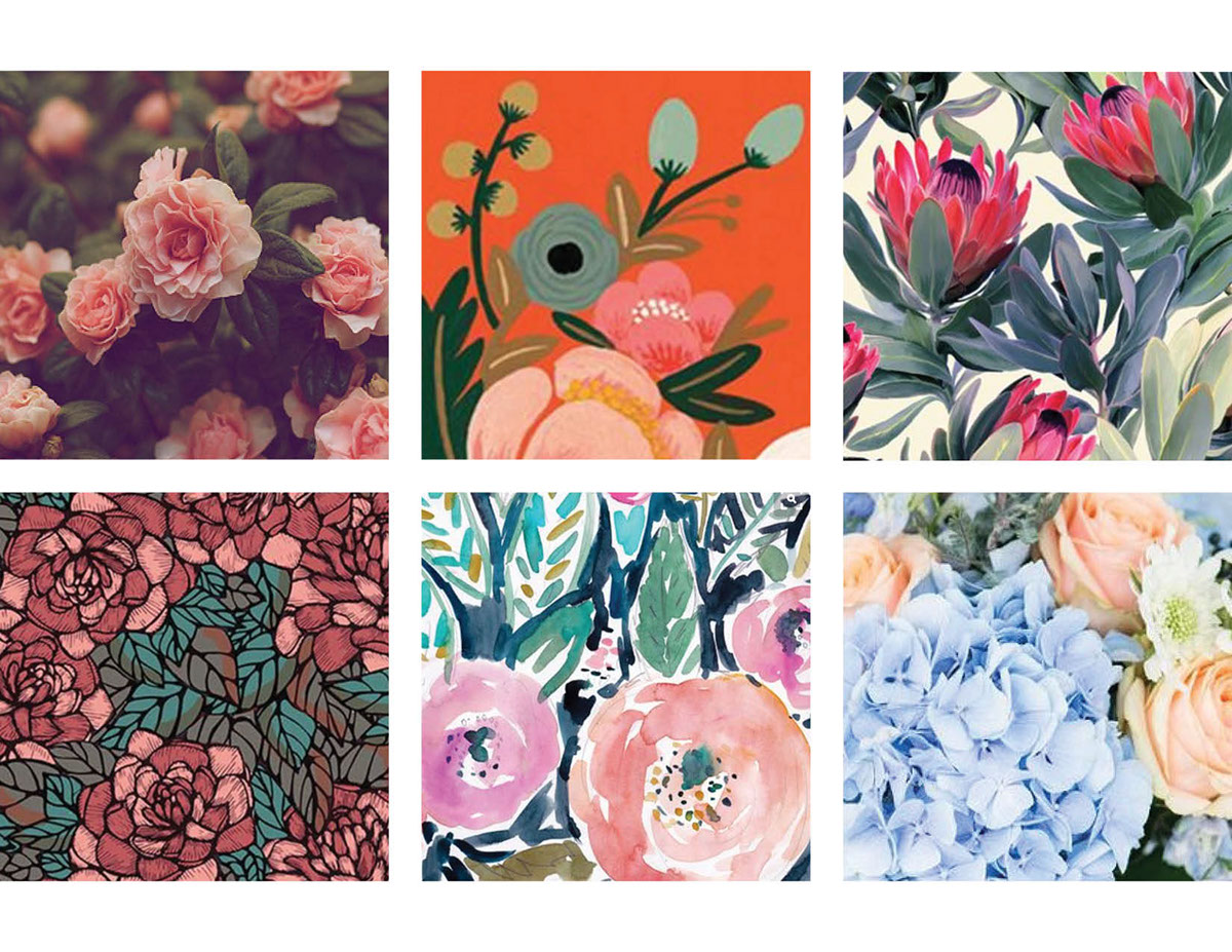
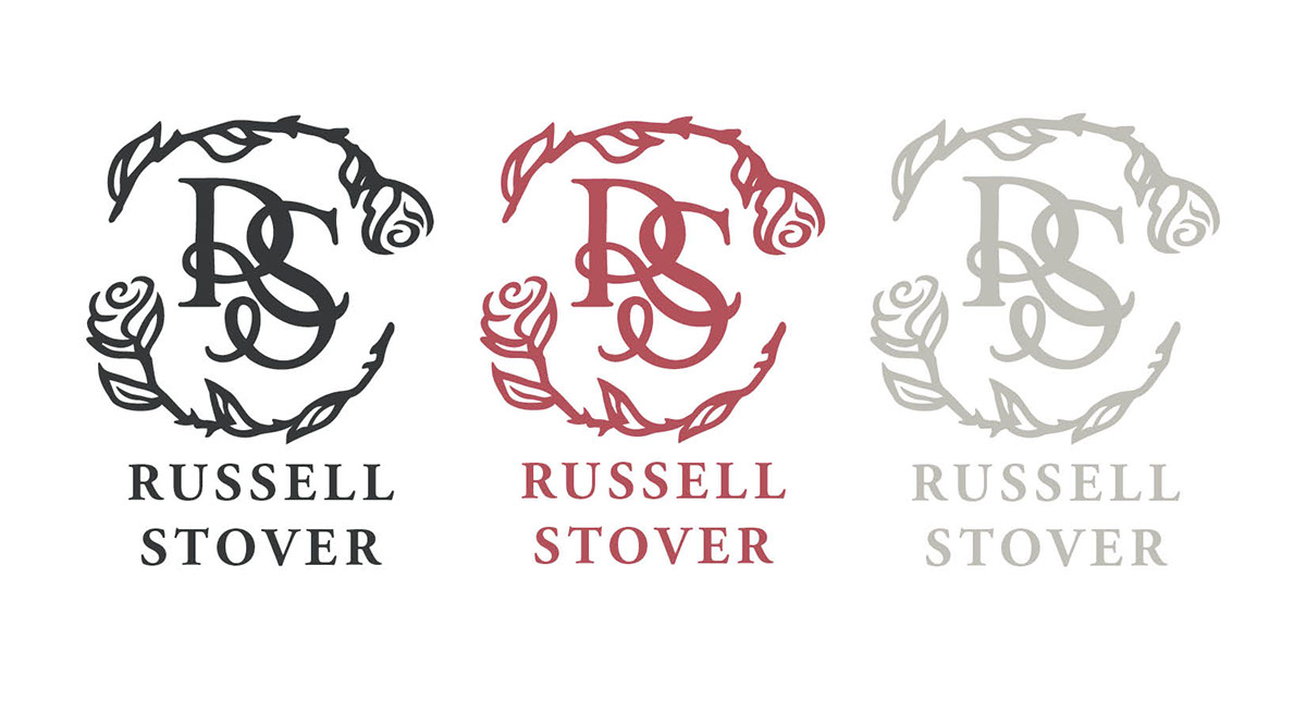
My intention for the direction of Russell Stover's identity was to incorporate the history, character, and quality of the brand. Some of the inspiration was derived from ribbons and roses which have long been associated with the brand and chocolate. Another played with the idea of seal or handwritten note, and the personal hand-crafted quality. At the same time, as I looked to give Russell Stover a more elegant feel, I was inspired by luxury branding.
The final identity direction I think captured the best elements out of all these inspirations, the personal touch of a seal, the romance and elegance of a rose, and the feel of a luxury chocolateir.

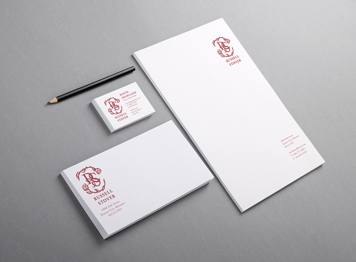
Stationery
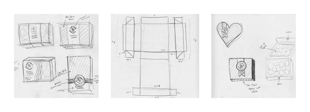
Packaging
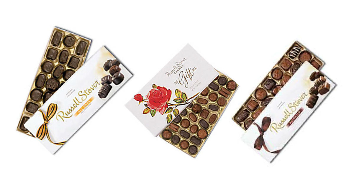
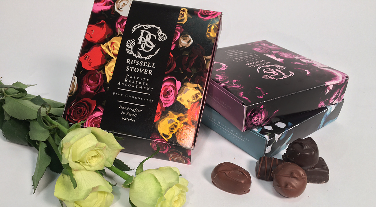
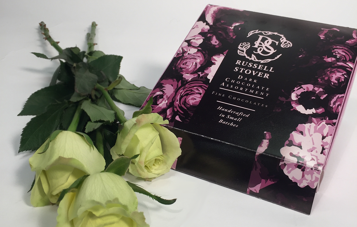
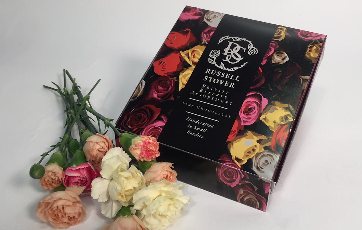
If you were to go shopping for chocolate today, the chances of you choosing Russell Stover from the many other options now available is slim. The everyday chocolate brands like Hershey's are bright and eye-catching packaging, while the more high end chocolate selections like Godiva and Lindt have packaging that feels like indulgence. Russell Stover, seen as mainly a Holiday Chocolate gets lost on the shelves.
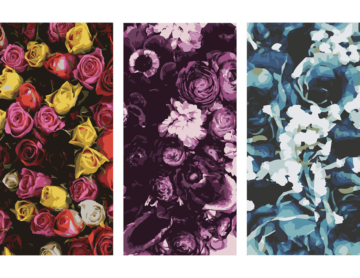
My intention for the Russell Stover packaging was something that would catch your eye on the shelf, something that was colorful, but also clean and classic. The patterns were inspired by floral prints from the Art Deco 1920's, touching on the brand's history.

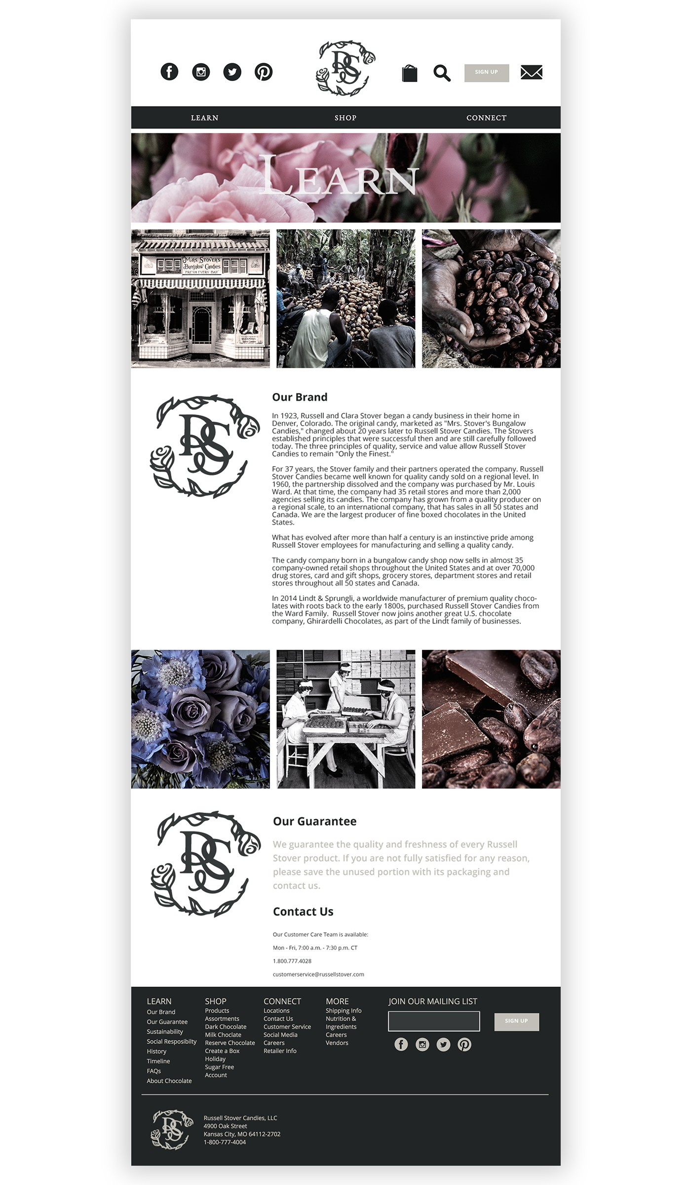
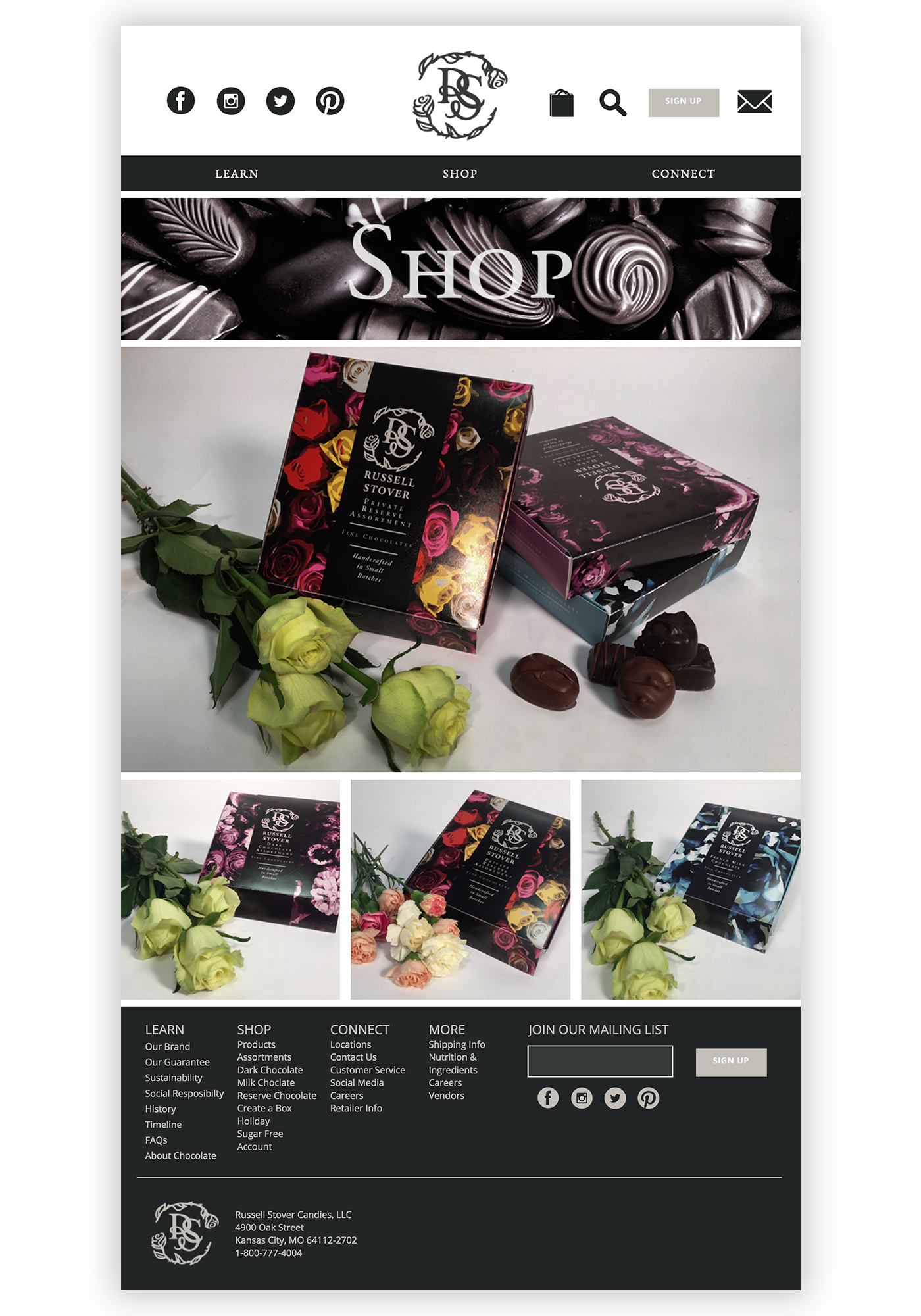
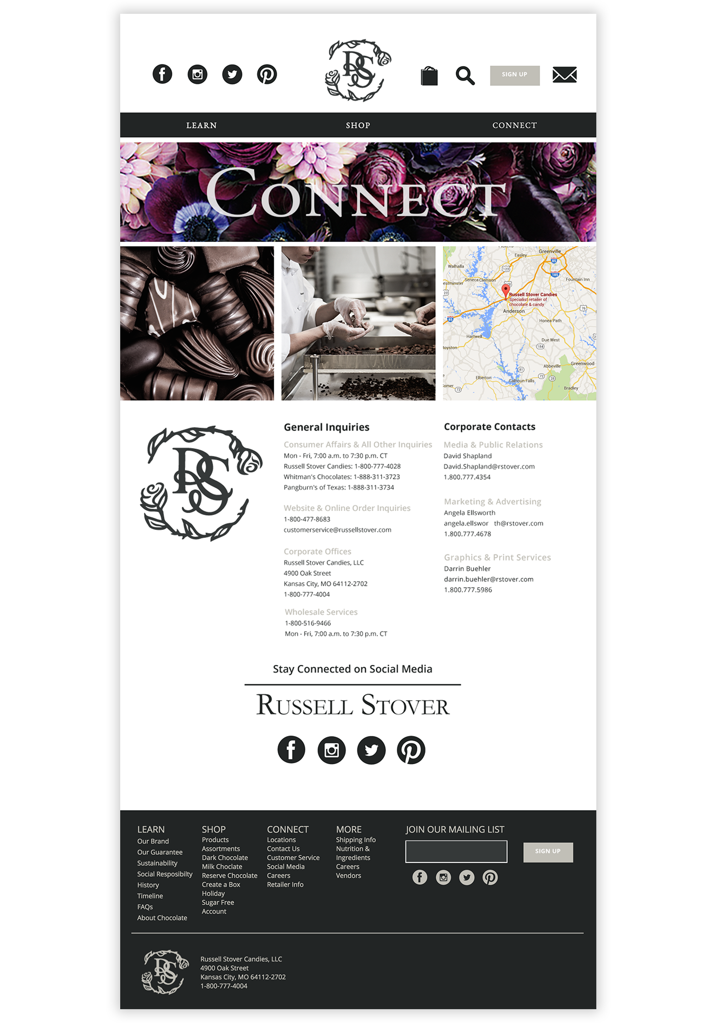
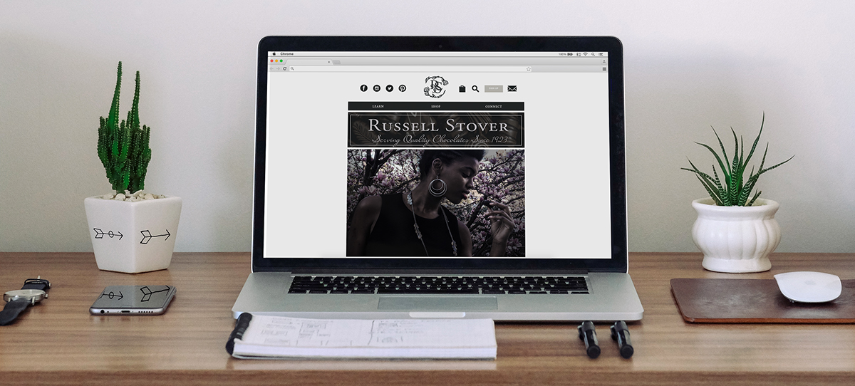
Web Design
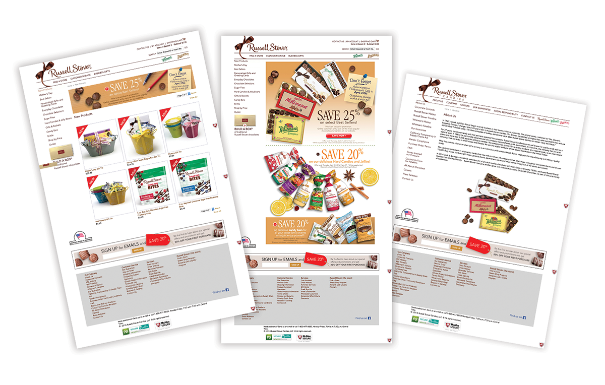
I found visiting Russell Stovers' existing website to be a confusing and complicated experience. The layout is plain and simple, however the navigation is anything but. The site has navigation to linked pages in the header, left side, and in the footer, but more than that, the organizational method is confusing in that you aren't sure where to look to learn about the company or where to buy chocolate.
My intention was both to give character to the website, but also to provide a cleaner, simpler, and more effective usability. In order to give Russell Stover a more elegant feel, I drew inspiration from websites like Vogue and created a simple layout which uses striking images to draw you into the page. The navigation is much simplier as I felt almost everything on their website could fall into three categories: Learn, Shop, and Connect. My hope is that their online presensce better reflects the brand and is a more enjoyable and easy to use experience.