Didot vs Walbaum | Type Comparison
Introduction
In the creative industry, typography is one the most important elements of design, so constantly companies try to introduce new typefaces to be implemented into the creative world. To promote these new styles to designers, type manufactures construct specimen books to compare and contrast unique features and typographic differences each lettering has.
Task
The objective was to learn typographic nomenclature and anatomy terminology. Increase observation skills of the subtle typographic differences that influence type choices and textures. Learn to effectively design a page using visual hierarchy and design a sequential eight page type specimen booklet. This book would compare and contrast two similar fonts from the same type family that exhibited unique and subtle differences.
Actions
Initially I started by researching the history and development of two typefaces that were similar but different and I chose Didot and Walbaum. To accomplish my objective I wanted to create a handcrafted specimen book commemorating the skill the typeface creators used when the type was produced.
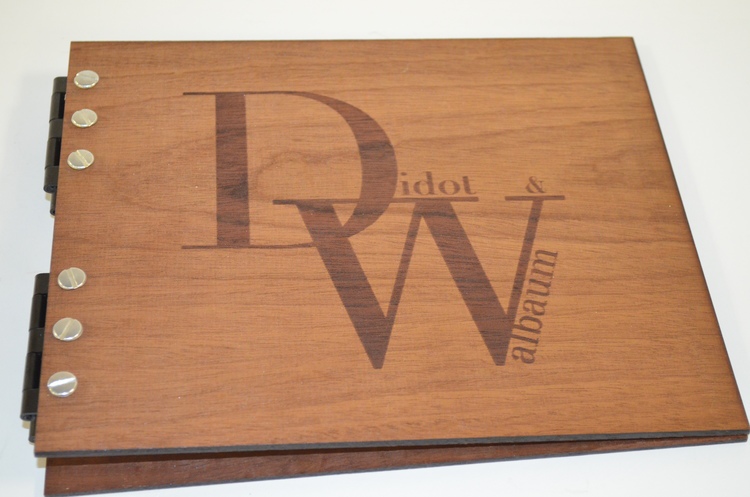
Results
To satisfy my goals I developed a booklet that was encased in wood covers, laser cut to emulate the visual of letter pressing type. Then, I used an industrial like binding technique to honor the craft and machinery used to press and cut your own letters during the time period these typefaces were created.
The content of the specimen book compared both type styles and exposed the subtle differences certain letters featured.