A rebranding project with the goal of updating logo, applications, and overall look/feel of the brand. Amsterdam's airport branding was very outdated and needed a minimal, European aesthetic. Applications included logomark, way-finding system, app concept, and branding.


App Concept
Concept wayfinding app for around the airport. Buttons, icons, and type were intentionally left large so as to make it easier for travelers to read the screen while also navigating the busy airport.
Concept wayfinding app for around the airport. Buttons, icons, and type were intentionally left large so as to make it easier for travelers to read the screen while also navigating the busy airport.


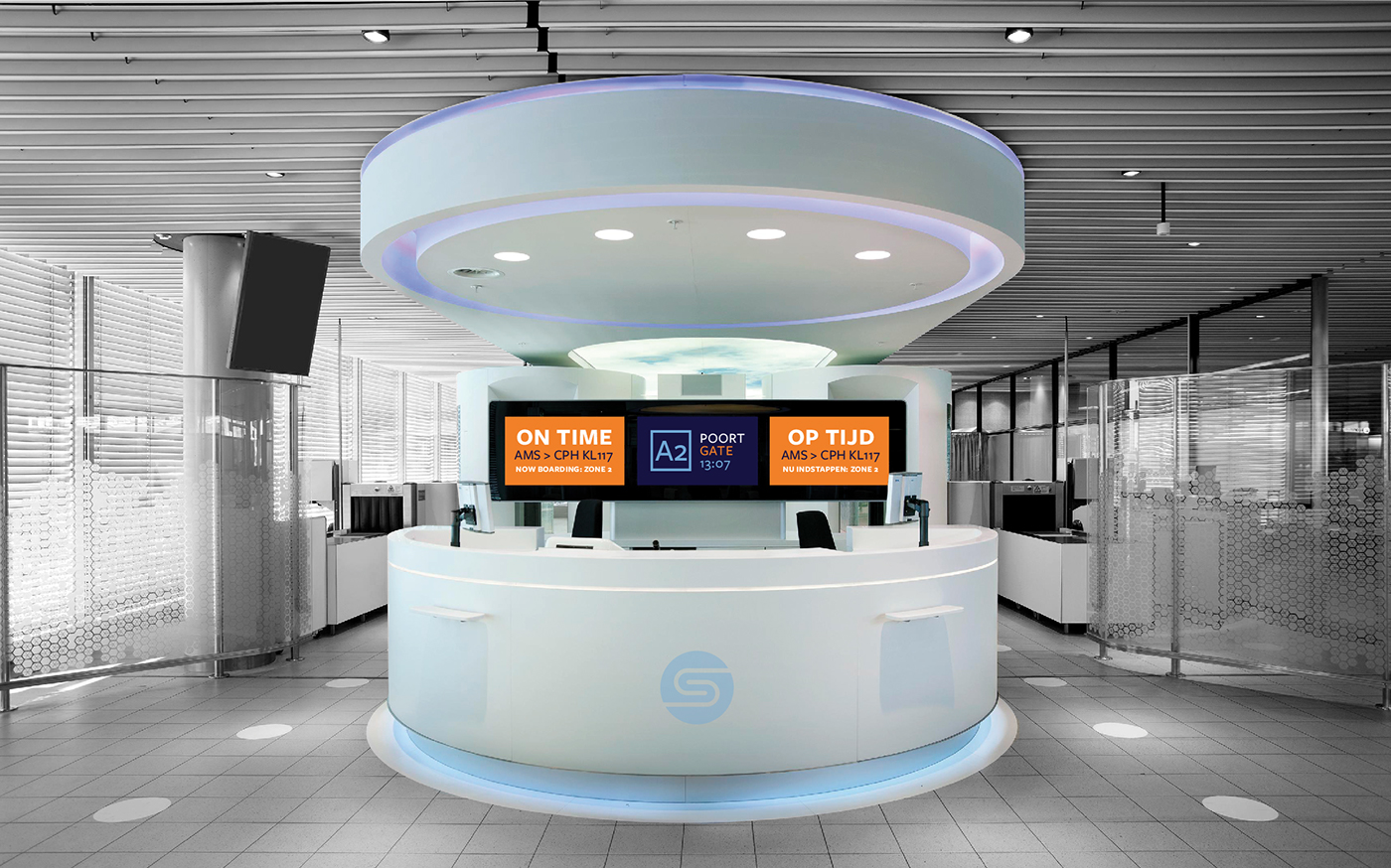
Branding Applications
Commuter train from intercity Amsterdam to the airport, new voice poster, and new gate design.