

Simonsberg Cheese
Range Redesign
Range Redesign
We were approached by Simonsberg to help this known and loved brand update their look.
Our brief:
The design new must...
• communicate 'master of fine cheese' with crafted, refreshed packaging
• create higher on-shelf impact
• retain the distinctive 'Simonsberg' look
• create a unified look & feel across all SKUs and segments
• be clearly differentiated from competitors
• be accessible to our target market (LSM 9-10, Female, 'Forever 30')
My solution:
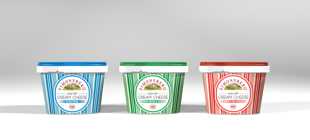
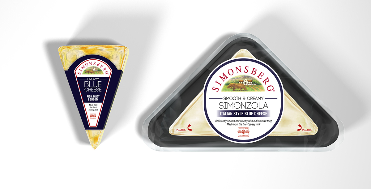
Within the market, and across its ranges, Simonsberg's strongest design assetts are the circular holding shape and the striped pattern. These design devices formed the basis for creating a new look for the brand. The utilisation of clean space white space in the holding shape, which sits on top of the pattern device, gives the brand a more contemporary feel, emphasised by a new modern and structured typeface.
Across the range the structure remains the same to create unity for the brand. A unique pattern was designed for each product range - a 'Greek influenced' pattern for feta versus 'Paul Smith' inspired pattern for the white moulds. The patterns give the brand a strong shelf presence and help tier the range based on the varying degrees of product 'premiumness'.
The striped devices are own able for Simonberg, giving the brand unique differentiation and increased individuality from its competitors.
Our brief:
The design new must...
• communicate 'master of fine cheese' with crafted, refreshed packaging
• create higher on-shelf impact
• retain the distinctive 'Simonsberg' look
• create a unified look & feel across all SKUs and segments
• be clearly differentiated from competitors
• be accessible to our target market (LSM 9-10, Female, 'Forever 30')
My solution:
Within the market, and across its ranges, Simonsberg's strongest design assetts are the circular holding shape and the striped pattern. These design devices formed the basis for creating a new look for the brand. The utilisation of clean space white space in the holding shape, which sits on top of the pattern device, gives the brand a more contemporary feel, emphasised by a new modern and structured typeface.
Across the range the structure remains the same to create unity for the brand. A unique pattern was designed for each product range - a 'Greek influenced' pattern for feta versus 'Paul Smith' inspired pattern for the white moulds. The patterns give the brand a strong shelf presence and help tier the range based on the varying degrees of product 'premiumness'.
The striped devices are own able for Simonberg, giving the brand unique differentiation and increased individuality from its competitors.
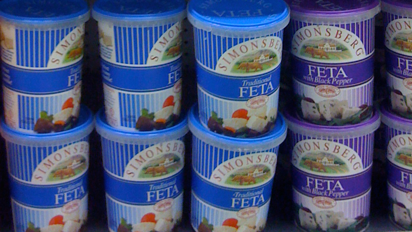
Previous Simonsberg feta packaging
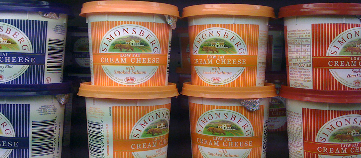
Current Simonsberg cream cheese packaging

Concept: New Design


Shelf Impact


