Client: MacPlus
Project: Re-brand
Agency: Föda Studio
Project: Re-brand
Agency: Föda Studio
The Project Review:
This rebrand explores the concept of a customer only needing IT services in two phases of their business: growth & technical emergency. Along with the graphic rebrand challenges, we also provided resolution with the MacPlus name. The word "Plus" usually implies simple addition or software solutions, but we wanted to show that MacPlus goes beyond basic IT solutions: they provide physical, in-the-field education along with various other I.T. services.
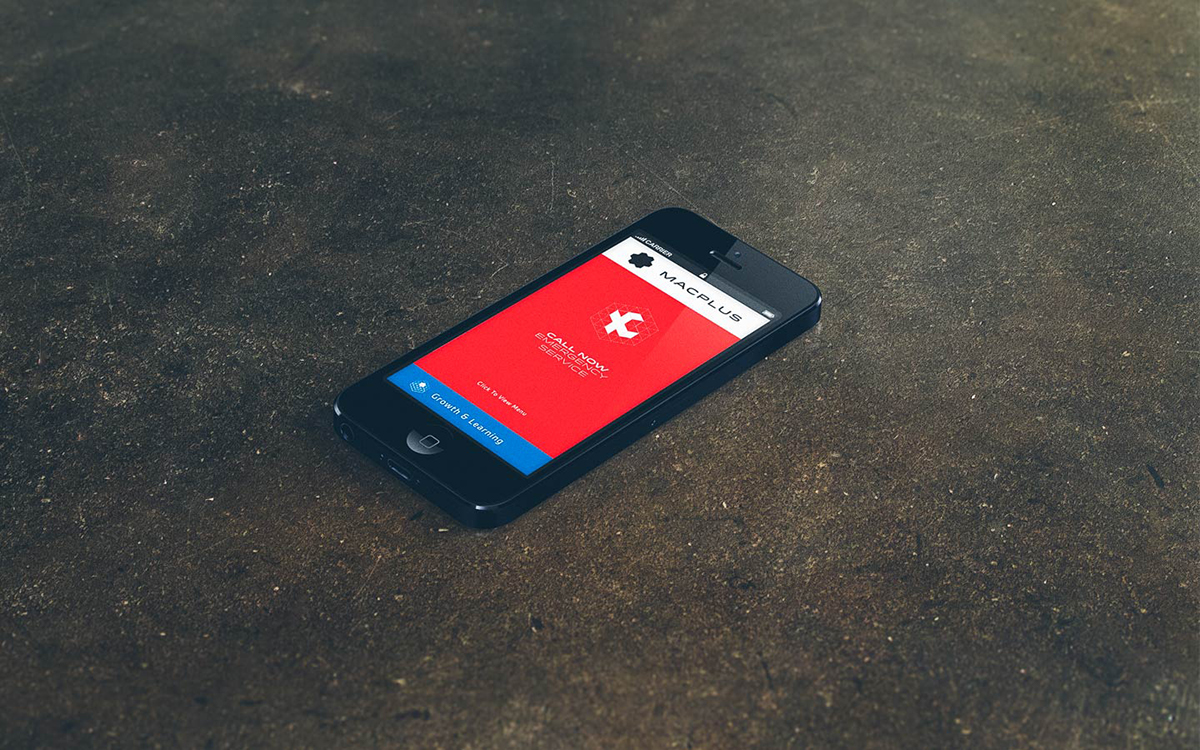
We started with the "+" and placed it into a 3D grid matrix that allowed us to develop a system of ever evolving symbols, icons and color patterns to create a robust graphics kit for the brand. Our approach to the web was also radically different. Based off the user's experience, we knew that most IT providers get called when something bad happens. With this knowledge we knew that the mobile site would be the most used device for the MacPlus brand, so we focused on designing a simple, clean, easy-to-use mobile site that would allow quick access to MacPlus wherever they are needed.
With MacPlus being an information technology company, we didn't want to forget about the importance of their print collateral. Our mission was to keep their printed pieces simple and clean, just like the Apple products that they provide support for. We used a printing technique called thermography and metallic inks to help elevate their print collateral system.


Creative Team:
Creative Director: Jett Butler
Art Director/Lead Designer: Kevin Taylor
Developer: Big Skillet
Project Management: Lesley Taylor
Documentation: Sheerin Vatankhah
Creative Director: Jett Butler
Art Director/Lead Designer: Kevin Taylor
Developer: Big Skillet
Project Management: Lesley Taylor
Documentation: Sheerin Vatankhah

