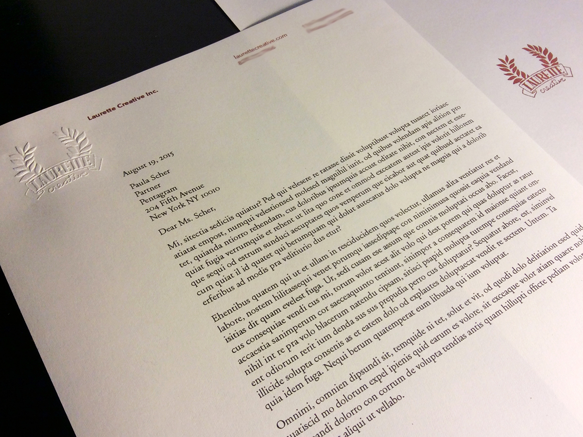
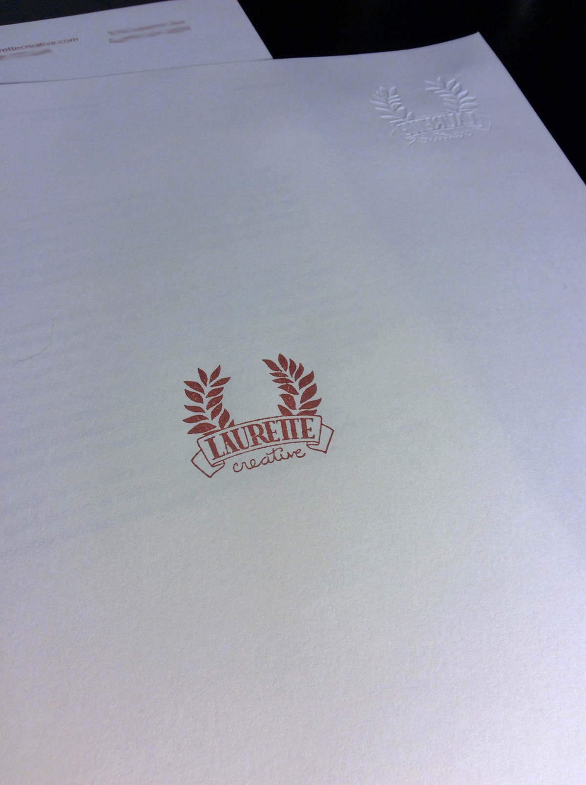
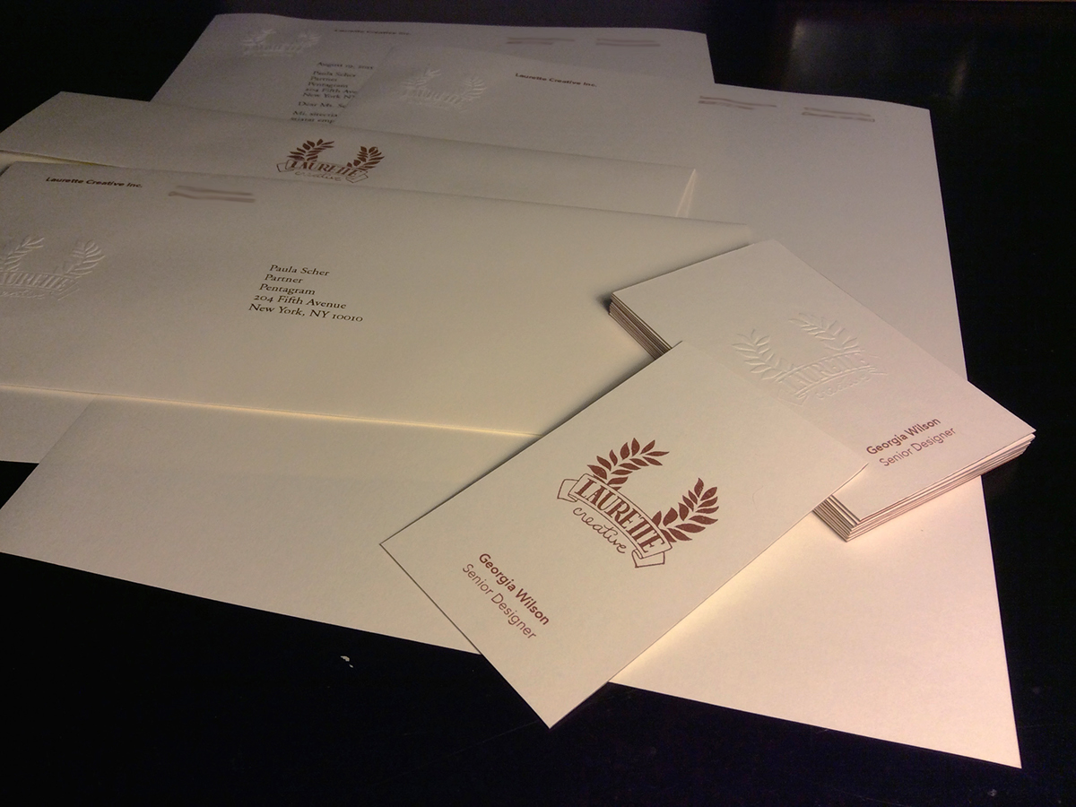
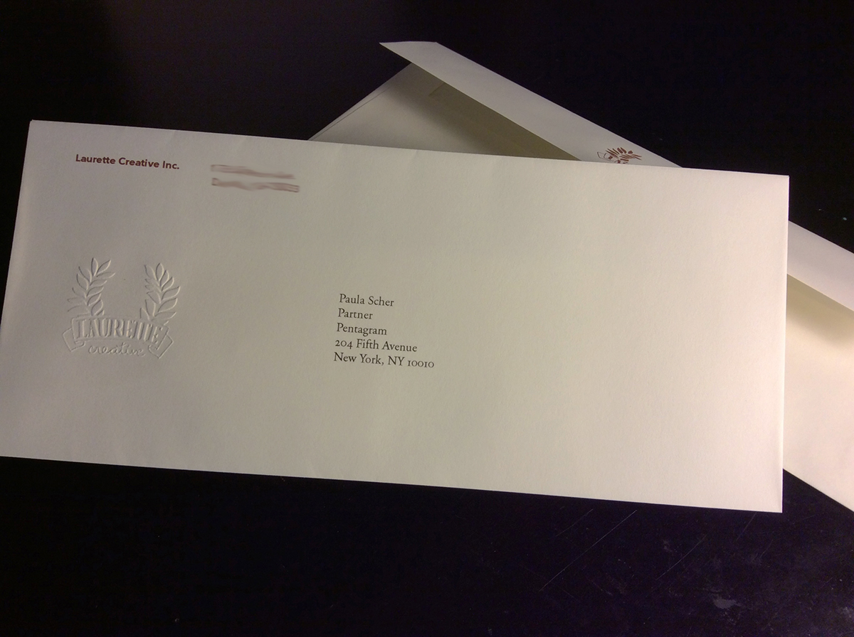
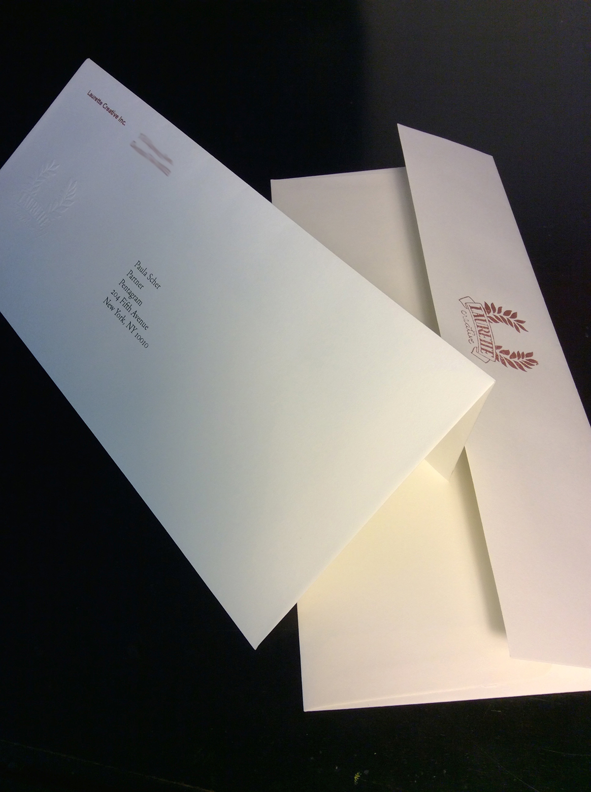
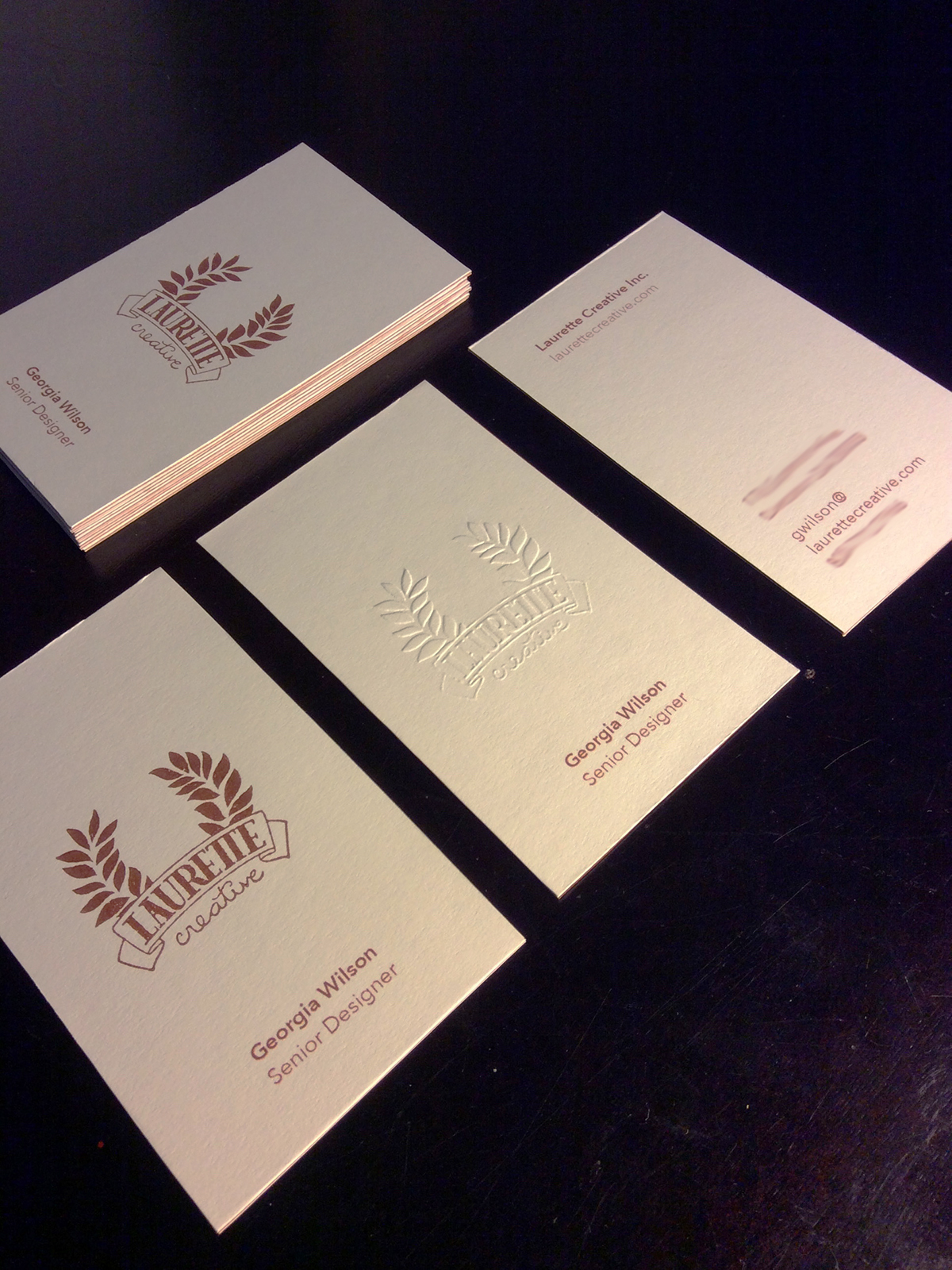
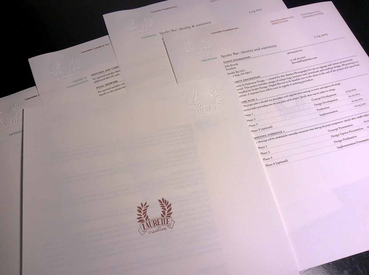
I am named after my grandmother, whose name was Laurette. This French name is a different spelling of Laura but it also means Laurel or Sweet Bay tree, which symbolize honor and victory. This is the same laurel that crowns royalty and was placed on the olympian victors head. I handdrew my own serif logotype as well as a script secondary typeface that could be used for other aspects of the company. I chose to make an emblematic logo for the subtle respect that it conveys, I also wanted something unique from the rest of the logo's I've made in the past. Something more illustrative while still being practical.
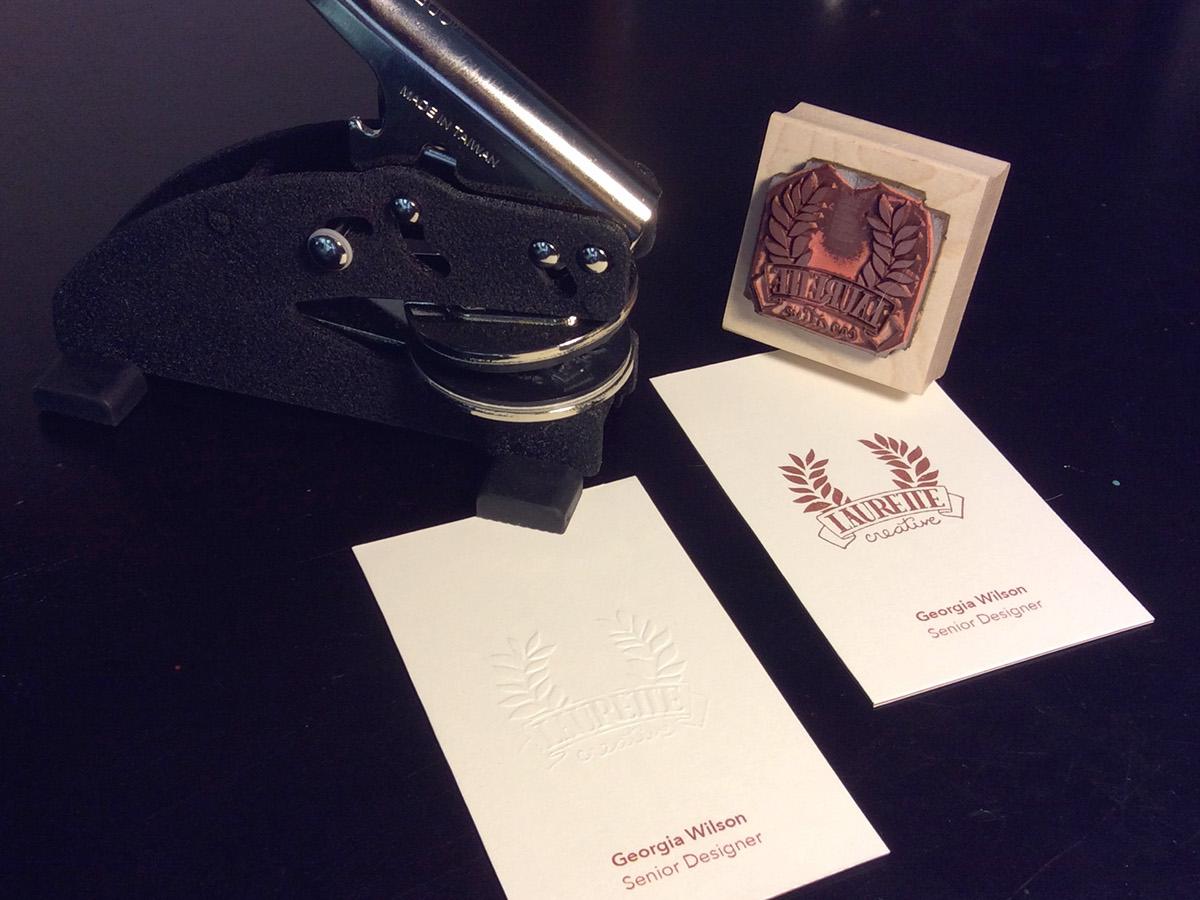
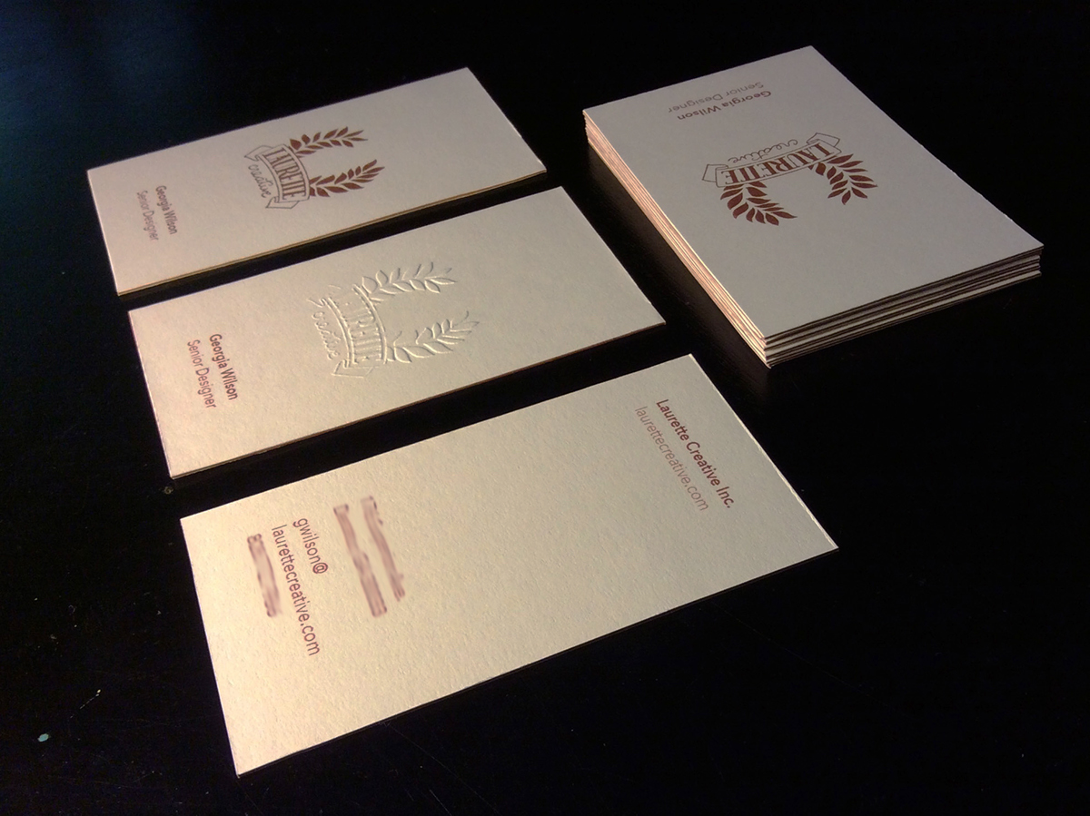
The logo is individually stamped on the business cards with a metallic mahogany. This is continued with the metallic copper paper the business cards are layered. This triplexing gives the card a nice sturdy quality while allowing for some cards to be embossed on only one side.
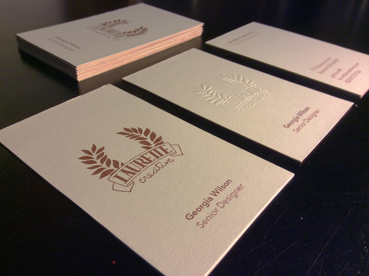
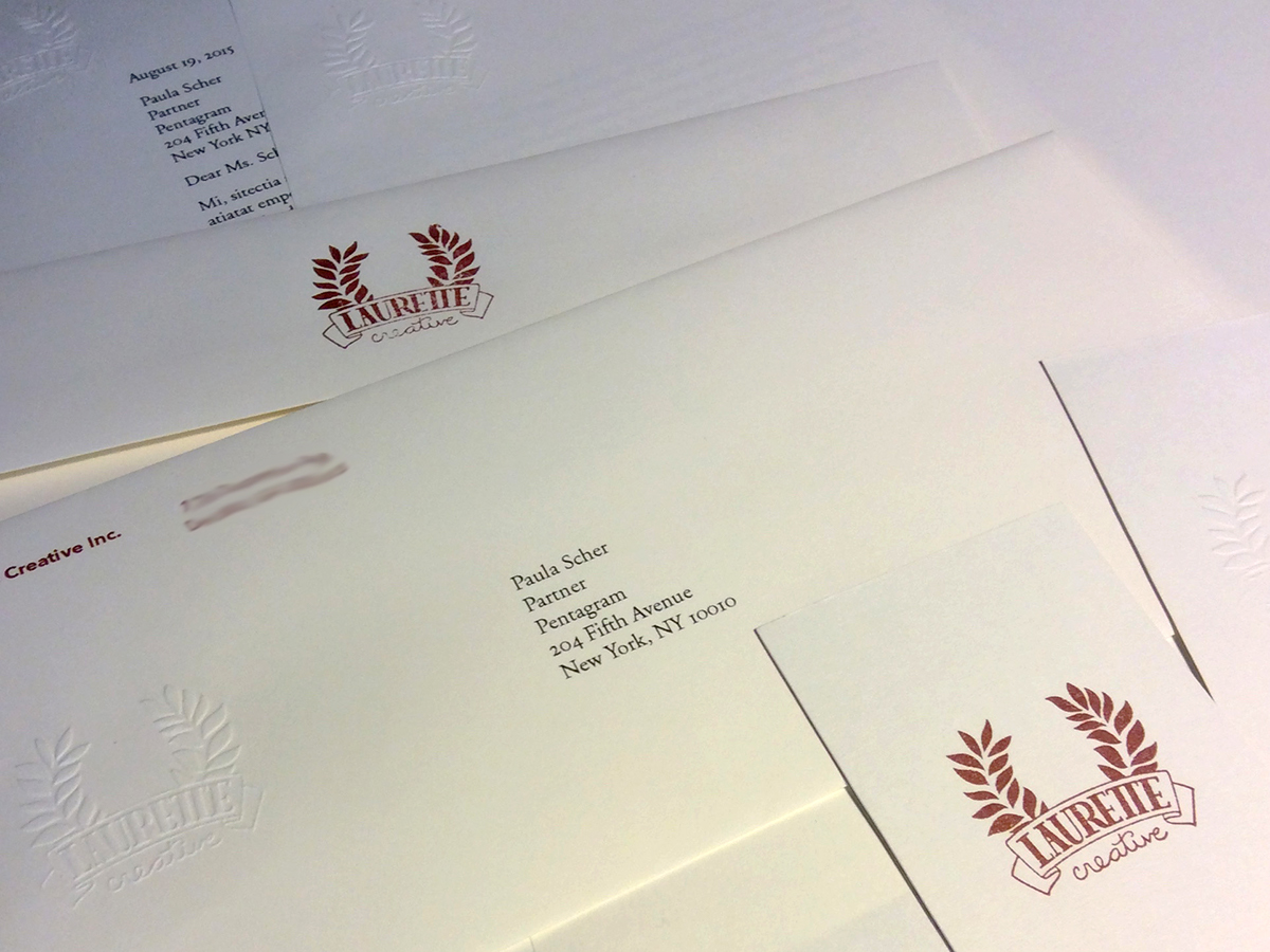
Everything is printed on Neenah Classic Crest Natural White Smooth paper.