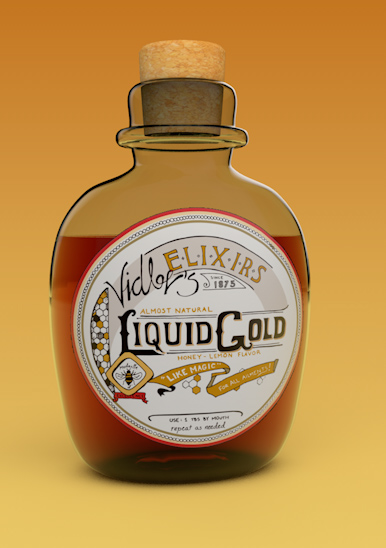
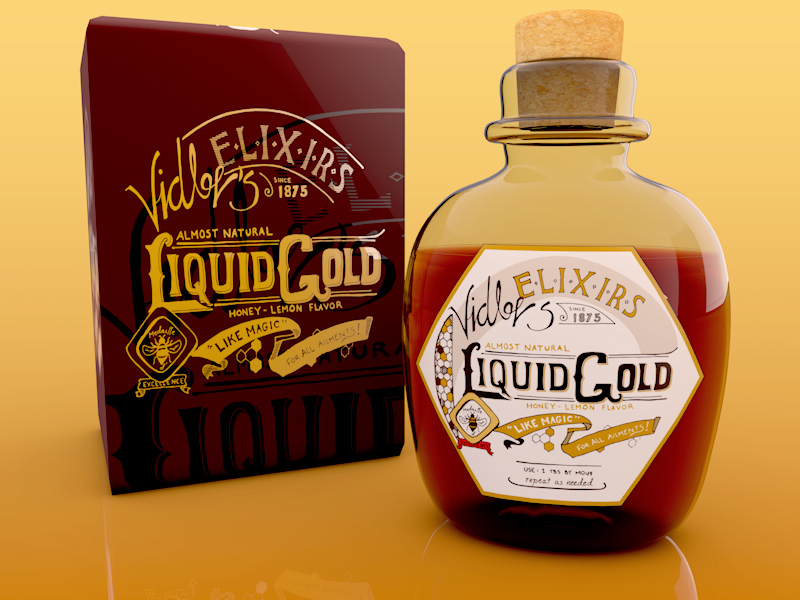
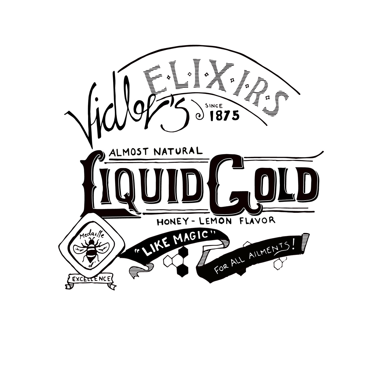
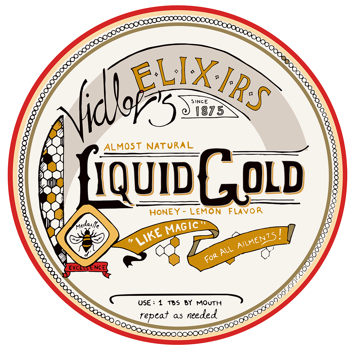
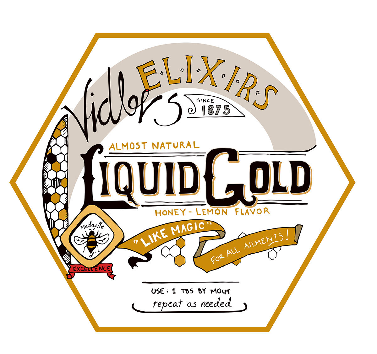
This was a fun side project I did in response to a Skillshare class by Mary Kate McDevitt. The inspiration came largely from a Five-and-Dime store in my town (named Vidler's). I evolved the Vidlers branding, which is normally candy-apple red and white stripes, into a more muted and refined style that I thought would contrast nicely with the magic potion I wanted to sell. The goal was to hearken back to days when quack medicine was much more elegantly presented than the crappy informercials used to market it now.