Mash-up Design and Architecture
User Research, User Experience Strategy, Information Architecture, Interface Design
User Research, User Experience Strategy, Information Architecture, Interface Design
The Project: The Guardian Life Insurance Company has dozens of intranets and web based applications managed and maintained manually by siloed divisions with the organization. In order to create a unified experience for their Agencies, I designed a new portal with mash-up applications for reporting, alerting, and compliance ready marketing materials and educational content.
Leading the user research phase of the project, I trained a team of application architects and business analysts to conduct Contextual Inquiry on site at representative agencies. In a matter of days we gained key insights into how the agencies worked, who our primary users were, and what their needs were.
From these key insights I developed a new information architecture and user interface that delivers key data and information to users within the context of their workflow.
2010 - 2011
Key Messages, Metrics and Personas

Sitemap and Wireframes


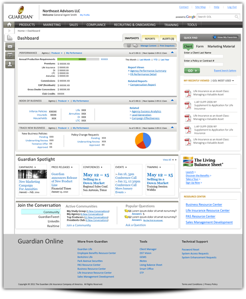
Selected Design Direction
The users and client liked the wireframes so much, they wanted the design to look just like them. I combined the clean, upscale look of the Guardian public-facing brand with an interactive app feel and the clarity of the wireframes. I also added responsive web elements for a large base of iPad users.
Strategic Roadmap Visualization
I create consumable strategic roadmap visualization pieces for complex, multi-year projects to allow project sponsors to communicate their vision and gain buy-in. These roadmaps include targeted language around business and user goals and benefits and the supporting technology that will enable these goals.


